MoMA Review
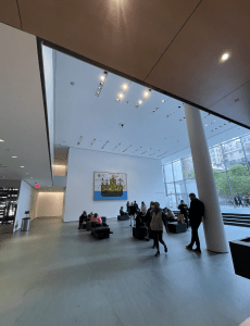
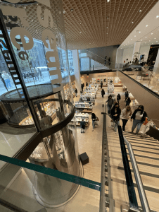
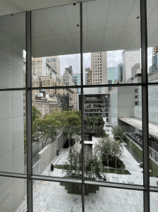
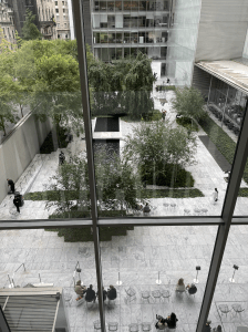
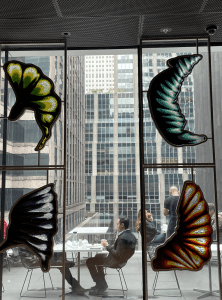
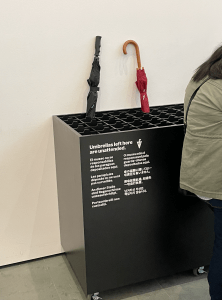
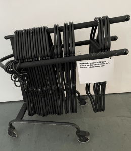
I entered MoMA smoothly with no queue, only having to show my vaccination passport and ID, then my pre-bought student ticket that was only $14. The entrance to MoMA opens up to a beautiful open-plan space that is flooding in plenty of natural light due to the modern architecture. MoMA has many spacious areas including the Statue Garden that is thriving in vegetation, trees and even has a pond. There is a cafe there too which is a great place to sit and break in such a peaceful oasis. They even have a restaurant / Terrace Cafe on the 6th floor if you are planning on spending the entire day there, the views from this floor as well as many of the higher floors is a perfect capture of New York City. The designers clearly took into account the need for seating and rest areas which can be seen with the many benches spotted around the Museum. On the first floor, they had a specific seating area for the Elderly and Disabled which I thought was an extremely inclusive design and something I have never seen in other Museums before. A fabulous extra they offered was free portable stools you could take around the museum with you to sit and watch at ease. Many larger elevators with space to take large groups and art. They had a place to leave wet umbrellas as well as a secure cloakroom/bag check. Free wifi that actually worked unlike most. Water fountains were tactically placed in areas where the art couldn’t potentially get affected. Many many hand sanitizer machines amplified the cleanliness and utmost hygiene of MoMA. Plenty of maps and signs make it easy to roam around knowing where you’re headed. QR codes on most of the art and even had assisted listing QR codes, something I haven’t seen before and again extremely inclusive/considerate of MoMA. If QR codes aren’t you’re thing they also had the option of information headphone sets. I was happy to see the bathrooms had the choice of a genderless bathroom. The bathrooms were clean and modern. I noticed there were plenty of bathrooms throughout the MoMA followed by many signs making them very accessible.
 .
. 
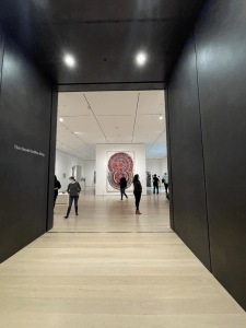
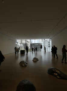

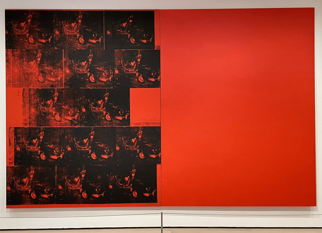
There was a huge variety of art on display, ranging from illustrations, paintings, sculpture, film, installations, performance art etc. They even had vintage cars on display in the Automania Exhibition. In this exhibition they had one of Warhol’s most eye-catching screen prints from the 60’s “Orange Car Crash Fourteen Times” in which is I did a deep dive analysis; Looking close at the layers of paint, one is able to visible see the paintbrush strokes creating a variety of textures. Leaning into the piece with close inspection, some areas have fewer coverages of paint where the brush would have been lifted from the canvas demonstrating the impossible task of creating a fully even surface with a tool such as a paintbrush. The brush lines around the canvas make it hard to determine the size brush used, due to the contrasting strokes giving me the idea of multiple brushes being used and potentially by multiple different hands. From afar, none of this is noticeable. One area of the fully orange canvas which looks as though some black paint landed on it most likely by accident, seems that Warhol attempted to cover it up but still has left some pigment. Probably from the silkscreen print, or perhaps whilst lifting the squeegee from the screen. Unintentionally emphasizing the accident and damage of the piece. There are 14 screenprints on the right canvas, all of the same image and size. They are a representation of the timeline he screen-printed onto the canvas. An obvious order can be seen of where he started with fresh paint and where he was running low. For example, the bottom right print has a full flood of paint on the screen. Then furthering to the left the images become less paint heavy which created a more textured effect. This makes the print become less monochromatic due to more of the orange color from the canvas base coming through. This can be seen multiple times during the piece, the top right has full flood down to the center two prints that have a lesser paint coverage. Leaving lines of the physical screen print, exaggerating the handmade element of the piece. Access black paint left around the canvas, creates a feeling of a fabric print, although it is on canvas which essentially is a fabric, the fabric has been hardened with the orange paint layers. But the access paint and lines almost revert it back to the physical fabric. The prints with a medium flood of paint allow more of the details of the image to be seen, though it is a still image that has been repeated 14 times, every print is unique and differentiates from one another. Allowing a different perspective and technical view of each.
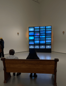
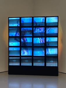
A piece that caught my eye in the Collection called ‘1970’s – Present’ was a two Chanel video installation by the British Ethiopian artist Theo Eshetu. The piece is called “Till Death Us Do Part”, 1982 – 1987. Eshetu’s explanation of the piece “Till Death must be seen as a semi-biographical attempt to understand my black and white body as if the wholeness of my body had a binary quality with two contrasting spirits that animated it”.
8aaeb9b6d4bc49db92b299868e5a123c
6e75627d2d8e41c593605dcea71dcf41
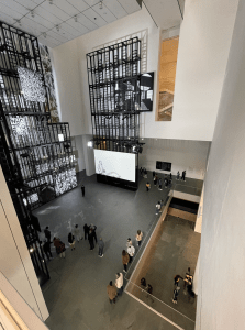
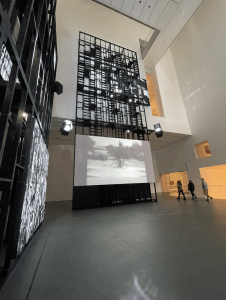
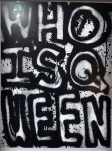
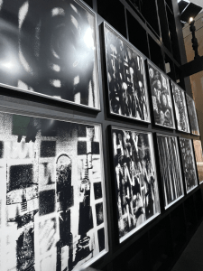
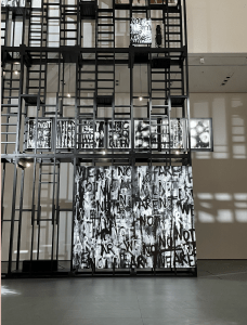
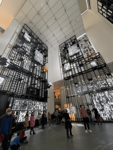
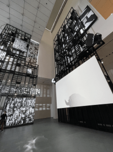
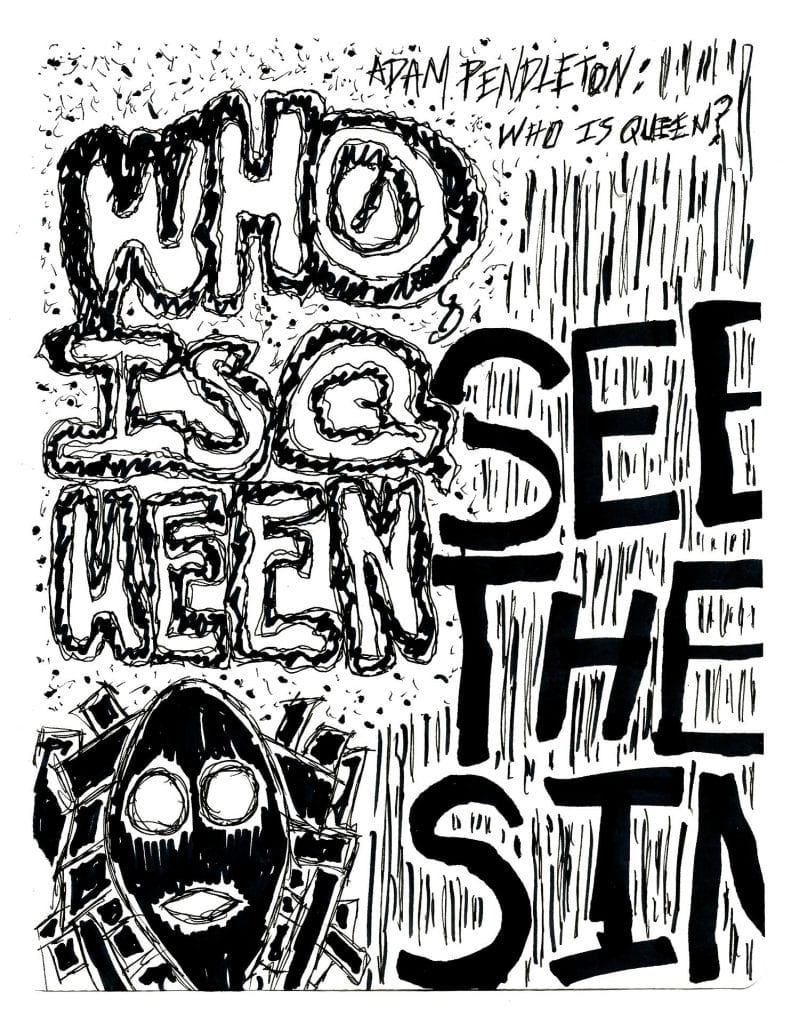
Another exhibition I found fascinating and spent a large chunk of my time, was “Adam Pendleton: Who Is Queen?”. This was held on the 2nd floor and was innovatively displayed by 3 very large wooden scaffolds/sculptures. 2 showcasing his paintings and 1 showcasing his film from the project. There is a large open space between these 3 scaffolds allowing people to pitch their stools and soak in the magic of his work, including myself (sketch below). In this project, Pendelton’s “Monumental installation explores Blackness, abstraction, and the avant-garde. Pendelton stages and spatial collage of text, image, and sound – a total work of art of the twenty-first century”.
f8b3f6407a094266a555a5a8ddf2e31b
My Sketches:
Overall I thoroughly enjoyed my time at the MoMA, originally expecting to be there for an hour/hour fifty but instead leaving three and half hours later feeling as though I had only been there for a minute or so. I was totally immersed in the environment and art. The exhibitions organically followed from one to another, one great masterpiece after another. The entire museum was comfortably cohesive allowing so much to be seen and absorbed. I was greatly impressed by the perfectionist attitude, attentive attention to detail, and deeply thought out innovation to inclusivity by the curators and designs of Moma. By no means did MoMA disappoint and over-ruled my expectations with flying colors, definitely by far the best museum New York has to offer!
