VESSEL/WIREFRAME EXPLORATION (SPACE/MATERIALITY)

Our second major project for the first semester was fabricating a Vase using wire and any other linear materials. These linear materials could take the form of string, straw, wire, paper, anything that possessed a linear plane.

Approaching this project I wanted to create a vase that was simple and not too complex in form. So I choose the form of a large water jug like vase.

This is a great representation of the form of my vessel.

Before messing with wire we had to create an orthographic drawing of our vessel and then fabricate it with chipboard so we had a model we could easily work with for the next step.

Orthographic:

Chipboard Model:

After creating the orthographic and chipboard model we started to move toward really fabricating the vessel with wire and other linear objects. I started my fabrication utilizing the chipboard model I made to create 4 vertical posts with aluminum wire, then connecting and fortified those posts with a circular wire on the bottom and the top. At this point during the fabrication I started to realize that the wire I was using was not really good when it came to fortification or stabilization since it was aluminum. Nevertheless I pushed forward using the aluminum wire and the small wrapping wire to keep the rings in place.

The final product was bent and not necessarily stable. Due to the aluminum wire the structure could be easily manipulated. I gave the vase a little flare with wire at the bottom criss crossing around the lower half of the vase and then the upper half I used string to add a textural difference.

Final Product:

After creating the final form we had to make a layout/presentation board in Indesign discussing our thoughts and ideas, documentation and work in progress, and finally the final product. I created my layout prior to completing the finished wireframe vessel product.

Presentation Board:

Space&Materiality Presentation Board (02:06:2022)

Overall this fabrication was hard and tricky to get behind, I think this was heavily due to the utilization of the aluminum wire. If I used a stronger steel gauged wire, the frame of the vessel would of been un bothered and a lot more stable. The addition of the string was fun but I also think I should of added more rings onto the frame to have different levels of connection and further mess with texture and differences.

I learned a lot from the vessel wireframe project and had a good time doing it once I got past some of my minor frustrations.

THEME (POSTER PROJECT) VISUAL CULTURE

The project we were assigned in Integrative Studio 2 Visual Culture required us to select a theme out of list and create 3 posters revolving around that chosen theme. I chose general health, and in particular virus’ that may arise that are similar to Covid in the near or distant future.

The research for my specific theme was looking at the common covid information posters that are scattered around NYC and in particular the MTA. Another inspiration in general when it comes to doing design projects is the Designer Republic.

covid-19-prevent-spread-palm-card

Designer’s Republic above.

For brainstorming and my process I created a mind map as seen below.

My final work produced in Photoshop Below:

Looking back on this brief project I feel as though I could of refined the look of the posters more so. I’m not very pleased with the colors in particular and the font as well. At first I enjoyed the font but now after looking at it for some time it feels too clutters and loud. Overall though I was happy with the product I produced, in the future though I will stick to more minimalistic designs, and lighter warmer colors.

Hidden

Thru these photos my goal is to express a sense of self consciousness and hiding of ones self, whilst at the same time being ominous and mysterious. Being self conscious is a huge thing many people experience on different degrees, especially in this day in age. I myself deal with a great deal of self consciousness, and always wonder what people think of me, and always wonder why I can’t look better. So in these photos I chose to reveal myself without revealing my face, to keep myself in a blur whilst everything else is crisp and clean.

Homework 07/19

Our idea is pairing everyday food items with monochromatic outfits. We want to incorporate a 90s aesthetic with music and editing techniques. Our goal is to encourage people to not be afraid to stand out and not be afraid of other’s opinions. Our intended length is a minute to a minute and a half. Each of us are going to model 2-3 outfits. We plan to shoot the lookbook in a household, and the food items in a studio environment. We plan to shoot the food items in the first few days. Then, do the outfits over the weekend. We’re all going to use our cameras to shoot. For the lookbook portion, one camera will be on a tripod, and the other will be handheld.

REFERENCES: 

https://www.youtube.com/watch?v=tGzCFcx_90A&t=105s

https://www.youtube.com/watch?v=fGOTVne2Tkw

https://www.youtube.com/watch?v=o3YGaHTkZM4

We have a different approach because we’re doing an abstracted version of these fashion videos. Plus, we’re pairing the lookbook aesthetic with the simple food item shots. For style, we want to be a little on the hectic side with editing like the Calvin Klein Spring 2016 video (https://www.youtube.com/watch?v=bb–k_Xv2MQ), but we want to stay still stay intact and calm like the A-Z of New York Style. We will have music, and we already have songs in mind: https://www.youtube.com/watch?v=3qiTIW38DuM, https://www.youtube.com/watch?v=kPXy-yHkULw, https://www.youtube.com/watch?v=Yv7u3yEIObo.

The roles for the movie will be the following: 

Main editor: Milo

DP: Madeline & Davis

Creative Directors: Madeline, Davis & Milo

Producer: Milo

Models: Madeline, Davis & Milo

Styling: Madeline

Homework 07/18

Bill Owen Questions:

Have you ever been throughly disappointed with your work, and has that disappointment motivated you to do better in the future, and have you learned from it effectively?

How did the success of suburbia when you released it effect you? Were you nervous that you wouldn’t achieve success? or did you publish it without the thought of success.

Homework 07/18

These two animatronic heads from the MOMI Jim Henson exhibit is actually the two heads for the two main elf like characters. I thought this was very cool because it really made me look at the process of the movie differently. I realized that okay more work that I thought was put into making The Dark Crystal. Also I just never thought that they would use something like this for some puppets.

This is a picture of a Skeksis from the Dark Crystal. I found it so fascinating to be looking at one of the actual puppets from a movie I grew up with. The amount of detail and care put into making this puppet must of been out of this world. It almost looks real, to me this is one of Jim Henson’s best works.

This is a picture of the fake body of Linda Blair, and if I’m correct they used this exact body to rotate her head around 360 degrees and projectile vomit all over the set they were on. This part of the MOMI really fascinated me because beside this were set pieces from blade runner & Freddy Krueger. Aside from this one the blade runner set piece was astonishing because the opening scene of blade runner looked as tho it was taking place in a life size stronghold on a completely different sci fi world. When in fact it was a “huge” miniature that was then closely shot and modified with special effects.

Final Project 07/18 Deep Travels

Bottle caps. Some new, some old, but each hold a memory of a time past. The gum resembles a relationship breaking and tearing. The fresh cap – new and crisp – resembles a kind of innocence. The gaping hole within the bottle cap resembles an emptiness. But all of these bottle caps can be manipulated to identify with ones self. Each holds a different meaning to whomever looks at it.

Homework 07/12

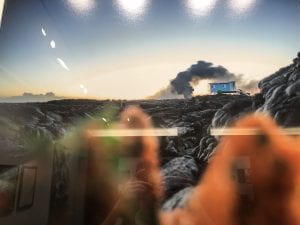
The thing that stuck with me in this photo is the location itself. It looks like its a baron wasteland on some other planet with only rocks. The blue of the house stands out and catches the eye along with the smoke. Even though the house is so small it still stands out in this large landscape picture.

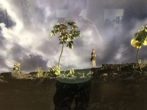
The thing about this photo that interested me is the play on perspective. The trees around the woman look so big but I was interested if the tree on the right is just a tiny plant taken up close and made to look huge. Sorry for reflection.

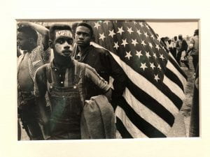
This photo stuck with me because of how this is taken from an earlier time but still is very relevant to what is happening today. The vote on the mans forehead I feel is the main point of focus in this photograph, that paired with the american flag makes this picture powerful.

Homework 7/10

I never really liked Coney Island very much, even though I’m a native New Yorker. I always thought the place was riddled with tourists and that drove me away from there. Amusement parks aren’t my favorite either, neither are beaches. The only thing about Coney Island that I ever liked were the Nathan’s hot dogs. Until I realized something very important. I realized there was a strong everlasting open community that riddled every crack in the boardwalk. From the man fishing on the far stretching pier, to the lady whom was born and raised in Brooklyn, sitting on a bench open to any conversation to be had. A community so strong and open that the second you step foot on that boardwalk, your apart of it.