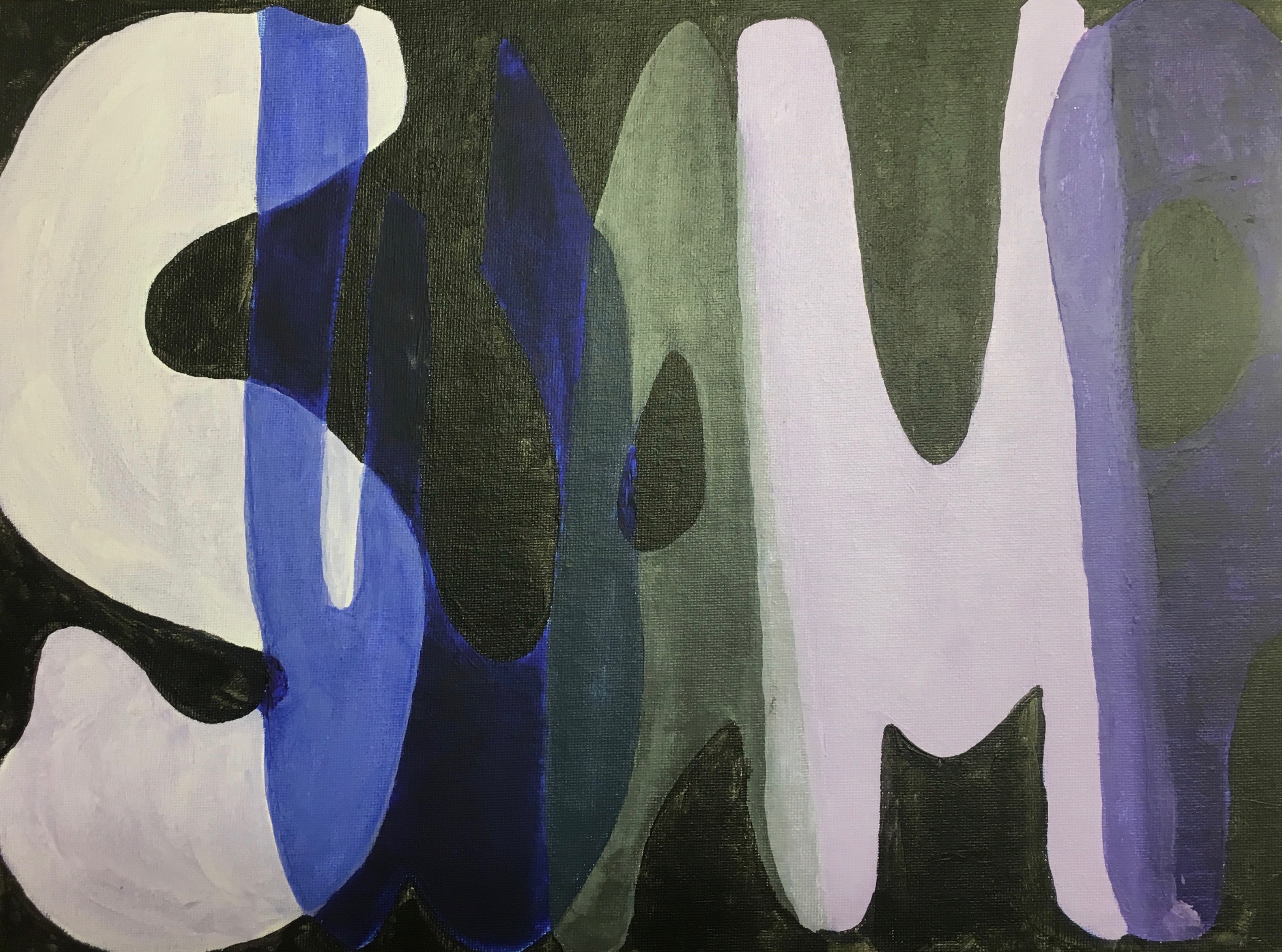
It was fun to figure out the proper values and shades to manipulate the letters to look like they were transparent or overlapping. If I were to do this project again I would definitely be more thoughtful with my color pallet and really choose what I want to overlap. Instead, I feel like the letters chose their own positions.
