Originally, when I was creating my motif unit, I had the idea of using a symbol from Buddhism, and I though the conch shell was the most visually appeasing.

Buddhist conch shell symbol
However, out of the six drawings I had, I was not sure what look I wanted my garments to use. I drew them all in Illustrator to see them and get a better idea of each one so I could narrow down the choices.

Motif iterations in my sketchbook

Motif iterations in Illustrator
I liked both of the ones in the bottom row the best, but I made a pattern for each and compared them, and decided I liked the more linear shape better. Having a plan at this point worked really well, because all of my motifs were in illustrator and I could experiment with them to see which one would be the best. Also, this allowed me to create a pattern for each so I could decide which one I actually liked better before I began, instead of later changing my mind and starting over, which saved me time in the long run.
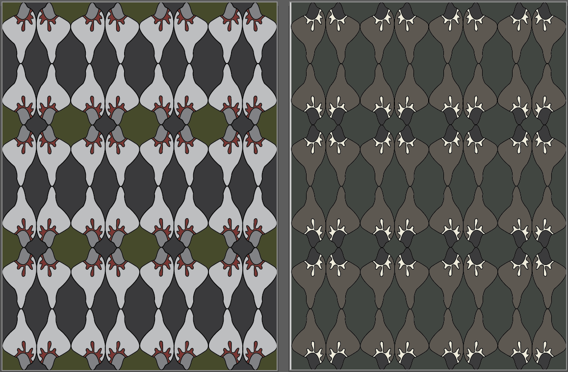
My first motif idea made into a pattern

My final motif idea made into a pattern
When I was choosing colors, I followed my intuition rather than a plan. I did have several Buddhist images I wanted to work with, but my actual choice of color was done casually.

A few colors I used were inspired by this Buddhist temple.
I just used the eyedropper tool to pick out certain colors I liked, and changed them a bit to fit together. I used many different colors and experimented with placement of color on all my patterns before I eventually settled on a palette. I originally had six palettes, and my final palette ended up being a slight mixture of different colors on each palette.

My original six color palettes

My final color palette
This took longer than it would have if I had in mind a particular color scheme, but it also helped me see my different options. I enjoyed working with my intuition because I feel I wouldn’t have been as satisfied with my original ideas. I think my ideas have become more focused as I have learned more about the Buddhist culture.