Week 3: Body Measure + Touch
Site Plan & 2 Sections


3 Key Built Features Measurements


MetroCard Scanner Orthographic Drawing

6 Texture Rubbings & Material Qualities
Texture 1: Ceramic tiles with linear and angular designs; very smooth but obvious sudden and straight increase in depth is present; the middle section where the 4 straight angles meet has a very unique feeling; overtime the tile starts to become less cold as I continued to linger my hand in one spot.


Texture 2: Mosaic cubical tiles made of tesserae; Rougher to touch in comparison to ceramic tiles, but also ice cold. Because these tiles have various sizes and are not cut perfectly, I felt a lot of disruption when I first moved my hand aronud. Overtime, I was able to start sensing designs and patterns through touch such as the yellow shapes and blue outlines.

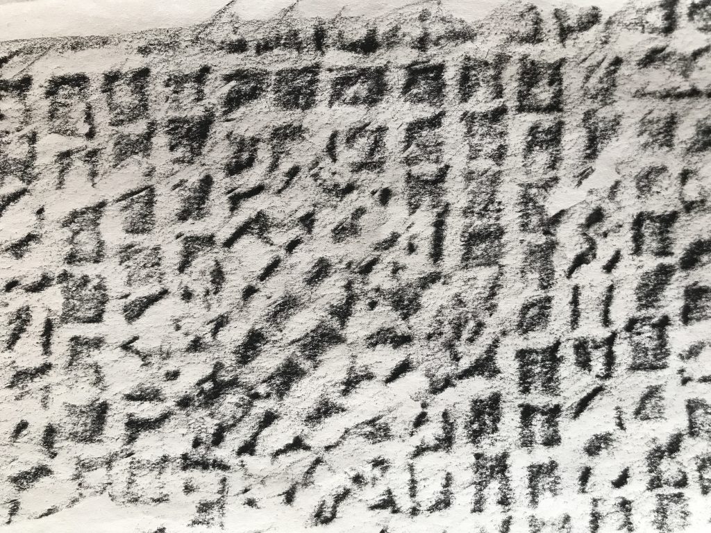
Texture 3: Green and white ceramic tiles with Union Square Carving; The sensation is somewhat similar to that of linear and angular white ceramic tiles. Cold to the touch in the beginning, but gradually less so overtime. Smooth to the touch. Because this design is less angular, the circular curves made the experience more harmonious and less intense. Because the rise of depth only occurs on the text and the rest stayed consistently flat, it is easier to identify the carvings purely through touch.


Texture 4: While ceramic tiles; Sensation is very similar to that of ceramic tiles with linear and angular designs. Ice cold and smooth to the touch. One very big difference is the uniformity and consistent depth of the pattern covering a large portion of the hallway. This sensation is so far the best in comparison to that of touching other materials, due to the predictability and sense of harmony. Although overtime a sense of boredom emerged due to the lack of variations.


Texture 5: Black steel subway entrance/exit door; The temperature of the door is definitely colder than that of other materials, especially the larger strips supporting the fences. The texture of the design is rough to the touch because it was painted with most likely acrylic paint. The consistency of repetitive rectangular patterns making up the door fense is very comfortable to touch for some reason, particularly because when I moved my hand around the softer parts of my skin goes through the holes of the fences.


Texture 6: Sewer lid; This material is definitely the most uncomfortable to touch of all. It is cold and rough. It is very dusty and has unidentified liquid on it, which I tried my best to avoid. The overall sensation of this touching experience is worsened by the fact that the holes on the lid make the bottom of the sewer see through. I was constantly worried that some kind of creature is going to crawl out from the sewer. What is interesting about this object is that whenever train entered or left the platforms, I was able to feel the vibration through my palm.


Week 4: Sight + Taste
Experience Reflection & Desired Activities Notes
10 Curated Images
Matrix of Design Elements that Construct Flavor
The matrix of design elements are separated into 3 individual categories in the 3 collages below. The first flavor I wanted to convey about the space is the flavor of history. The space obviously had a long history and is demonstrated by these writings and carvings featured in the space. The second flavor that marks the place is electrical. There are many many things in the space which I found are powered by electricity. My experience at the space gave me the feeling that without electricity, the space would seize to function altogether. The third flavor I wanted to convey was the flavor of mechanical. For this collage, I am not sure if my word choice was correct, but bascially I wanted emphasize on how these construction components were all so exposed, making the space very industrical and raw.

Color Pallet and Sentiment

Most to least common colors used:
1) White Walls: Signifies purity, clean, easy, goodness, but also isolation and loneliness.
2) Yellow Ceiling: Signifies brightness, energetic, warmth, happy, perky, but also irresponsible and unstable.
3) Light Brown Floor: Signifies dependable, flexible, crisp, but also dullness and boringness.
4) Steel Silverish Machineries: Signifies glamor, high-tech, graceful, sleek, but also indecisive, dull, and uncommitted.
5) Green Beams and other Designs: Signifies freshness, nature, new, money, fertility, and healing, but also envy, jealousy, and guilt.
6) Grey Floor Tiles: Signifies security, liability, intelligence, solid, but also gloomy, sad, and conservative.
Uncommon but present colors:
1) Blue Ticket Booth: Signifies tranquility, integrity, intelligence, peace, loyalty, but also coldness and fear.
2) Featured Red Elements on Mechanical Objects: Signifies power, passion, desire, heat, but also danger and anger.
Week 5: Sound + Smell
Circulation Maps


Map of Sounds

Map of Best Places & Activities

2 Methods of Experimental Site Analysis
Site Analysis Experiment 1: Destination Interviews and Map-Making
Ask 100 to 200 subway riders where they came from and where they are headed. Why they wanted to stop at Union Square, how long do they intend to stay in the station, and their general experience of riding in the trains or passing through the station. Use a map of New York to mark their journeys from start to beginning and how the station interacts with their journeys. Afer the dataset is converted into a map, the map should be very exciting to read and will serve as a good tool to analyze social and transportation issues.
Site Analysis Experiment 2: MetroCard Sound Recording and Diagram Making.
The MetroCard Scanner’s Beeping Sound is a great indication of how many people enter and exit the station. Use a sound recorder to record the sound of the scanners during the morning, noon, and evening for 30 minutes each. Repeat the step throughout all 7 days of a week. After the recordings have been collected, Count the number of the times the scanner sound went off for each recording. Map the sounds on a linear diagram and find patterns. This will search as a great tool in understanding the traffic flow and ridership population of the station.
Project Reflection
Putting together all these information about my site was definitely a memorable experience. I never really spent this amount of time at one place solely for the purpose of observation and analyzing. One of the most valuable lessons I learned from this experience is how there are so many creative and possible ways to analyze one space. The approaches introduced by this project to go about research is not only unconventional but also taught me how to see things in a different way. By putting together this project, I learned that one space can have infinite ways of being looked at, felt, and experienced. I learned how designs are highly related to sentiment and the functionality. I learned how a space can have an underlying social context that is either visible or invisible to the users. Finally, I learned how my experience of a space can be so different as I shifted between broadband and pinpoint focuses psychologically.