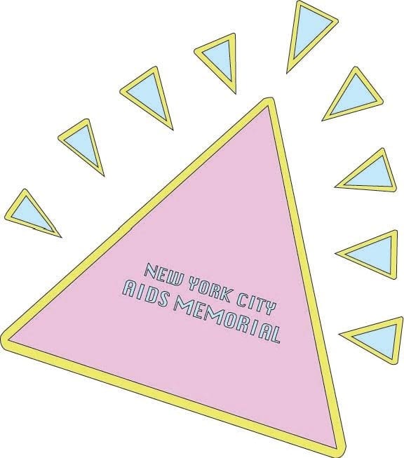
We wanted to encapsulate the same motifs that the old monument did. It was hard to find an issue with the old monument because it incorporated pretty much everyone who fought for their lives with AIDs. We also choose to keep the logo simple so that it could be easily translated into our own monument designs. The triangles from the World War 2 concentration camps, the pastel colors to contrast the blood lost, and the name of the monument in the center obviously to show what the logo is and who we are. One thing I would change would be the font, because it’s hard to read, but, hey, I wasn’t here at the time, because I was in the hospital for a week so I couldn’t complain about their choices. I like the logo.