
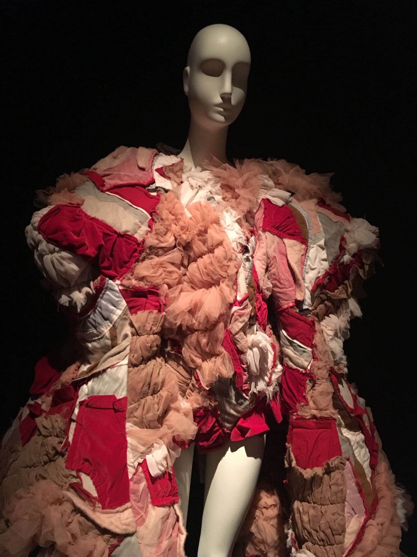
I chose one of the many pieces from Comme des Garçons.
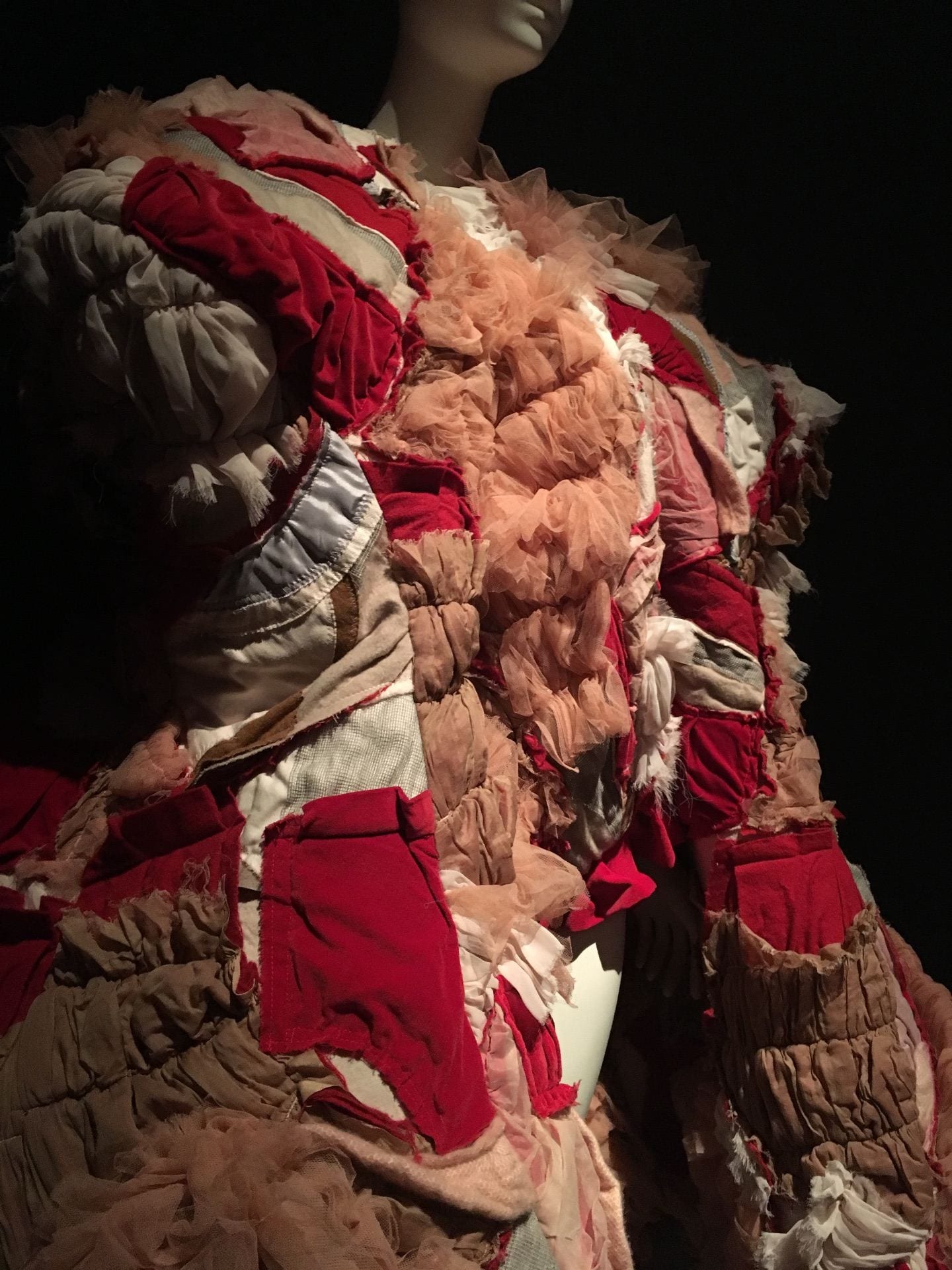
However, this piece stood out to me more than the others because of its volume and structure, I love garments that are massive and have a lot of texture.
In a way, I think that having garments with texture provoke the viewer to touch or explore the object than rather just observing for a couple of minutes and then walking away. (but it’s not possible to touch this garment because I’d probably get kicked out, but I still was very intrigued to feel it)
Another aspect which I liked was that this garment has very popping/contrasting colors, however they seem very neutral, when I first saw the garment I wasn’t attracted to the colors, instead I was curious about the structure and materiality of the garment.
While reading the explanation for the garment I realized that the color pallet selected for this garment was based of Japan’s top three favorite colors, and Comme des Garçons being a Japanese brand it makes sense they’d like to incorporate their own culture into the designs…
The three top colors are red, white and pink, although these three colors aren’t a typical or tasteful way to combine colors Comme des Garçons pushed it through making work and look elegant.
“Japanese culture, says Nemitz, pink is perceived as a masculine and mournful color that represents “young warriors who fall in battle while in the full bloom of life.””
After reading this passage it kind of does make sense, the garment has this overpowering presence, you just notice it, and although it has pink it doesn’t seem to be a feminineor softer type of garment, it feels strong and powerful just like a warrior I would say.
I think this garment was chosen by the FIT museum curators due to its overflowing gracefulness and at the same time sturdiness, seaming powerful and grand. I think they wanted to portray how pink can also be a color of stout and a pinch of playfulness.
Works Cited
Bucknell, Alice. “A Brief History of the Color Pink”. 2017. https://www.artsy.net/article/artsy-editorial-history-pink