Places I choose:
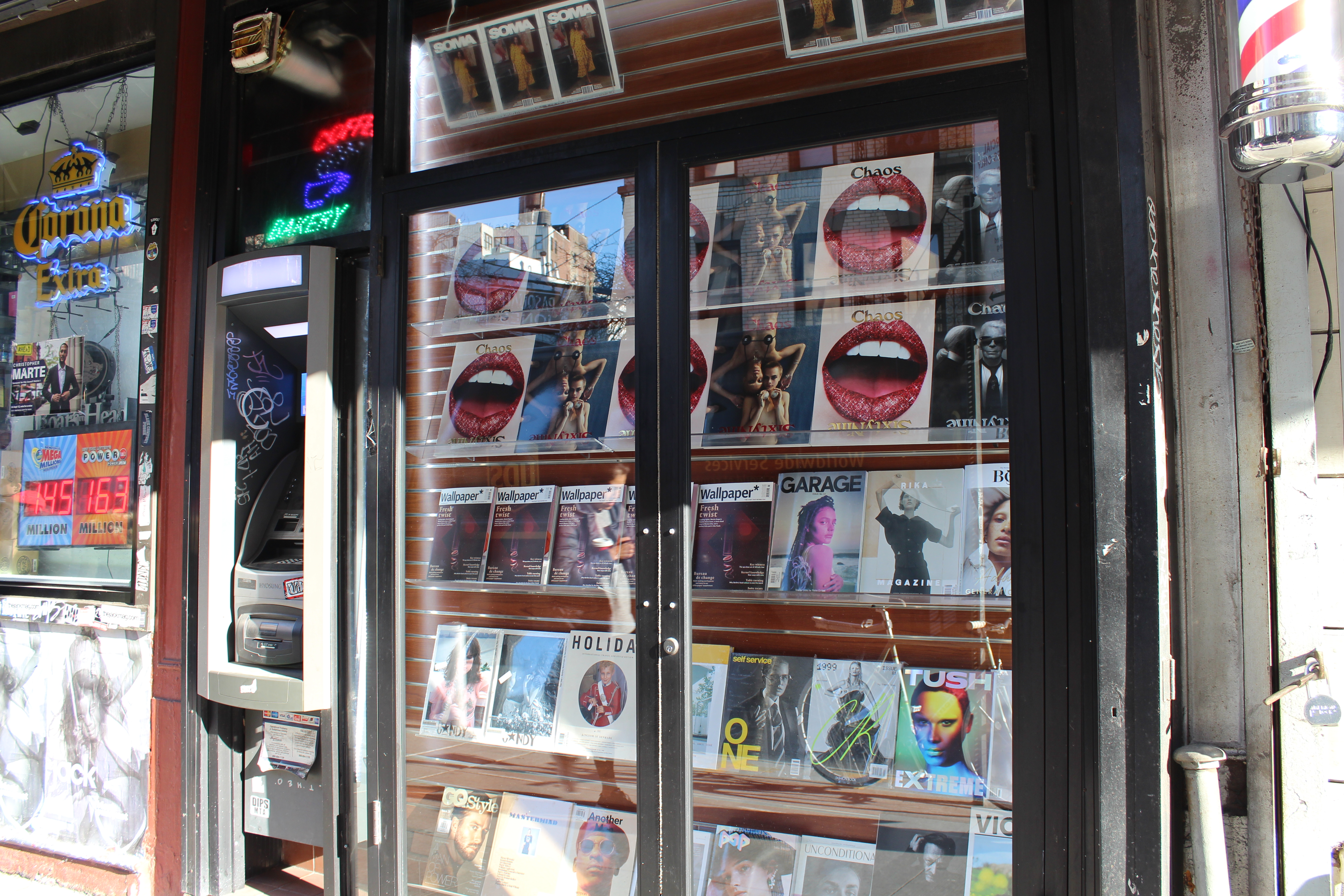
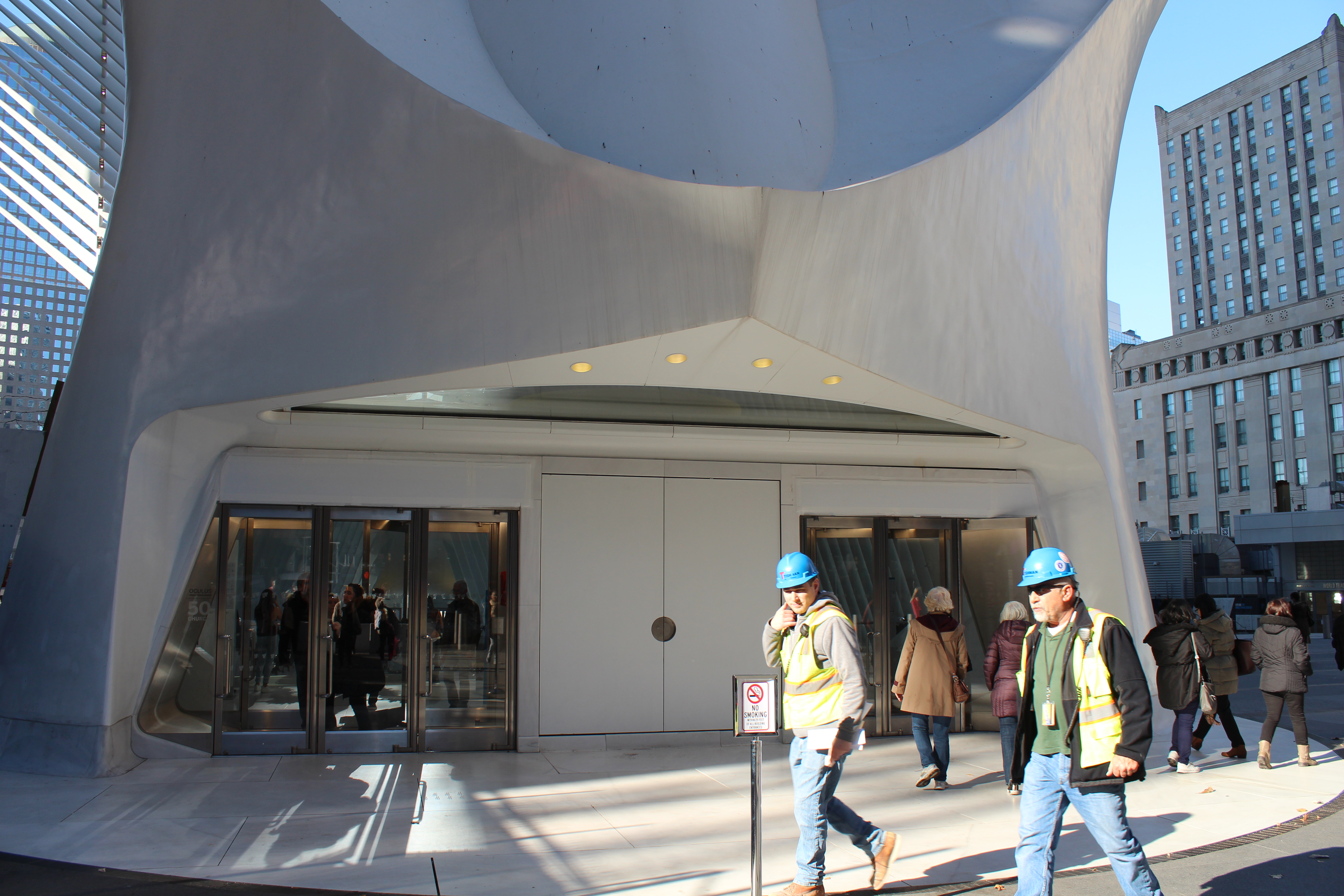
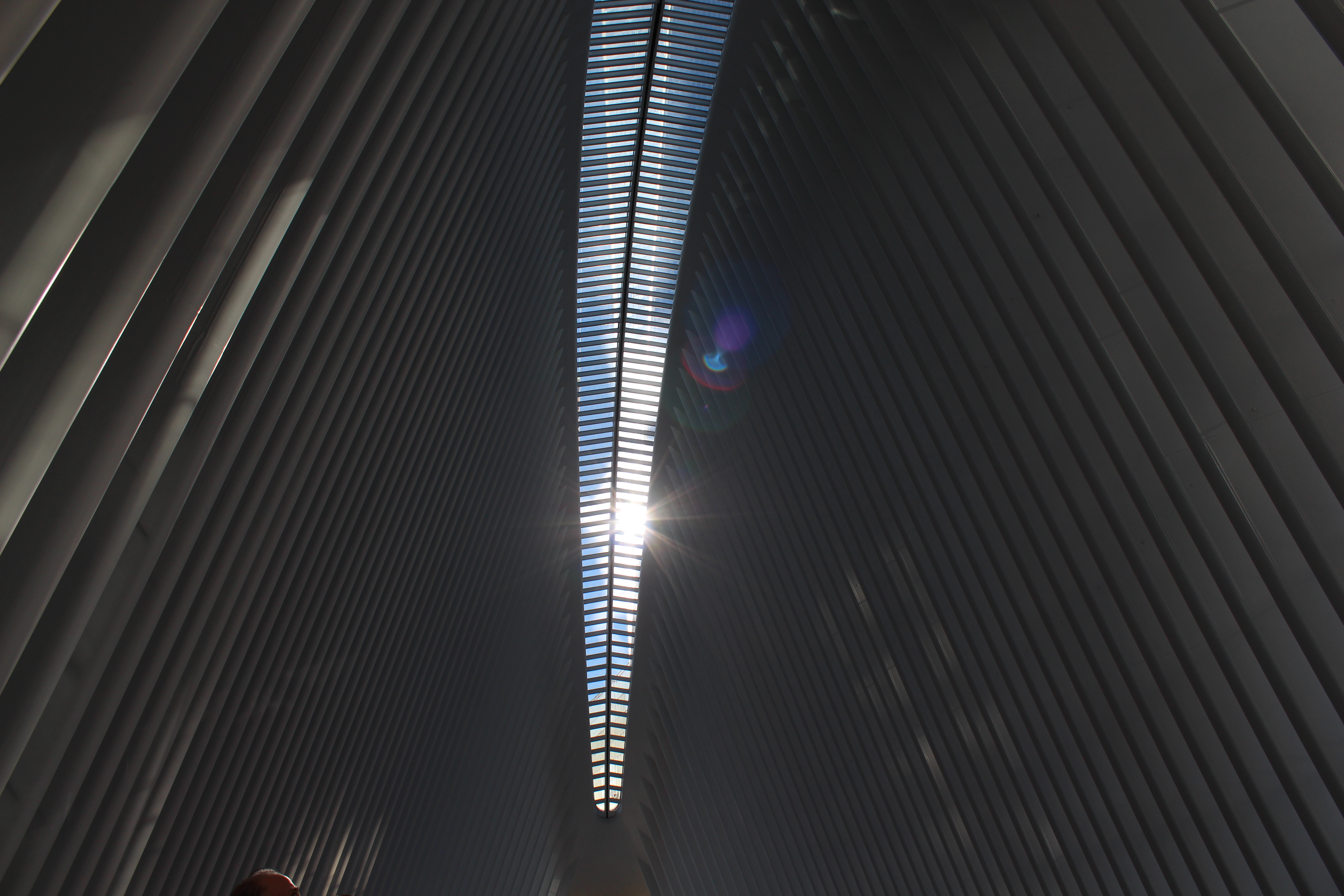
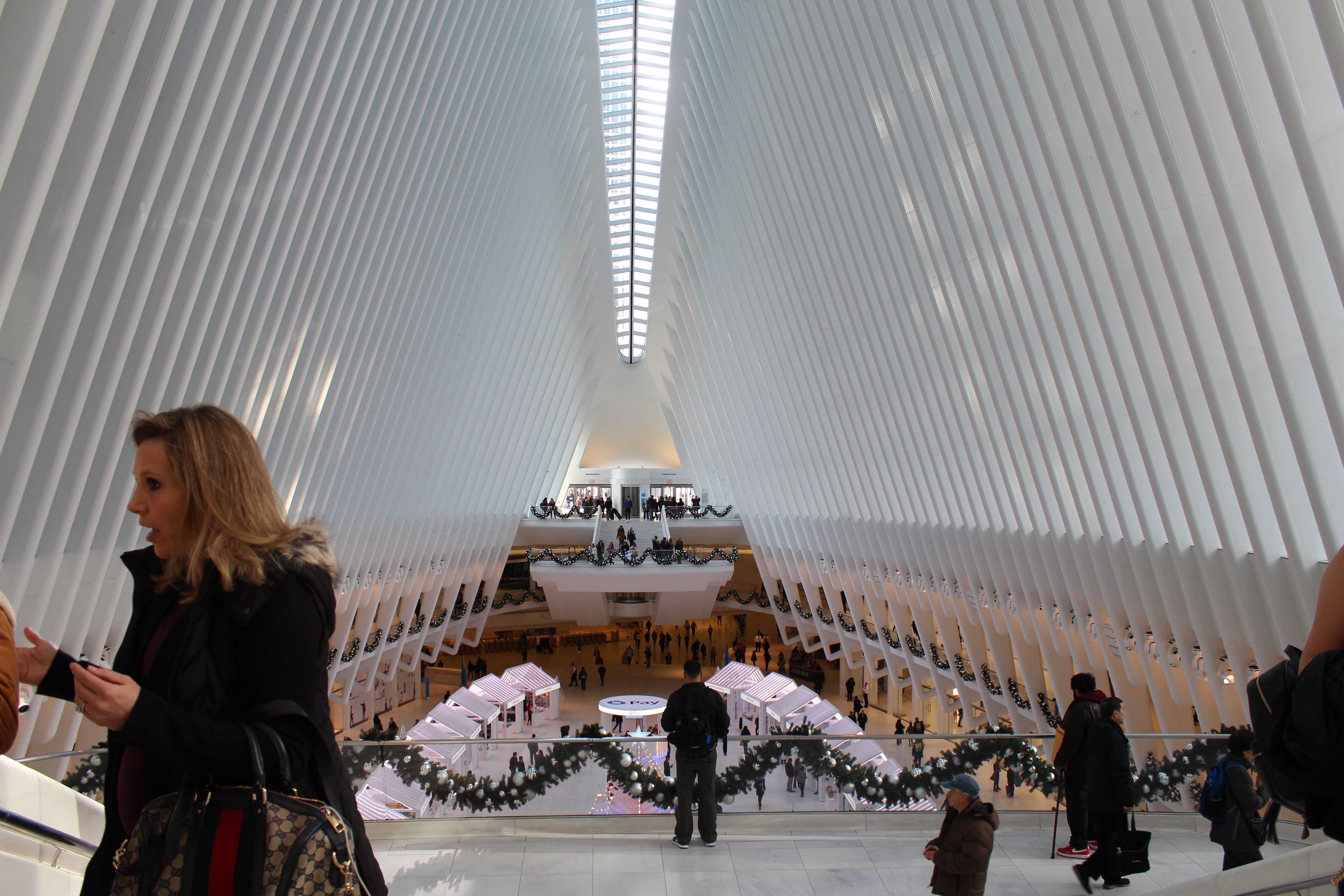
Mulberry st. & World Trade Center
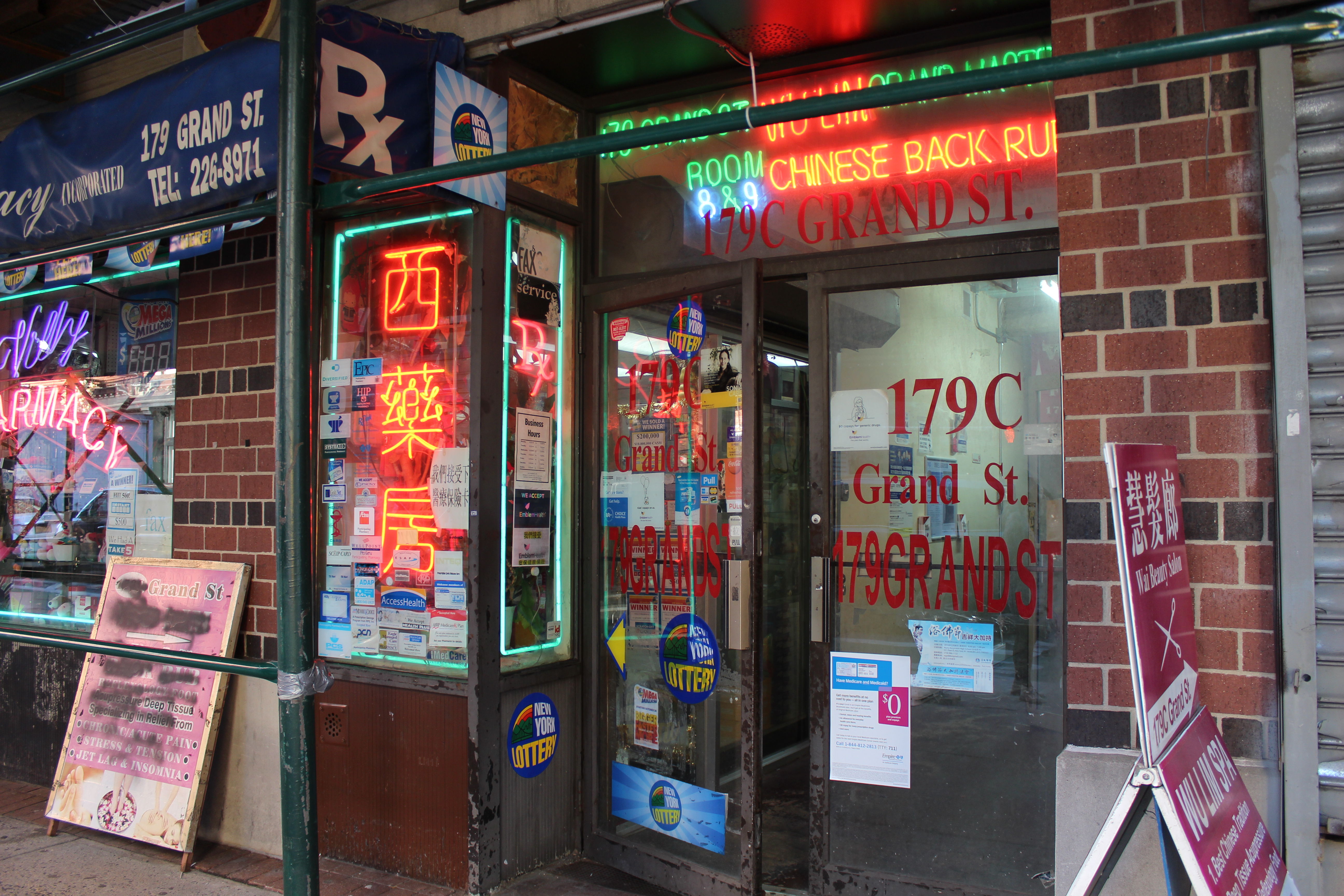
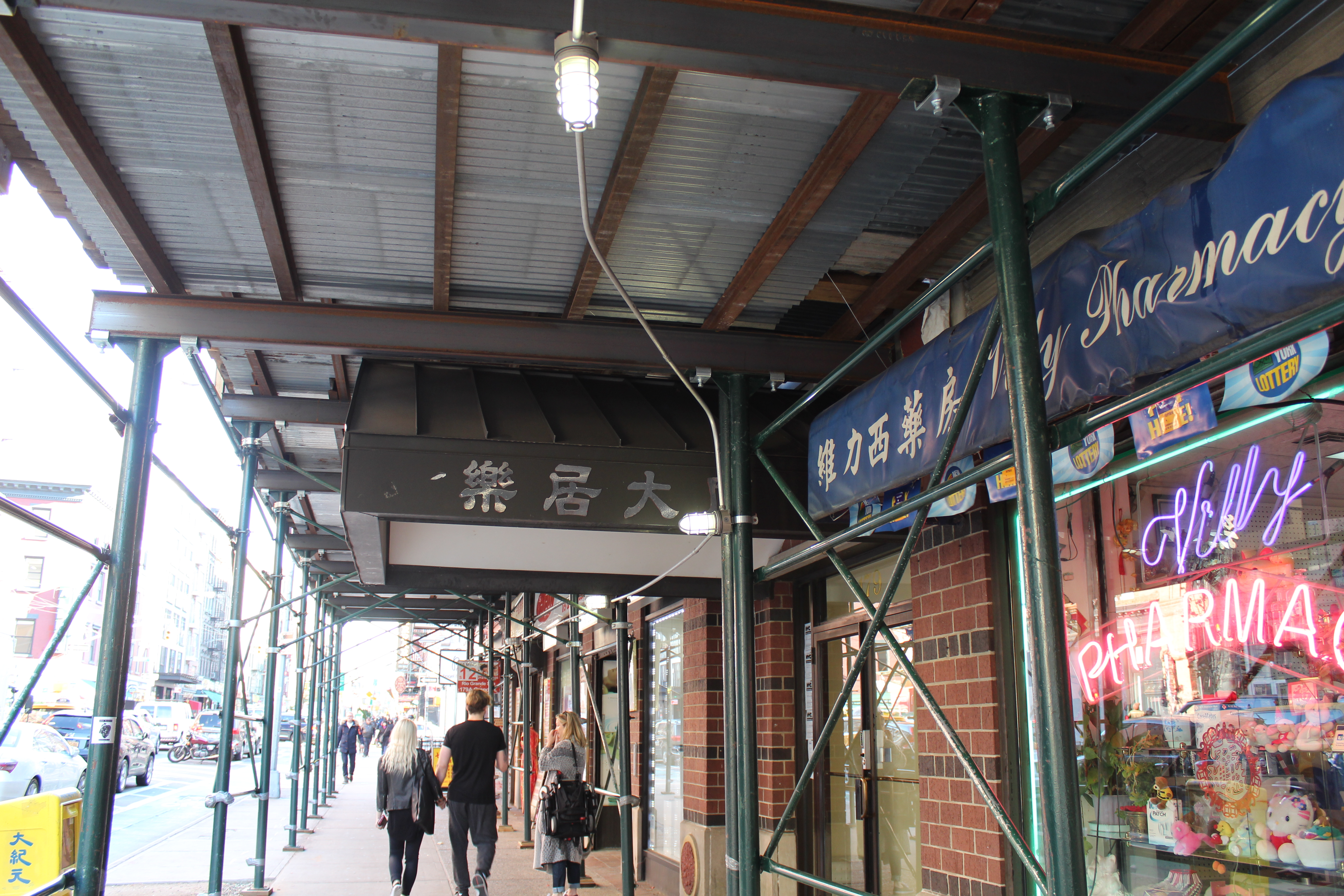
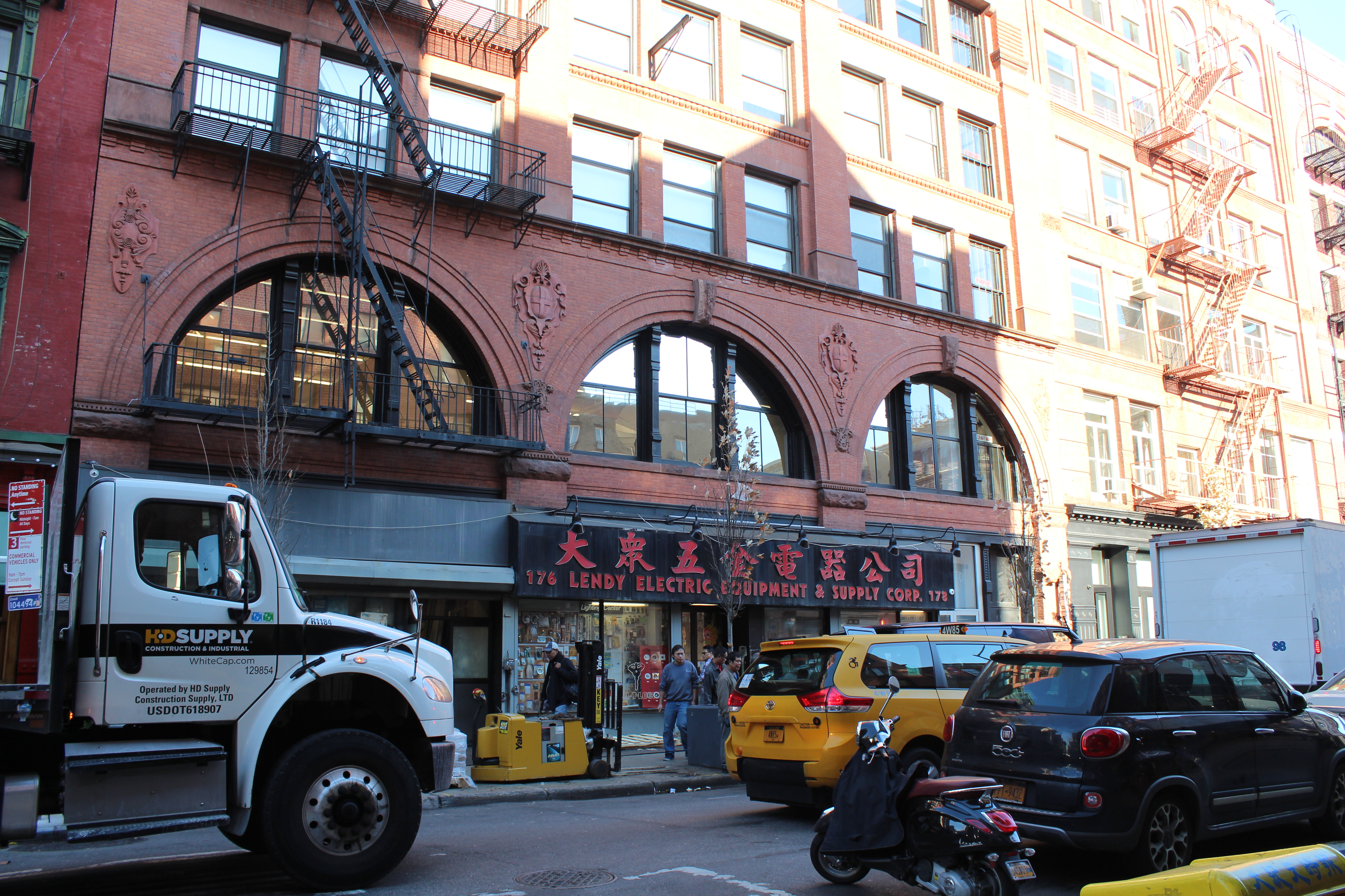
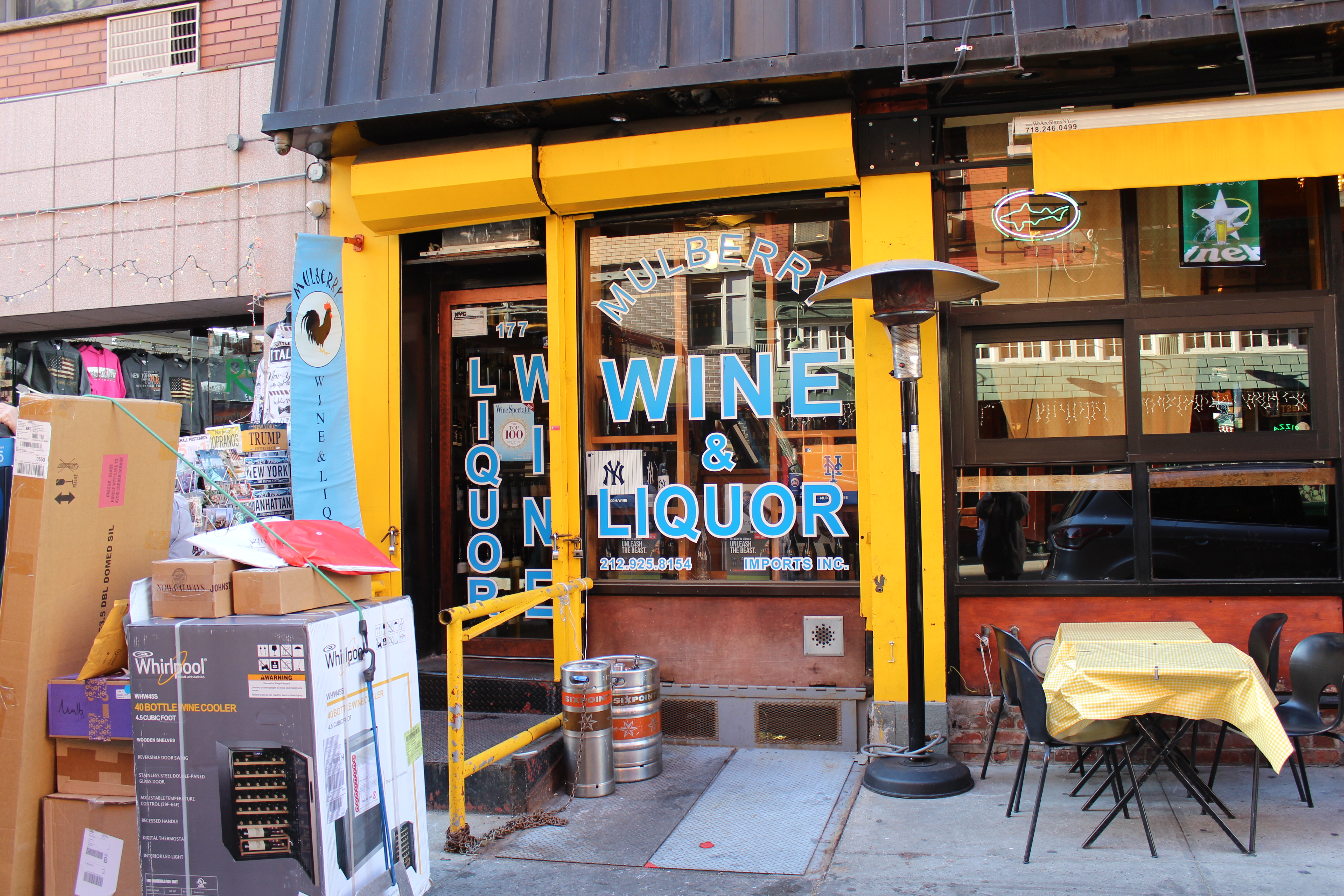
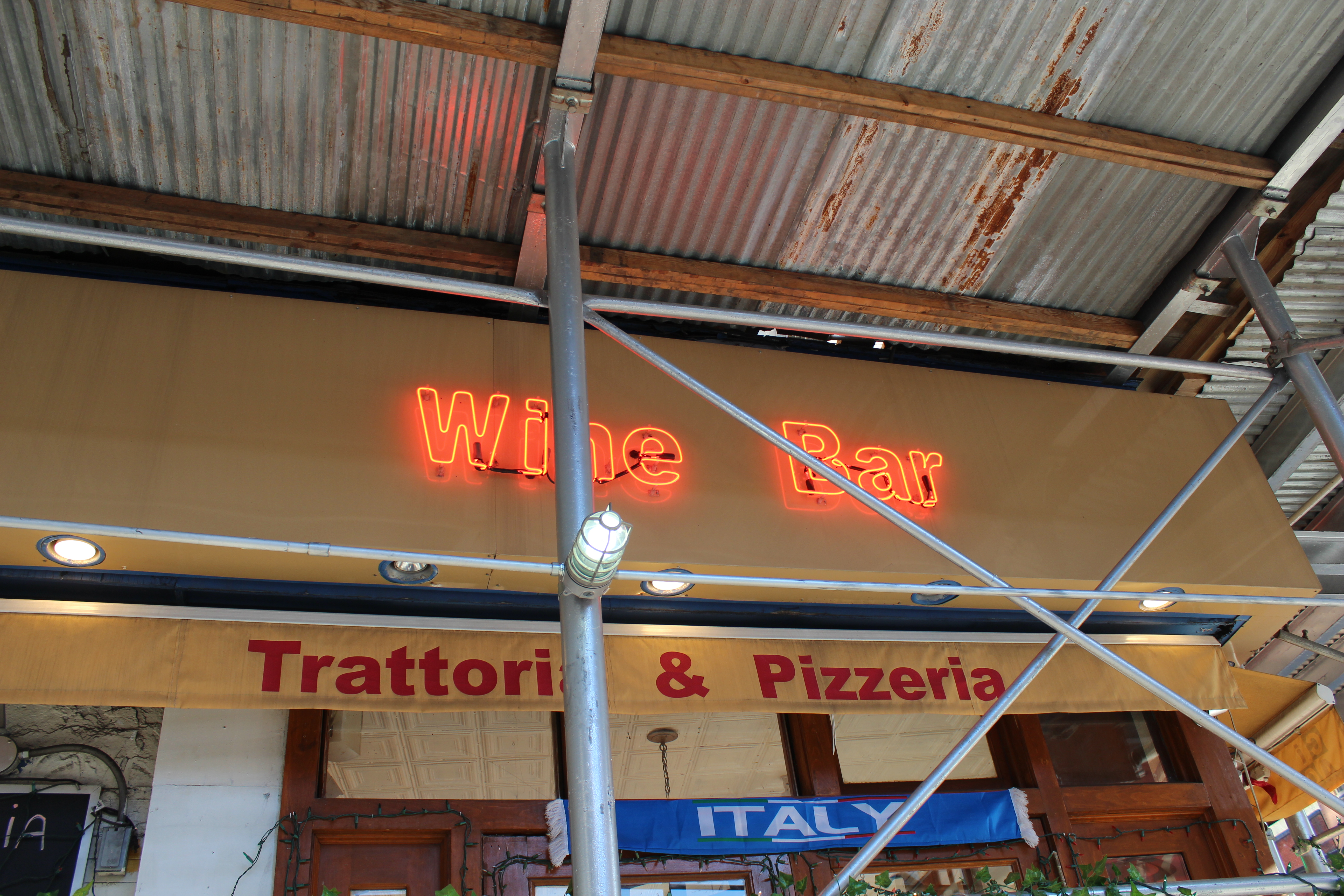
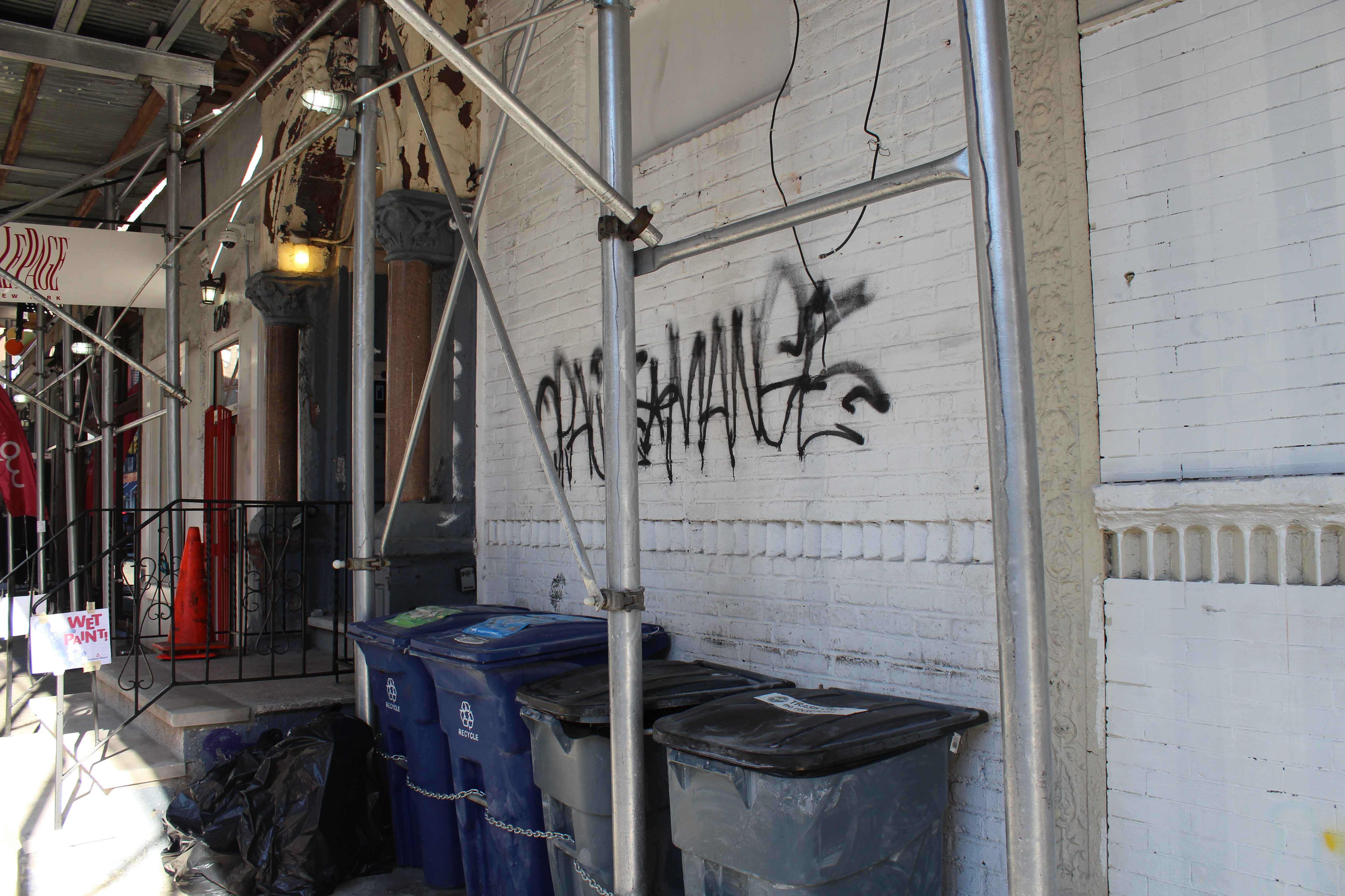
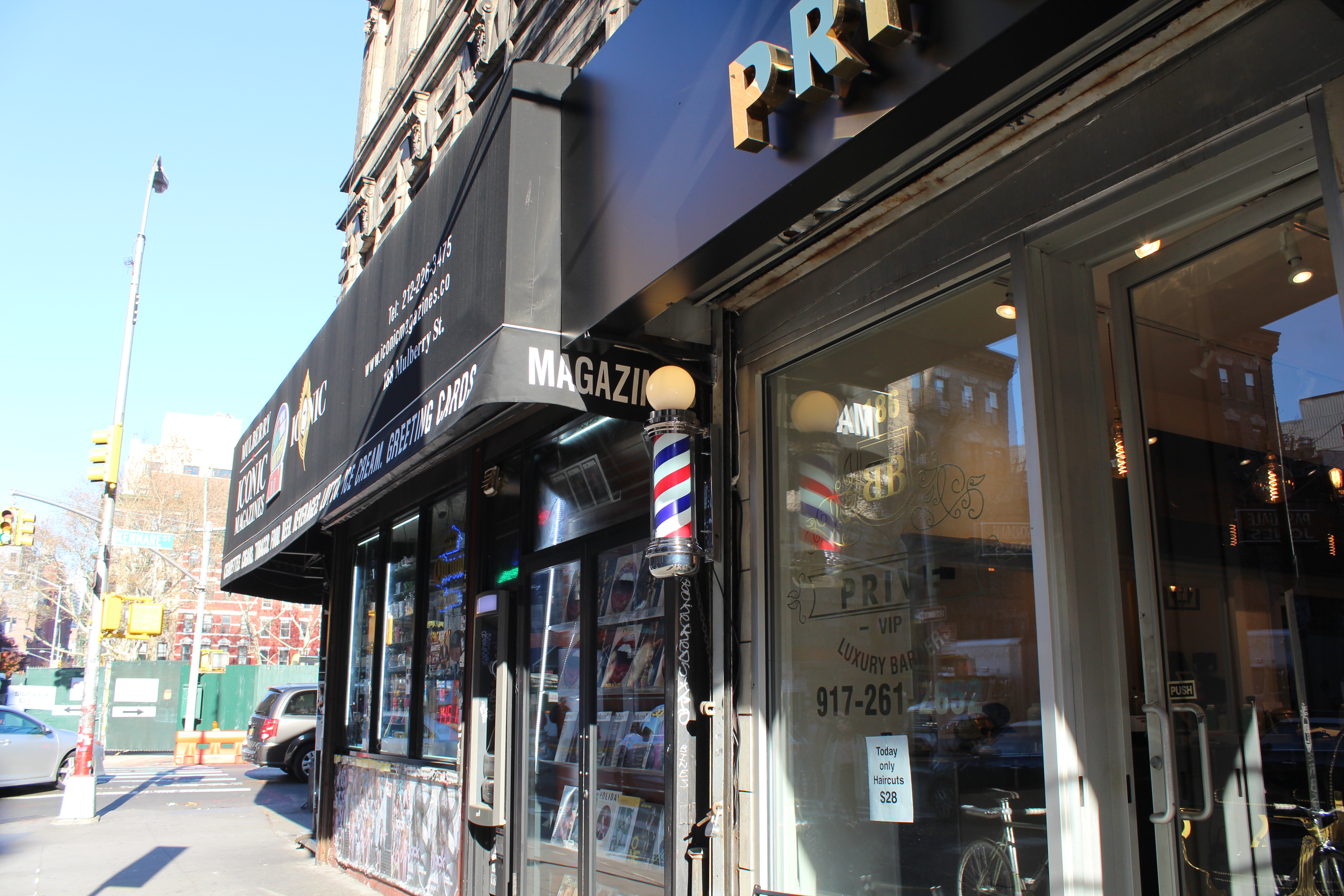
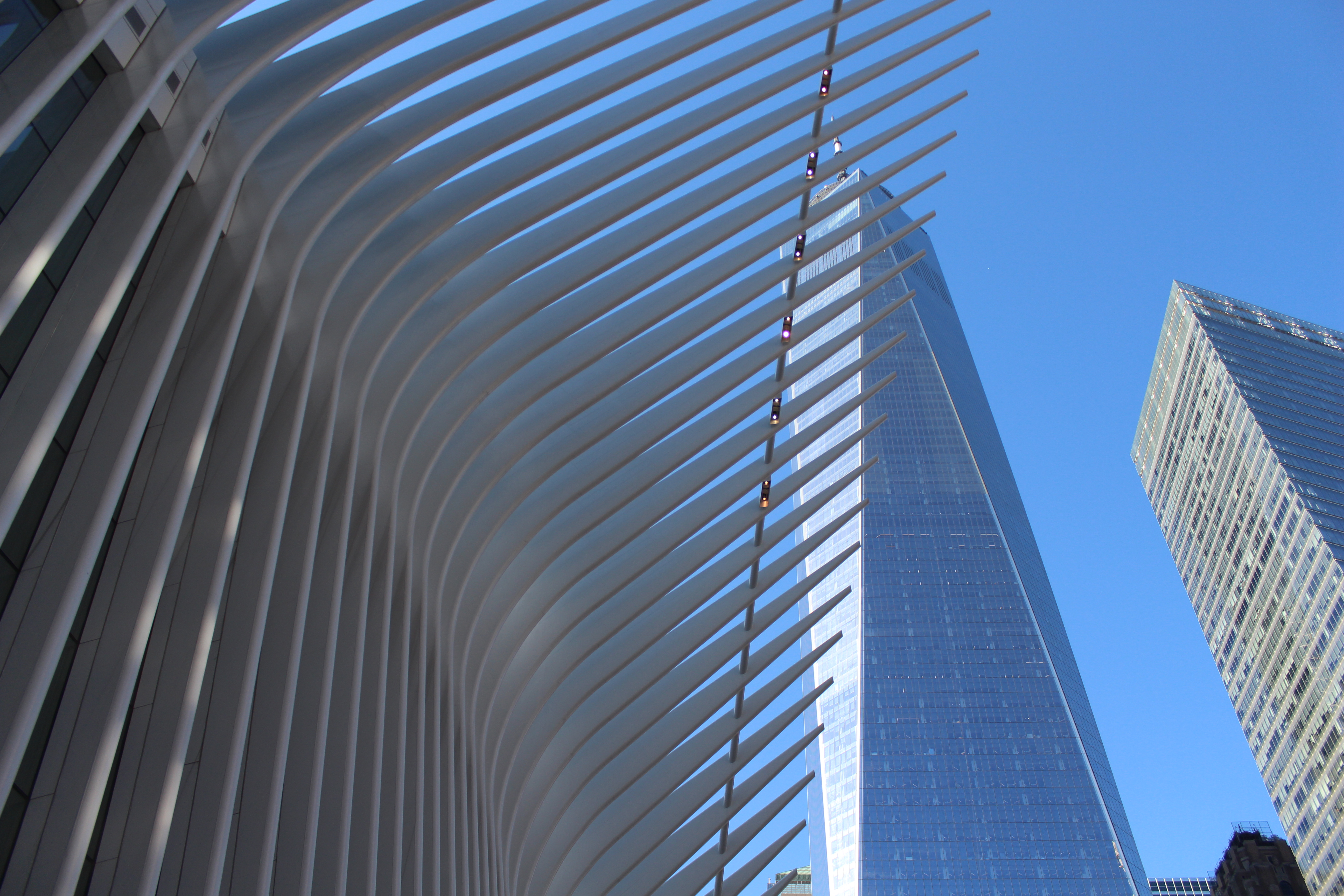
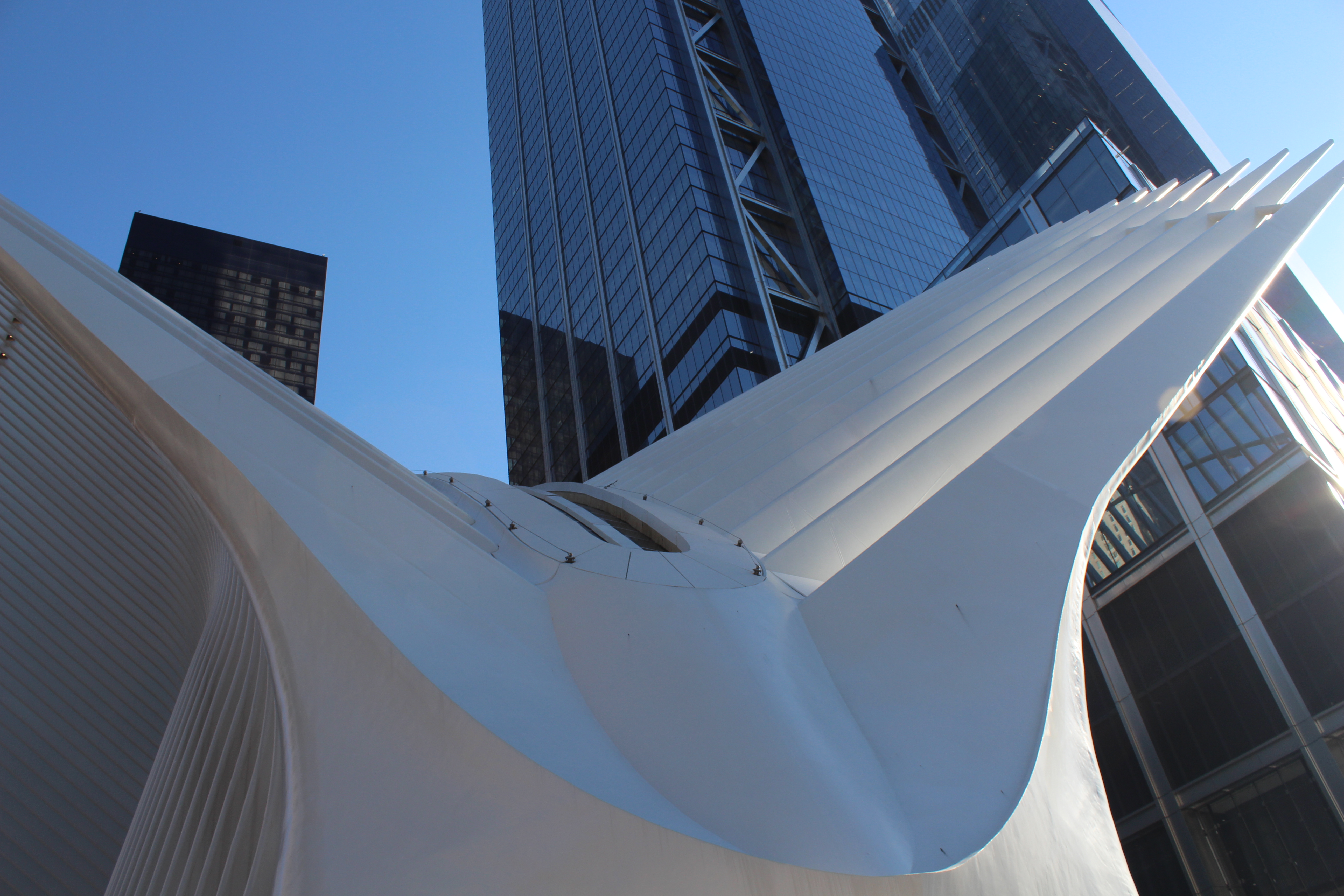
When I went to the Mulberry st., I found a lot of old time Neon written in foreign languages, and the buildings are almost all very old Cast-Iron style. Also, when I took some pictures, I found out the buildings at Mulberry st. are largely restaurants, gift shops and wine bars, and these stores’ windows have many stickers and posters on it. So I immediately think about Cyberpunk. So I choose World Trade Center as my another location, because I want to choose something very futuristic and technologic to match up with the old Mulberry st. to form the environment of Cyberpunk.
Mulberry st.:

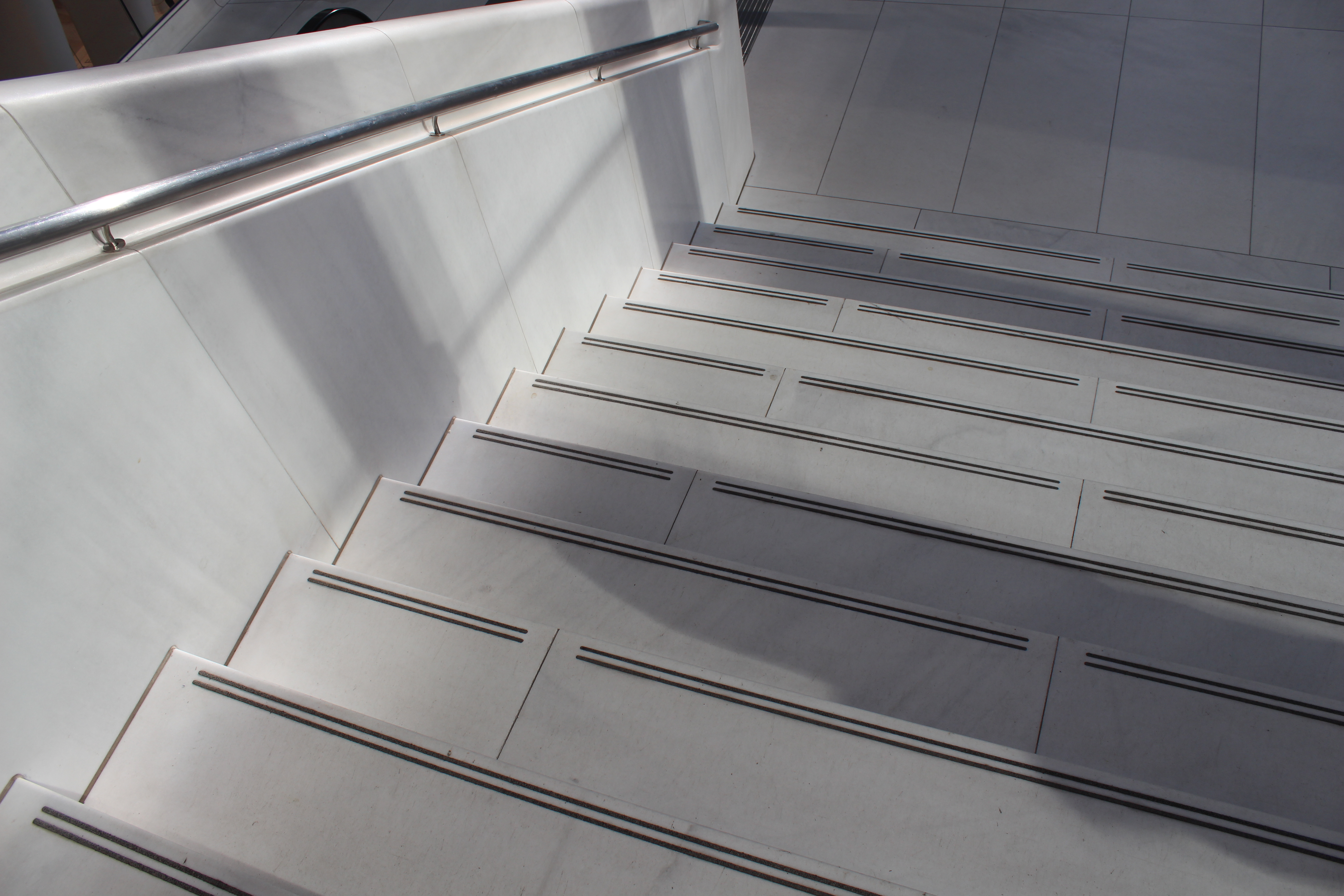
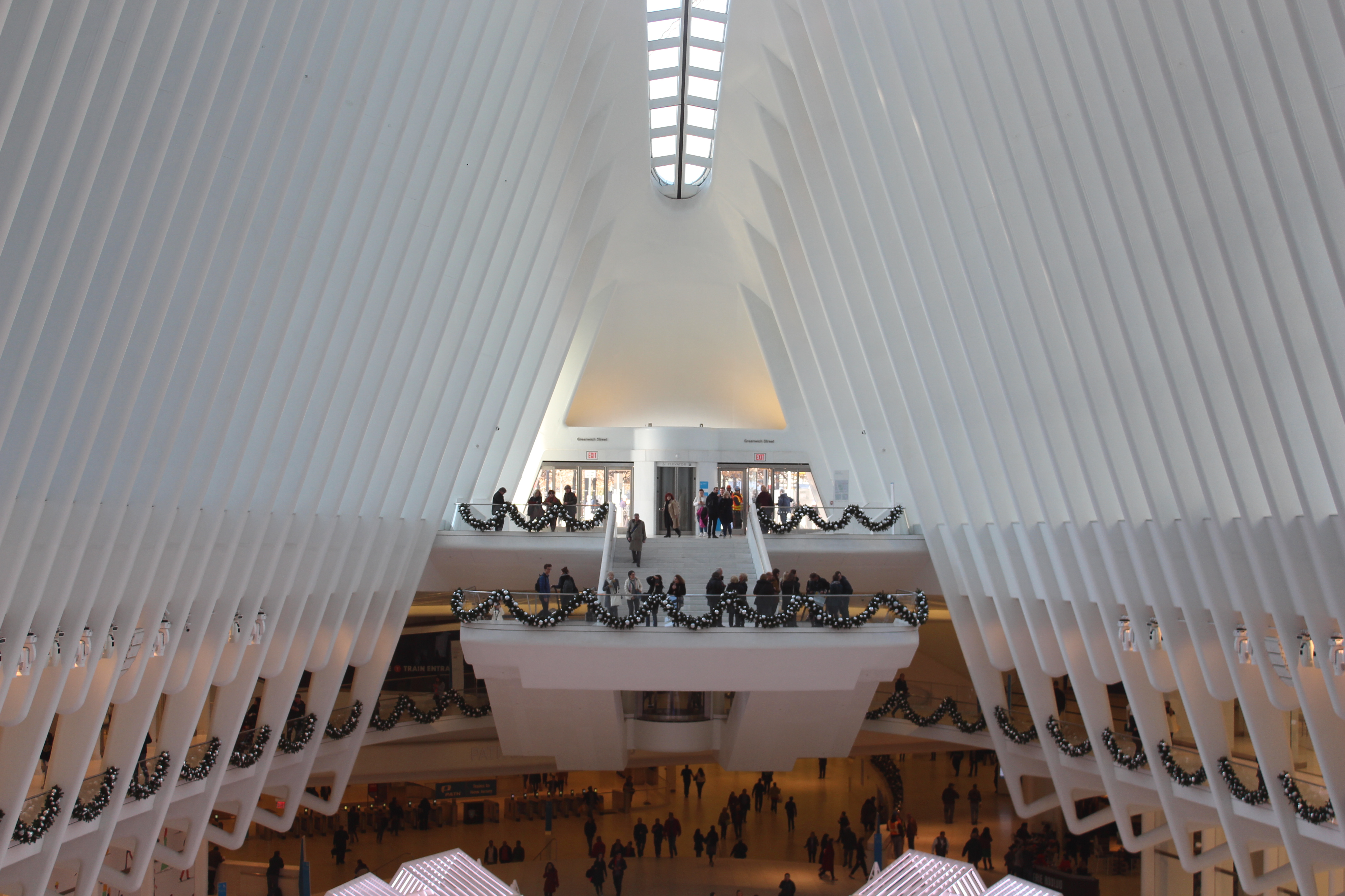
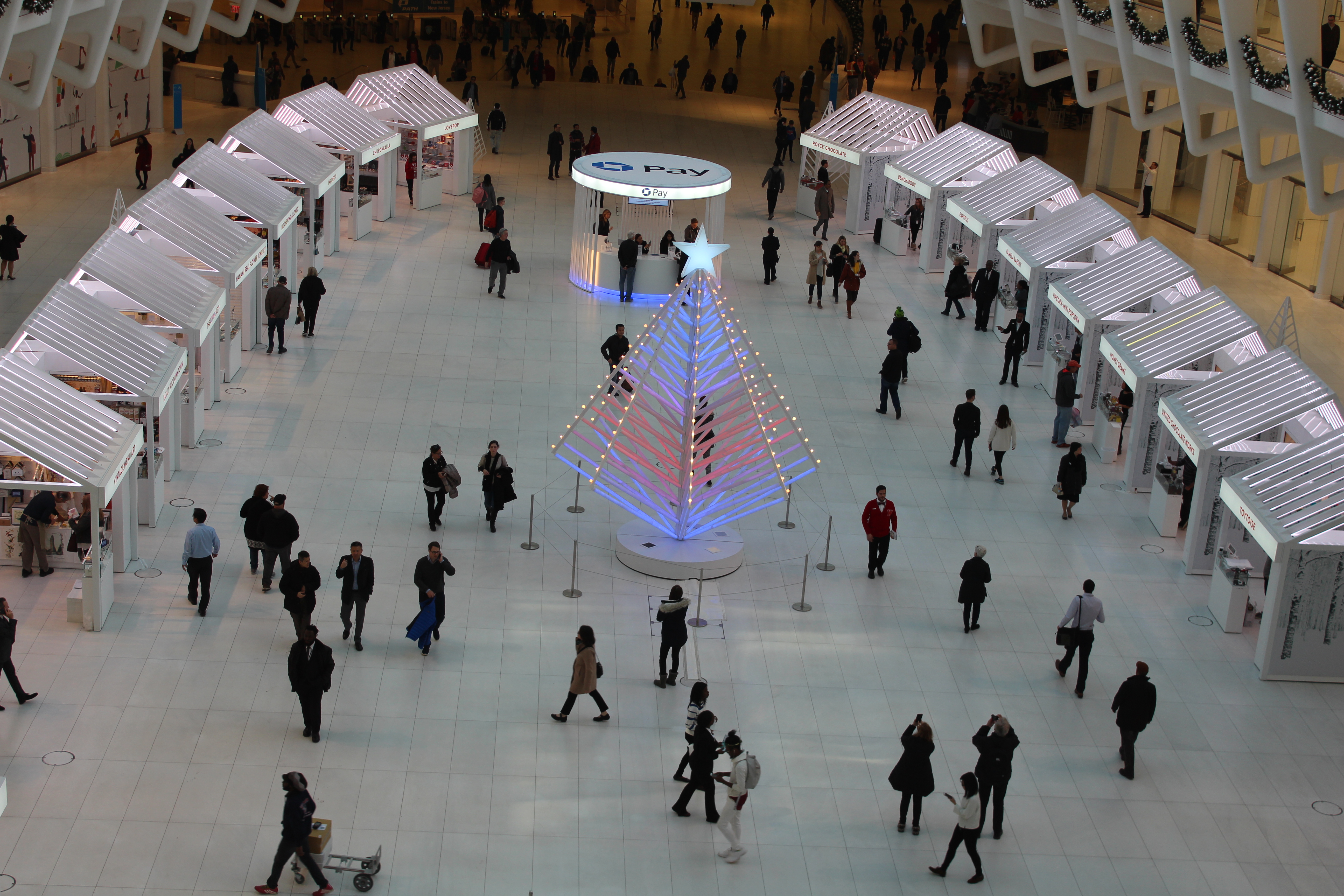
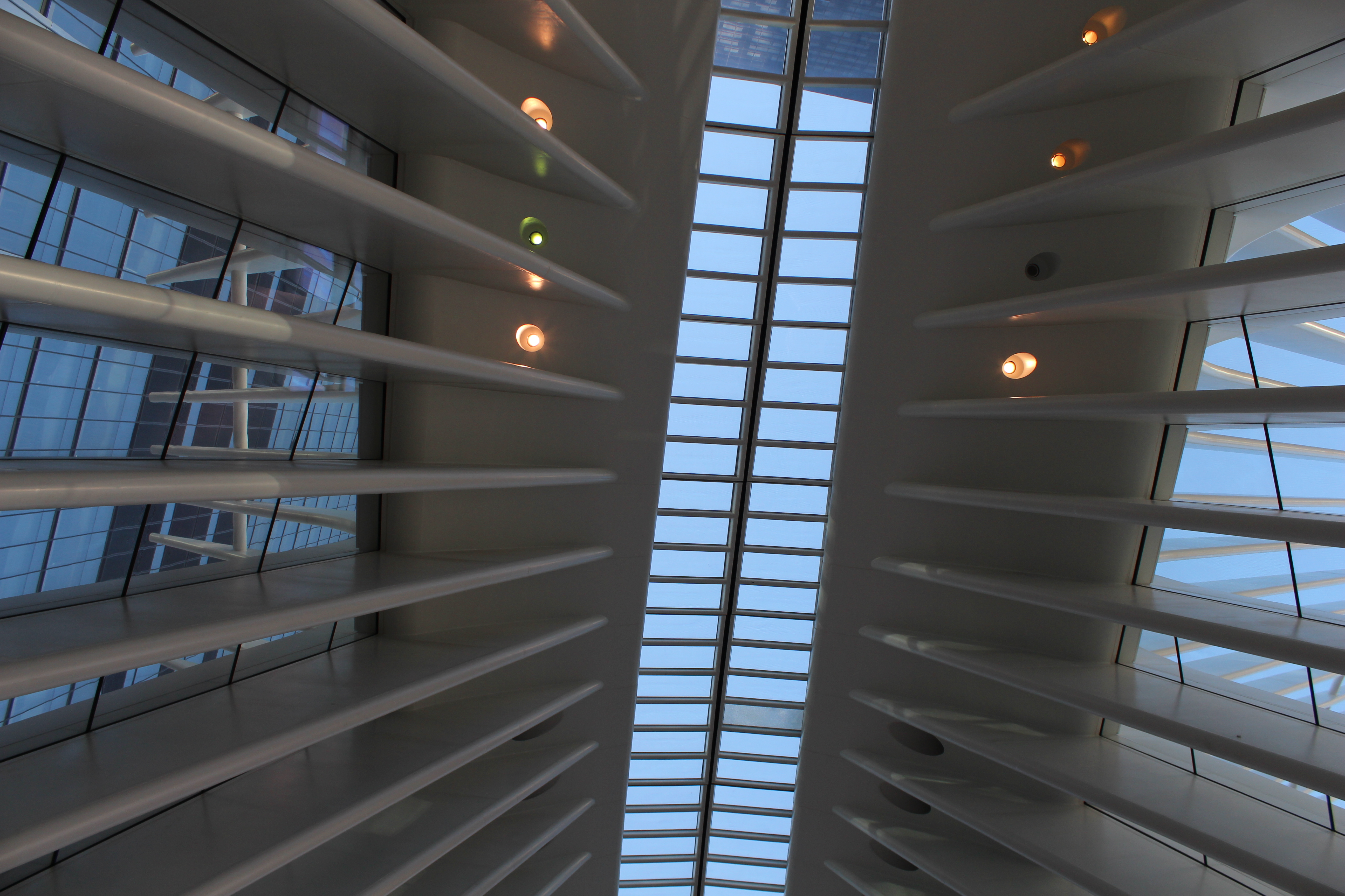
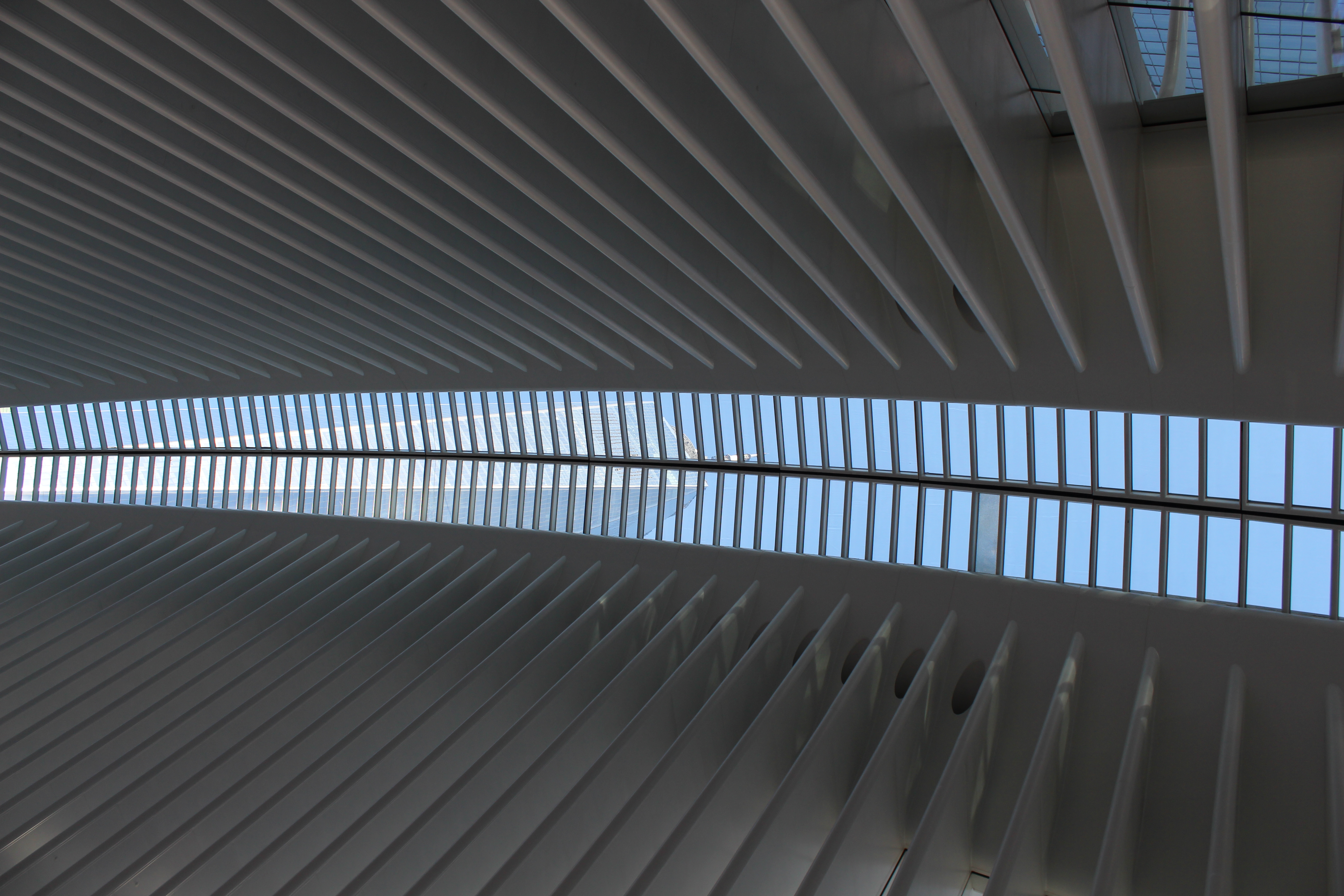
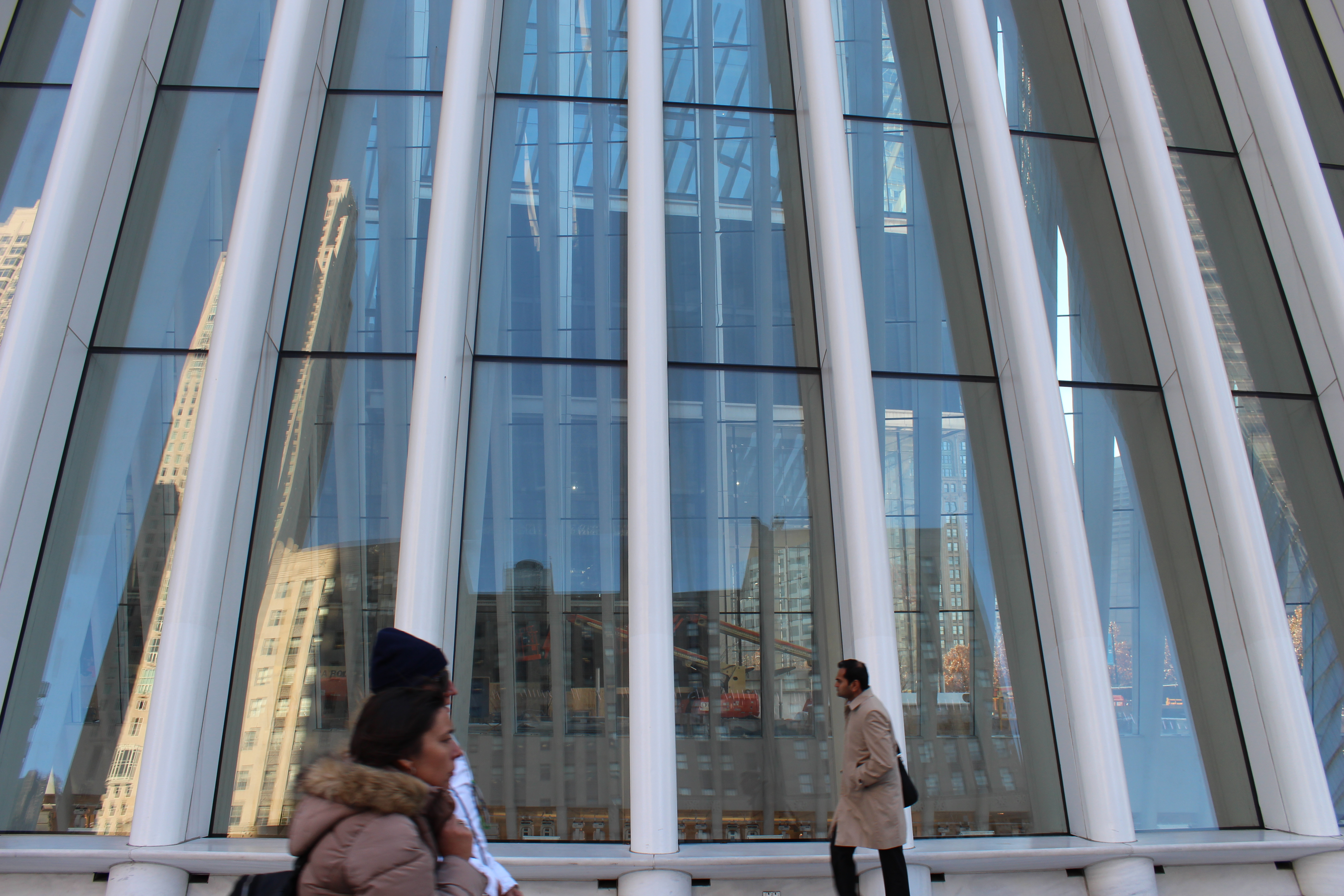
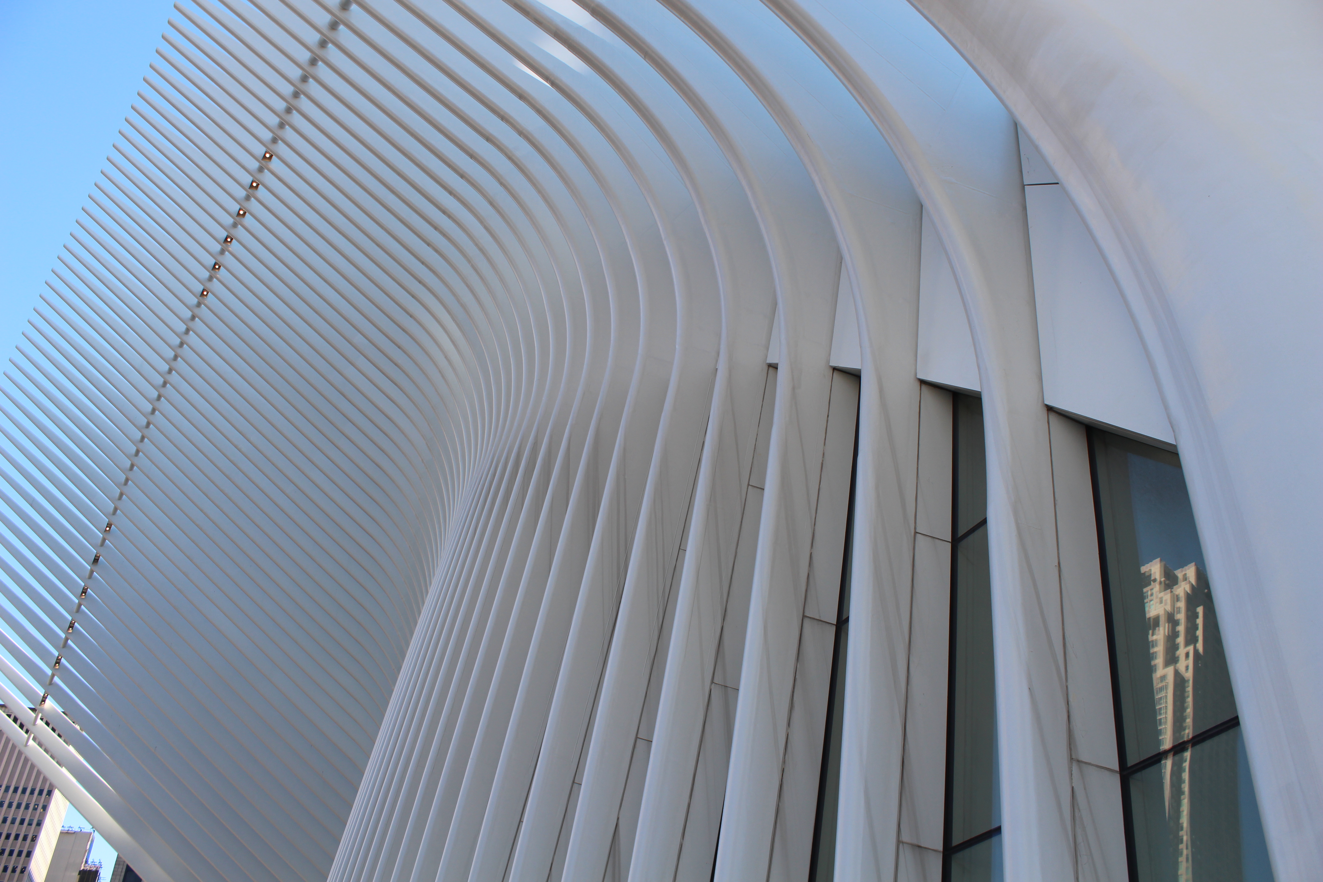
World Trade Center:
Sketches and ideas:
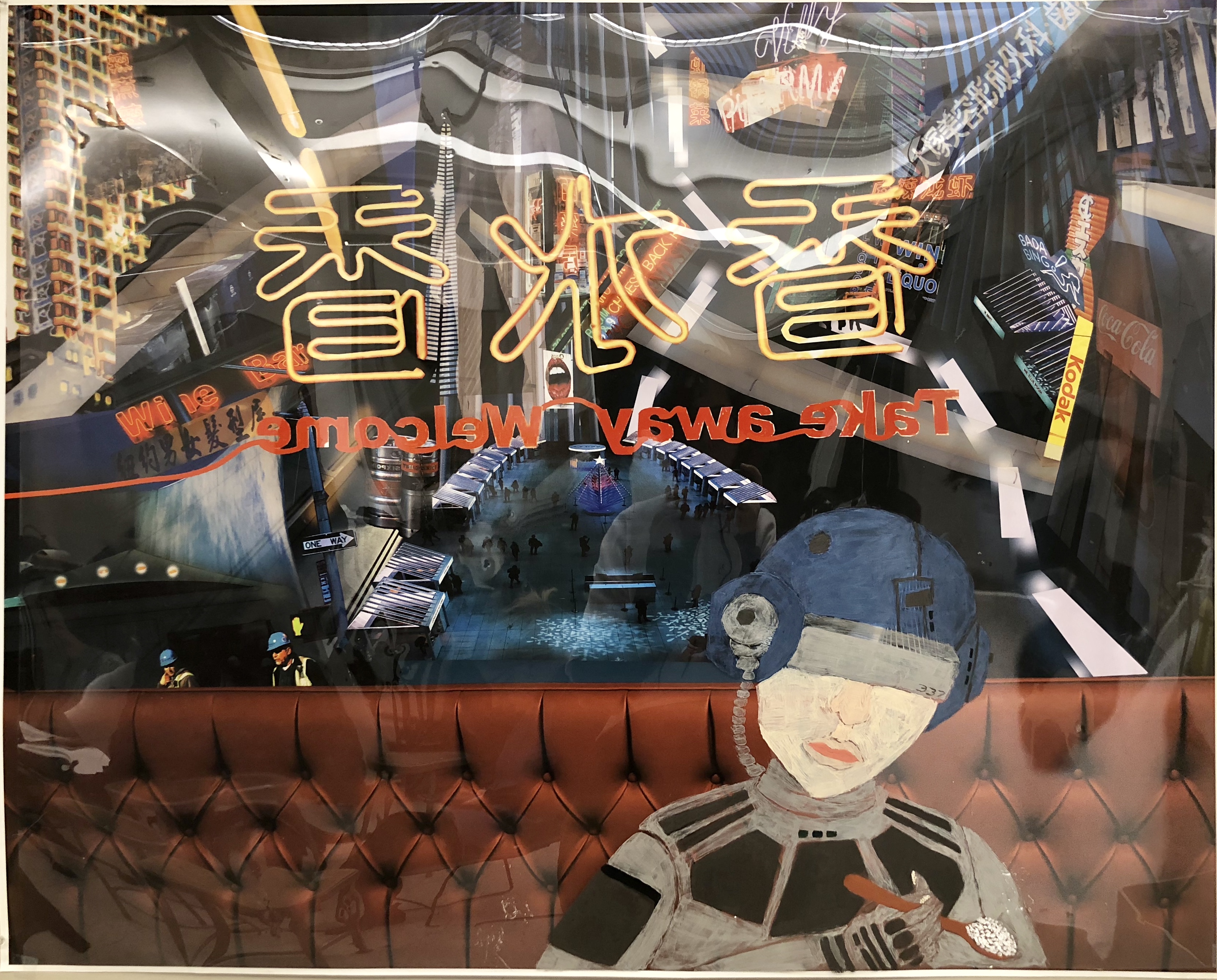
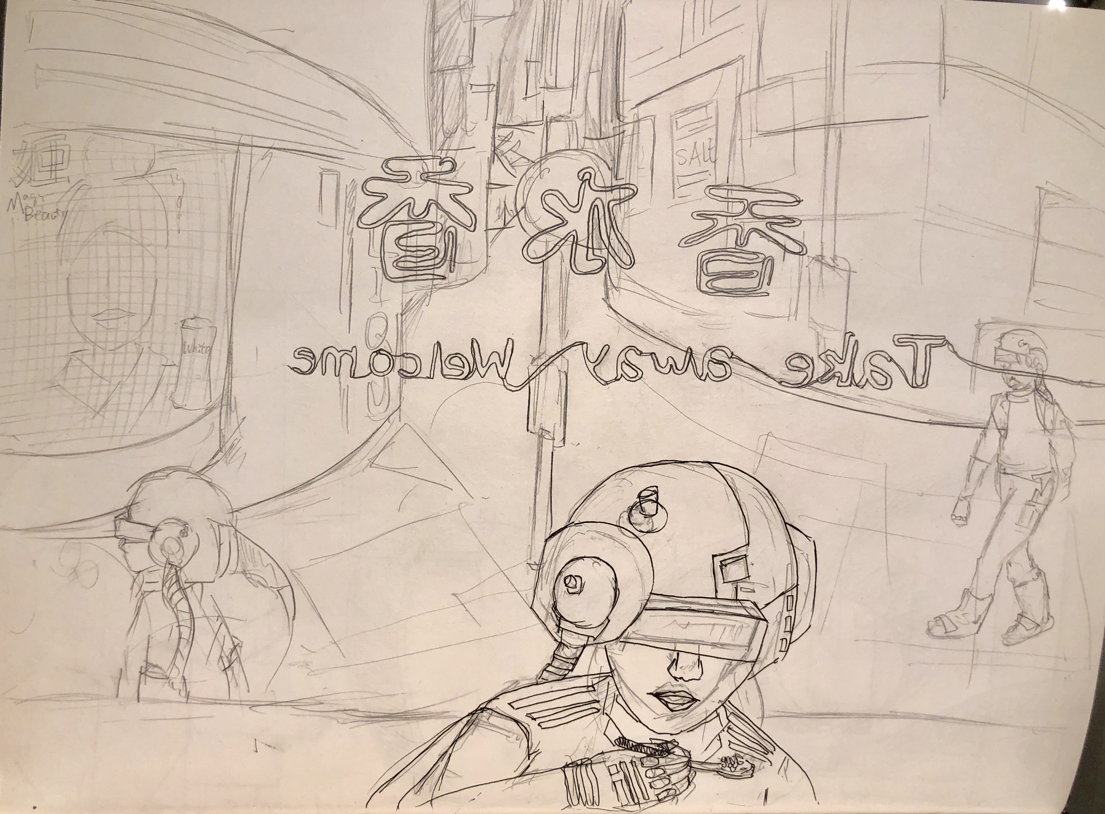
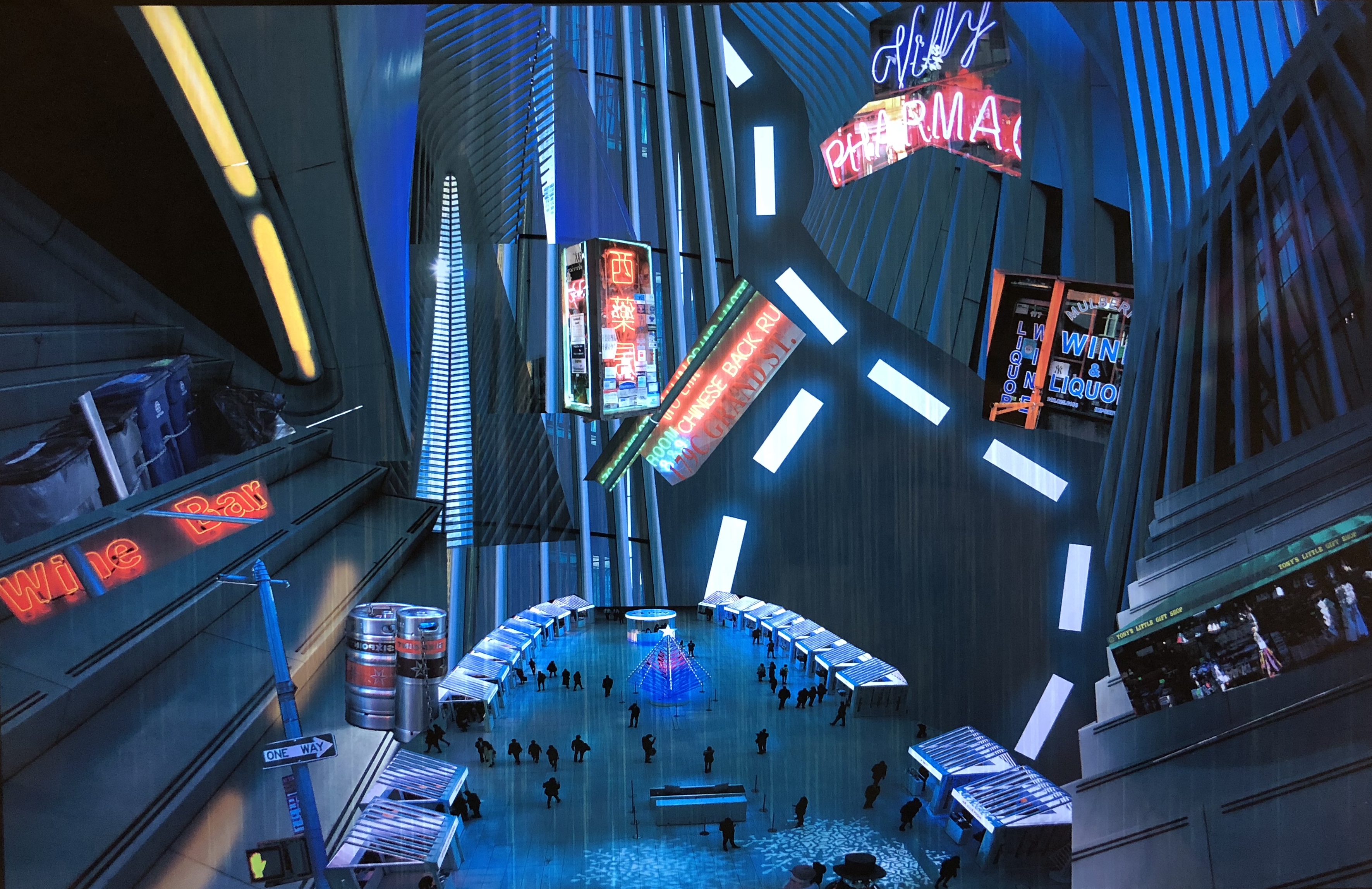
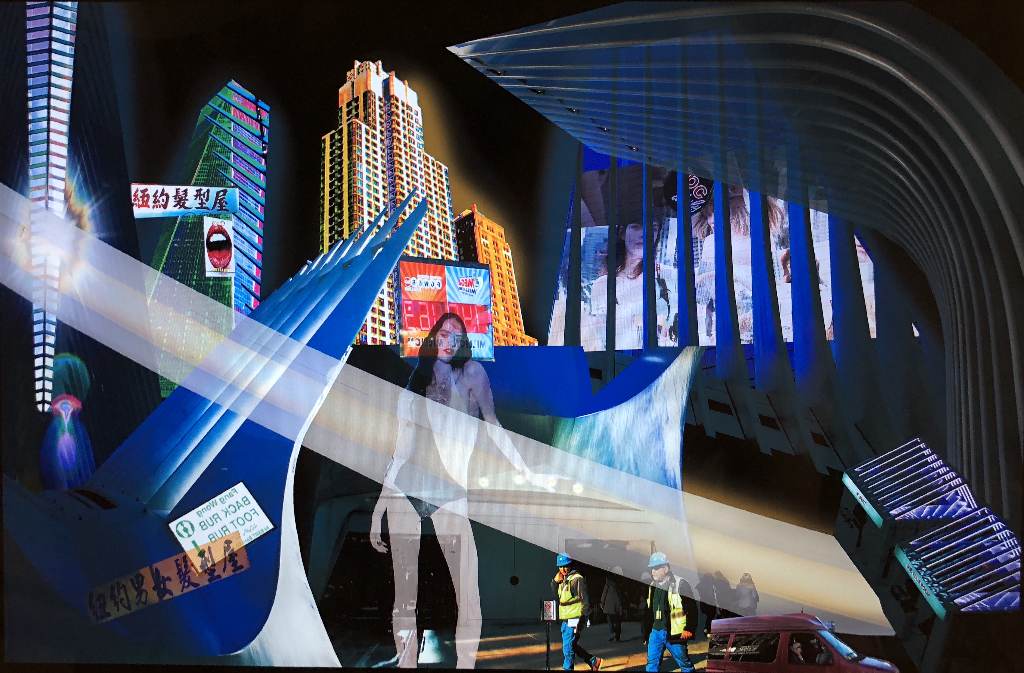
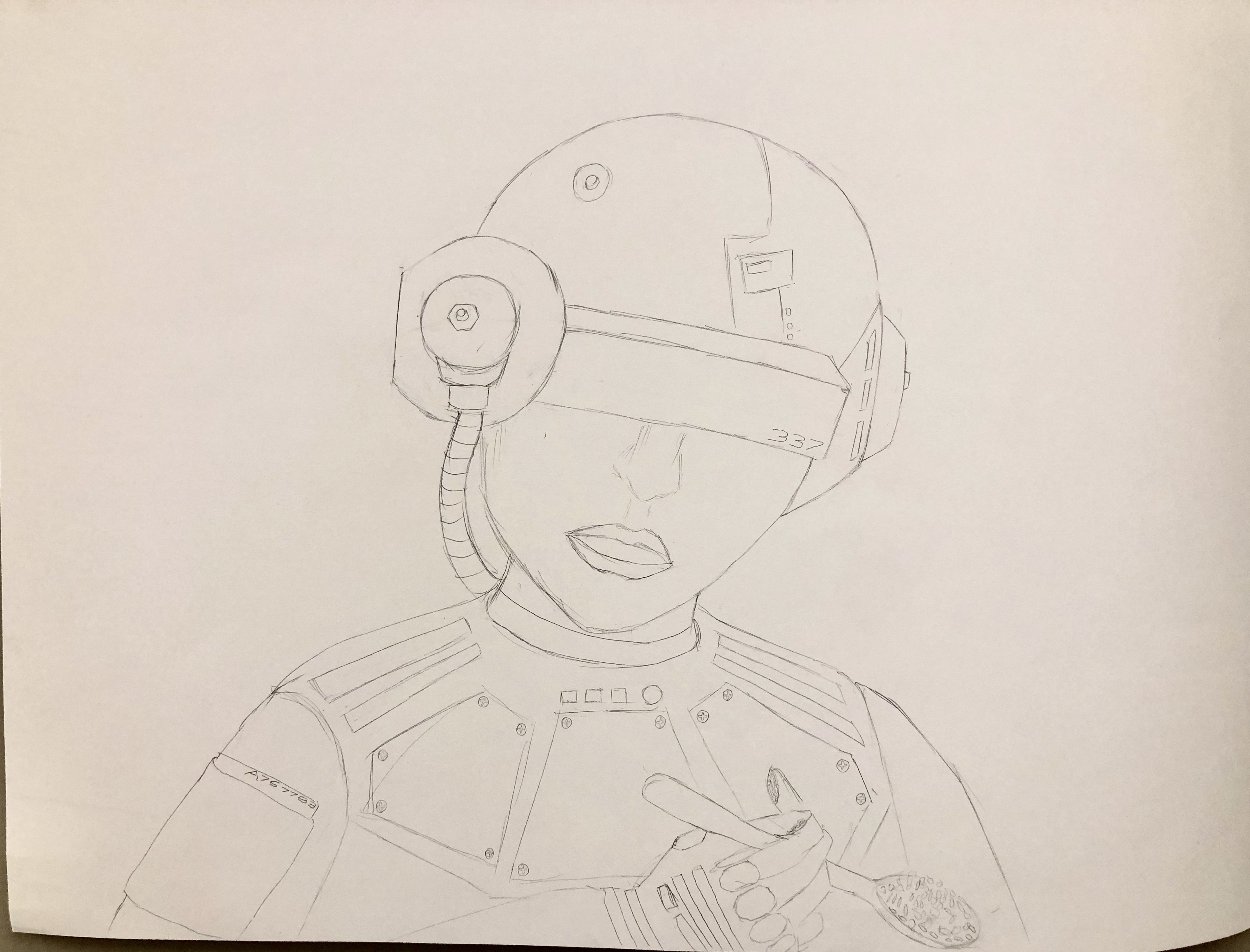
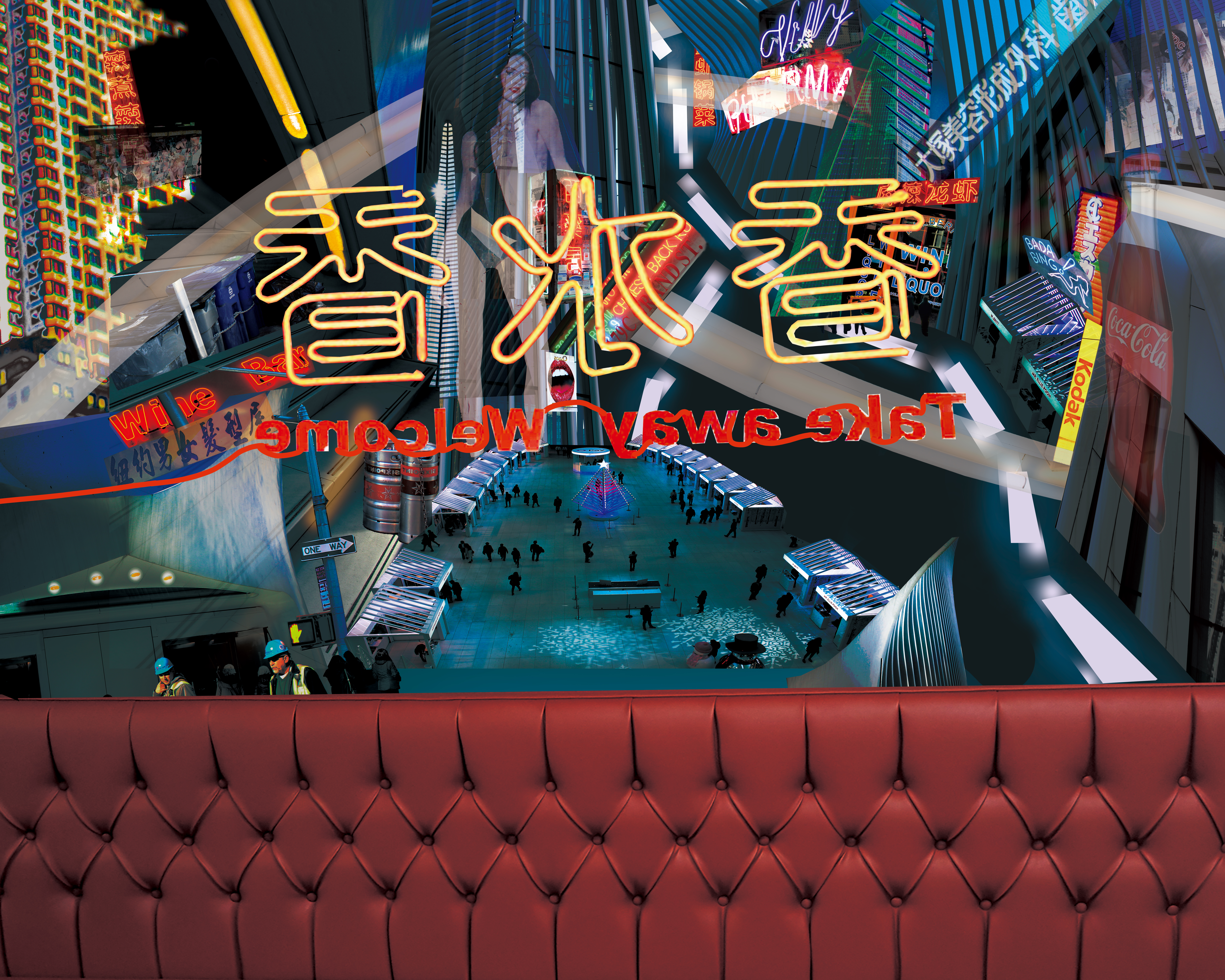
At first I want to play with perspectives in my sketches, so I draw a sketch of a perspective of looking out from a restaurant. And then I thought about add some cyberpunk-style city-view at the background. So I did two digital collages in photoshop to form the background city-view by using the pictures I took.
mock-up:
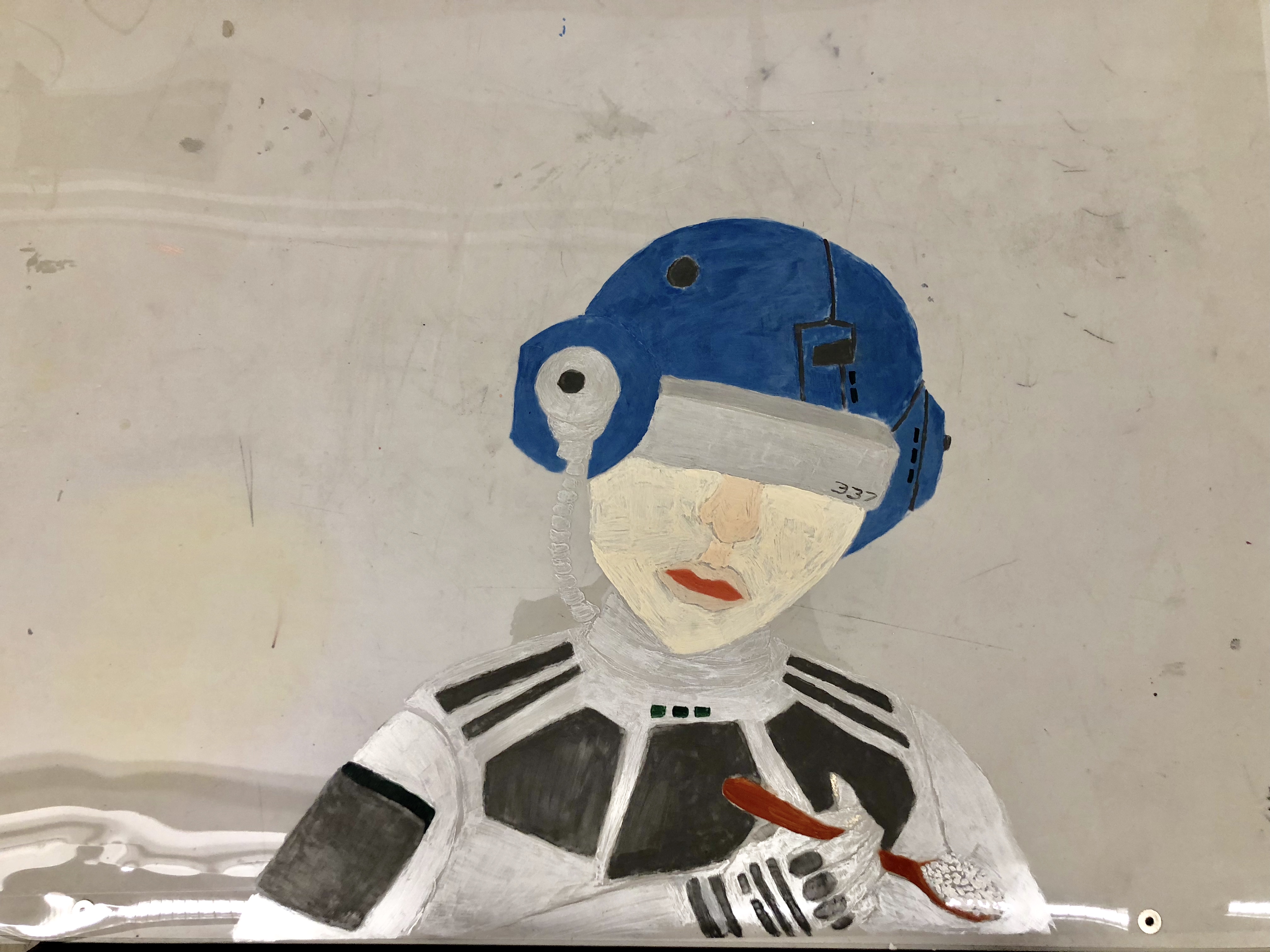
Since I really like cyberpunk movie recently, such as Ghost in the shell and Blade Runner 2049. So when I went to Mulberry st. and took some pictures, looking at the neons, posters and old buildings I would immediately think about Cyberpunk. And because I want to show the cyberpunk city-view from a different perspective, so I decided to use the sketch of looking out from a restaurant window. I choose a Grafix texture paper which is as the same size as the background city-view adding above it, and draw the character who is eating inside the restaurant on the Grafix paper. When I was working on the mock-up, I realized that it’s hard to work on large scale paper than small scale paper. Especially the surface of the Grafix paper is so smooth that the acrylic pigment is hard to stay on the paper. So I need to paint the pigment 2-3 times to draw a shape. I draw the character mainly in blue and silver to match up the color tone of the background.
Final work:
In the background I add more transparent 3D advertisements and driveways to add the sense of futuristic. Also I printed the background in photo quality plotter to add more reflecting effect in addition to the Grafix cover. Although the Grafix paper reflects more lights than I thought and make some parts of the background are hard to be seen, overall I think the final work achieve my original goal. The character is also a little bit transparent and reveal the coach adding some interesting elements to it.