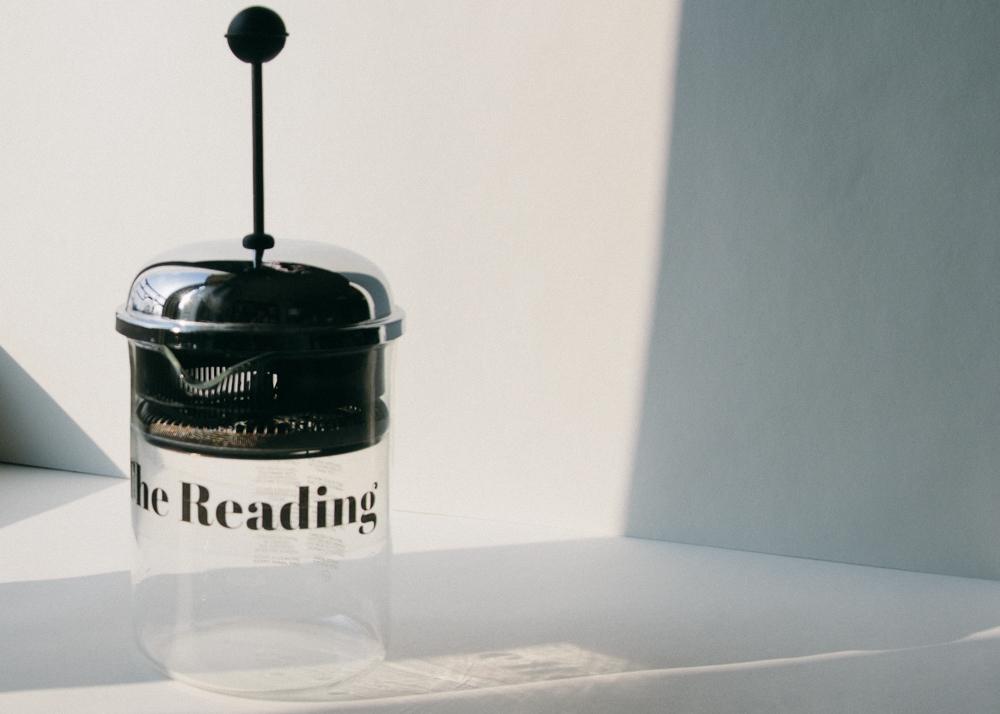
THE READING
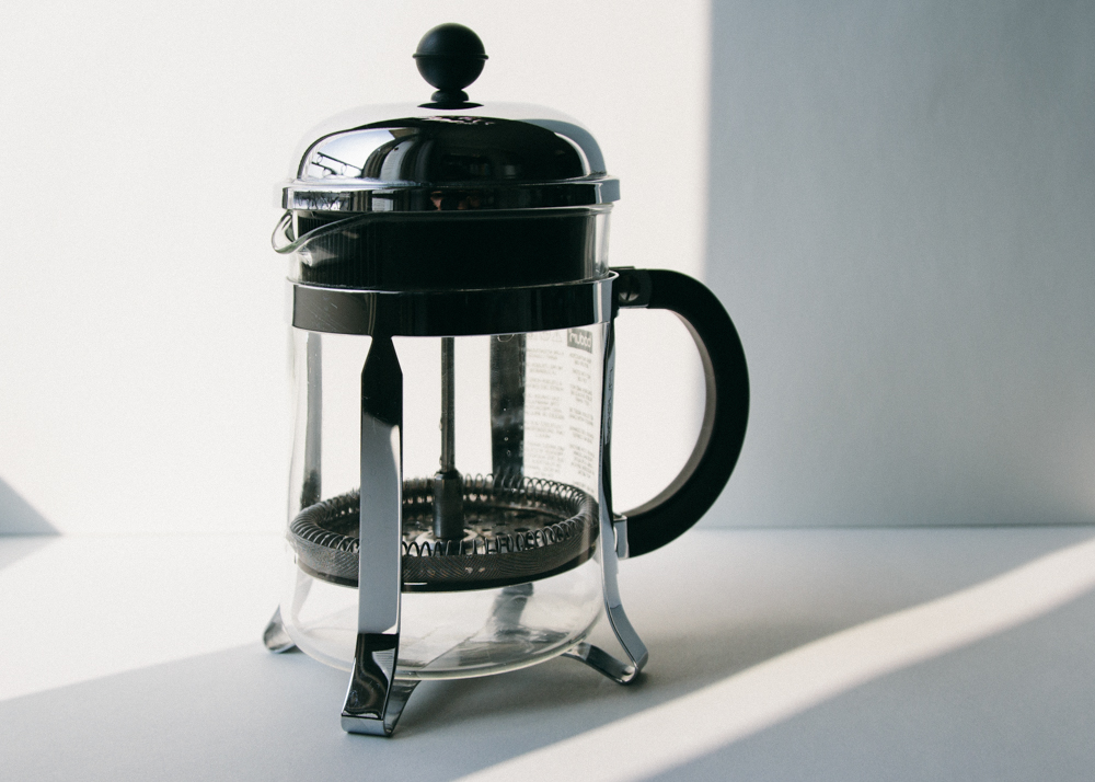
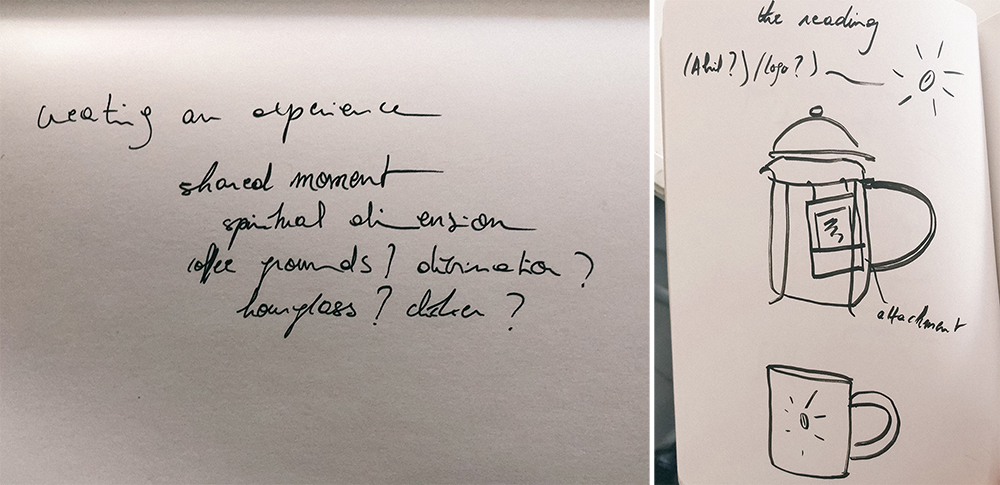
The Reading is an experience designed around a French Press coffeemaker. The challenge definitely was about taking something so clearly functional (coffee) and giving it a higher dimension than what it already was, without necessarily changing its original purpose. The project thus stems from two observations: first, the lost spiritual dimension of coffee (which, in the 15th century, was used by Sufi mystics as an aid for spiritual accomplishment) and second, the lessening of communal moments in our urban, ultra-connected lives. The Reading is a way to start your day and open yourself up to the possibilities you could encounter. It is meant to be experienced in a duo, though using it single-handed might be good too in the sense of spending time with yourself.
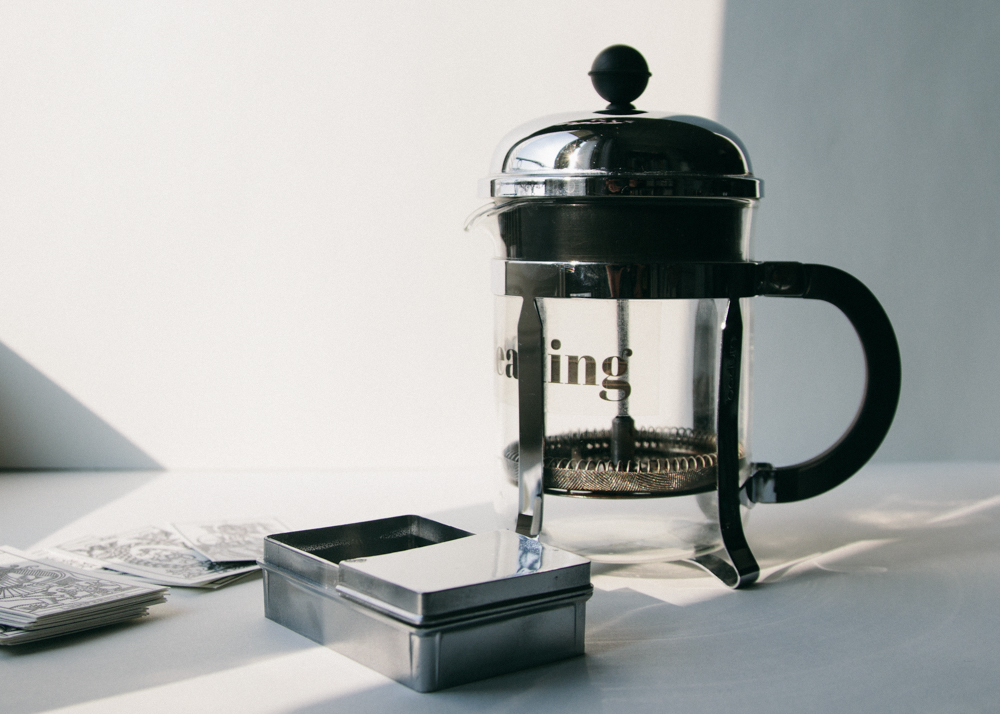
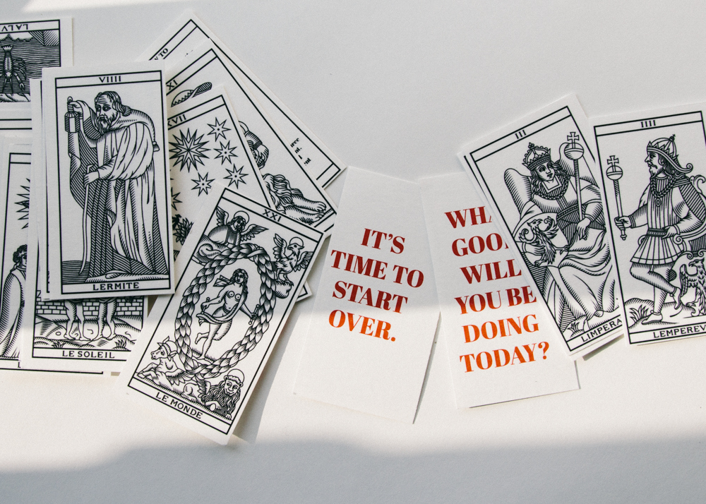
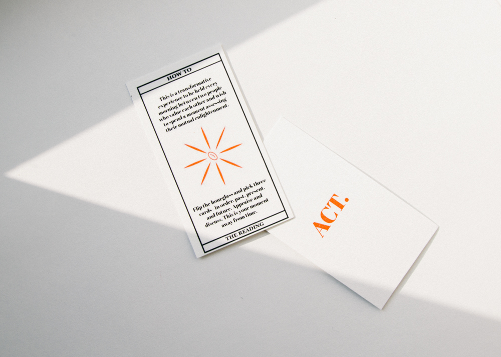
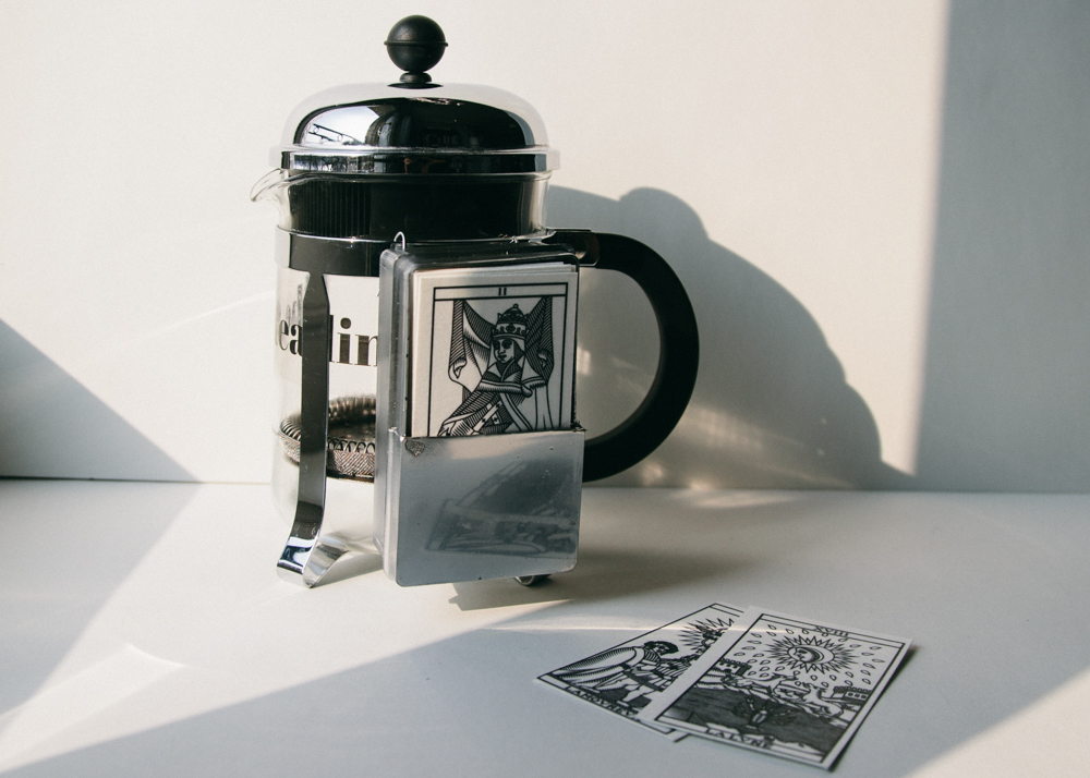
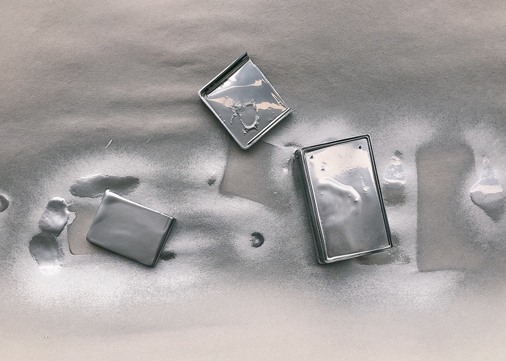
The first component of it is the stack of cards linked to the French Press itself. Ideally made out of chrome, the prototype’s is a cut up plastic box with chrome paint, attached with steel wire. The cards themselves are freely inspired by the Tarot de Marseille, which appeared at the same time in History as coffee drinking. Coffee and the Tarot cards both being very strong instruments for divination, it seemed evident to associate them. The Reading’s cards reappropriate the Tarot’s visuals and have added questions or statements freely inspired by each card’s meaning on the back. These writings aim to stimulate a conversation between the two people “playing”, each looking into elements of their life and what they wish for the day to come. An instruction card is included.
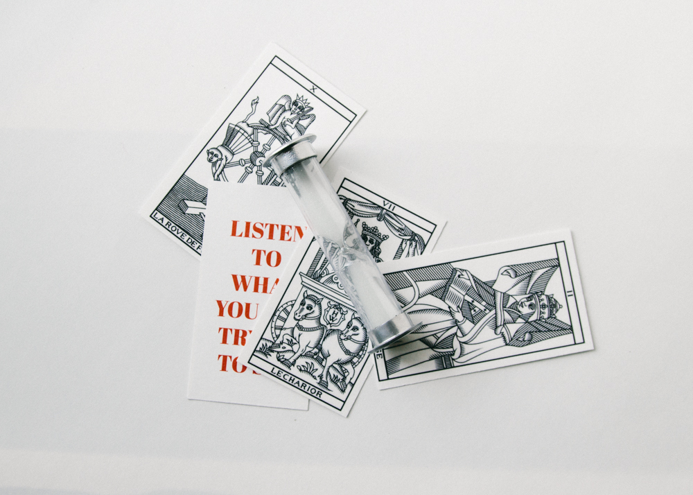
An aspect of time had to come into play next. For introspection and communal purposes to take effect, the moment has to be separated from the rhythm of everyday cadenced life. The hourglass is meant to be turned when the moment starts– coffee, then cards. The sand falling then stopping is meant to lead the duo into a dimension away from time, allowing a full experience of the project. The hourglass was chrome painted too.
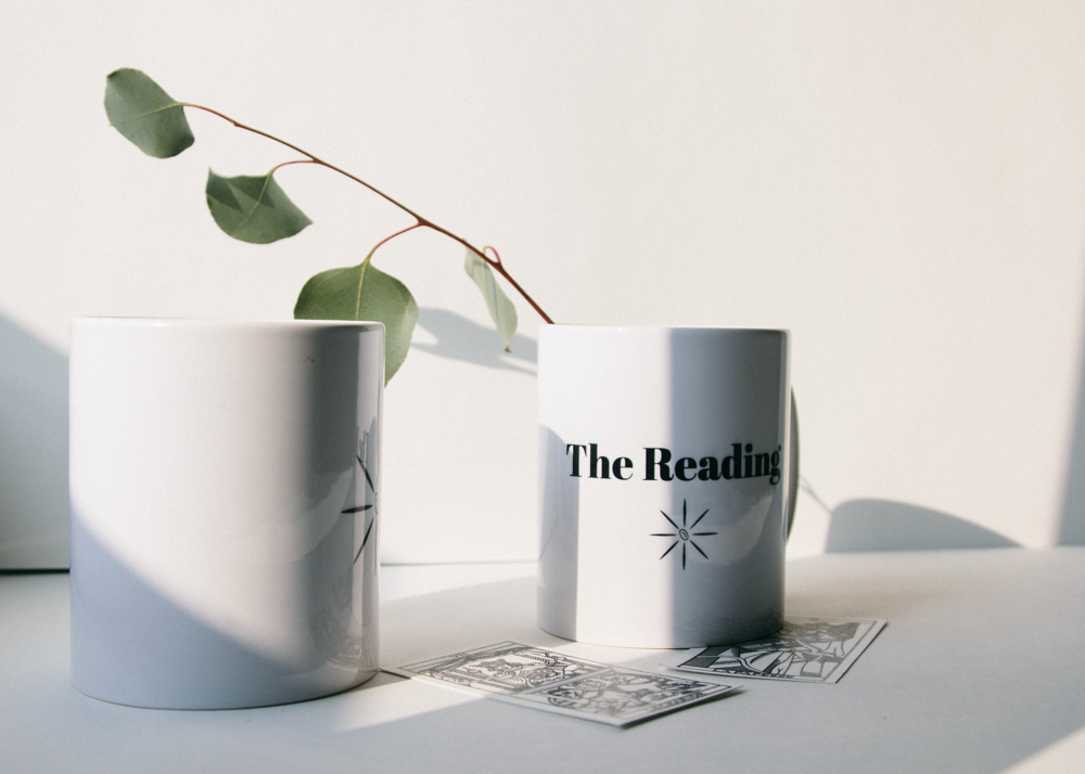
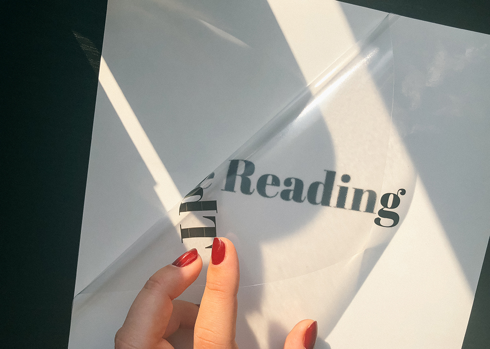
The Reading being heavily based on experience, it was important for everything to fit into a set with a common theme. A logo (inspired from Tarot, with a coffee bean at the center) and typeface were picked and repeated on the glass of the French Press as well as on a duo of mugs. The chrome theme runs throughout, from the coffeemaker and its attachment to the hourglass. A spot of red comes from the writing at the back of the cards. All of it is meant to re-center us on what matters: introspection, mutual shared experience, human meaningful relationships, and good coffee.