Bridge 4: Human Occupancy

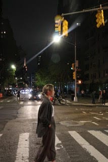
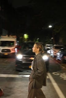
While walking around New York I noticed that despite the vibrancy and the liveliness of the city, the people in it are far less positive. At first I thought that this is simply a coincidence, but soon I realised that actually there is a reason behind this lack of happiness on the faces of the New Yorkers. This reason is the loss of identity. As people arrive into this gigantic city with millions of people in it, they might feel the need to fit in with the ones that surround them. This will to fit in with the people in my opinion leads to them loosing their original selves, and appropriating snippets of the cultures and characters that they see. The personality of people fades away, as if they fade away themselves. This motivated my photoshop exploration.


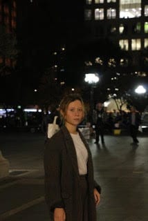
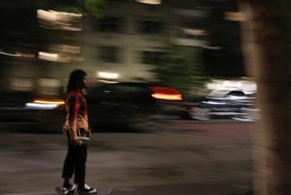
The photos that I have taken in the beginning of this project came in a treat, as they show a person roaming around the city at night, and that dark and gloomy atmosphere made me consider the project in the way that I did. The idea came to me when I thought of the word fade. Peoples personalities fade in New York, and I decided to demonstrate that by the people fading themselves. Thus, came about the composition. A central figure looking directly at the observer is fully present, and looks at us with a saddening look, which asks for help from us without words. From the sides of the figure two ‘doppelgängers’ leave, each taking a part of the personality with them. Because they only take a part, they are transparent, as they fade into the dark background. They part their own ways, and the city takes another victim who lost themselves in this vast megapolis.


Bridge 3: Site specific Installation

In this project me and my group has aimed to deliver an experience which would enlighten and inform people. We wanted to change the way in which people would perceive the park and we hoped that through informing them of the past we may change the future, and may prevent people from taking this area for granted. We planned to create  site specific piece which would stop people who are walking around the park, and motivate them to think about the place that they see, and about the people who have contributed to the formation of the contemporary park.


In working with a group I found it challenging to collaboratively choose the idea that we will take as the main one, and go through with it. It was also slightly challenging to spread the workload according to everyones skill set due to the fact that our group had mostly similar knowledge. I was surprised by the fact that during the process of translating the ideas that we had in our heads onto material it turned out that we had different visions of what we want to end up with, yet we managed to resolved that issue swiftly and come up with a piece that was suiting the vision of all of us.

The critique taught me that we should have spent less time thinking up different ideas, and focused on the materiality of what we want to be our final piece. What we ended up with did not seem to convince the general audience due to its seemingly poor quality of assembly and looks that attracted attention, yet did not look like the objects are made to last. This made me realise that in the next projects I should prioritise the build quality higher.


I think that the piece was successful in the fact that the information was delivered in a clear concise way that was easy to read and easy to perceive, thus the goal of informing people was achieved swiftly. On the other hand, the build quality lacked therefore letting the idea down. That was what I would change if I was to repeat this project.

Project 3: Perspicere-to see through

Buildings in perspective

In this project the focus was on the perspective, and the way in which the objects looked in it. The work in perspective allowed me to explore the buildings located around the residence where I am currently staying. The perspective also allowed me to make a relatively precise drawing of a multi story house located on the corner of Union Square and 15th street. The building is an example of a classic New York building with the stores on the first floor, and then more residential floors above it, hence the height of the windows varies so much. In the drawing I have left the horizon line and the guide lines, in order to demonstrate how I have arrived at the final shape of the structure.

After finishing the realistic picture, I have decided to deconstruct the structure of the building into several layers. I have noticed that the building gets lighter as it goes up, as it progresses from the ground and more brown color, to the much lighter blue color on the top levels. The building also resembled slightly a childs tower toy, where the top levels are smaller and the lower levels are larger. Thereforewhat I have done is I have divided the building into sections which become smaller as you go up, and then I have coloured it, so that it starts with darker, richer brown colors on the bottom, and then when it goes up to the top, the colors turn into much lighter blue ones that resemble the sky.


Manifesto

From the ground up to the skies rises the building

From the dark  it stretches out to the clear skies

The floors of the building are like the parts of a child’s pyramid

There is a central axis running through it

And as you look up, there is a progressive shrinking

The house is like a child’s pyramid

It goes up into the air

And it feels like the floors are not attached

But they are to the ground

With strings

They do not let go

And they hold it in place

Like a sky castle