I was browsing a portfolio website based on graphic designers and designers in advertising, I came across Bankov’s portfolio, which was heavily based on concert, theatrical and other performing arts posters. I personally have a strong connection with theatre, throughout my junior and high school career, I focused in theatre production. Over a year ago, I learned about Paula Scher and her impact on New York’s public Theatre revamp, through her bold and new ideas that have re-identified theatre and the history of the Public Theatre.
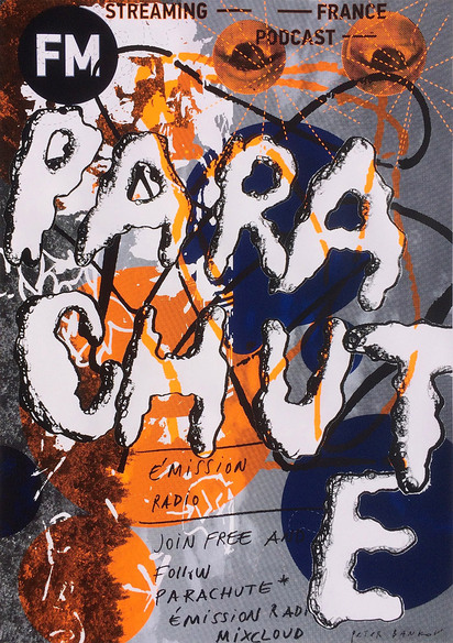
Bankov’s poster work is designed with his personal identity, I read a auto-biography and he stated, “I have nothing to say except for the fact that I like drawing posters. In my opinion it is the most interesting genre in modern graphic art design.”, the work that he produces is not designed to make a profit, he is creating these layered pieces because he wants to. He created a series of posters that shed harsh light on the poverty and I found that his designs communicated this exhaustion and aggression, overall his artistic choices never seem frivolous, they’re very powerful and present.
I recently have began exploring the art of typography and how letter forms and shapes can communicate more than the actual language, throughout my time at Parsons, I have found that my style is minimalist and I am very eager to push my boundaries and explore colors and textures in my graphic design work. Bankov;s work includes digital text, drawings, paint and mediums that provide rich texture on a two dimensional surface. His eye in his use of color is bold and offensive, but it captures the audience and illustrates aggression and an abundance of emotions in his chaotic compositions.


http://bankovposters.com/shop/posters/colors/