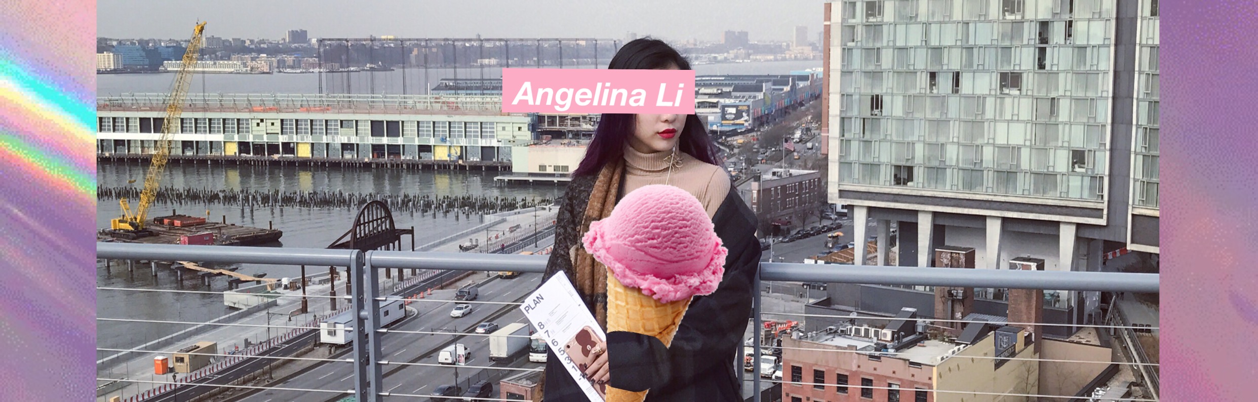
BISENSE
My fashion illustration design collection was named BISENSE. BI means two in English, and sense is just a general feeling of what womenswear and menswear should be in real life. My topic is based on the idea of ANDROGYNY and GENDER FLUIDITY, so that’s how I came up with the name of my collection, which is BISENSE.
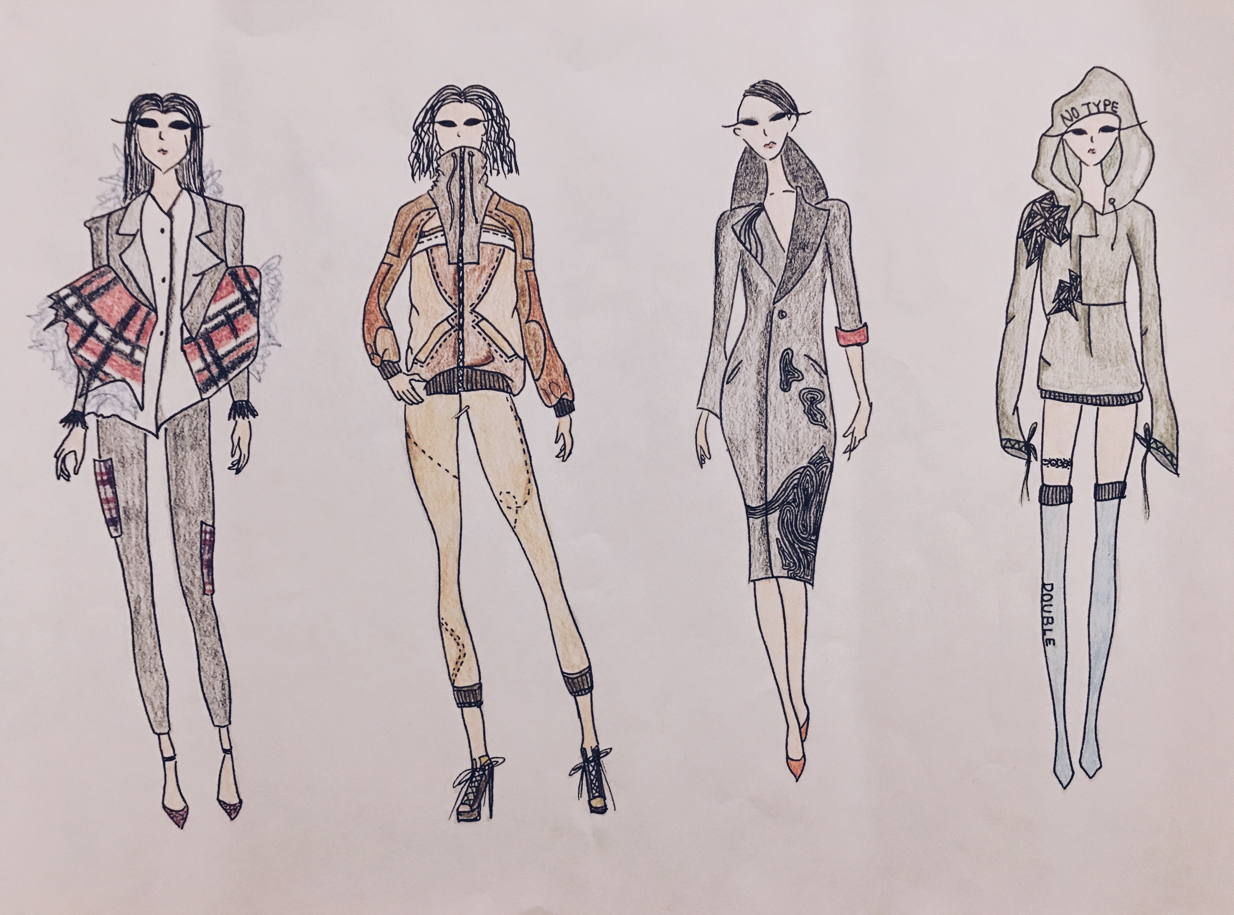
Most of my piece were pretty well-known as menswear, like hoodie and suits. However, I designed it into a more feminine way and a ready to wear collection.
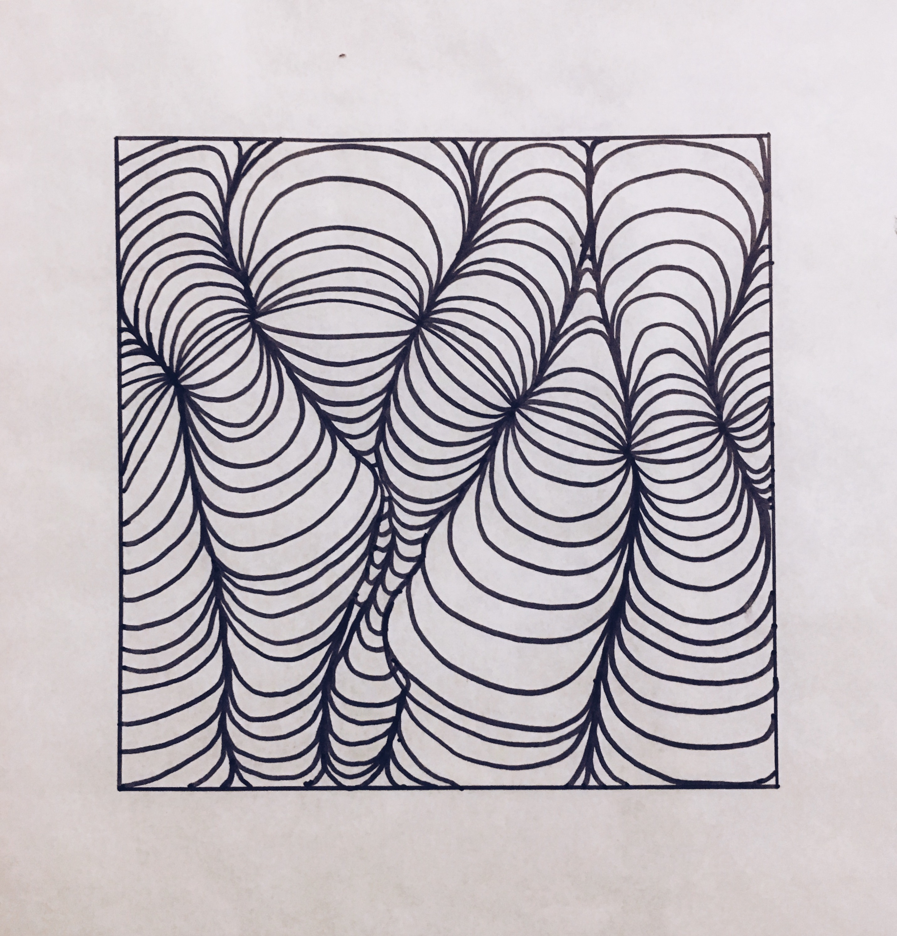
I personal created these pattern for my collection, it was hard to think of any pattern when it comes to ANDROGYNY, however, based on the original idea of general bisexual prints, which is line. I personally explored more in line designing and how to make it looks cooler and more fashion forward. Later, I used some of the pattern in my collection, very asymmetrical way. I believe the idea of my pattern, which is very structural and irregular also shows how gender fluidity can be seen as something that’s not normal but acceptable.
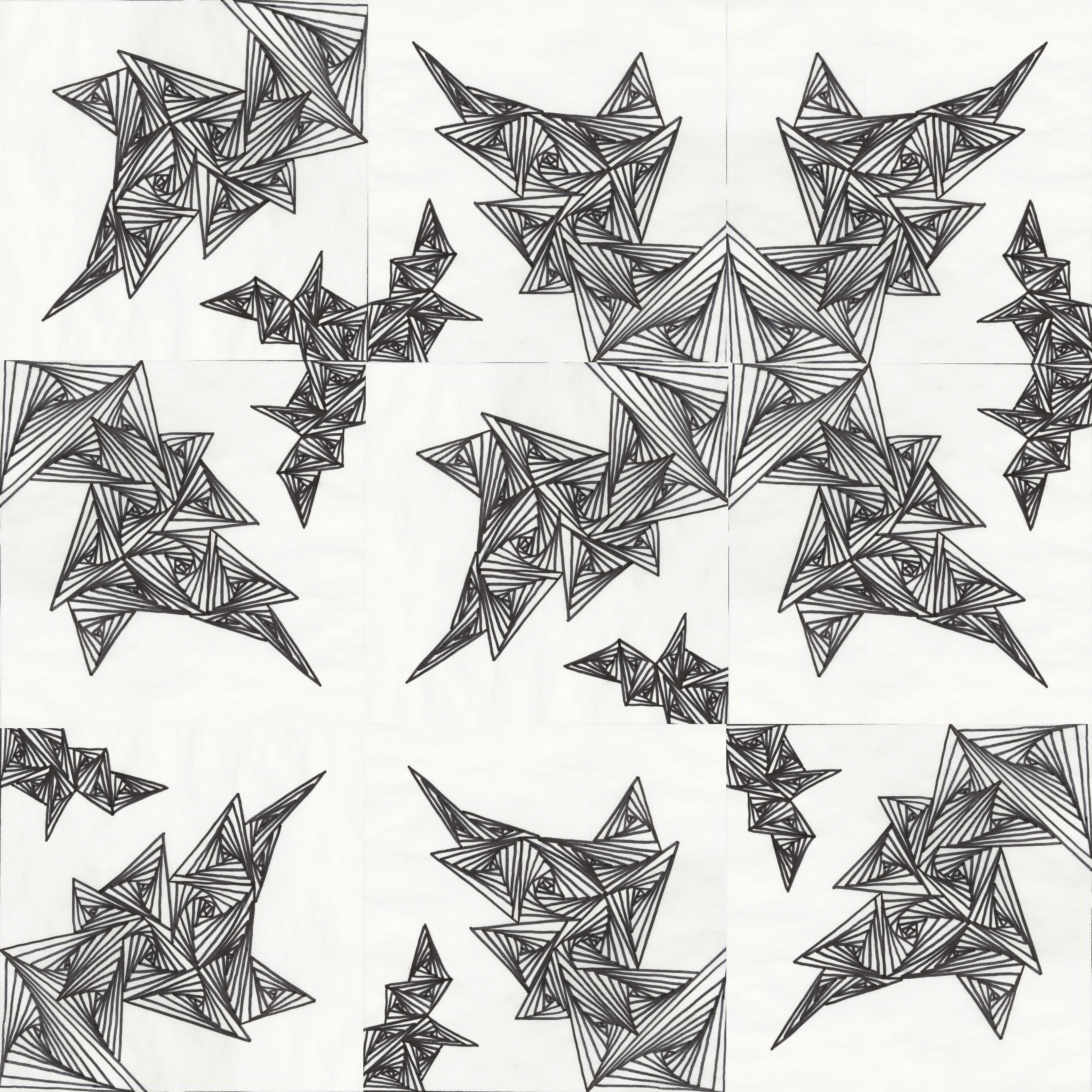
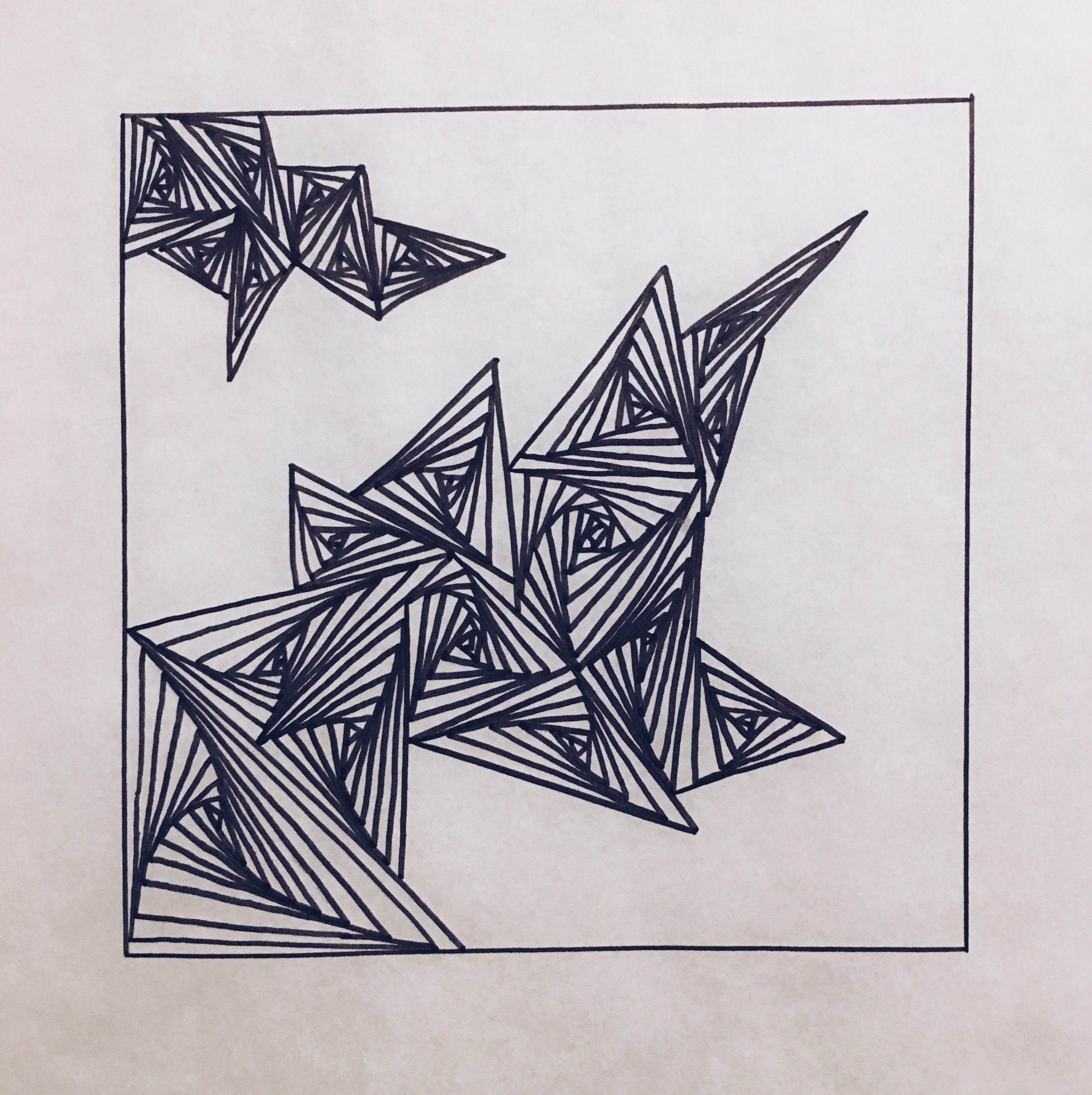
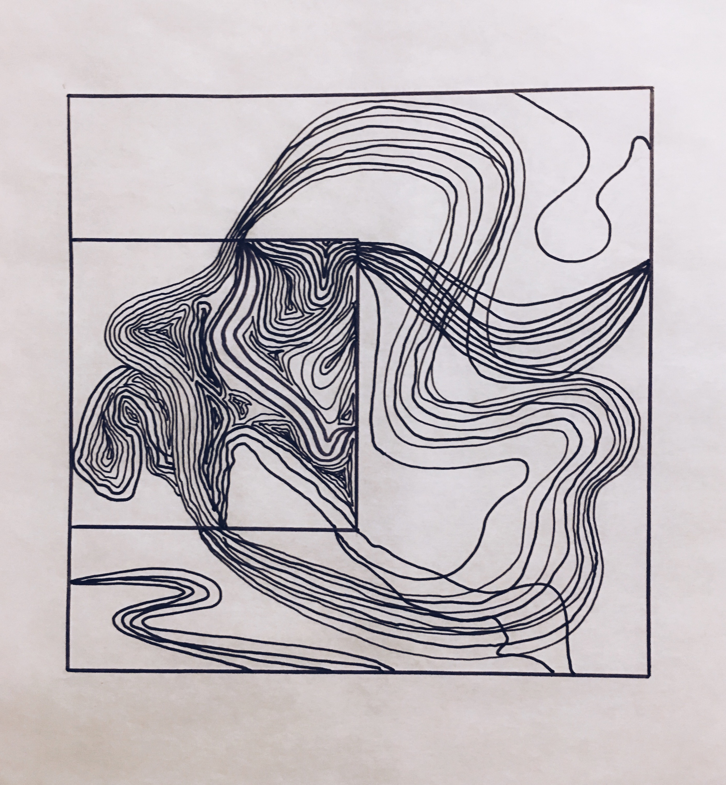
Here is the final 36” * 36” pattern that I created for the collection, super abstract and geometric. I also wanted to show the idea of different possibility of a pattern can be as in this final piece. Things might be different if we see it in a different way, just like gender inequality. There is no right or wrong of giving a specify gender identification, it is also a learning of accepting new things.
“The takeaway is that only you know who you were born to be and you need to be free to be that person.” — Ruby Rose.