Swatch samples:
I painted different swatch samples using fabric paint to figure out which fabric to purchase. I wanted a silk faille because it has the structure that will allow it to poof out and stay stiff while remaining soft and smooth. This smooth hand to the fabric is extremely important because the fabric paint works well on a smooth fabric for my desired design. I plan to paint the flower print the I created in my swatch booklet as a type of border print on my garment. With the different variations of silk failles and some synthetic failles, I chose the bottom left swatch to work with because the hand and texture worked well as did other silk failles, but also because the color was warm enough to remain cohesive with the color scheme, but not too warm that it would blend in as a skin-tone color. The strap material is a


Timeline:
Friday May 1: Finished garment sewn
Friday May 8th: Flowers painted on garment.
Saturday May 9-Tuesday 12: Studio and concept photo shoots

Final garment illustration
Photo shoot ideas:
Brooklyn Botanical Garden- mimic and point out importance of flowers on dress. The Brooklyn Botanical garden encompasses a wide variety of flowers that allow for education, mixing of cultures, and the resemblance of cultural appropriation. The way that we appropriate culture, gardens take culture in the form of flowers. I think this location can depict my image clearly by creating a floral and cheerful setting that tells the story why cultural appropriation is positive in the fashion industry, while at the same time paralleling the mixing of cultures for display.
Construction Process:
The first change I had to make between my muslin pattern and the final was the change in the front yoke to exaggerate the curve on the bottom. I created a new pattern piece by using the old one and drawing down the curve. This altered the front bodice pattern because they have to match up. As a result, I used the new yoke to draw a new front bodice piece and slashed and spread it to create the fullness. Once again, it was difficult to perfect the fit of the straps by inserting the back pieces into the back yoke as the last step and top-stitching because the fabric was slippery. I had to carefully undo and redo the seams for these straps in order to maintain a clean fabric without holes because it was very delicate.
The construction process was difficult because of my fabric choice. I used a heavy silk faille in order for the final garment to have a weight that would allow it to flare out from the gathers. The fabric also worked well with the fabric paint in the test swatch and the color translated well with my theme, sketch, and with the other colors in the color scheme. While I chose this fabric for these many reasons, I did run into problems while constructing the final piece with it because it was my first time using silk. I created the yoke piece and the straps which all have doubled pieces so they are finished when turned inside out. Not until I gathered the front bodice piece and sewed it onto the yoke front did I realize that this fabric was fraying extensively. Before I continued with the garment I needed to find a solution so the ends of the fabric would not fray. I decided to use the zigzag stitch on my machine to finish off every raw edge. It was difficult to zig zag over the already gathered edge of the bodice joined at the joke because of the fullness, but it was smoother than I thought it would be and it successfully stopped the garment from fraying apart at this seam. I then zigzagged each raw edge before sewing the pieces together. This was easier to do on the back bodice before I did the gathers. At the side seams, I wanted to do french seams with the in-seam pockets, but I decided it would be too bulky because the fabric does not allow tiny seam allowances to be pressed down well.
During this process compared to the muslin, I had a harder time putting in the pockets and the zipper because of the slippery fabric. I also used 1″ seam allowance in the muslin in case I needed to alter something and changed the seam allowances mostly to 5/8″ for the final, which confused the process further. After installing the invisible zipper, I noticed that there aws a gap and that I had to resew the zipper so it lined up with no gap. Also, the yoke was not matching at first where the zipper top ends, but I opened up the top of the back yoke and resewed it by hand to gradually bring it lower to meet the seam at the front yoke.
While this fabric was difficult, I think the construction turned out well because I learned about caring for a different fabric along the way. I also think it is important to realize a fabric’s properties prior to working with it, but sometimes it is best to learn hands-on during the process. The fabric also worked well with turning up a large 9.5″ seam allowance and did not show as many mistakes as the muslin in this aspect. I think that with the muslin I realized after messing up and redoing the hem that I had use pins generously in order to perfect the fit and smoothness.
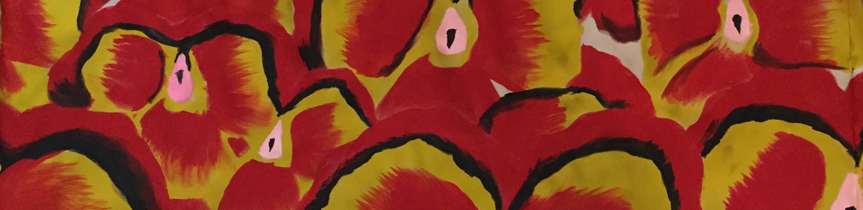
Painting Process:
I started out the painting process by attempting to lay out where I wanted each flower with pins. This did not work well because it was easier to eyeball the flowers, but it did help me realize to keep the flowers smaller and to only bring them up to the border or just above the border so as not to cut the body and dress in half. I used my original flower drawing and my sketch as a reference to the placement and the composition of the flower. I started by using a foam paintbrush, but the first flower failed because this brush did not allow for small gestures of brushstrokes and it created thick lines. I left the first flower to try again with a smaller paintbrush and succeeded in recreating the flower I used in my print. I was able to form the blending of the red into the yellow with the smaller paintbrush. After a few flowers I got a smudge of red towards the center middle of the dress, but continued to do all of the flowers around the front and back boarder before dealing with that mistake.
I went back in to fix the first flower by painting white over it and then using the color mixed with a little black to darken them, but the paint still looks brighter in that one flower. The smudge of red and that flower are mistakes, but they are hardly visible. The brighter flower blends in because it is smaller and they both get slightly hidden in the folds of the dress. While these mistakes are annoying to me, I think the viewer will not notice them. I am still trying to think of a way to resolve the smudge, but I can only think to cover it up with a smaller flower that will result in me bringing up the flowers higher than I expected to. One other option to resolving this smudge would be by covering it up with paint that is a similar color to the dress.
Practice swatch test to cover smudge:
I painted different amounts of the red fabric paint on a swatch of fabric and tested by covering it with white and then painting it a similar color to the dress and by covering the red smudge with just the paint that is the similar color to the dress. The photographs below illustrate the tests, but none of them came out that well. I think that covering the smudge would create more of a mess because the paint always dries a something darker color and looks more like a stain that a cover-up. I think the small red smudge can be hidden easier in the folds of the dress rather than with paint. I think testing the swatch was worth it to find out if the paint could cover the smudge, but it works better without altering it further.


Connections to seminar paper:
Throughout the semester I focused on the theme of cultural appropriation as a positive because it counters the popular opinion that cultural appropriation is a negative phenomenon in today’s fashion. Through my research in studio, I developed my theme by researching at the Met and the Killer Heels exhibit. The research acted as the backbone for my paper because I decided to focus my swatch book collection on a focused set of motifs as some of the designers in my research did. For example, the main points on my paper focused on past designers that have used cultural appropriation in the sense of taking motifs, influences, and pieces of others’ cultures and incorporating them into their designs. Through this act of appropriating, I think these designers are creating various benefits like globalizing cultures, educating, and creating change for cultures. Past designers that I looked into included Ralph Lauren, Diane Von Furstenberg, Peter Pilotto, and Mara Hoffman. Each of these brands takes influences from outside sources and cultures and incorporates them into their art through their respective points of view. Mara Hoffman, for example, takes inspiration from many ethnic cultures to create her prints. Without even traveling to some of these places, Hoffman takes inspiration by researching online. The garments that she creates inspire many to want to explore these cultures that she is emphasizing. This is one way cultural appropriation benefits in the fashion industry is beneficial because it creates a fantasy world based around the culture that draws consumers and viewers to explore this place. Additionally, other brands point out the cultures that need change or globalize places by bringing the cultures together. In my swatch booklet, I took a motif apparent in two culture that I wanted to appropriate. I used a motif based on the vine symbol that is present in both embroidered lederhosen from Bavarian culture and also in ethnic embroidered pieces from cultures like Nepal, Tibet, India, and Peru. In my four garments that I sketched, I transitioned from creating looks that were more obvious like appropriating the actual full silhouette of the lederhosen itself. The collection transitions, however, and the last two looks appropriate more subtly. The dress, for example, is the look that I based my final garment on because it subtly incorporated select aspects of the lederhosen silhouette and ethnic embroidery without appropriating entire garments. With the final, I appropriated the silhouette of the lederhosen bib and the criss-cross straps. With the ethnic embroidery aspect, I appropriated the feeling of this embroidery by painting flowers with a brushstroke effect reminiscent of embroidery. These aspects come together and clash two cultures in a way that brings a final piece to represent taking inspiration from cultures that I do not belong to. In the end, I think the garment shows the inspiration and theme clearly, and also advocates for cultural appropriation in fashion. As a result of wanderlust to travel and take inspiration from the outside world, I think appropriation is always a result that is up for question, but it can be looked at as a positive aspect that can focus on the cultures and highlight them to expand exploration, bring cultures together, and allow viewers to become more aware and educated about the world around them.