Project 3: Bring Back The Colour Summary
Project 3 merged scientific data analysis and artistic exploration, essentially learning how to create projects which visualize data. The final project was open to interpretation and discovery but consisted of the same scientific research and experimentation for the source of data.
We began with identifying the locations of central park that we would study and investigate. My group consisted of Tyler and myself where we were stationed to examine “The Ramble”, a part of central park dense with shrubbery and trees outlined by the large boathouse lake with many trails to explore weaving though the area. I used a generalized approach to the ethnographic research, as having been to this part of the park before I knew what to expect in terms of observable biodiversity and human interaction with the environment. However I did use the scientific method and conducted a hypothesis before testing the water and soil samples.
In my hypothesis I stated that the water should be more biodiverse than the soil sample. My reasoning was that the lake covers a larger surface area spanning the entire Ramble area whereas the soil is very isolated to the specific excavation location; thus is only impacted by the organisms which come to it rather than what I can go to. During our visit to the location we also collected soundscape data, various plant based samples, copious images of our location and surrounding environment as well as observations in smell and weather conditions. This gave us a very good understanding of the environment and its surroundings as well as the sites at which we gathered the soil and water samples for incubation. I also had the opportunity to embark on a boat tour around the Ramble enabling me to observe the ecosystem and visible biodiversity from a different angle not usually seen.
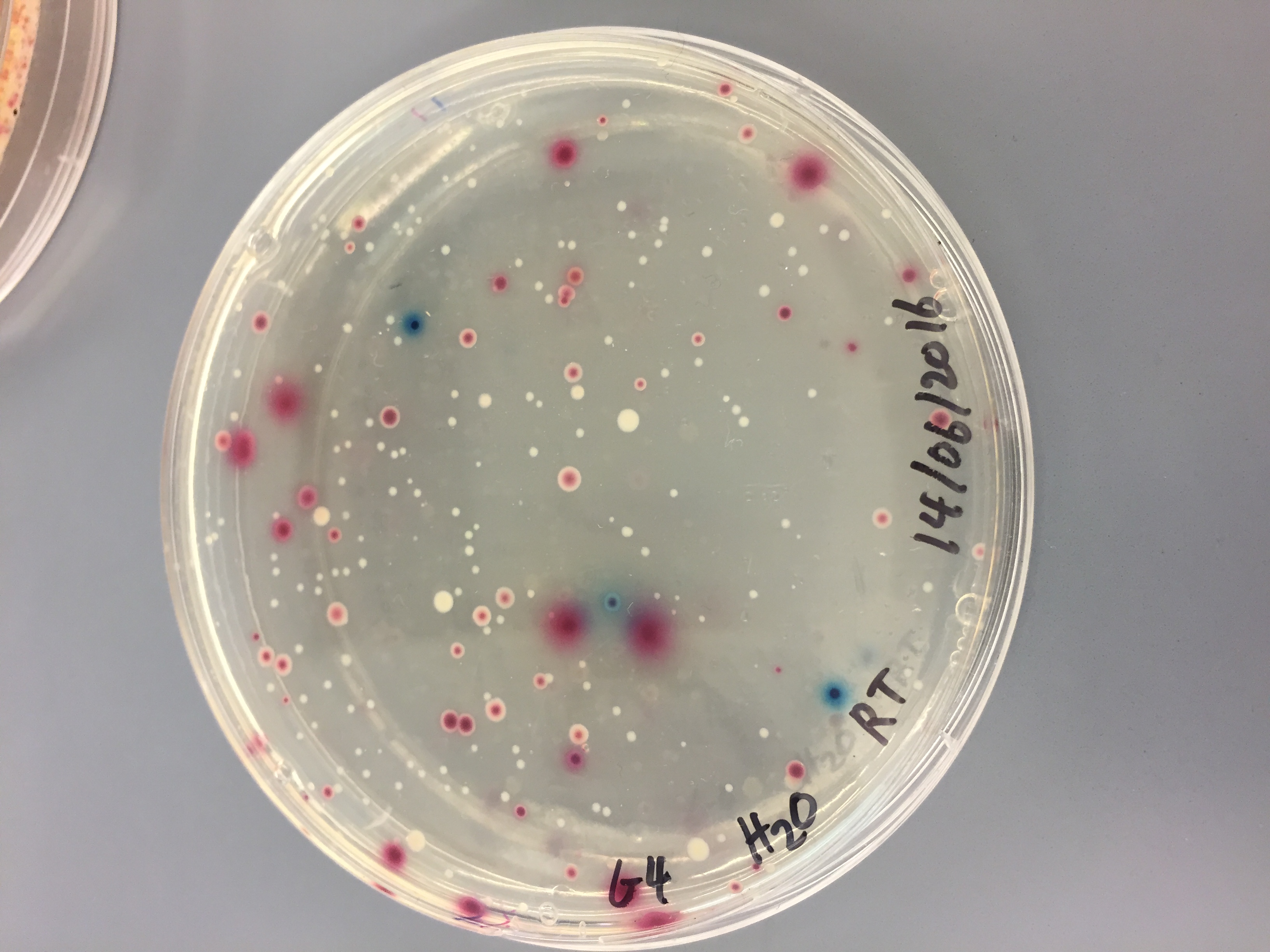
In the lab we separated the soil and water into two different incubation tests. One set of soil and water would be incubated at room temperature and the other set of soil and water would be incubated at 37 degrees celsius to see if heat played a major factor in bacteria growth or not.
We incubated the samples for 48 hours and came back to some great findings. In summary, the soil samples both at 37 degrees and room temperature were much more condense in their density of biodiversity compared to both water samples. However, both water samples were actually more diverse due to the broader range of observable colours found on the petrie dishes. After reviewing our hypothesis, it was evident that we were partially correct, but also vaguely incorrect. The water did have a greater range of biodiversity but we underestimated the soil content, which produced many more bacteria colonies than I would have expected that covered over the entire surface area of the petrie dish.
I became particularly intrigued by the water results, thus I chose to focus on them for my final project. After having a reliable data source, I pushed into the ideation phase of how I was going to visualize this data in my final project. Surprisingly, I was quick on the draw in this stage and formulated an idea that I really wanted to execute. Using a variety of artistic variables along the way, I decided to start by selecting a photo that I took at the water collection site in the Ramble. The photo was a landscape view of the lake with the surrounding environment of the Ramble in black and white. I was going to open the physical coding which formats the photos and presents it in a way where I colorize the lines of code into the shades depicted in the photo. I used a triangle as the main enclosing shape because in a naturalistic view of the world, sacred geometry depicts various elements as perfect 3 dimensional shapes, if synthesized down the water element can be identified by an upside down triangle.
Because I chose to focus on the findings from the water samples to keep the project clear and concise, I needed to include a more interactive element into the final piece. The second element that I chose to include consisted of clear tubing that used water density to depict the color variation on the petrie dish over time. It was very difficult and tedious to make the densities stay separate if the loop began to move or was moved, therefore I had to seal the tube exactly as I wanted the colors to sit and hang in the installation immediately.
During our design process we conducted an exercise to help focus our projects meaning and theme. Using magazine cutouts we tried to represent in a pictorial way what we were trying to portray and achieve by creating this data visualization. This was complimented by a second exercise in which we used the pictorial images to find thematic and meaningful words that represented our projects and placed them on a rising and falling action story line. Then describing why those words are effective in defining your project. I thought this exercise really helped in concentrating my thoughts and ideas about what the meaning of the overall project was and enabled me to have a clear direction as to what my final project would achieve if executed well.
As a finalizing element to give my piece a greater more observable meaning, I decided to implement a subtle to bold text phrase in the printed part of the project. Using advertising like properties, the words say “Bring Back The Colour” in reference to the biodiversity of the water. The more color variation that we see in the petrie dish the greater the biodiversity of the Rambles aquatic ecosystem, which is what we want more of.
After my class presentation, I was particularly pleased with how the piece was executed, especially how nicely both of my elements worked in cohesion as complimentary objects. I thought the display of the color intensity and disparity over time depicted what the biodiversity is now and what it could be if everyone kept the park clean and flourishing instead of trashing it. The park is a global community of people from all around the world and it is everyones job to keep it sustainable and healthy for the long term. To achieve this improvement in the biodiversity, we have to help and promote a clean and natural environment that the organisms also want to flourish in, as to why it is vitally important that we are able to visualize the data that we collected to the public so they understand the situation the park is really in and where it can go in the future. Data visualization is an essential component in spreading important information quickly and meaningfully to attract the attention of as many people as possible in an engaging and creative way; which is the only way that people will start to listen and engage in the support and promotion of a thriving and beneficial ecosystem to the global community of New York City.