During class last week, Sarah and I went to Anthropologie and H&M to observe the interior and overall ambiance of the stores. The two stores were very different in their approach to attract their clients. We went to Anthropologie first, and immediately noticed that the entrance to the store was intriguing. The door itself was a single, large, and quite heavy piece of wood, and the handle was vine-shaped. As soon as we walked into the store we both noticed how nice it smelled, it was a fruity scent. The front of the store had a section of candles, which a was great placement technique so that the candles would be the first thing people would notice once they walked in. The store also has a lower level, and the stairs leading to it were on the opposite side. However, the railing alongside the stairs were glass which made the stairs visible to the people who entered the store to signify there is another level downstairs, I thought that this was a very successful design idea. A common theme throughout the whole store was the use of repurposed wood and metal pipes that added a very industrial feel. The floors, borders of the windows, and tables were all made of recovered wood.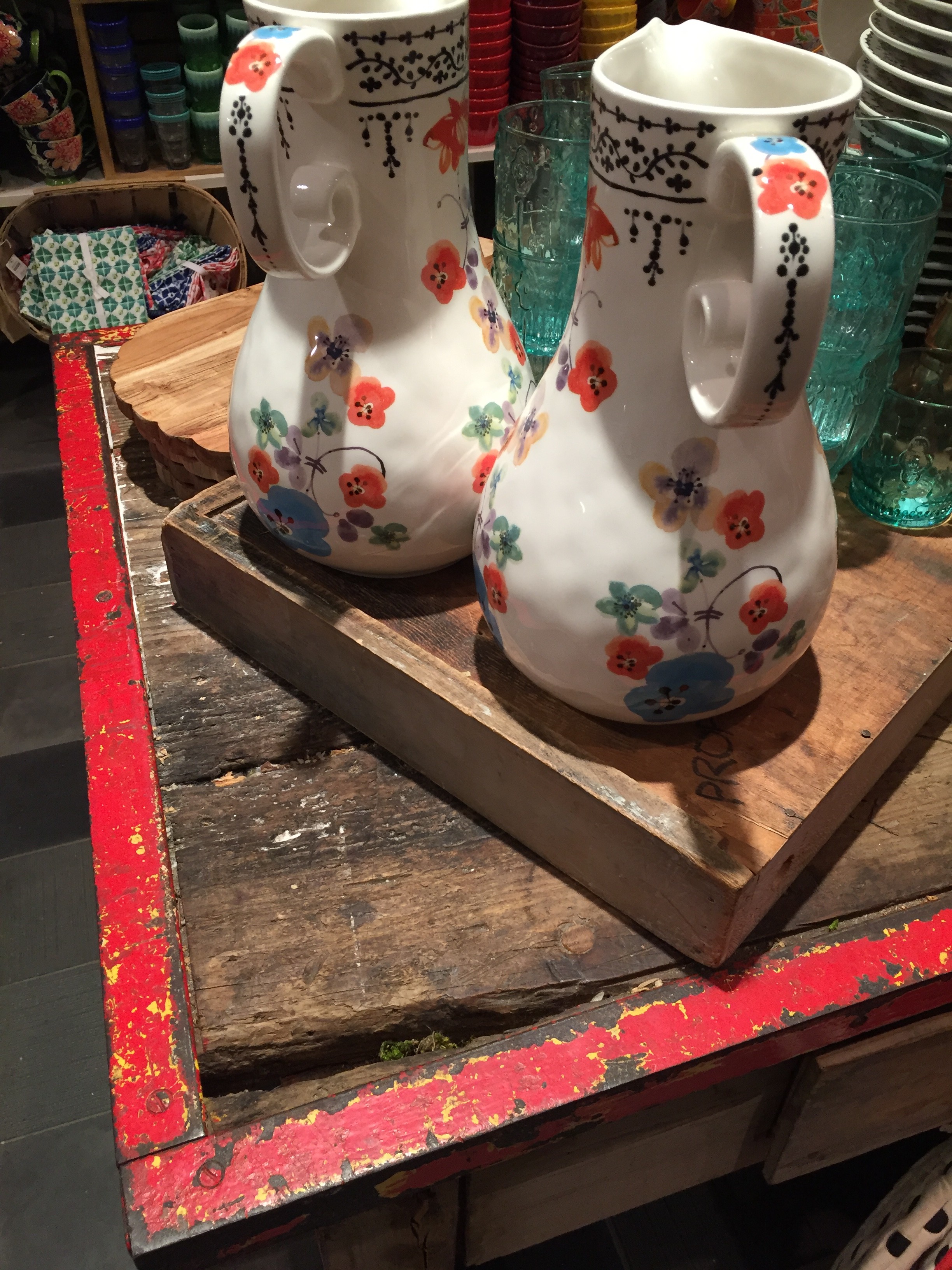 There weren’t many, but even the few signs that we saw were made of pieces of wood and were also hand painted. There were old wooden crates that were turned sideways and used as shelves to place items on.
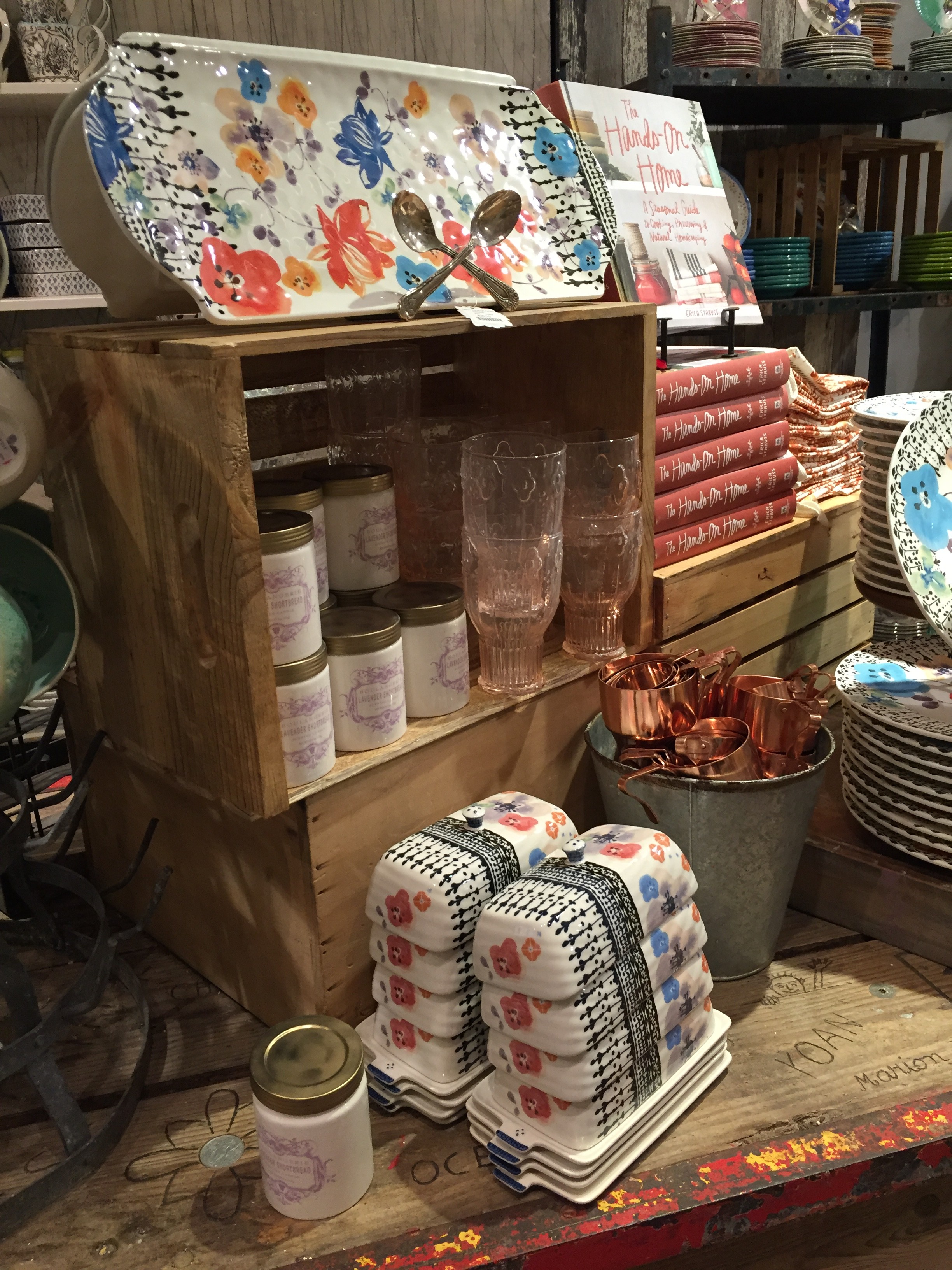 Plumbing pipes that were part of the building structure were incorporated into the design with attached canvases
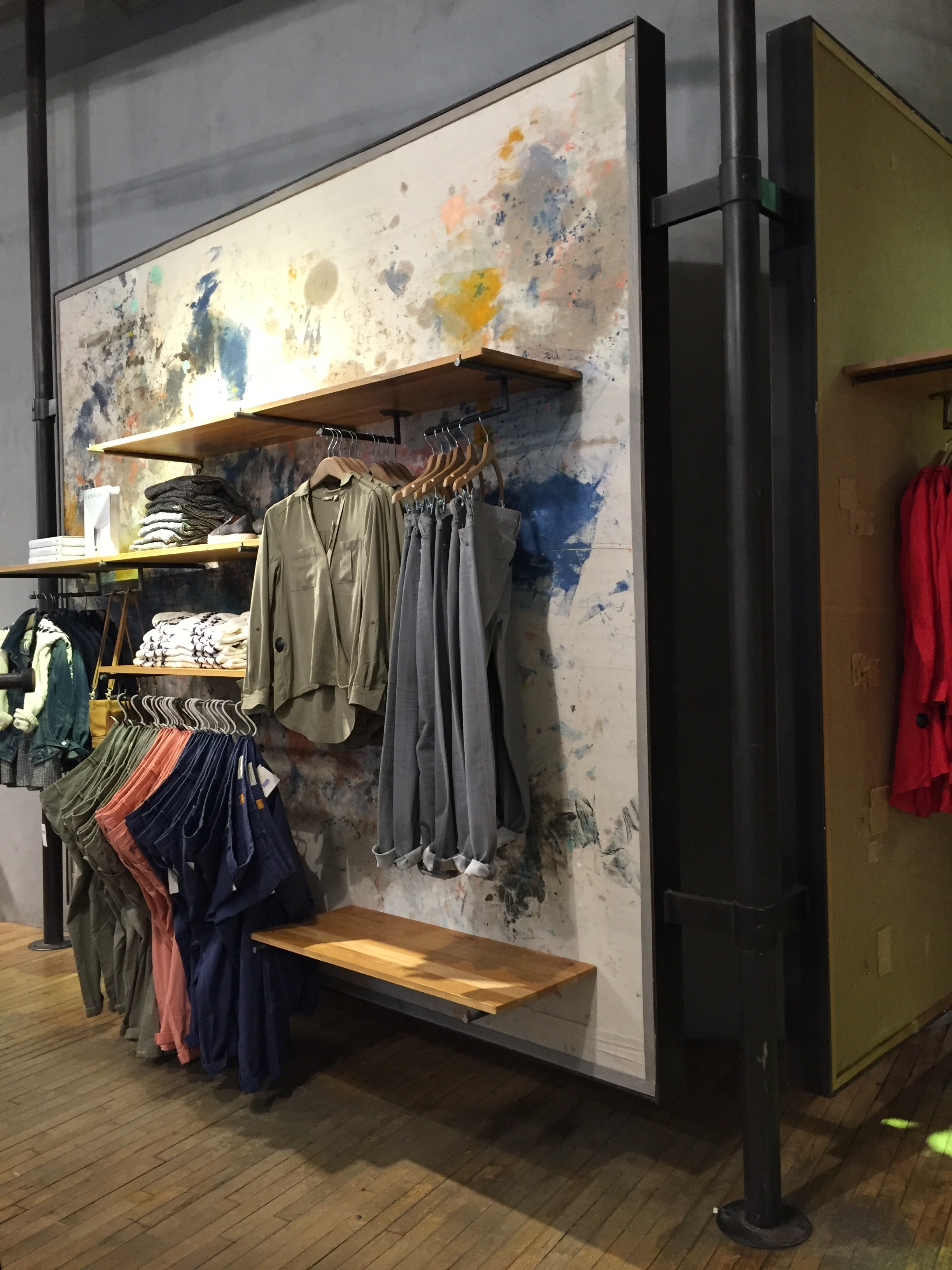 and smaller pipes were used as rods for clothing hangers.
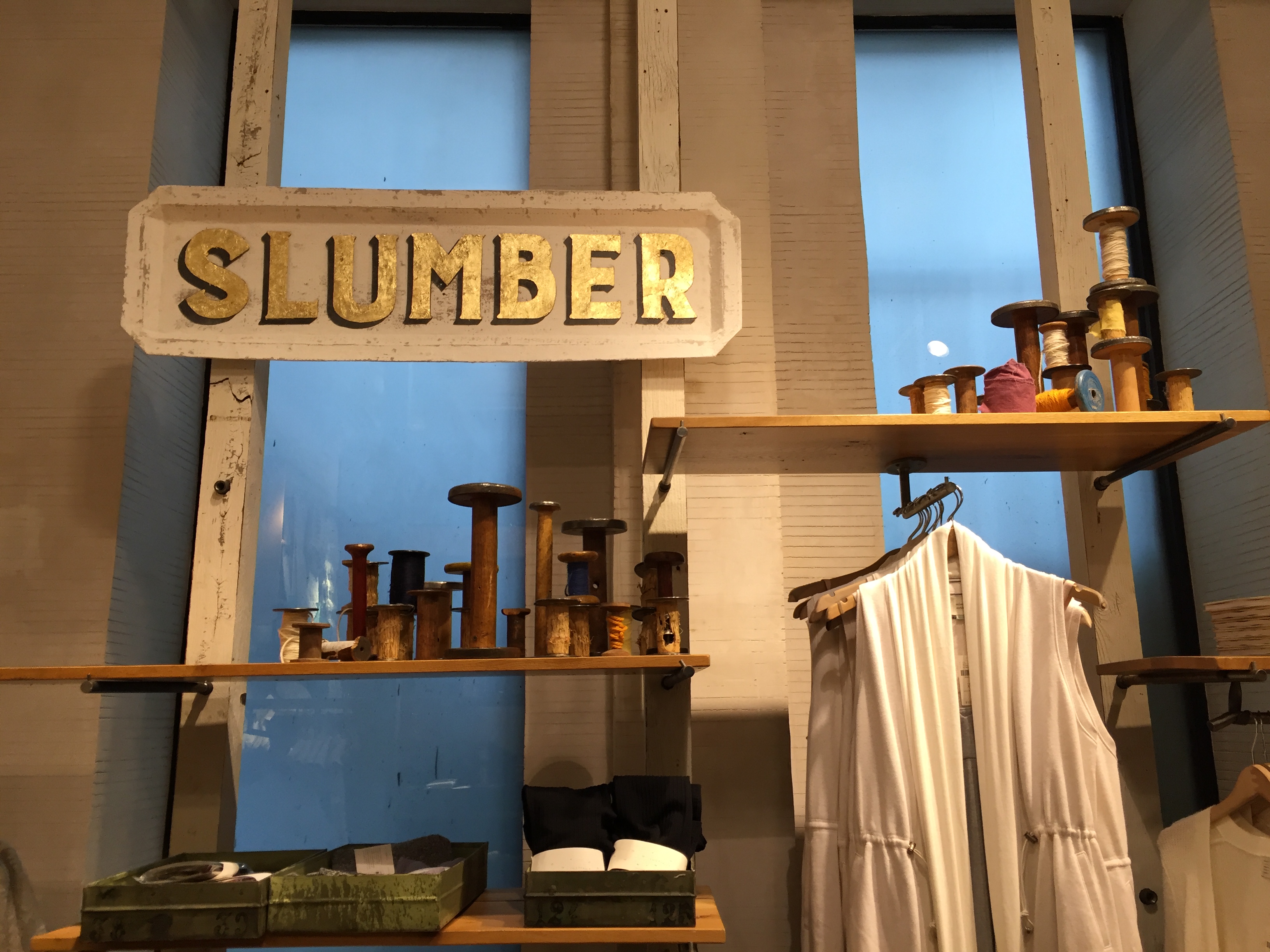 The store had high ceilings and a light pastel color scheme. My favorite part of the store was the bedding section. This area of the store was in it’s own corner, making it seem like an actual bedroom. There were staged windows behind the “bedroom” that added an extra element. The reason I knew these windows were not actually real was because the Anthropologie store building is attached to another store on the side of it, so these windows were just put there for decorative purposes.
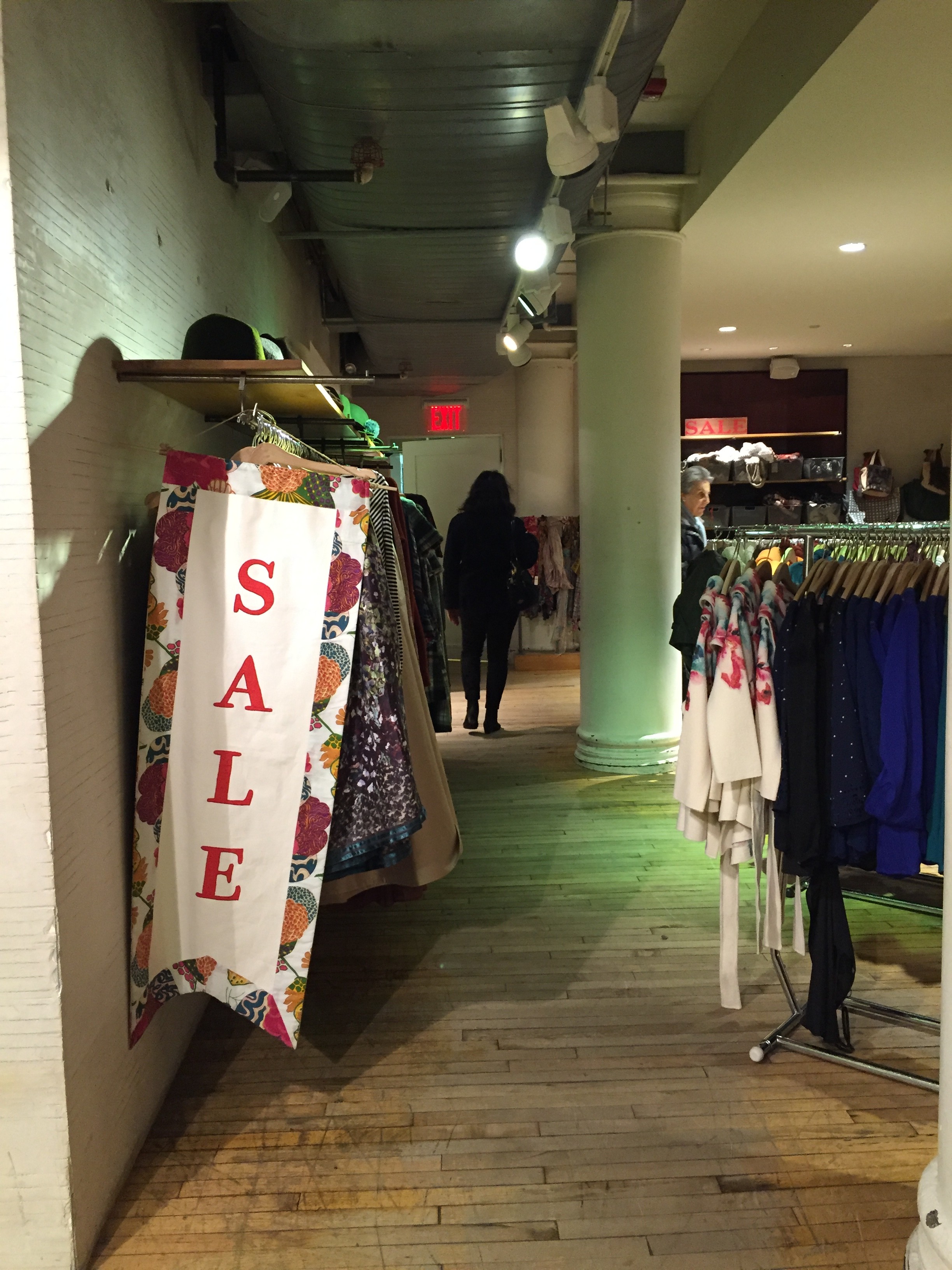
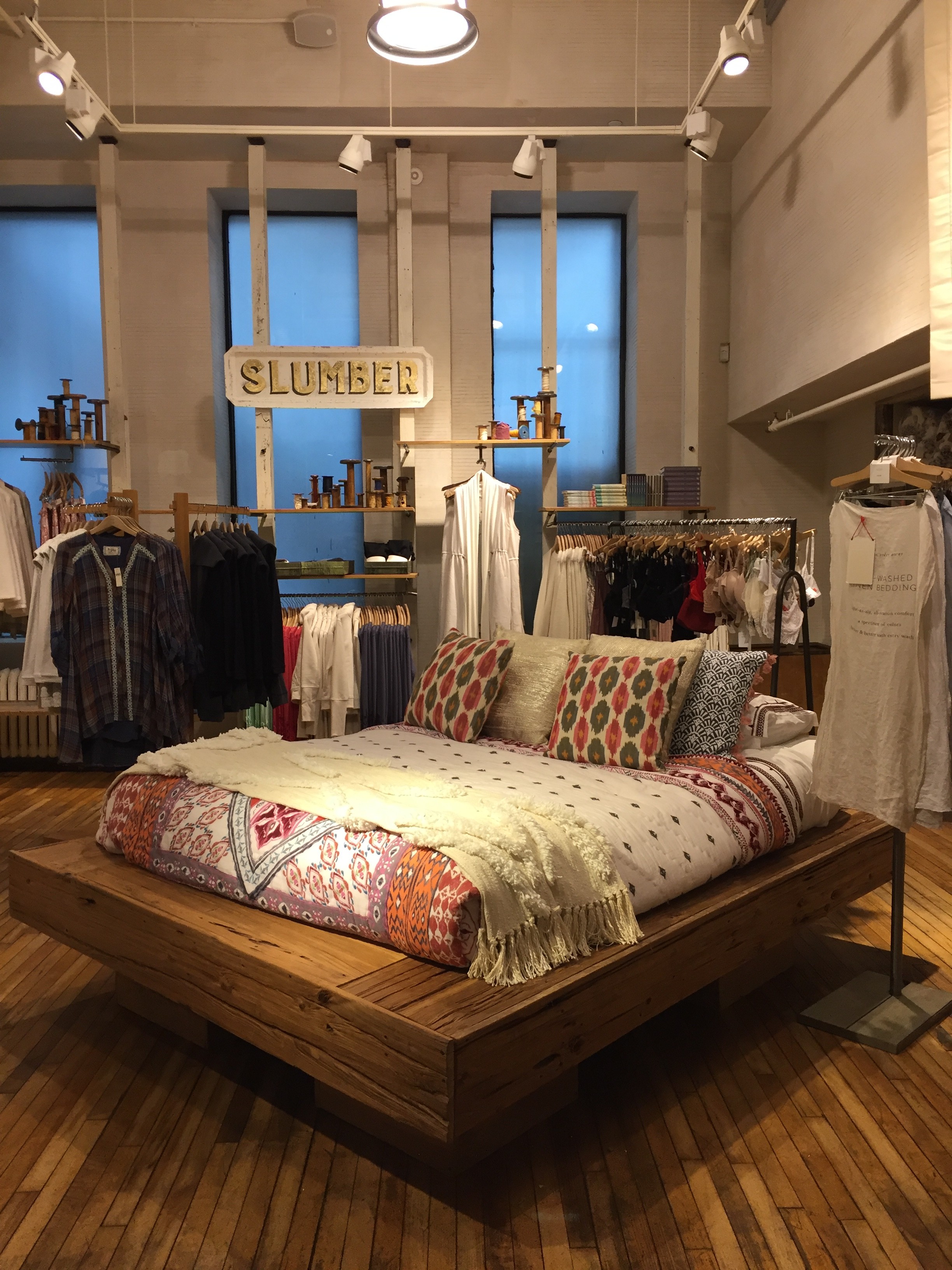 The sale signs at the store were hand painted wood panels as well as stitched banners, both pretty and subtle.
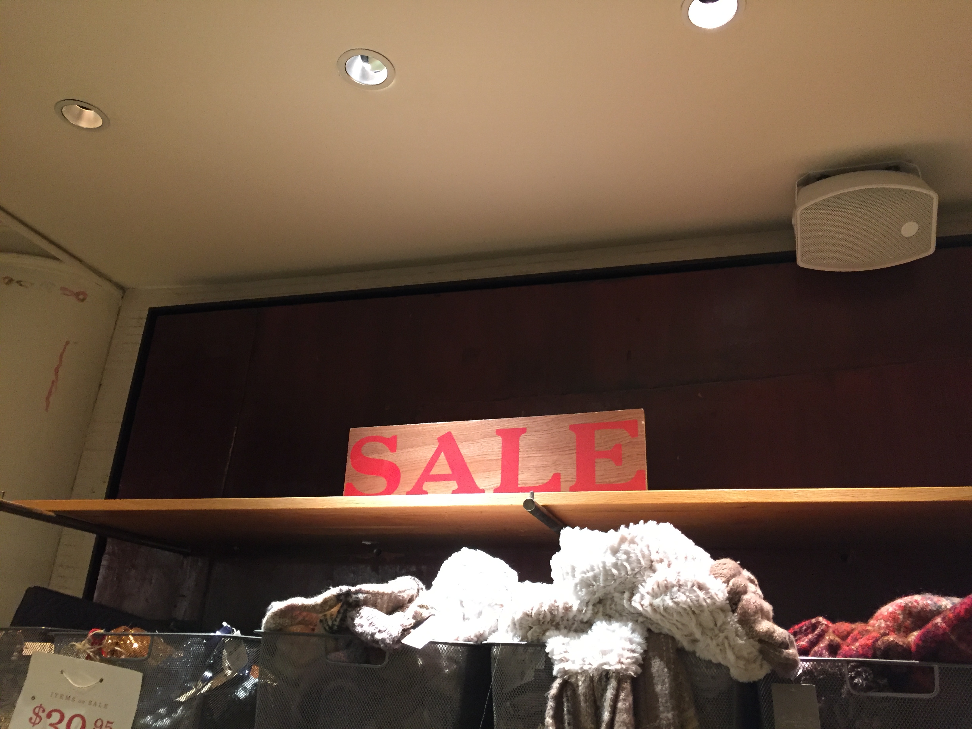
 In contrast, when we walked into the H&M store down the street we were overwhelmed by that bright lights within the store. Everything at H&M was white, the floors, the walls, the lights. There was also an overbearing amount of mirrors and signs. The prices of the items on the racks were smacked left and right, as well as bright red “SALE” signs that were mass printed on the computer.
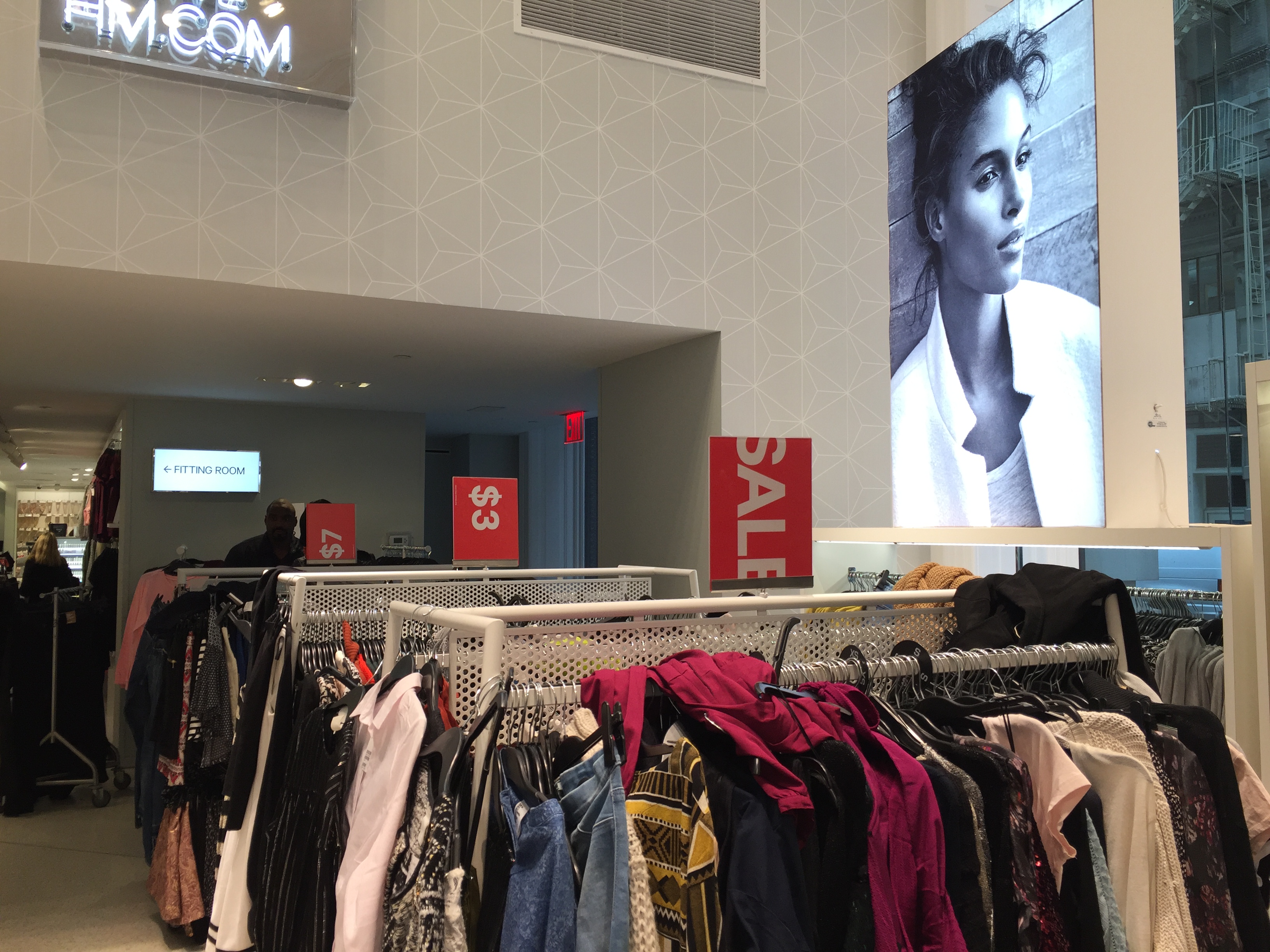 Although these signs were very useful in attracting customers to the discounts, it was a bit much. There were also large posters of models throughout the store, however, they were hardly advertising the clothing; most of the pictures were portraits of their faces.
 These posters were all over the back of the cash registers, which I thought was an odd placement.
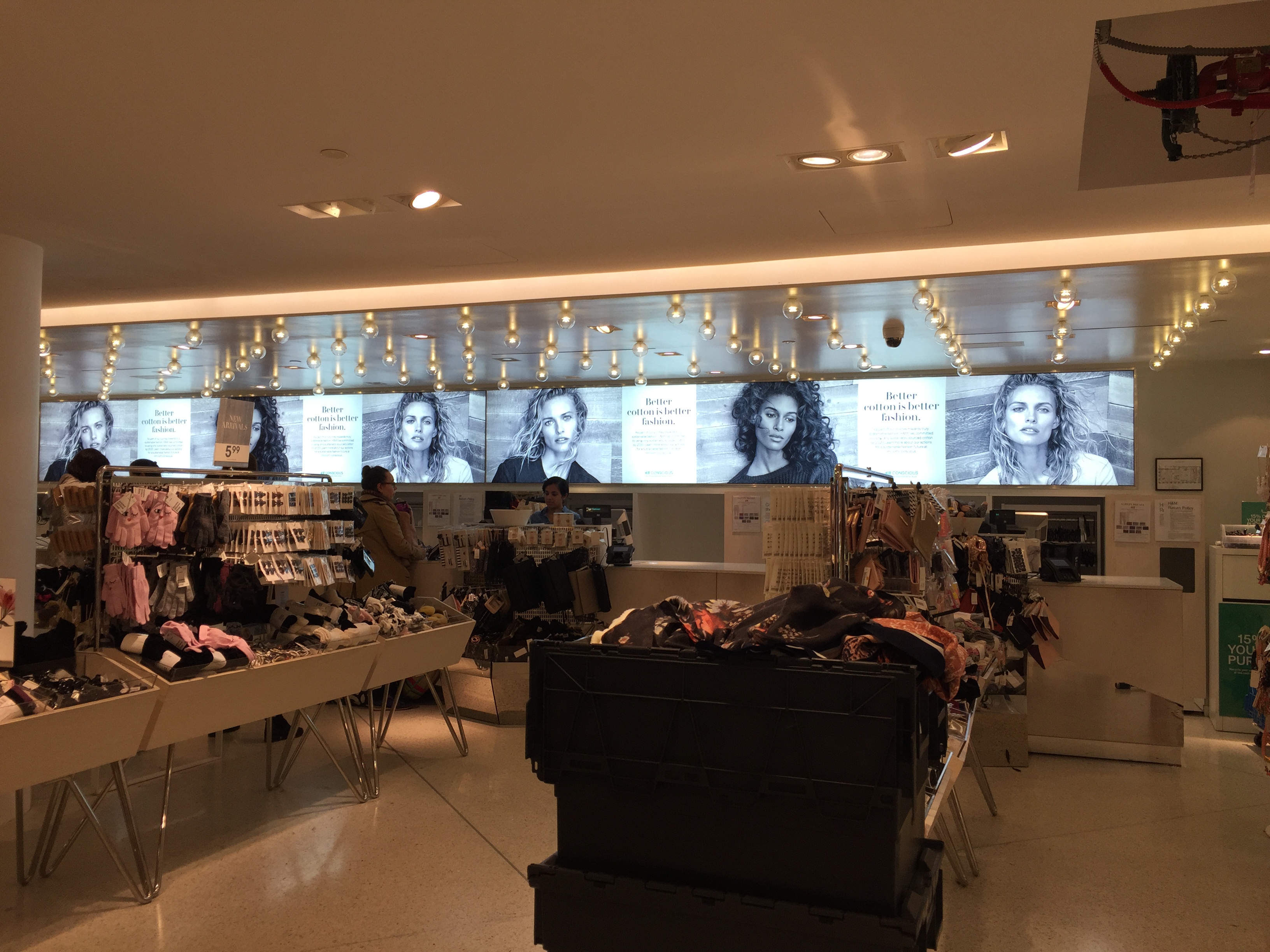 We noticed that the cash registers were all the way in the back of the store, a great technique to get people to walk through the entire store before making their purchases. The music in the store was very loud and upbeat. There were elevators to get to the other levels of the store as well as stairs.
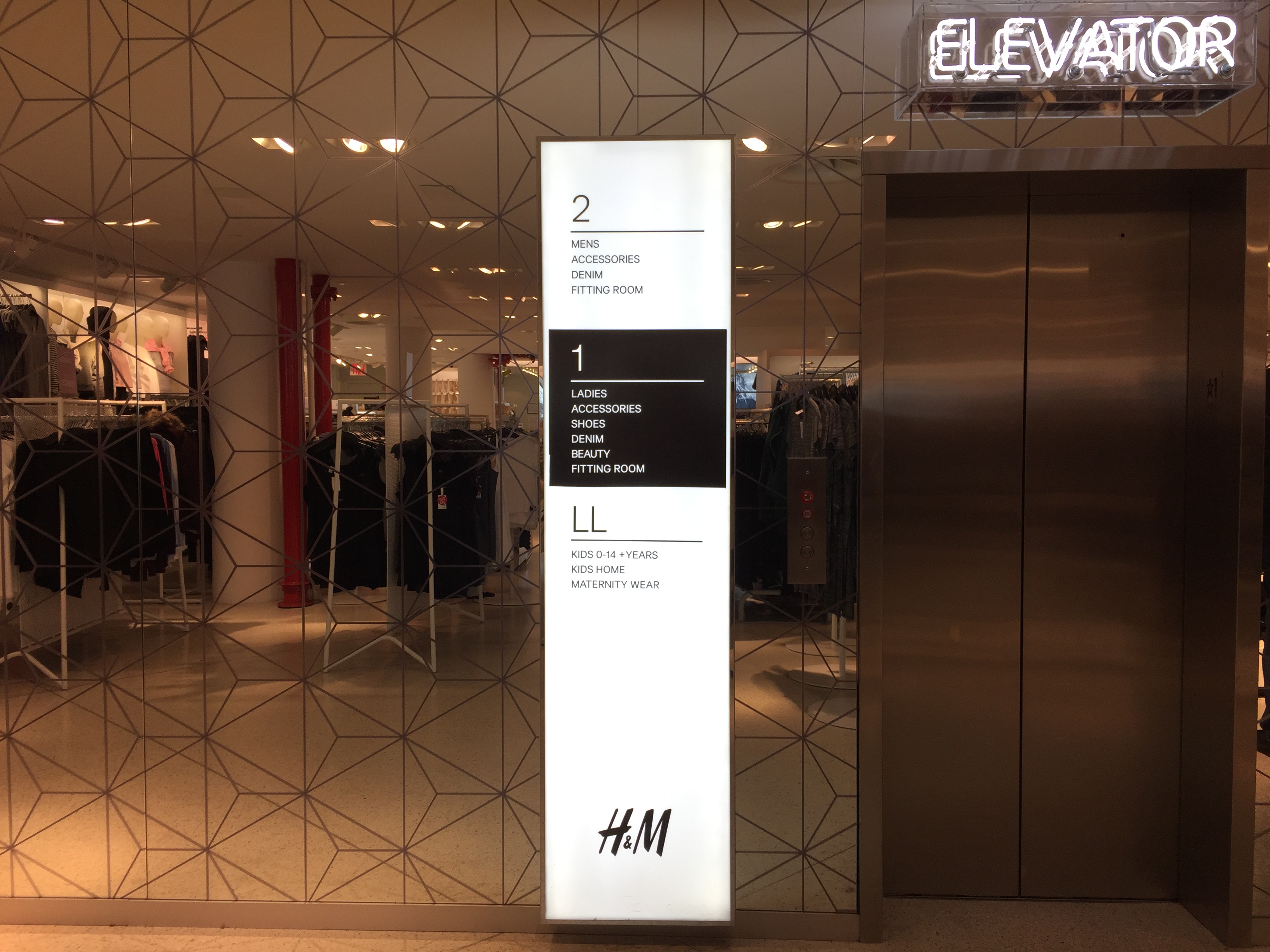 Adjacent to the stairs was a large light box with words indicating what each floor consisted of: Women’s clothing, Men’s clothing, Kid’s clothing, Accessories, etc.
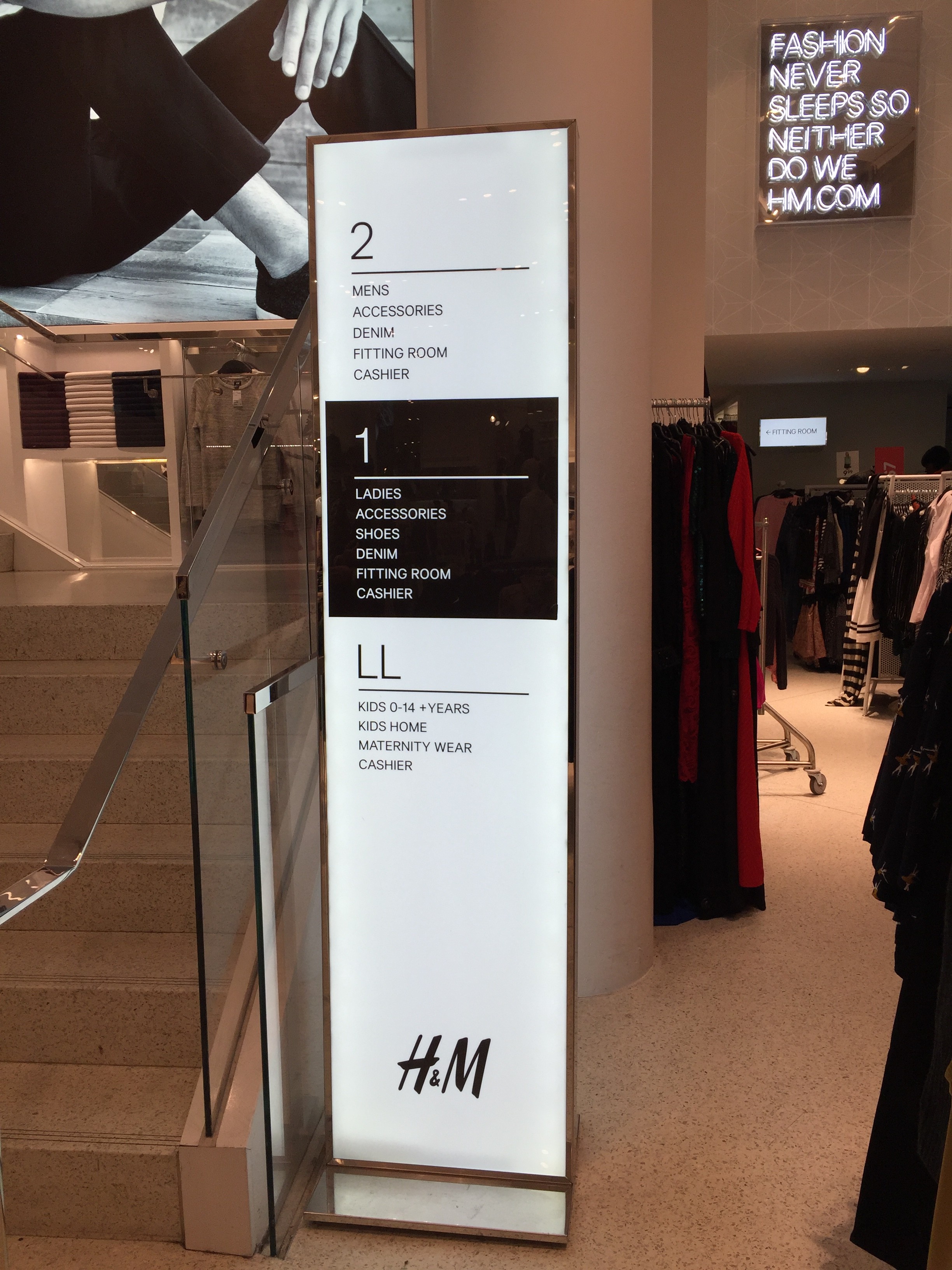 Ironic enough, with everything in the store being white, giving off a bright and clean ambiance, the floors were anything but bright and clean. The floors were in obvious need of cleaning.
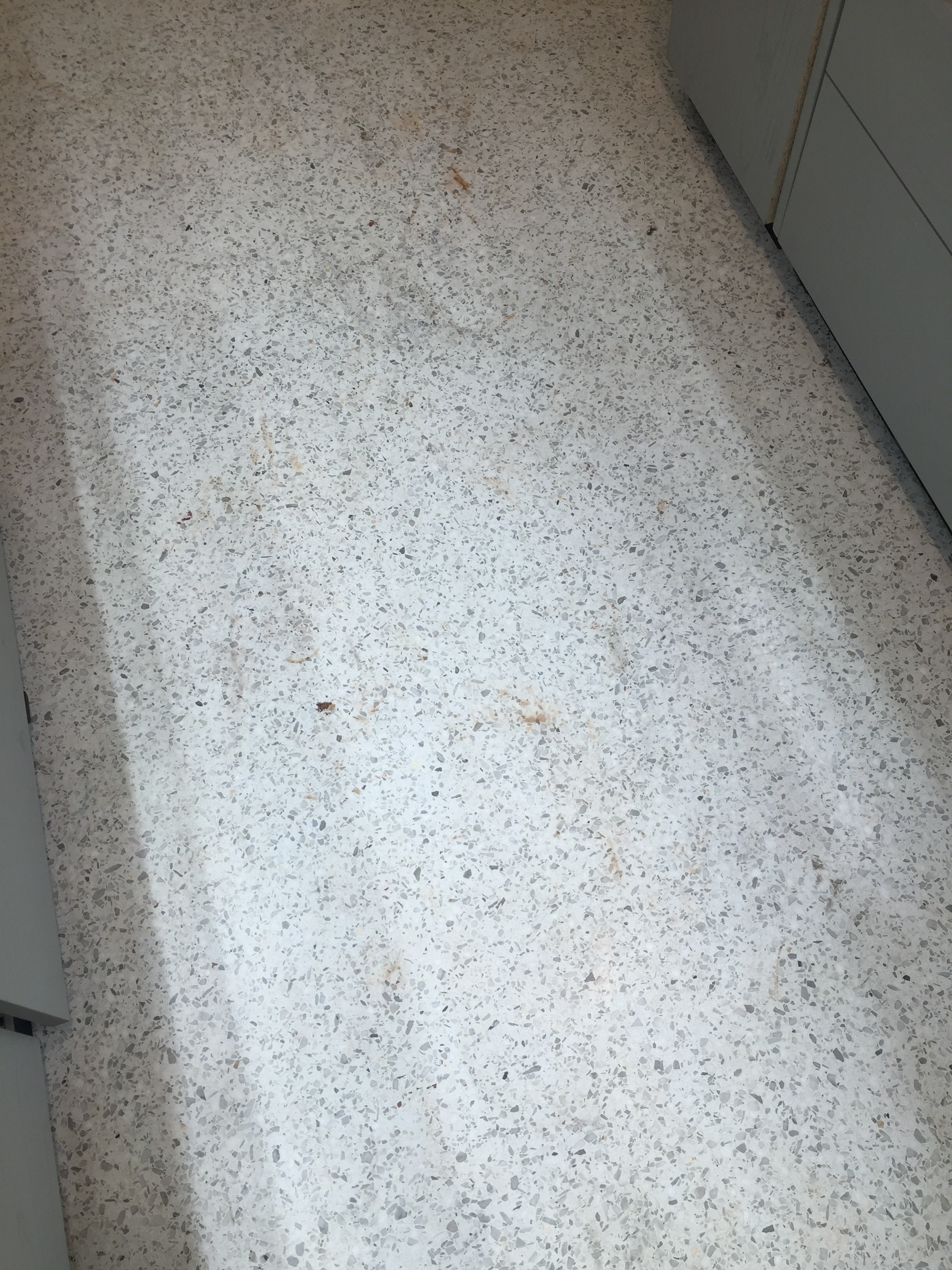 Sarah and I found ourselves out the door, spending a far less amount of time at H&M than Anthropologie. Anthropologie gave off a very relaxed, homey, vibe and we were able to walk around for a while. Whereas H&M’s obnoxious lighting and booming music made us want to rush through the store and leave.