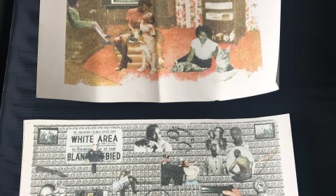
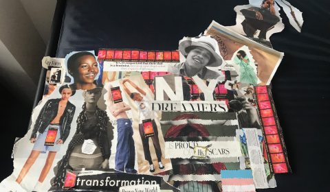
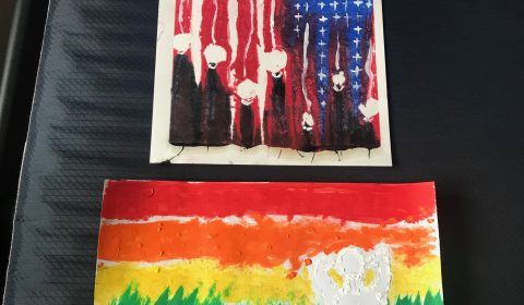
The first image plays host to two solvent transfers, whereas spent time in photoshop coming up with a conceptual idea, then had them print. Next I use critic solv and a rag to transfer my preces on to bristol paper. The on the bottom was just to take a collection of images from during slavery, up until today, alongside popular police brutality weapons and white supremacy, that are used to dehumanized people of color. Not only is the images of from here in America, there are also some from Africa, showing how the suffering of people of color, specifically African Americans is a global issue. The repetitive background reads ‘Stop Police Terror’ and comes from a series of photos Margaret Bourke-White to produce to explain apartheid to Americans during the 70’s. The transfer above that one, is centered around the idea of African Americans understanding their oppression, but still trying to living a happy normal life, building a secure family. The tv is quite small, but if one looks closely, they could see the first transfer as if it was showing on tv like a show or commercial. In the second image, is my collage. This piece was more personal than the first, being that it’s locus is surrounding my gender identity. I swiped images from several popular fashion and lifestyle magazines and created a masterpiece. Most of the images compose of body parts, or figures who came across as somewhat masculine to me, or held masculine features I want to possess. There are also several words and phrases scattered around the piece, emphasise the point of where I am currently at in my transitioning journey. In the final image, there is one painting with a rainbow, representing the lgbtqa+ community with a figure identify as male, representing myself. The Male figure however, is outlined in white dabs on acrylic paint, as compared to how the colors of the rainbow are vastly spread out in there respective spaces in all different layouts. The other painting above is a combined piece of monoprinting, then finished of with acrylic paint. The monoprint originally came out completely messed up compared to what I ad planned, however, it told it’s own story. The basic American flag, all thirteen red and white stripes, along side the blue box in the corner. At the end of each red stripe, there laid a blackness oozing down the page, with a white circle placed above, representing African Americans. After that base dried, a few days later, I painted white lines connection the top of each red stripe, to the necks of the people. While in the blue area, I painted white crosse that melted into the lynching party on the bottom left of the page. Signaling a metaphor for how African Americans were never free or protected but the so call government for the people.
I hate to sound cliche, but my inspiration derives from the world around me. I was able to find my found his passion and voice at a young age through his own personal struggles, alongside being quite observant of my surroundings.
Coming to the realization the other day, most of the work I produce revolves around the concept of identity. I create with a mission and message, producing works with themes demanding attention exploring and analyzing the ideology, controversies and misconceptions surrounding the term “identity.”
I wanted to try and stay away from my typical medium, still and motion pictures. For the transfers, I used critic solv and bristol paper, because from what I learned in my time class, Critic solv is less harmful to the body, compared to other cleaning products that could be used, alongside it smelling like critius. Bristol paper is the only paper I have, plus its a durable paper for transfering images using liquid. For the college, I used cardboard paper, a glue stick, scissors, my hands and magazine pieces. I’ve been wanting to do paper collages since I was younger, just never really found the time or reason too. I specifically used a glue stick, instead of tape or liquid glue so there were little to no bulges disturbing the artwork. As for cutting, I didn’t use a regular straight edge scissor, I used one’s with curves and when I wanted a different cut, I used my hands to just rip the pieces, giving it a more gritty feel. Also, there in one occasion where I used a sharpie to cross of the word her and replace it with his. As for the last two, I choose acrylic paint over watercolor for a simple fact, I wanted to bring texture to the pieces.
I source different visual cues from the world and try to incorporate them into my art. Depending on what’s going on in my head, what I am seeing and what I want to communicate usually starts the process off. From there, I will either just start throwing things together and see where it takes me, look at out artworks for inspiration, or create mood board to help me physically see what’s manifesting in my mind.
This work fits into my growth and development, because it helped me to see what overall topics I was leaning to in my art. Help guide me to officially saying my work is focused around identity.
I think my works relates to other artist because a handful of people of color are trying to make impact statements now a days, instead of just producing art for the culture of fashion, compared to what I’m used to seeing. They are trying to use their talent to bring awareness and change to society.