The visit to the Society of Illustrators , right after the sketching and illustration assignment at Rockefeller Centre helped us to don different hats and look at the same visuals, scenes, images, themes and concepts from the point of view of an art director and not just an illustrator. By this I mean, that while the visit to Rockefeller Centre helped us come up with raw content for our next Bridge Project, and pushed us to think about the narratives, concepts and themes that a set of visuals could convey by framing them in a sequence or order to create the short film, the Society of Illustrators, helped me notice the nuances of sophisticated, and cleverly planned presentation of illustrations and idea and how it could be manipulated t frame an opinion in the minds of the viewer. The way things were arranges, the order and colours chosen ,I realized were a deliberately picked to convey an idea, and help the viewer come up with i on his own, after seeing the work put up.
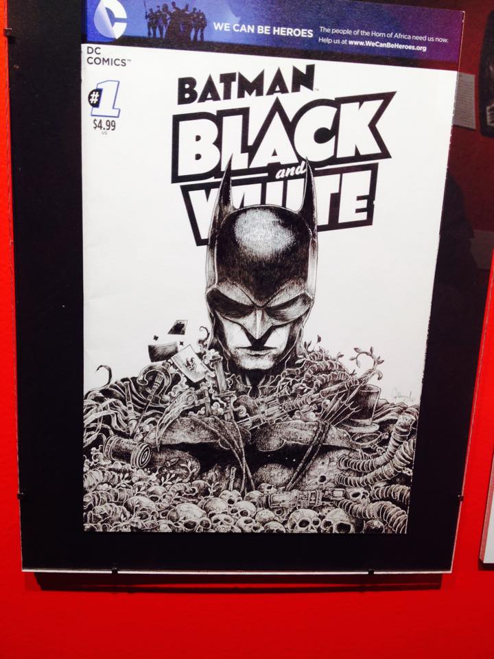
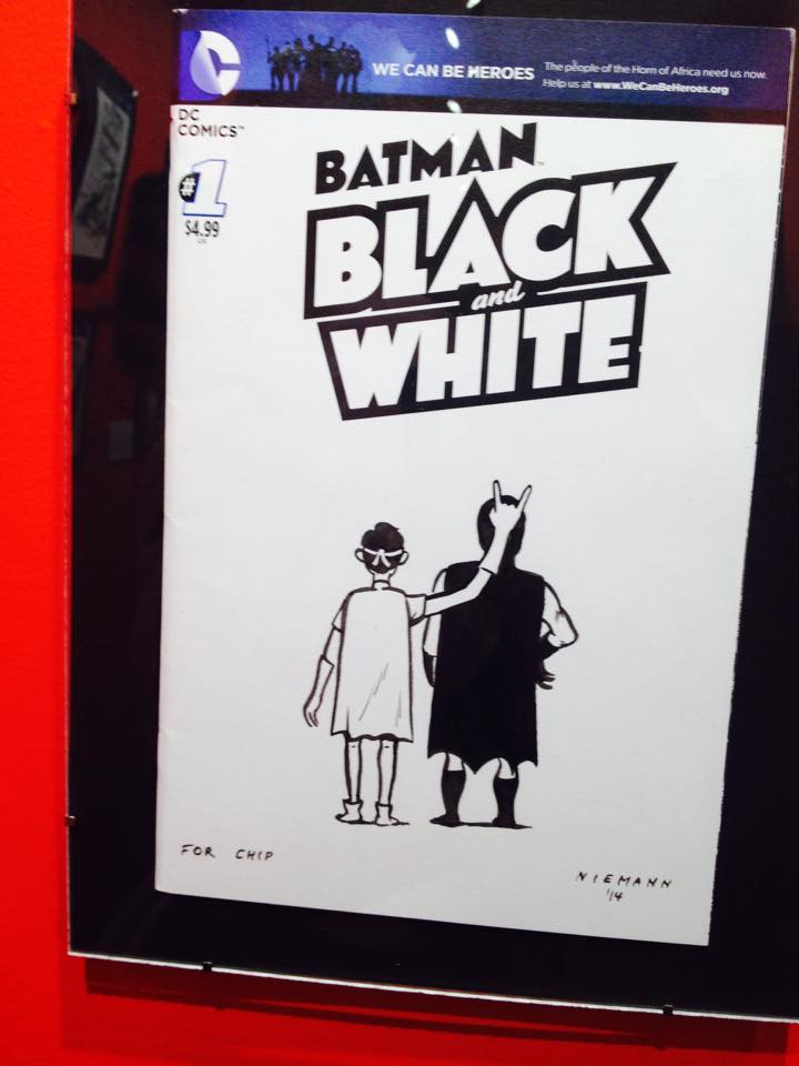
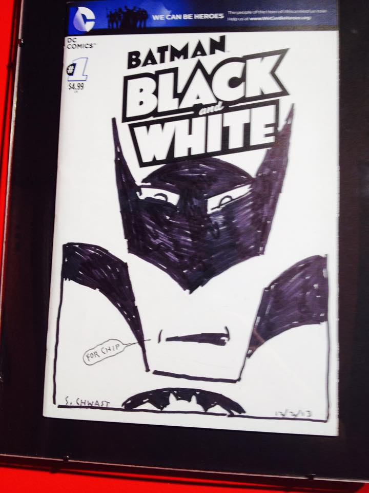
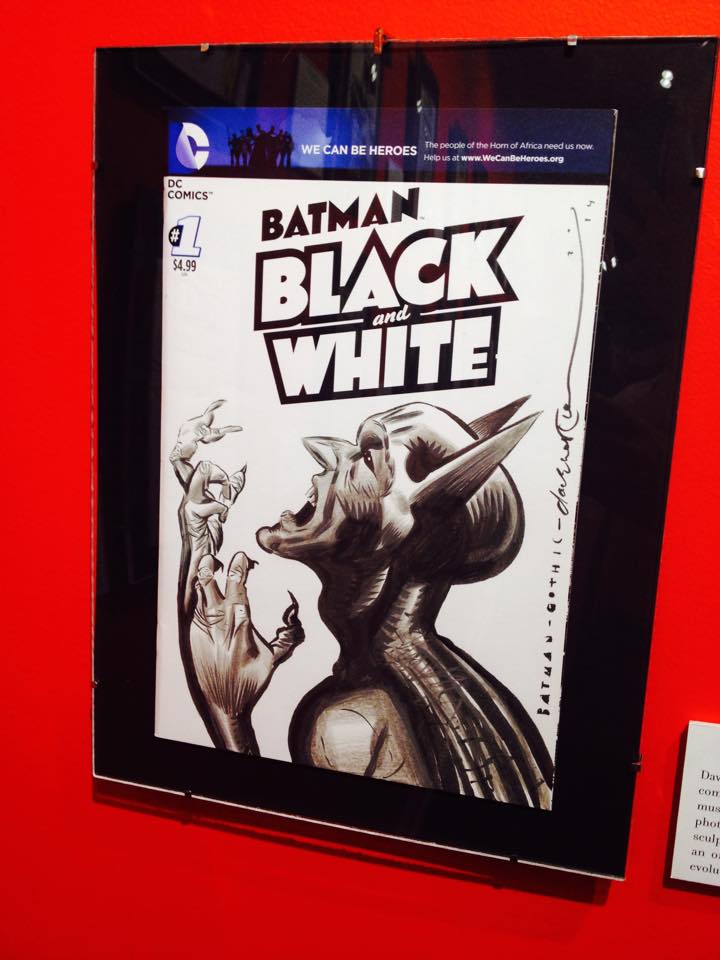
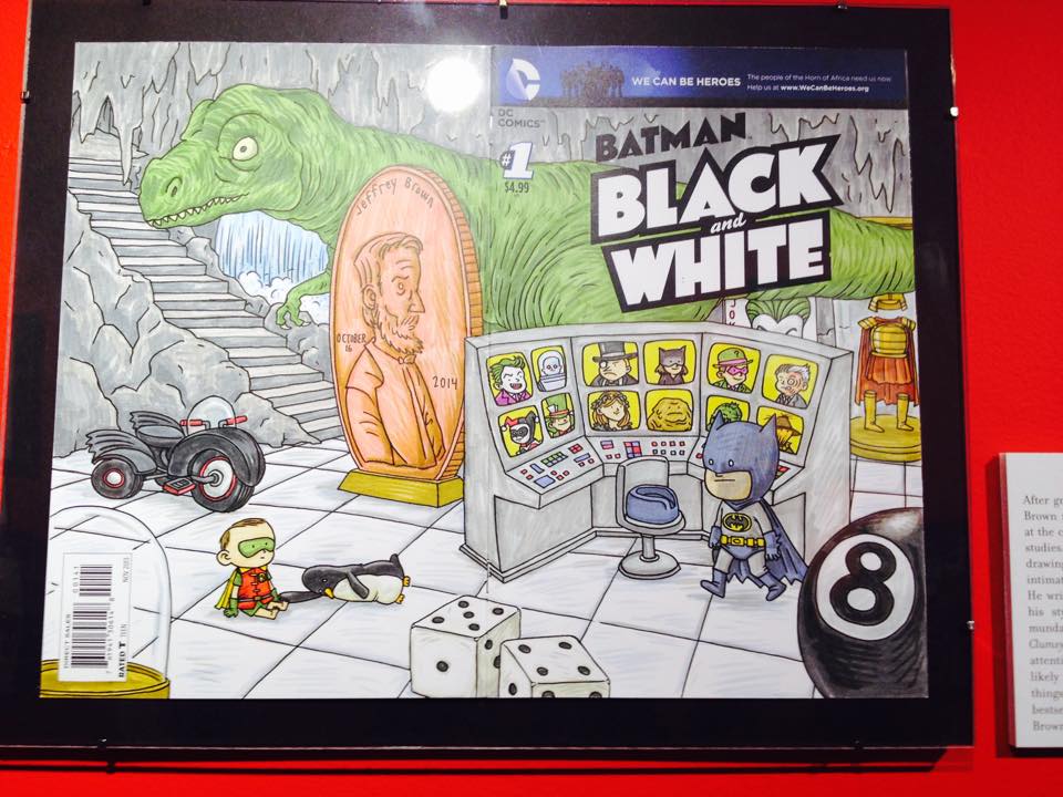
The first floor of the museum consisted primarily of an exhibit depicting Batman comic book cover illustrations done by different artists and illustrators, in their own style and depicting their own perspective, on the blank cover spread, compiled together by Chip Kidd, who is famous for his extraordinarily brilliant comic book covers. I am a huge fan of is work. I had no idea that he was exhibiting his work in the Society of Illustrators and that made a the visit all the more exciting.
The colours used in the entire Batman exhibit on the first floor are red,white and black. The colours help set the fun, active and dynamic theme of the exhibit and batman comic books, and also helps mark the extent of the exhibit, as it lets you know where it starts and ends. The selection of the three colours helps us focus on the work. Museums usually choose neutral colours to go on walls. Using red, gives the exhibit a pop artsy feel, that is often associated with comics, and goes with the colours of the Society of Illustrators. Red works in this case because it makes the exhibit more vibrant and allows Chip Kidd’s fun and fabulous personality to seep into the exhibit, allowing it to tie together the perspectives of the various artists whose illustrations are showcased in the work.
The bold black frames capture the viewer’s attention and focus it in the area inside the frame, without the viewer realizing it, unless he or she actually stops to consider and speculate over the way the art manipulates the path of his or her gaze. The concept of using a narrow corridor and not a spacious room to exhibit art, is also extremely intriguing and exciting, and it works because it gives the audience, the feeling of being completely enclosed in the art work. All those comic book visuals, so close to you face, especially if there is a small crowd in the corridor, make you feel like you are inside the art work.
I almost felt like the corridor was a giant comic book surrounding me. The experience was similar to the one you get when you open comic book and hold it close to your face to read the dialogues in fine print and view the illustrations in every frame of the page. The black frames surrounding the illustration pieces, reminded me of the black borders of the frames that divide the scenes n every page of the comic book.
Another fascinating new thing i learnt during the visit was that, an illustrator while illustrating with black ink, or felt tip, or gel, or micron pens, may make a rough sketch using blue ball point pens, since the blue ball point pen marks do not show up on the scanned copy. This is a genius idea and I cannot wait to integrate it into my process of making illustrations. I really enjoy working with pens over pencils and often draw out my illustrations directly with pens, which is why I had resigned myself to the idea that I have to be perfect with each line on paper. But this is a revolutionary realizations. It will really help take the pressure off while I am working.
The ground floor and the level under it displayed artwork in the traditional art gallery fashion, and the display included a large expanse of a room with white walls and artwork put up. What intrigued me is that instead of simply having wall text under the framed original illustration, the gallery had also put up the illustration in its print form, and also in the context that it was created for. Thus the museum provided a brief summary of the artist, his interests, ideas and the purpose of the visual created by him, then the original illustration itself, accompanied by the printed version of the actual poster, pamphlets,book spreads, or other communication devices and purposes it was created for, in order to accompany, emphasize or explain a text.
Moreover, every illustration, painting and visual that had been put up in these rooms was so much more than just an image. Every visual narrated a clear definite story and showed a well planned and cleverly crafted, complex narrative.Every illustration here embodies that aspect of storytelling and narration, irrespective of how many elements, colours or characters, it consists of.