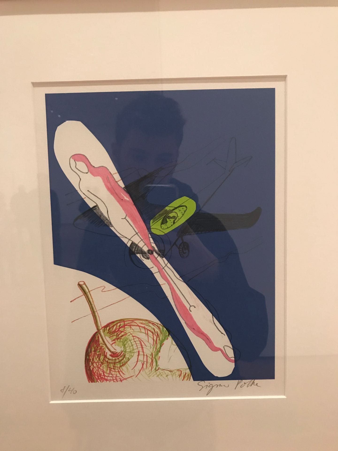
Sigmar Polke – Full Moon in Aries (2004). This print is one out of a series of forty prints. There are several different recognizable objects and forms in this print that compose the greater print. If you look closely you can see there are lines in the background that seem to make up smoke or water vapor in the sky. I think that this reference helps the viewer feel that the plane is in the sky. The woman propellors really come forward as they are lighter and warmer on a darker and cooler background… Overall I think that at first glance there is not a very strong sense of space as the forms are not recognizable as objects, but once you look closer the image is more understandable.
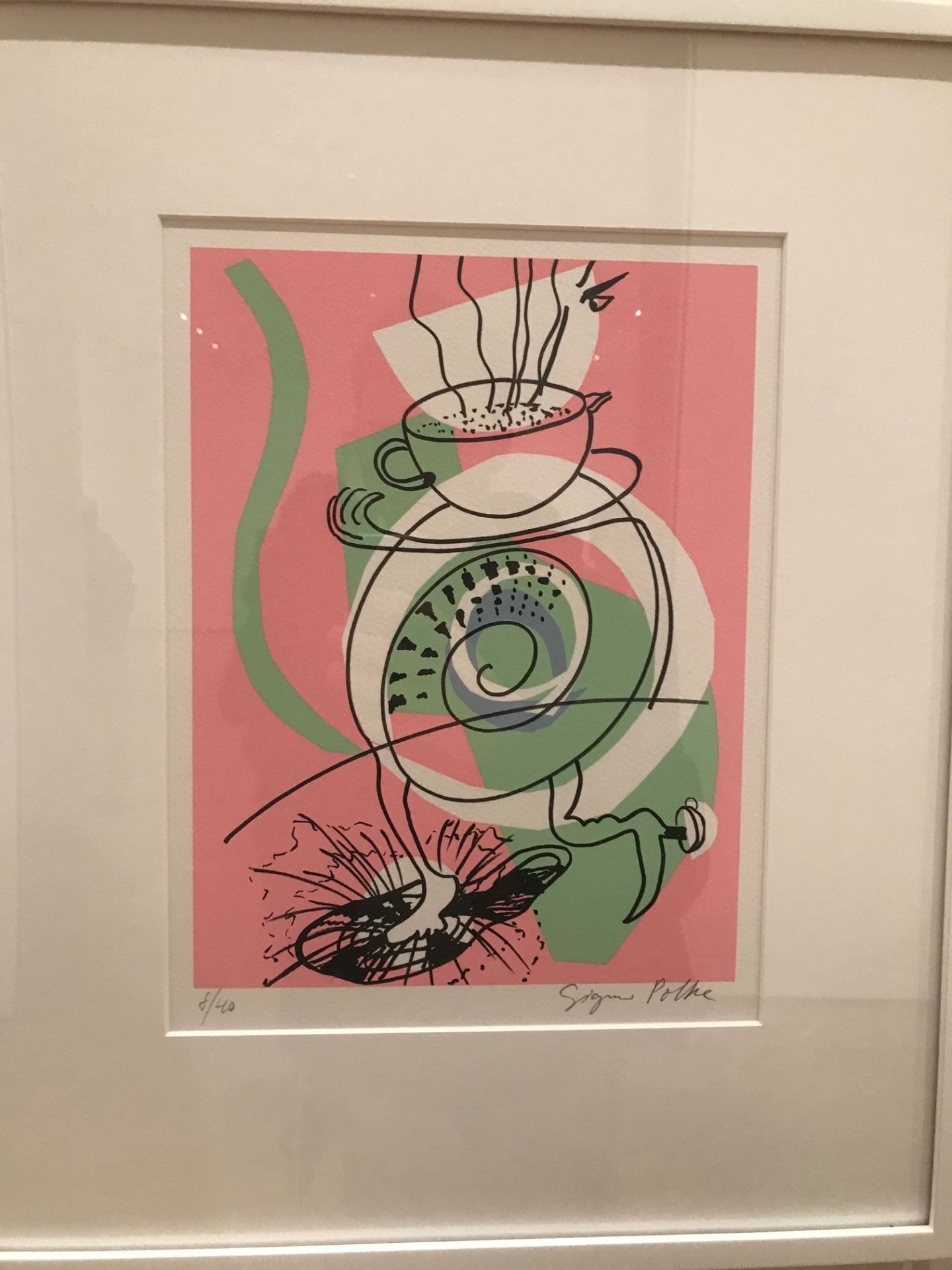
Sigmar Polke – Full Moon in Aries (2004). This print is one out of a series of forty prints. Just like the last print, the scene here is abstract and confusing to the eye at first glance. Actually, at second glance it is still abstract. I think this is because of the shapes layered under the drawing in black. The recognizable shapes do have something to do with each other (they’re kind of food/cafe themed), but they are drawn together that anthropomorphizes the every day objects. The heavy black at the bottom creates a sense of gravity, and the fact that everything besides the drawn form has color helps differentiate foreground from background.
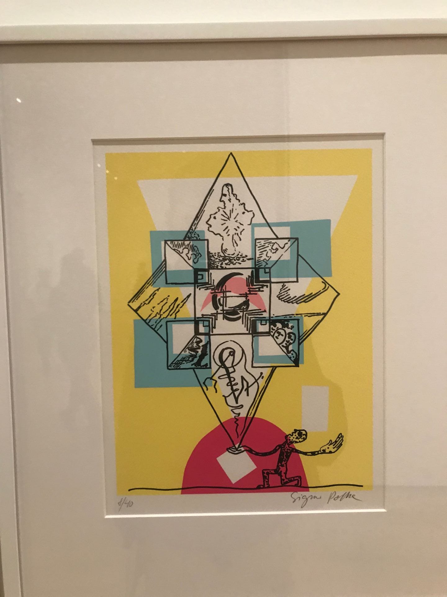
Sigmar Polke – Full Moon in Aries (2004). This print is one out of a series of 40 prints. These prints remind me of a an art project I saw where the artist covered his face with paint, glitter and other materials to break up the shape of his face. The goal was to be unrecognizable to facial recognition software used by facebook. It also reminds me of the dazzle paint that the navy used to use to confuse enemies (the ships were painted with unpredictable textures and patterns and lines with varying directions.) This series has a similar effect as the general shapes in the drawings are exaggerated by the colored shapes placed underneath the line drawings. The red on the bottom of this reminds me of a sunset and creates the feel of a horizon along with the line at the bottom of the image.
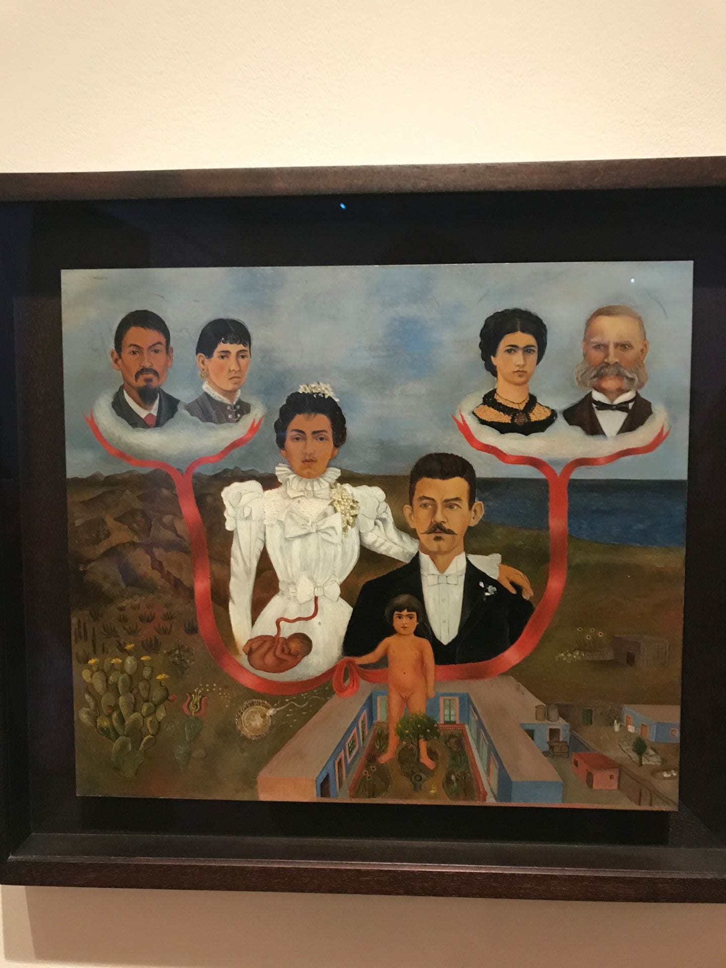
Frida Kahlo – My Grandparents, My Parents, and I, Family Tree (1936)
There are several different planes happening here. It looks almost as if the oceans and mountain in the background are at one angle, and then the building in the bottom part of the painting is coming out at us at a different angle. I think it is because of the way that linear perspective is used in painting the building. This adds to the surreal effect that Kahlo is known for. The space does feel deep though. The horizon line and the use of darker, cooler colors behind the figures and above the warmer browns creates this sense of depth.

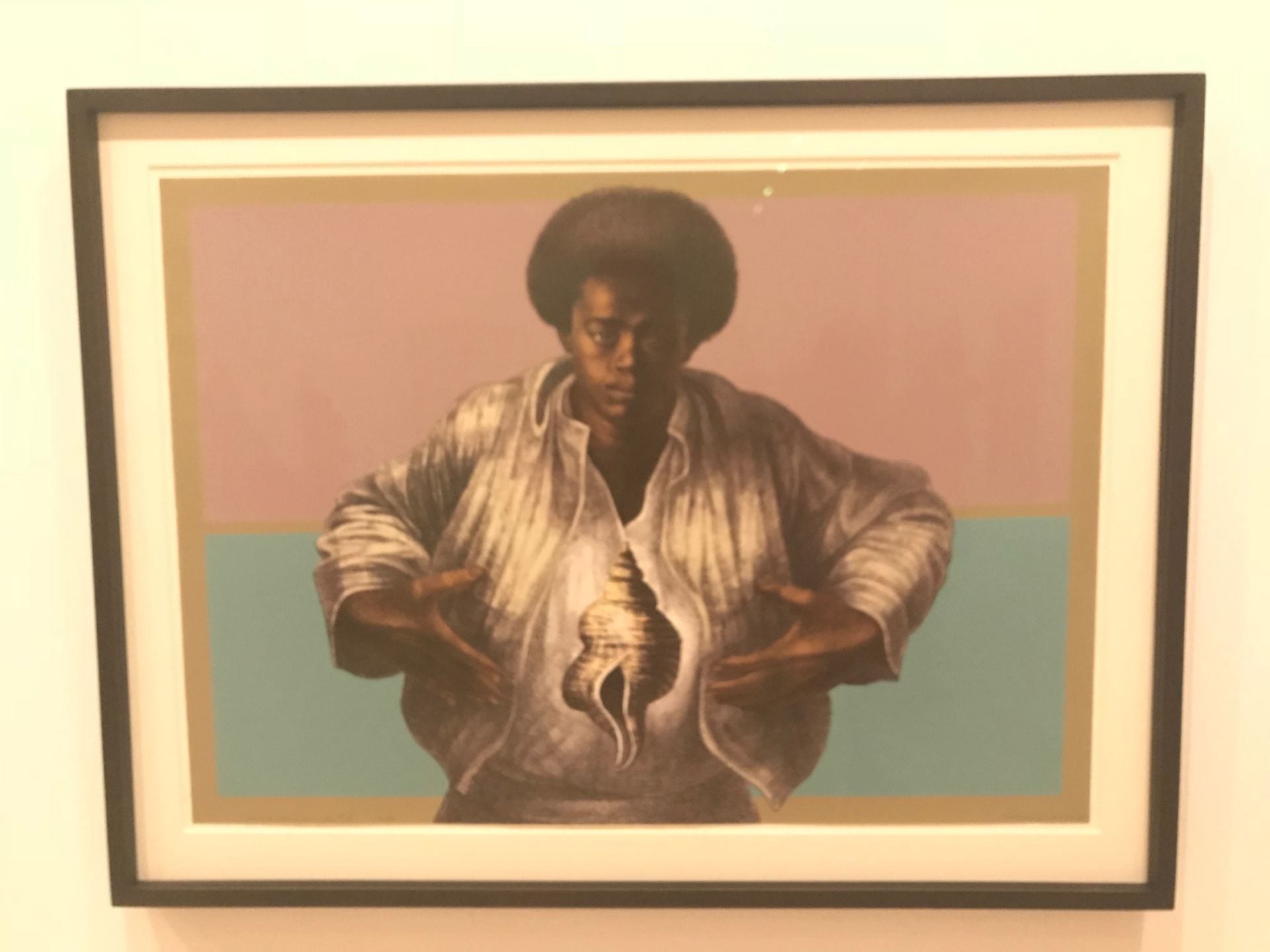
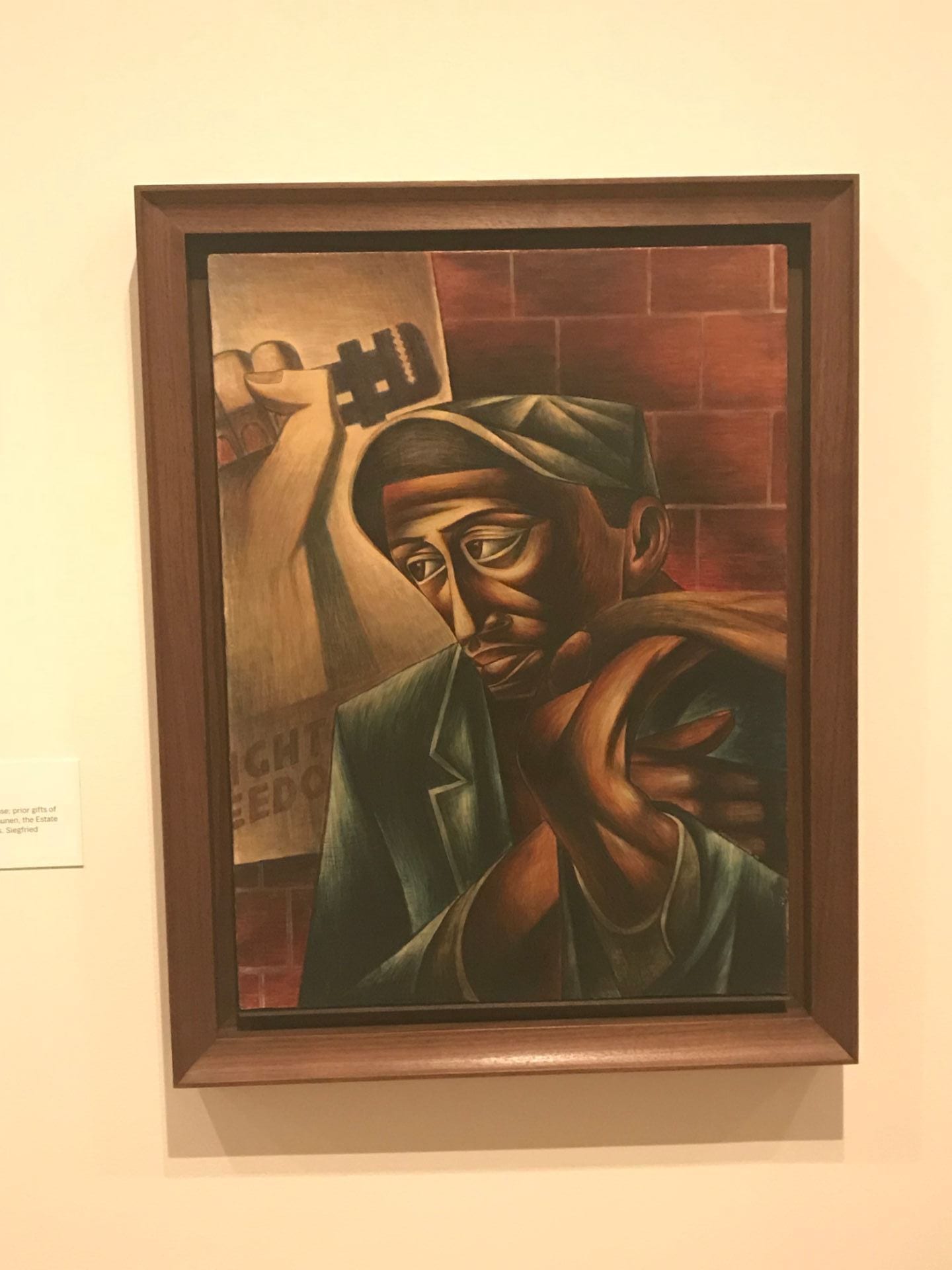
Charles White – Love Letter #1 (1971)
In this image I can almost see the square shape in the bottom two thirds of the image as a table with a rose on it, and figure is looking at it from the ground. It feels very flat if this is the case as the lines of this table are parallel with the frame of the image. The gradient from light in the center to dark on the edges all throughout the image further convinces me that the “table” shares the same three dimensional space as the woman above (she has the same light coming out from behind her, and it casts onto the table).

Piet Mondrian – Graphic Print (1930 – 40)
The space in the center of this print with no color is bordered by a sprinkling of rectangles with color in them. I think this image feels relatively static, as all lines are perpendicular, and the rectangles created are relatively predictable. However the brightest, warmest colors (red and white) pop out the most, and the darkest/coolest blues/blacks recede more. The misalignment of two black lines in the lower left hand corner makes a little more depth possibly by having one white rectangle be bigger than the other. The yellow in the upper left hand corner draws the eye upwards and creates a sense of verticality.
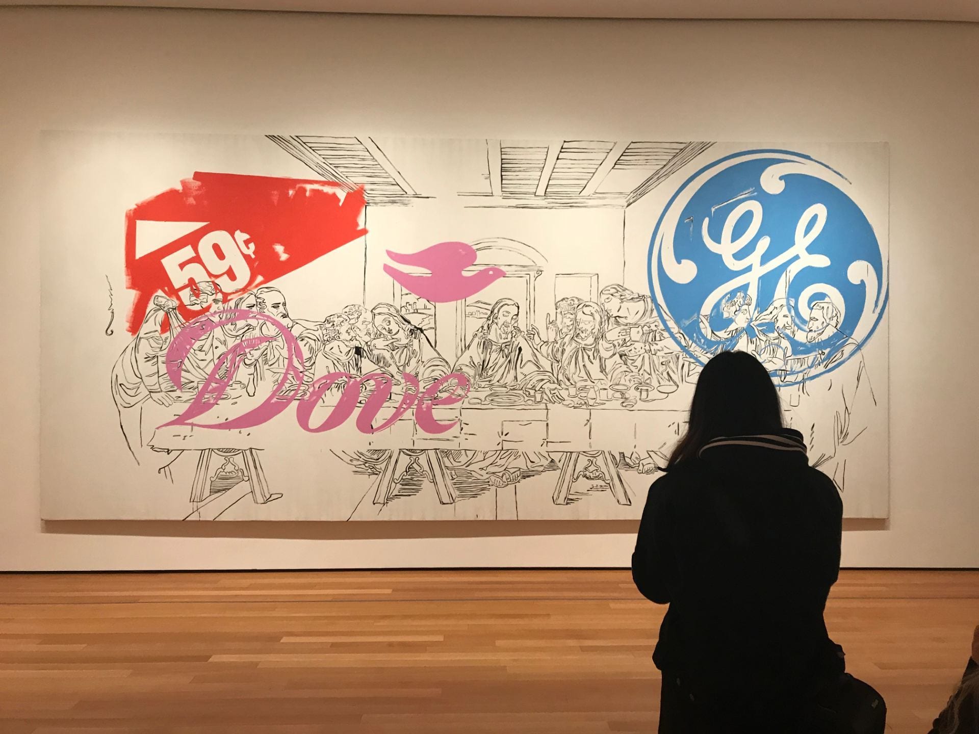
Andy Warhol – The Last Supper (1986)
This image is almost a “remix” of the original last supper by Da Vinci from 1498. The space is entirely defined by line and some shading on the ceiling and underneath the figures around the table. Linear perspective is used throughout but most noticeably to create the ceiling, walls and floorboards. The red, pink and blue logos do not do a ton for definition of the space, in fact they kind of flatten the whole thing out by going right over the figures seated at the table.
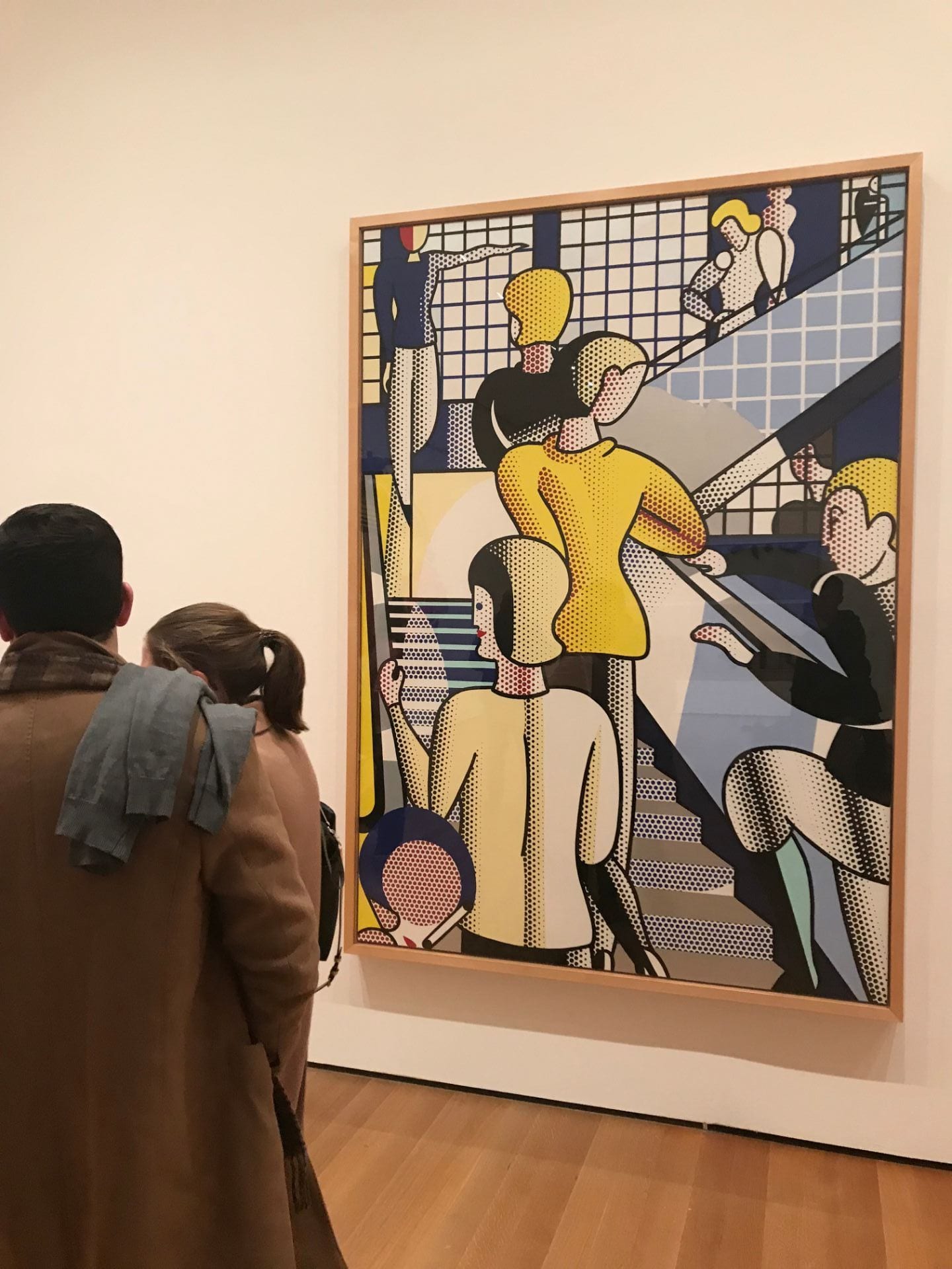
Bauhaus Stairway – Roy Lichtenstein (1988)
I should start by saying that this is an interpretation of Bauhaus Stairway by Oskar Schlemmer from 1932. So, much of what Lichtenstein did in this painting (I think it would be called a painting? It made with oil paint but it still could be printed with oil paint, right?) to create a sense of space was copied from Schlemmer. Structural things, like the shapes that make up the stairways, and the positioning of the white squares behind the figures that make us think of windows. I guess what Lichtenstein did that was original to create space was put gradients of large, tight dots together and small loose dots to create shadows.

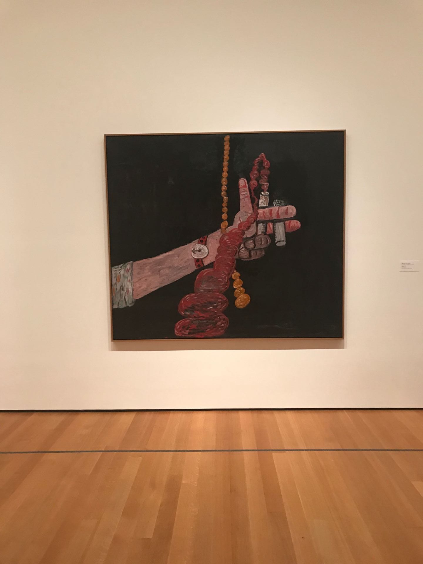
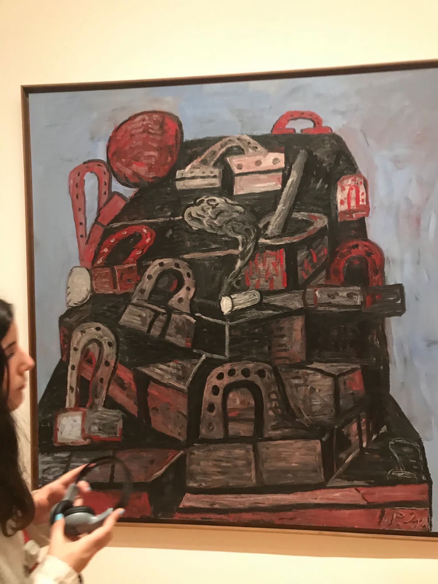
Philip Guston – Source (Oil on canvas 1976)

My Notes and Sketches


Other Pictures I Took of 2D Works