My Locations
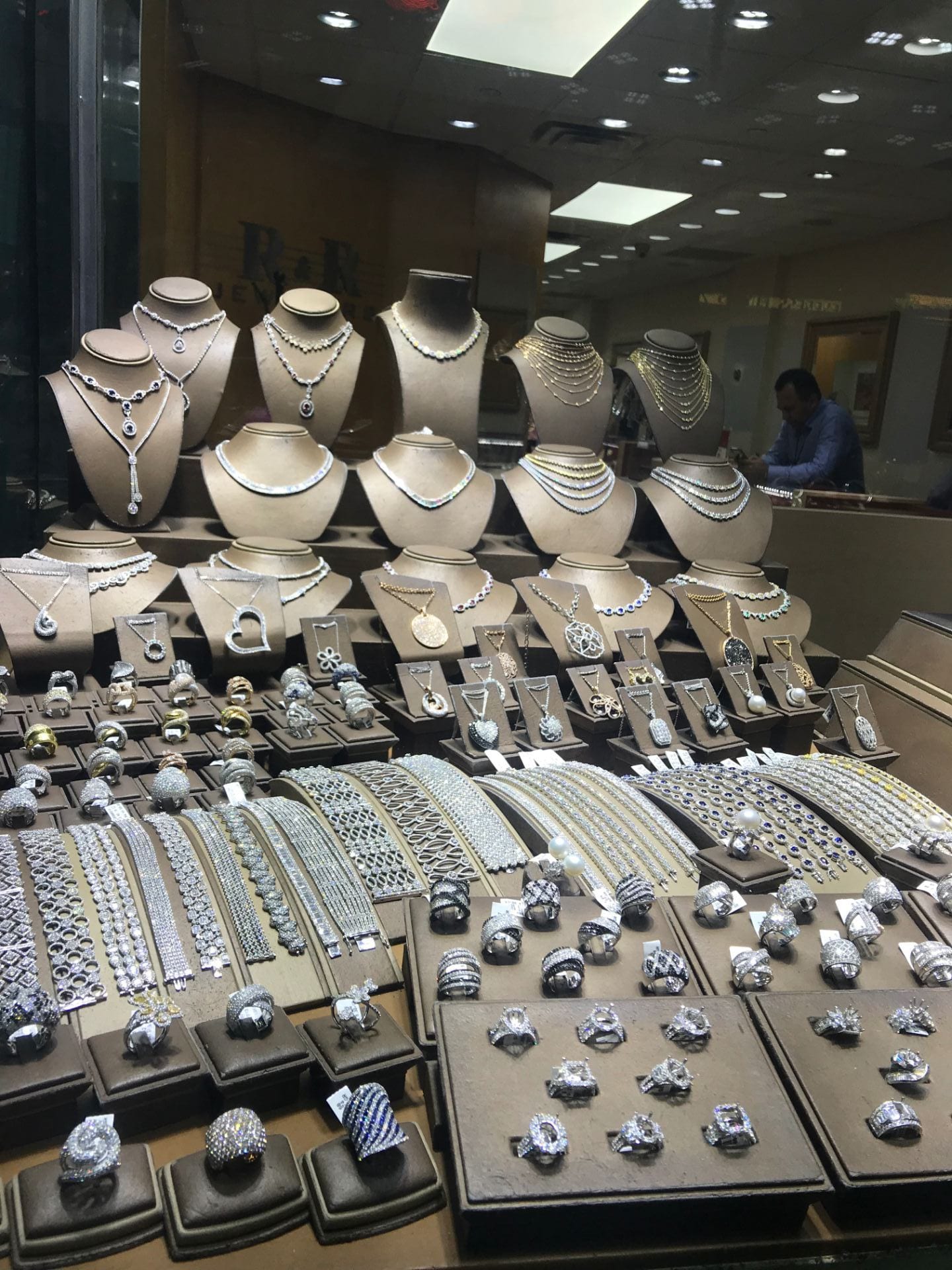
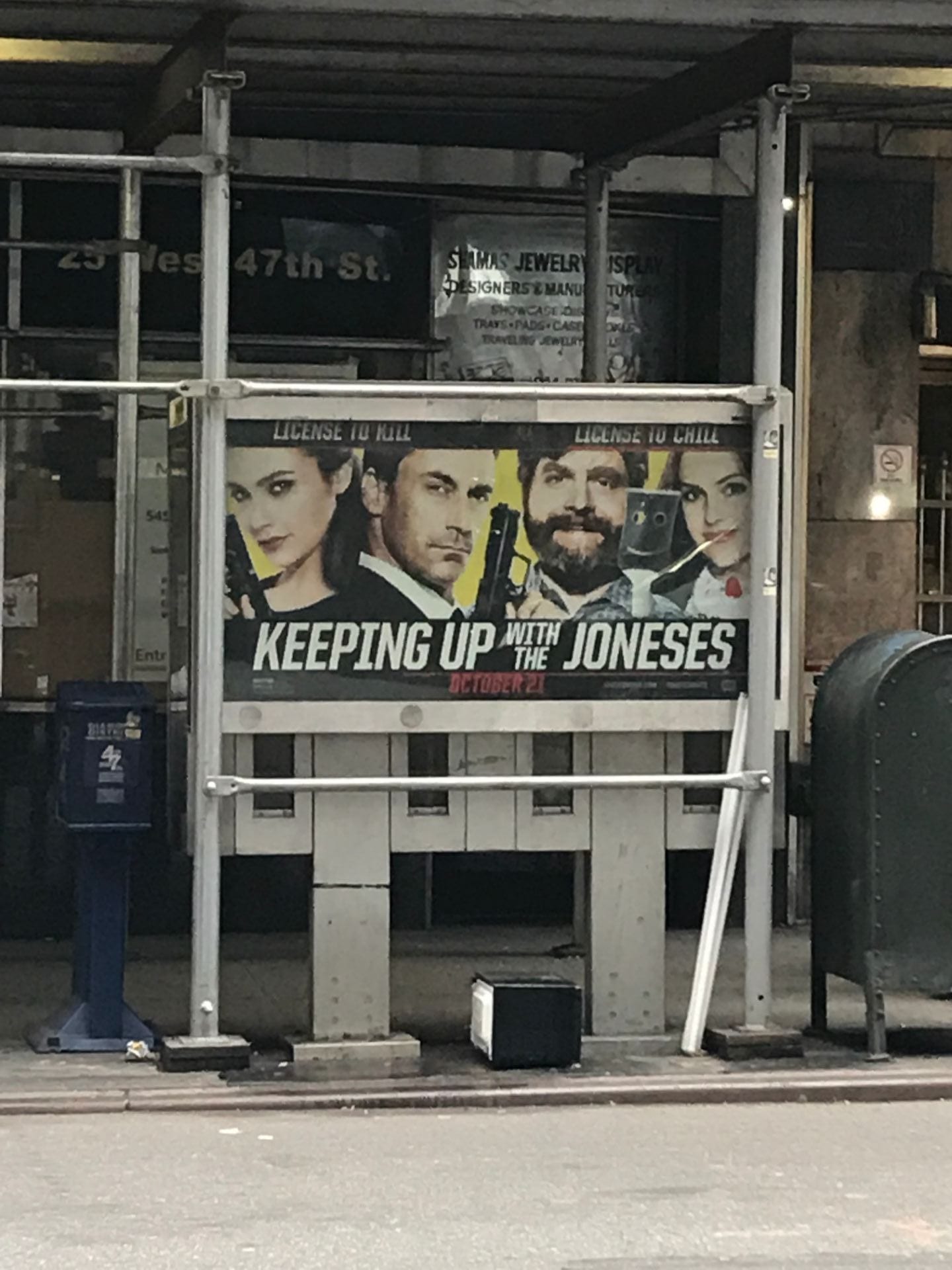
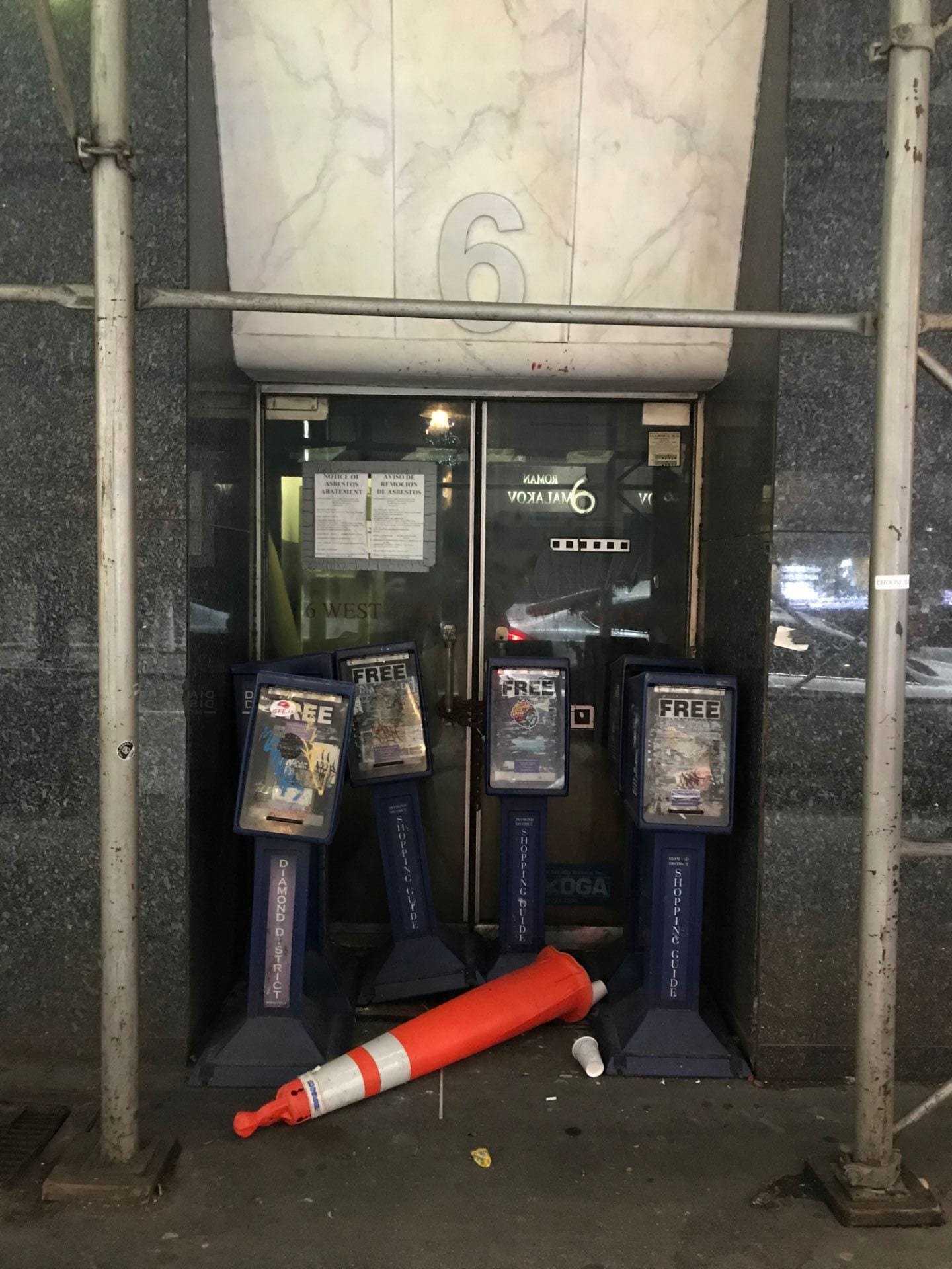
The Diamond District:


My Dorm:
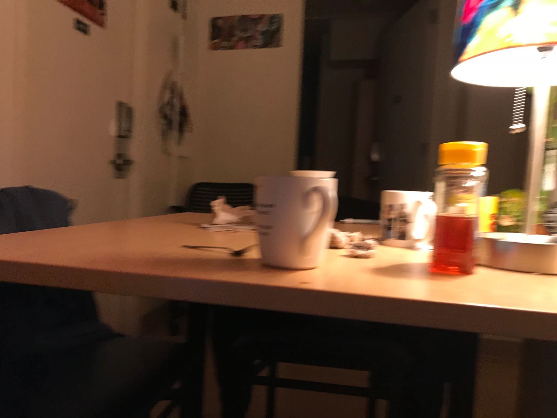
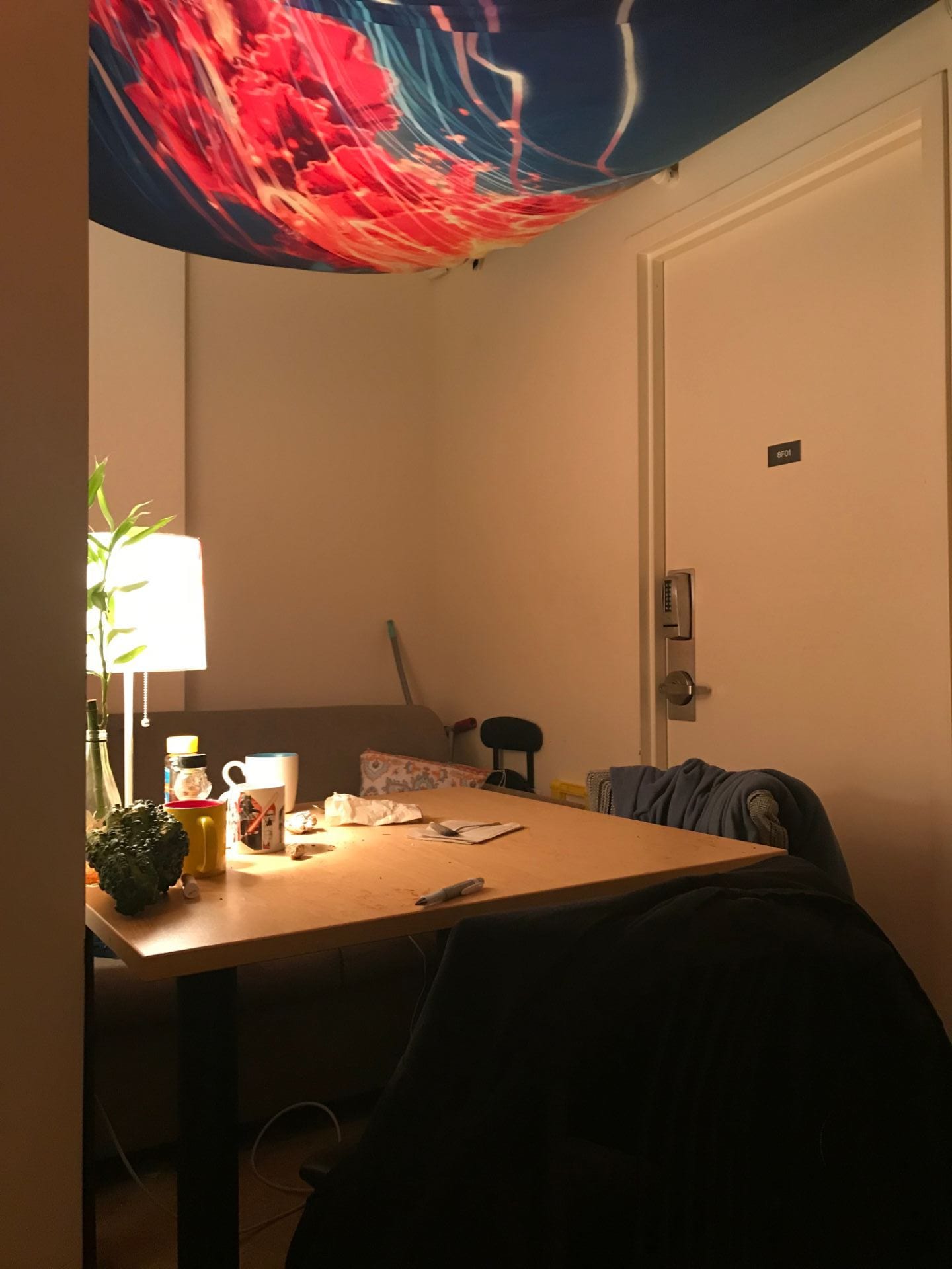


Once I chose my dorm as my second location, I noticed the stark differences between the two places. How one place to me felt warm and inviting and safe, and the other felt cold and unfamiliar. Visually speaking the colors on the day I was shooting in the diamond district were just cooler, and the colors in my dorm were warmer. This difference inspired me to play on that contrast for my final piece.
My Sketches


The two drawings above were of the diamond district. I later decided that I would rather cut these images up and paste them into a larger image as textures instead of using them as what they appear to be.

The image above was the first sketch I made when I had the idea to merge the inside and the outside together into one image.

My Mock Ups


Above were my first 3 attempts at mock ups. I was trying to highlight the contrast between the fact that the diamond district sells diamonds but the actual location is dirty, but since I took pictures of my other location my idea changed.

This last mock up was my favorite medium and style to work in (cutting and pasting paper and drawing with sharpie). It was also the theme that I wanted to work with and the convergence of my two spaces that I liked the most for this assignment.
Mickalene Thomas, Sleep (Deux Femmes Noires) from 2013 was an inspiration to my work… I wanted to echo the fractured texture that Thomas creates with the use of peachy-orange lines and cracks all over the his image. Also the cut and pasted aesthetic really appealed to me.
 Mickalene Thomas, Sleep (Deux Femmes Noires) 2013
Final Work

My goals for this project were to convey the home feeling that I have managed to find here in the city. So many different people live in the city, we’re all crammed and stacked on top of and next to each other in these little boxes. When I think of the feeling of home and safety I think of warmth and warm colors. I decided to use warm colors to communicate this feeling, and by contrasting these colors with cool colors I think it just makes the warm colors feel even more warm. I made the choice to use photos for the upper half and have the bottom half completely hand drawn. As children I drew a lot especially with crayons, and I like the contrast between this and photos.