Images from MoMA


For me, these images influenced different aspects of the final product. From the left, the first image is very wacky. It looks rather nonsensical, and I think my final print characterizes this as well. The second print is also very graphic and bright. Three dimensionality is created by having different and lighter textures towards the front, and differentiating between planes by changing texture and color. The third image feels more cartoonish overall, but the bright colors and thick black lines I think inspired me to have heavy black lines and many different colored furs throughout my image.
Times Square Photos


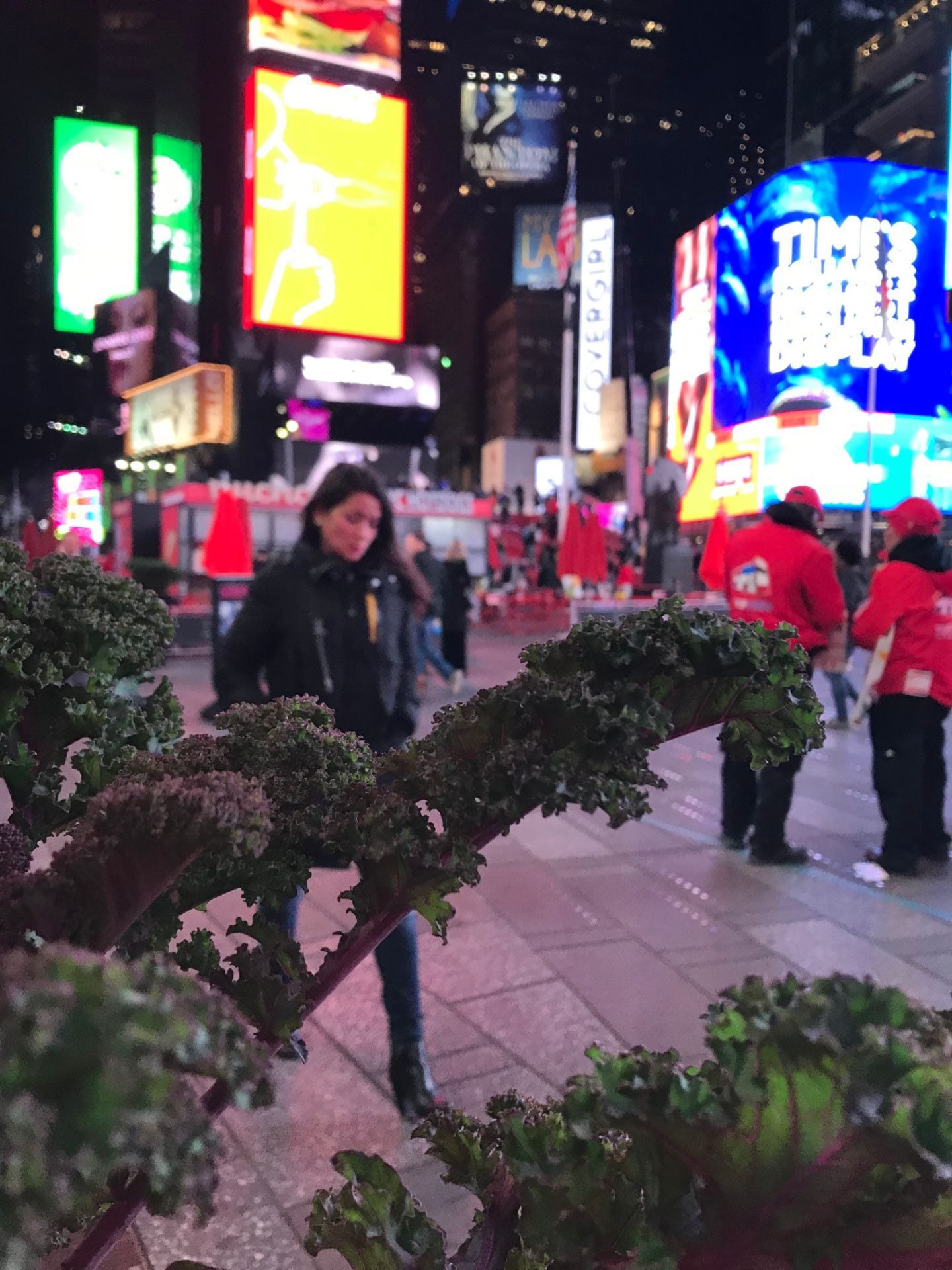

These pictures show the generally busy energy of times square… busy in every sense of the word. There are people all around, and aesthetically speaking it is a lot to take in. I think the 4th image (from left to right) of a woman in an advertisement holding a giant colored lollipop says a lot. Or at least its very representative of the space. Seeing tourists walk around and being instructed to watch them be tourists was a funny task… and it made the experience feel even more like going to a zoo. These people are brought out of their natural habitat and there I was watching them. The first image shows just how many different patterns and colors get crammed onto one big LED billboard… I think this influenced my choice of different kinds of fur for my final image.
Perspective Sketches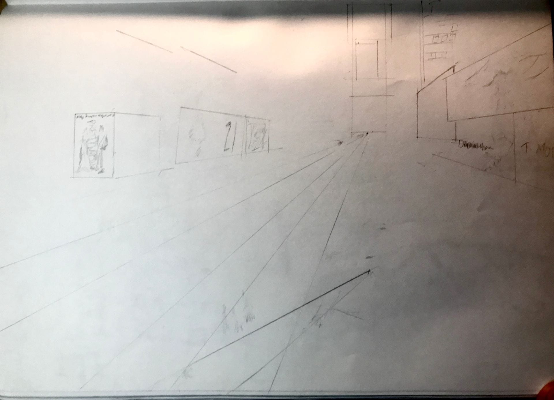


Perspective Analysis
One point:

Two points:

Three points:
Sketches


I had several different ideas originally. Generally I have a hard time choosing one thing and sticking to it. So when I had the instinct to cover times square in fur I just had to commit. Anyway, I had the idea to do a version of times square as if it were always Christmas. To make everything not only decorated as if it were Christmas, but to make the buildings out of Christmas related objects. One of my other ideas was based less in fantasy, as I was going to make times square as if New York were still New Amsterdam. Obviously it wouldn’t really look that way (probably) but I just liked the idea of turning the roads into canals and making the skyscrapers into those “canal houses” you see in Amsterdam. I think the reason I finally chose a “fur/zoo” theme was because I was excited about working with those textures. I don’t know why I didn’t anticipate it difficult to make every kind of fur imaginable work together aesthetically… but you know I did what I could.
Line Drawing

Illustrator file

It was really cool to see all the color palette choices possible on illustrator… however I did not end up using many of them! I went with this “metallic” blue because it has some white in it which I liked because I wanted the background to read as sky. Using just fur for the textures on the buildings was what I went with because I wasn’t sure at the time what my “palette” was going to be.
Final Image

One of my original ideas was to either not include any humans or reframe humans role in the space that is time square. I believe I have achieved this, as there are no actual people in this image however there are still characters. Non human characters. I utilized the skew tool quite a lot in order to match each texture to its plane. If I were to do it again, I would probably do some light shading to further clarify each plane, but I am happy with how it turned out.