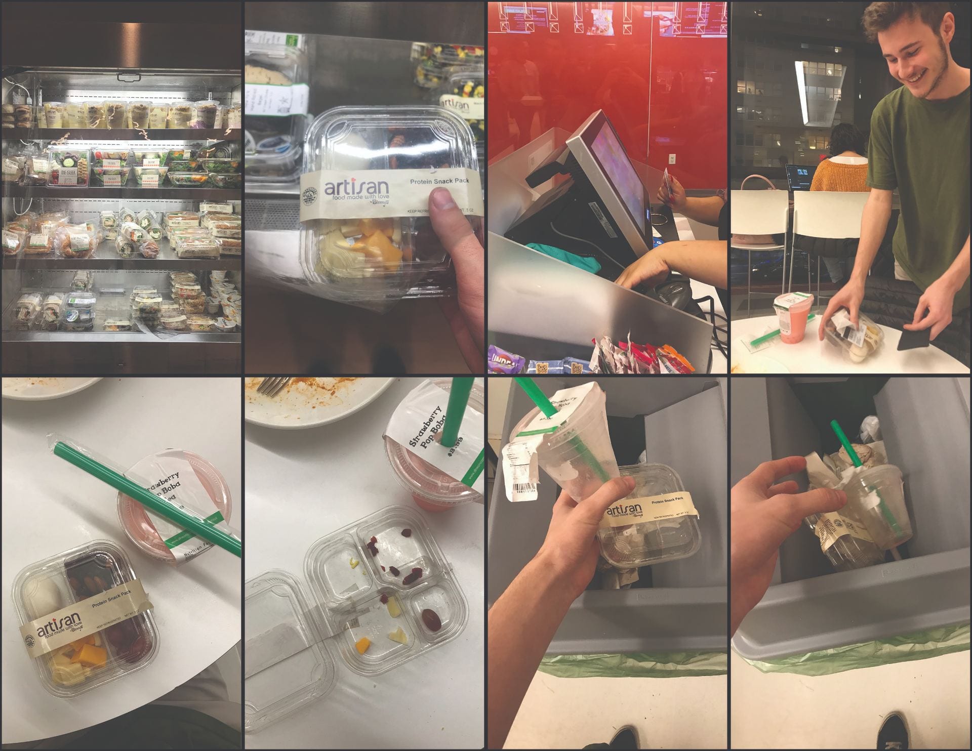
My very first idea was to show a meal at the UC, and show the progression of time in a comic-like format. I started by drafting with photographs I took and had my friends take in the UC cafeteria.


Then, in class during feedback, someone suggested that I should go with one of my original ideas. Something I had sketched in the very beginning – my story with very graphic, icon-style images.
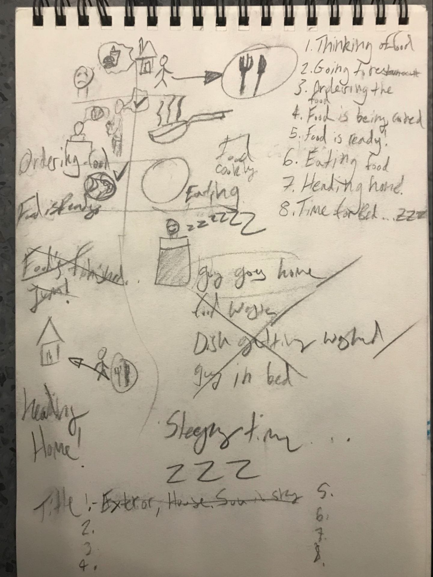
So that’s what I went with. I took inspiration from IKEA style manuals I found pictures of on google, and read an article or two:

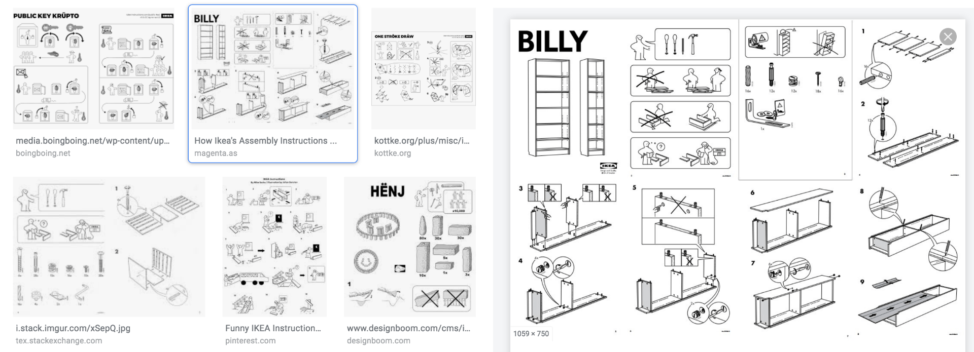
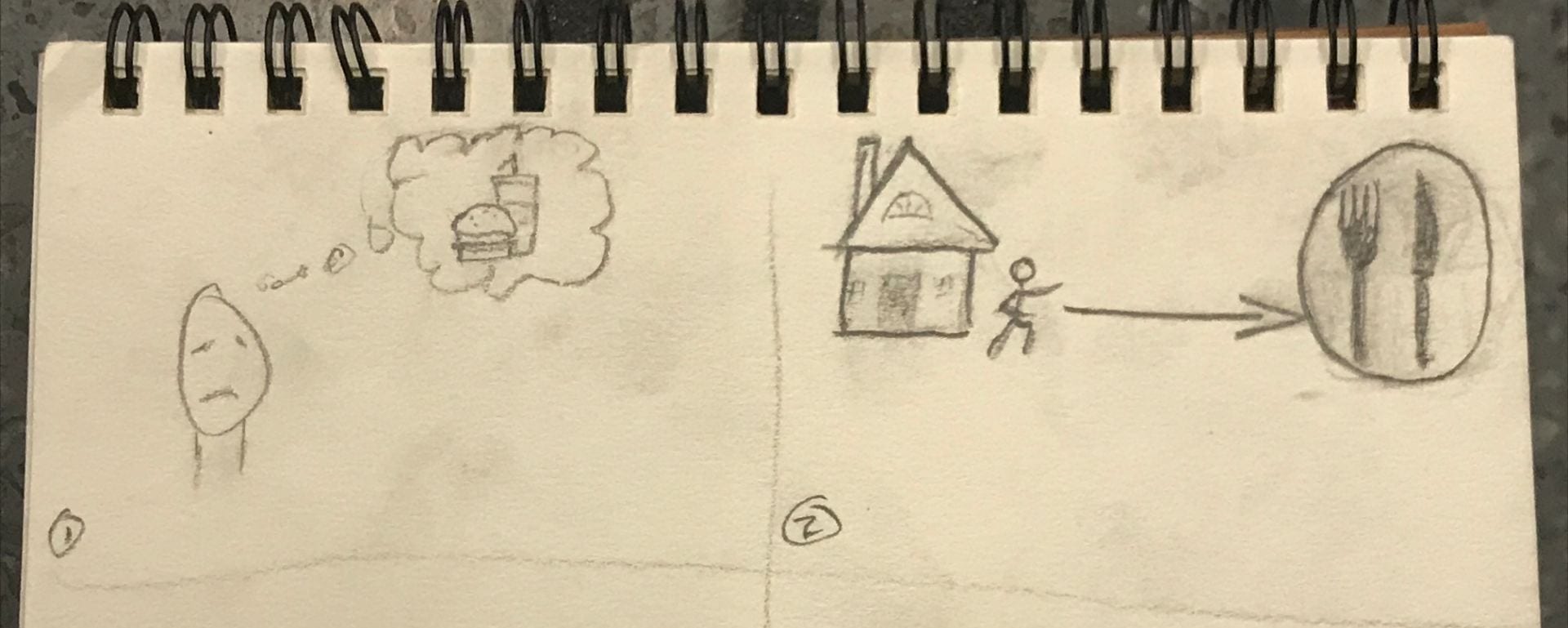
This was my interpretation. I ended up adapting my idea from me getting a meal at the UC to a little character I created leaving his house, ordering his meal, going back home, and falling asleep.
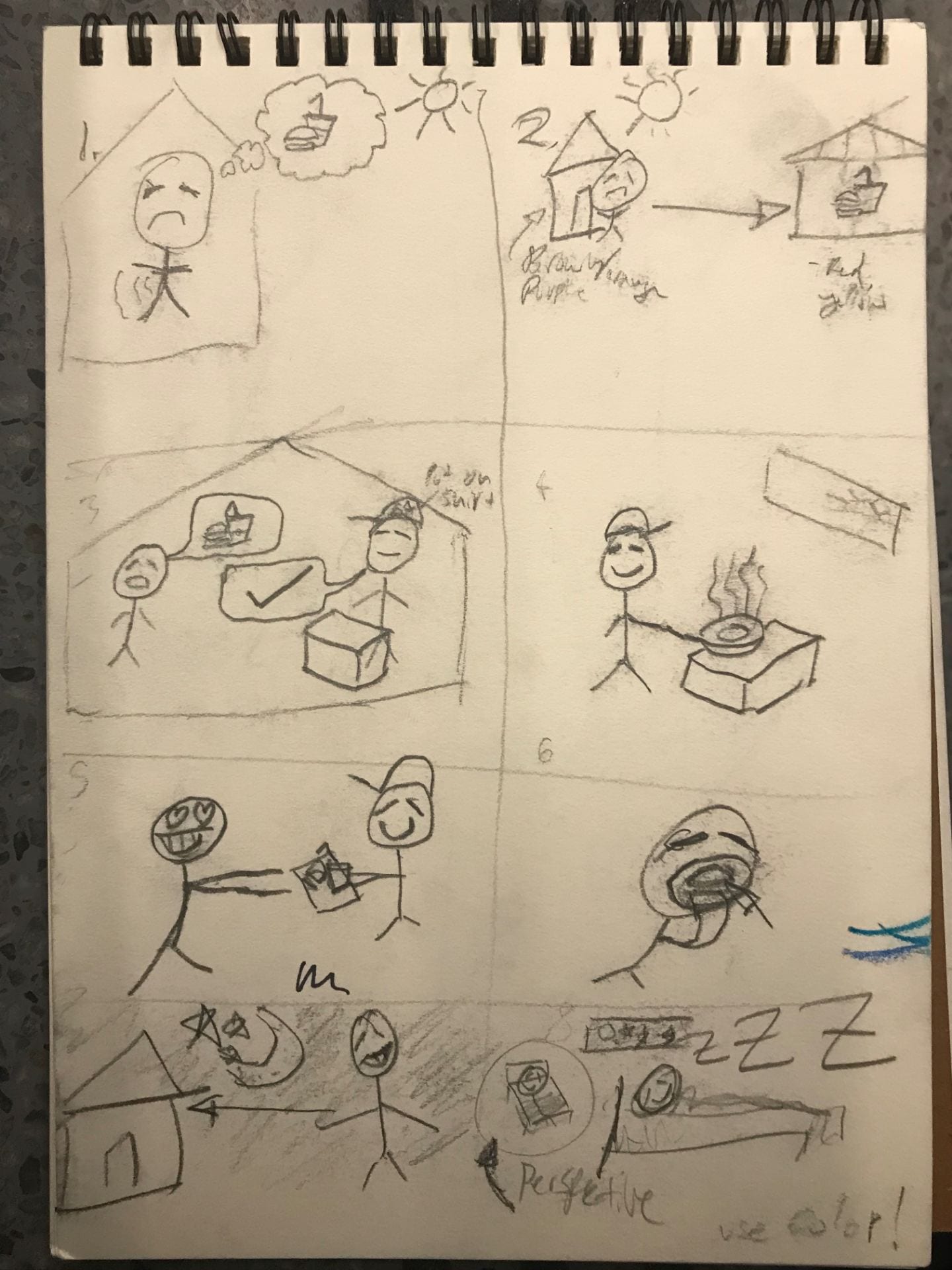
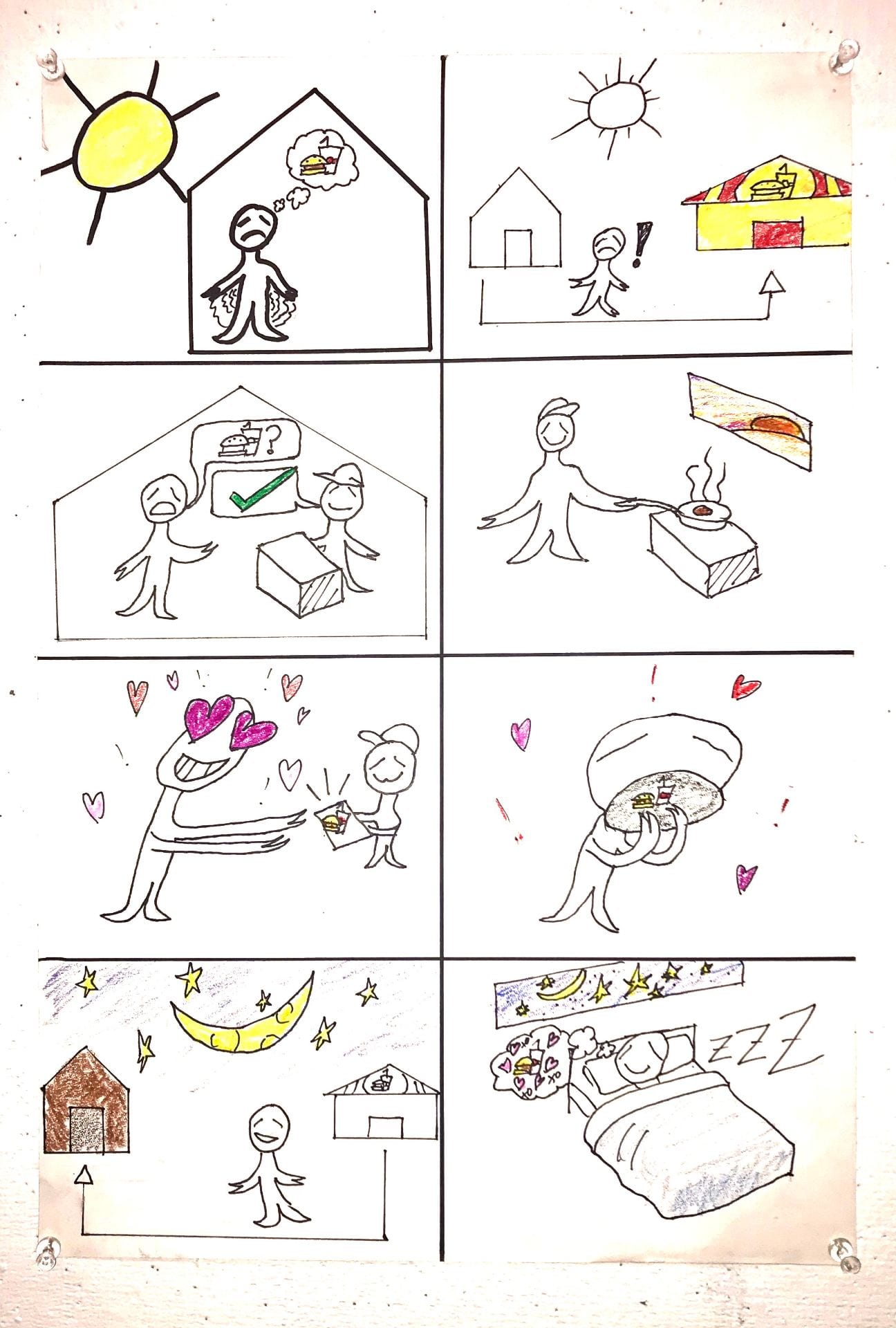
While I was making it, my intention was to use widely accepted if not universal patterns, symbols and colors in my design. However, when I presented, I realized that the scale at which it was being viewed was not appropriate for my format, and that it did not intuitively convey a sense of time at a glance.
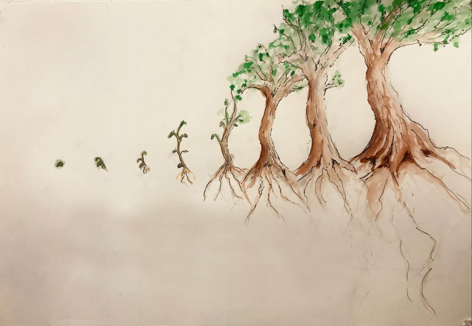
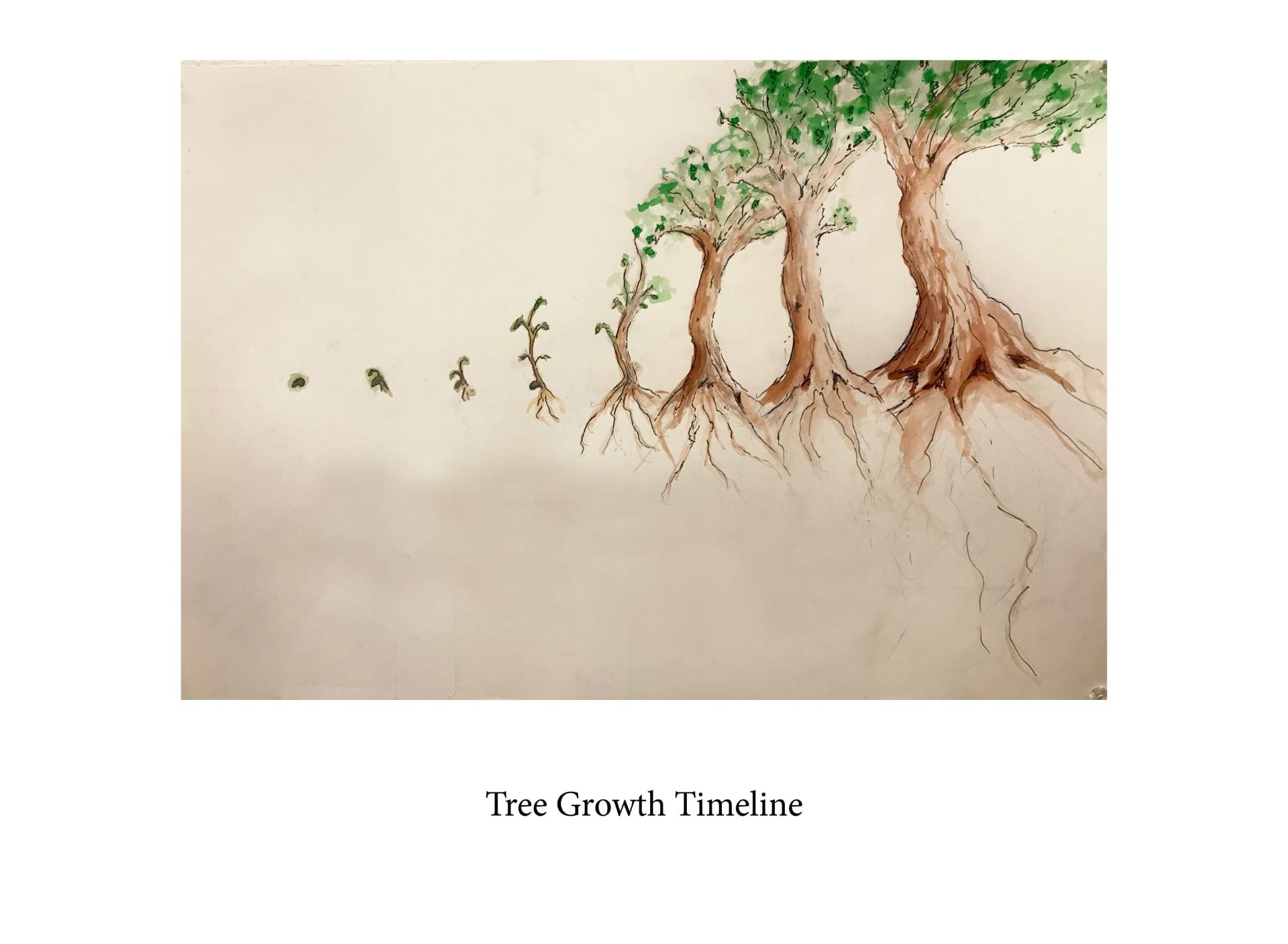
I decided to start from scratch! I needed to be even more simple with my idea. After a lot of thinking and some sketching I decided to use a tree, something everyone has seen and is familiar with the growth of.
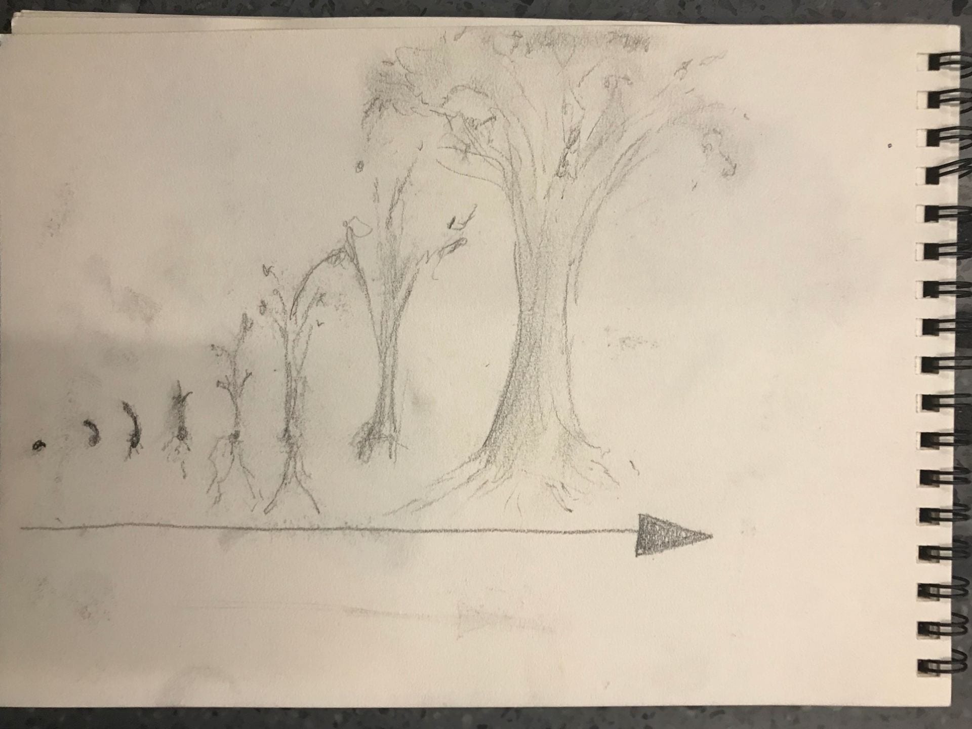

I received the note that the arrow was unnecessary, which I agreed with.