Parsons students hopefully familiar with the language of design as it pertains to graphic design, illustration, product design, photography. Lang students will have experience in developing arguments of one sort or another. Play up your strengths.
7 steps everyone needs to document in a worksheet when creating their website. There are more steps that are faded out. I do not require you to do those.
You are required to document these creative decisions in the worksheet. They are required for me to evaluate your midterm and final, and count toward your grade.
1) Develop Your Idea
Define the problem you are to solve when developing a web site. It is hard to create a good end product if the problem is not very well defined at the beginning.
Sometimes the problem is given to you by the client, but the client does not alway know exactly what the problem is. It’s your job to figure that out.
Either way, develop your idea.
It is hard to sell a bad idea.
This time you are your own client. That is difficult.
Make sure that whatever you come up with will work and is worth the time spent making it real.
2) Discovery and Research
Discovery and research is the second step. You might have a good idea of what you want, but test it by contrasting the idea with similar ideas that have already been executed. Google to see what others have done. The first assignment should have been a gigantic step in the right direction.
Find competitor web sites that have a track record that you can learn from, or have developed novel ways to express things that you are also desiring to express.
Tell me what you have learned and the conclusions you have reached from your research. I will be looking for that in the worksheets for both the midterm and the final projects.
3) Target Your Audience
Focus your energy by figuring out who your audience is, and target them.
Develop your content with that audience in mind.
Read the user experience article.
Go further and read Designed For Use by Lukas Mathis and develop a killer user interface because this excellent book will give you a good understanding of how user interfaces work, and work well, and what to look out for, to make sure that they do work.
Whatever you do, keep the user in mind.
4) Inspiration
Look for sites that inspired you. Here are two single page sites : UltraWebPage and Head to Heart.
Mood boards are another way to visually stimulate your design sense. You can test colors images, design elements, ideas, etc, as you develop your design intent. Print these out and place them on a board, or layer them in a Photoshop document. Playing with the visual hierarchy of like or contrasting elements can help gel the creative process.
Mood boards are used to develop the overall feel of a project, putting together images and objects which inspire, target desires and facilitate creativity and innovation in establishing the aesthetic feel of a web site.
Things that can be explored in the mood board include photography style, color palettes, typography, patterns, and the overall look and feel of the site. Soft or hard? Grungy or clean? Dark or light? A rough collage of colors, textures and pictures is all it takes to evoke a specific style or feeling. This process can act like a catalyst and save a lot of time and help focus in on your final design.
5) Thumbnails
Once you are clear as to what your problem is, and have content and direction, the next step is to respond with a user centered design solution using pencil and paper.
I would like to see the sketches and variations that show how you arrived at the solution. These are called thumbnails, because they start simple and small.
It takes more than one thumbnail to develop a finished concept. You never can tell ahead of time what will work, but you can separate out what does not appear to work ahead of time. Increase your success rate by staying with paper and pencil till you are clear about how to solve your problem.
Circle or otherwise indicate the one that you went with. Take a picture or scan the drawings and upload them to the worksheet.
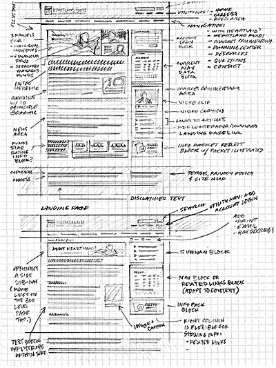
6) Wireframes
Wireframes are lines or boxes with some text and a few visual widgets that represent your website structure and help you establish hierarchy. It is a clean pixel perfect interpretation of the thumbnail that you selected to go with.
Wireframes help you save time because you can work out how your website works and looks over and over again until you get the details of user experience and design just right.
Then you will know exactly where the boxes need to go, their size, and how to position them, when you build the website.
Though a wireframe takes longer than a thumbnail, it takes much less time than a photoshop comp or an HTML prototype.
Take a moment and learn how to read, evaluate and design wireframes.
This is a low fidelity wireframe of the NY Times site.
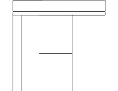
Higher fidelity wireframes provide more information.
It is possible to use ready made toolkits using photoshop(explanation), Illustrator (explanation) and InDesign (explanation with video tutorials) for creating wireframes.
A stylized Illustrator version (explanation) puts some distance between how it looks and what it will look like. This is ideal for working with clients who often start to sweat over details that can kill the creative process. Make sure you set the Document Raster Settings to 72 dpi for fast rendering while you work.
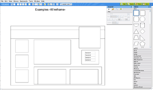
Balsamiq Mockups is a wireframe application with limited interactivity that is free to use for 7 days. It too has a hand drawn look to foil client expectations. They have a great tutorials. Other free wireframe web applications like Cacoo can also be used.
7) PhotoShop Comp
This is the last step I require that you take, which is to create a photoshop comp. After coming up with the idea, doing the research, sketching the direction and building a wireframe, you are ready to create the PhotoShop Comp.
It is quite common for people to comp up a site in photoshop, and there are lots of tutorials that will tell you how to do it. Those who aren’t can look through the tutorial or search the web for other tutorials.
Since most of you are photoshop wizards, I will not elaborate how to realize your website in PhotoShop.
Prototype the Website
The Web Design workflow has to reflect the information architecture, the interaction design and the user experience. Prototyping can help facilitate the development of all three.
A prototype can be fast, nothing more than a series of wireframe sketches, or it can be visually complete, like a photoshop comp or even a bare bones working website.
It can be static, meaning that the buttons are not functional and cannot be tested, or fully interactive, like a working wireframe, for example.
You can leave out the content, or use the lorum ipsum placeholder text. It’s also possible to work with finished content, which is most likely what you will do, but know that its often better to ignore the content (after it has been prepared and mapped out) while working on prototyping the design and functionality of the site.
Designing with a Grid
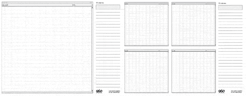
Whatever wireframe toolkit you use, you need to consider that you will be working in pixels, and to make it easy on yourself, use a 960 grid. This number is evenly divisible by a number of denominators, so its ideal for creating grids and organizing your layout. You get additional flexibility by adding gutters to the columns. The height is not crucial and can be between 700 and 800 pixels for development purposes.
Start with defining the grid you want to use with Gridulator. It’s enough right now to pick a grid that you want to develop in and make a png. It will be 960 pixels across. This example had been shrunk to 500 pixels across. use it in photoshop to develop your bio comp.

It’s possible that you want to develop not just a prototype, but the entire website in something like the 960 Grid System, which utilizes a number of canned CSS classes that quickly allow you to mock up your site. That’s not the goal right now, but we can use some of the 960 resources to help make the photoshop comp, or make pdf templates to print out for quickly sketching what you want your page to look like. There are a number of other such HTML/CSS Frameworks, like Twitter’s Bootstrap.
The Feedback Loop: User Testing
The reason for quickly prototyping your site is to receive user feedback, so that you can change it as you go along. You use the feedback from the review of the prototype to refine it, and get it reviewed again. The more user input you receive, the more likely the web site will work as expected. There are a few ways to get user feedback.
Card Sorting
One of the quickest ways to get meaningful user feedback is to use card sorting. Create cards with concepts, tasks and features the web site is to have and shuffle them. Then ask users to organize and rate the cards. Repeat the procedure with different users and you will have an idea of how to organize your website.
User Testing
Another way to get feedback is to do a 5 second test. This is quick and easy, and you will be required to visit 5 Second Test and participate in a number of tests. This provides rudimentary function and design feedback, but if the feedback isn’t spot on, it will have given you something to think about.
Once you have a prototype built, you can set up a more complete user testing that can gauge a user’s response to using the web site. There are plenty of websites that offer such services, of you can run user testing software yourself.