Bridge 3
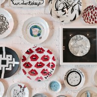
- Pattern on the plate
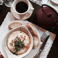
- Pattern on the napkin
- Pattern on the cup holder
Proposal
The pattern that our group created was inspired by our place Nolita and created a pattern that consisted of the symbols that each of us chose that seemed to represent the place. After we combined together the symbols to create the pattern, the result of it strongly embodied the various restaurants and cafe vibe around Nolita. Thus, I have photoshopped the patterns in the areas of the restaurants, whether it’d be on the packaging such as the cup holder, or as the decoration such as on the napkin and on the wall, a pattern on a plate. The function of the pattern serves as a ‘design’ part of a restaurant, giving the same atmosphere that I have personally received when visiting Nolita– casual eating district with multifarious cafes and restaurants that all seemed authentic and delicious.
Beatriz Milhazes at James Cohan Gallery
The Brazilian artist Beatriz Milhazes opened her exhibition called “Marola” at the James Cohan Gallery, which displays her paintings and sculptures. Upon visiting her exhibition, I could depict the repetition of geometric shapes and lines, especially circles. Her paintings were very saturated with color, consisting and filling the canvas with diverse range of shapes. When I saw the paintings, my eyes generally followed the curves of the circle shapes overlayed on top of each other shapes. Although different patterns and lines were layered, the painting as a whole seemed like a pattern, primarily due to the recurring theme of circination. The sculptures, I thought, were also very interesting as it seemed like a three dimensional version of the paintings, as if the shapes and lines came to life. The sculpture itself also looked like a pattern, because, although not blatant, there is a repetitive structure to its construction.


