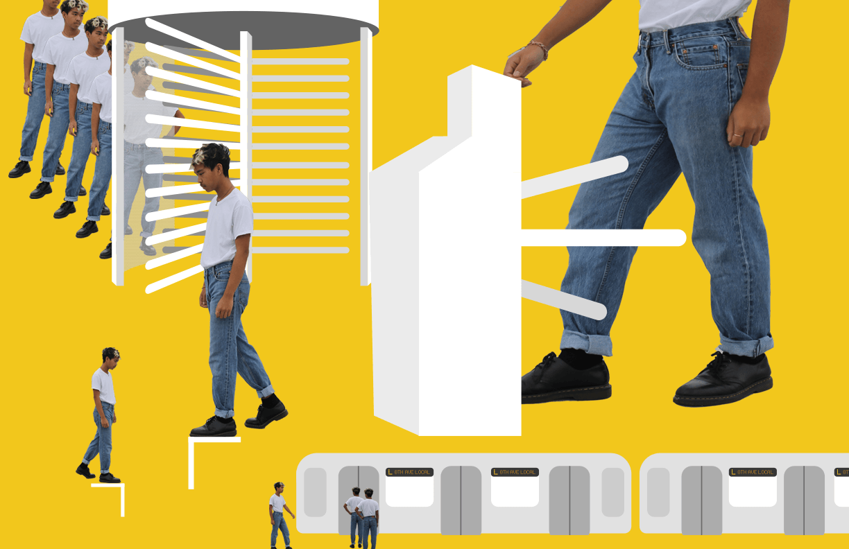
Concept Description:
When one begins to think about the notion of time, one may visualize the most quintessential object of time: the clock. The clock, which has multiple hands that constantly spin, depict motion. The hands are always moving, even when one does not perceive or think about a clock. In essence, time and motion are without a doubt synonymous with each other.
In the context of New York City, these concepts can be applied directly to the subway system. Much like a clock, trains and people are always moving – even without active thought or perception. This gives way to the old saying that New York “is the city that never sleeps”.
At the Dekalb Avenue on the L line, this idiosyncratic quality is disrupted by High Entrance/Exit Turnstiles (or “HEETs”). These are incredibly clunky and highly inefficient. Whereas stations with the regular turnstiles have an active flow of people entering and leaving the subway system, one can witness and feel a direct “pause” in the flow with the HEETs. The purpose of this time map is to illustrate that specific disjointed temporality in the subway system.
Yellow was chosen as the background to reference the MetroCard, another staple to using the subway system. The repetition behind the HEET was used to show my own frustration with the time spent waiting in line for those turnstiles. However, one can read the regular turnstiles as something like a flow chart, showing the continuous narrative and flow otherwise.
Process:
I scrapped my original idea and elected to go in a new direction instead. I was thinking about my neighborhood in the span of three blocks. While I don’t get to see everything around it in close detail everyday, I do get to see the subway station. I began with thinking about what defines my personal subway station station and what separates it from the rest of system. I noticed that the full-sized turnstiles are the “centerpiece”, and then I begin to think about how much I was frustrated with them. I did a “rough sketch” in Photoshop that originally had colors that emulated the metal that is used on the turnstiles. Realizing that this was not only counterintuitive and also plain ugly, I went with a simpler white tone for the turnstiles. Yellow is always my favorite color to use because of how much it can make something pop, so I chose that to ground the entire piece. I then incorporated photos of myself to not only make the piece personal but turn it into a mixed-medium piece. From there, I created the “regular” turnstile as well as an L train. I cropped myself out in the various poses and resized and added them where necessary.
Reflection:
I realized that I had been a bit harder on myself than I realized. I originally thought that my piece was going to be a bit too abstract for the overall assignment, but upon seeing everyone else’s concepts I’m glad that mine was a little bit different from the rest. However, I wished I had a little bit more time in order to improve the clarity and overall direction of the project. I’m happy with the way it turned out – I’m very satisfied with the contrast of colors, color choice, and the illustration of everything included. However, for my next pieces/projects I’d like to step out further of my comfort zone. While thinking broadly and conceptually was difficult, the overall technical process was fairly easy for me. I want to challenge myself in the future to see what I can do.