My two panels for my diptych primarily represent the development of my own technical abilities as an artist.
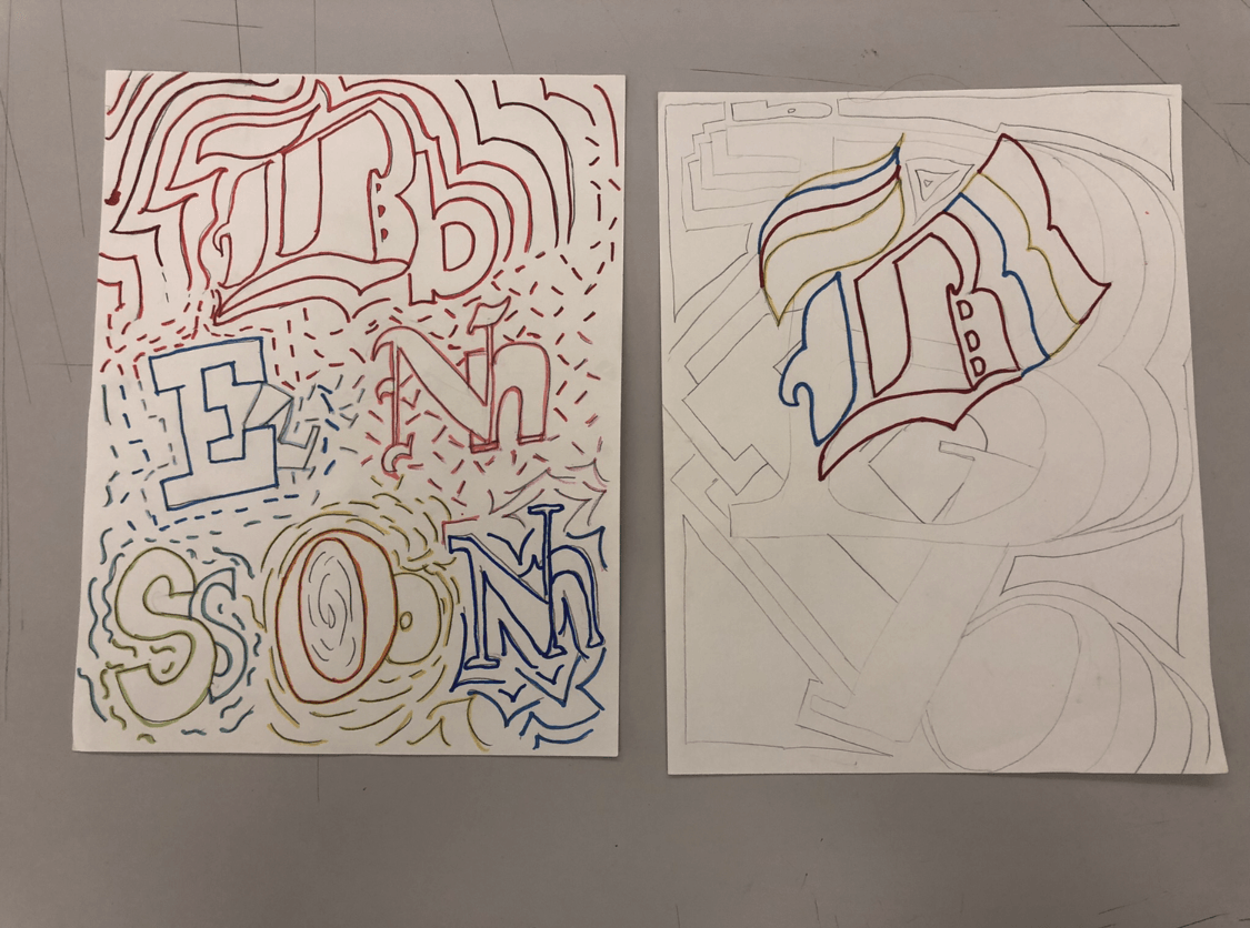
The left side represents a surface-level metaphor of an eye exam chart, with my name filling out the letters that would usually be present. The use of sporadic color and line represent an immense amount of undirected energy that presented itself before coming to Parsons. I chose using the eye-exam chart because my childhood was marked with bad eyesight. However, I always appreciated the eye-exam chart and how neat and orderly it was, and how absolutely satisfying it was to finally be able to see the chart clearly when the optometrist gave me my new glasses.
The right side is a more simplified version of that – with the use of both sans-serif and serif typefaces in the background. There is a focal point in the right side, whereas the left side there is no emphasis which highlights the path I felt I was going down, or lack thereof.
Both pieces definitely have elements that they both share and elements where they differ. I knew that I wanted the left side – or rather, the “before – to look and feel very exciting and uncontrollable and one to feel rather understated and simple. The use of typography was definitely the unifying feature between the two, but the use of color and line is where they differ greatly.
I chose to use typography as the main element of my diptych because I am, at heart, a very novice artist. I work best in digital mediums and I have a vested interest in interaction and typography, therefore I felt like using letters represented my interests and emotions best. I have taken a few classes in typography and am constantly fascinated by all aspects of it.
Again, my technical ability and execution when producing art through traditional mediums still remains rather amateur, so this was a great exercise in using the skills in Mark Making Grids towards real pieces. I hope to continue developing my skills as a traditional artist through conventional mediums. As of right now, they terrify me everytime I pick up a piece of charcoal or a drawing pencil. The goal I’ve set for myself is to be able to look at my art in the same light as when I saw the eye-exam chart clearly and sharply, through my new pair of glasses.