All of these artists use techniques such as line, shape, color, scale, and proximity to manipulate the sense of space in paintings.
Before 1950 (5)![]()

Wilson Bigaud
Murder in the Jungle
1950
Bigaud uses vertical lines, or branches, to flatten pictorial space and appear static. The painting has a wide range of values for a ground giving the impression of a deeper space. He also uses saturated colors to mess with our sense of the space. The overlapping shapes of the branches are also used to create the illusion of space and movement.

George Maciunas
Untitled
Early 1950’s
Maciunas’s painting has a wide range of values for a ground giving the impression of a deeper space. It has overlapping shapes and changes in size creating the illusion of space. He also uses linear perspective to give the idea of a horizon, which establishes the height of our point of view with vanishing points. It could also be seen as an example of one point perspective.

Henri Matisse
Plum Blossoms, Ochre Background
Vence 1948
Matisse uses color and overlapping shapes to create the illusion of space. He also plays with the sense of space by using combinations of linear, two point, and three point perspectives.

Andrew Wyeth
Christina’s World
1948
Wyeth uses a wide range of values for a ground to give the impression of a deeper space. He also uses color to create a sense of space and also to purposefully flatten it. This painting could be an example of linear perspective because the idea of the horizon creates an artificial sense of perspective.

Herman Rose
Tower and Tank
1947
Rose uses colors to mess with our sense of the picture’s space. He also uses two point perspective to give the impression of looking in two directions from the corner of the buildings.
After 1950 (5)

Peter Doig
House of Flowers (see you there)
2007-09
Doig uses color especially the idea of warm vs. cool to create a sense of space. This painting has overlapping shapes also used to create the illusion of space.

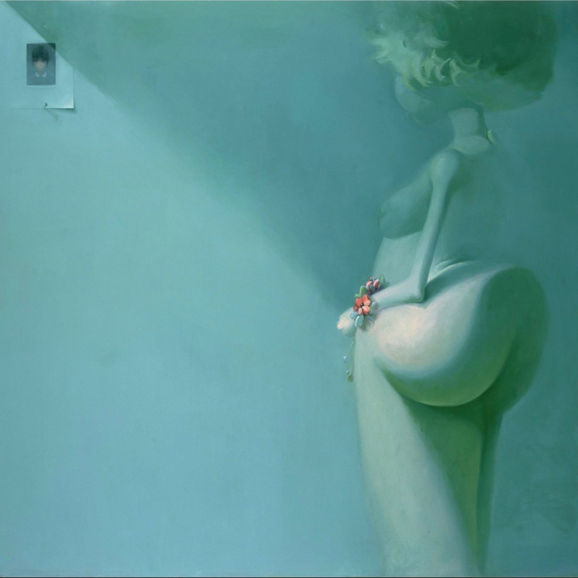
Lisa Yuskavage
Wrist Corsage
1996
Yuskavage uses a limited color palette and limited values in order to purposefully flatten the pictorial space. This painting also has contrasting values to make a deeper pictorial space in both the figure and the background. She also uses cool colors that appear to recede in space.

Roy Lichtenstein
Bauhaus Stairway
1988
Lichtenstein uses color especially the idea of warm vs. cool to mess with our sense of the picture’s space. He also uses overlapping shapes to create the illusion of space and multiple perspective points to create unsettling effects.

David Salle
Gericault’s Arm
1985
Salle’s painting has a broad range of values used to emphasize pictorial depth. He uses contrasting values to make a deeper pictorial space in both the figure and the ground. He also uses the push and pull of warm vs. cool colors to mess with our sense of the picture’s space and demonstrates changes in size to create the illusion of space.

Gilbert & George, Gilbert Proesch, George Passmore
Live’s
1984
This painting has lines that move on diagonals which imply space and movement. The broad horizontal and vertical lines flatten out the space of the image, while on the left and right sides diagonal lines imply a space that recedes from the viewer. It also has overlapping shapes and changes in size that create the illusion of space.