For my typography ideas, I wanted to go for a look that reminds me of painting and art because the object I’m designing a package for is a travel watercolor set. The decision was made to design these fonts by hand instead of looking for something similar that already exists.

For the first concept, watercolor was explored which developed into a brush font. Different brushes were used including a thin detail brush and a small flat brush. After noticing the variation in color and saturation while using the paint, I used a drawing tablet on Illustrator and used the paintbrush to write out the words. This way, the final font is more even and can be more easily manipulated. As for the packaging itself, I thought by wrapping the travel kit in a canvas material would allude the viewer to think of paint. During class, it was noticed that canvas wasn’t usually used with watercolor so the material of the fabric would have to change.

For the second concept, I chose to explore a quality of paint which when wet, drips down a page. For this font, research was done on graffiti and paint dripping images in order to get an idea of how paint actually pools. From there, the letters were first drawn with wavy lines and droplets of paint hanging at the bottoms. Then it was either outlined or colored in. After realizing that this font, when hand drawn with many letters and close together, may be difficult to read, the font was further explored on Photoshop. Using the software, the phrase was typed out using bold letters and an easily legible font. Then with the drawing pad, droplets were drawn along the letters and hanging off the bottom of most of the letters to imitate paint. By doing this, it looks more like paint is dripping off the letters and the paint can be adjusted so that it doesn’t compromise its legibility.

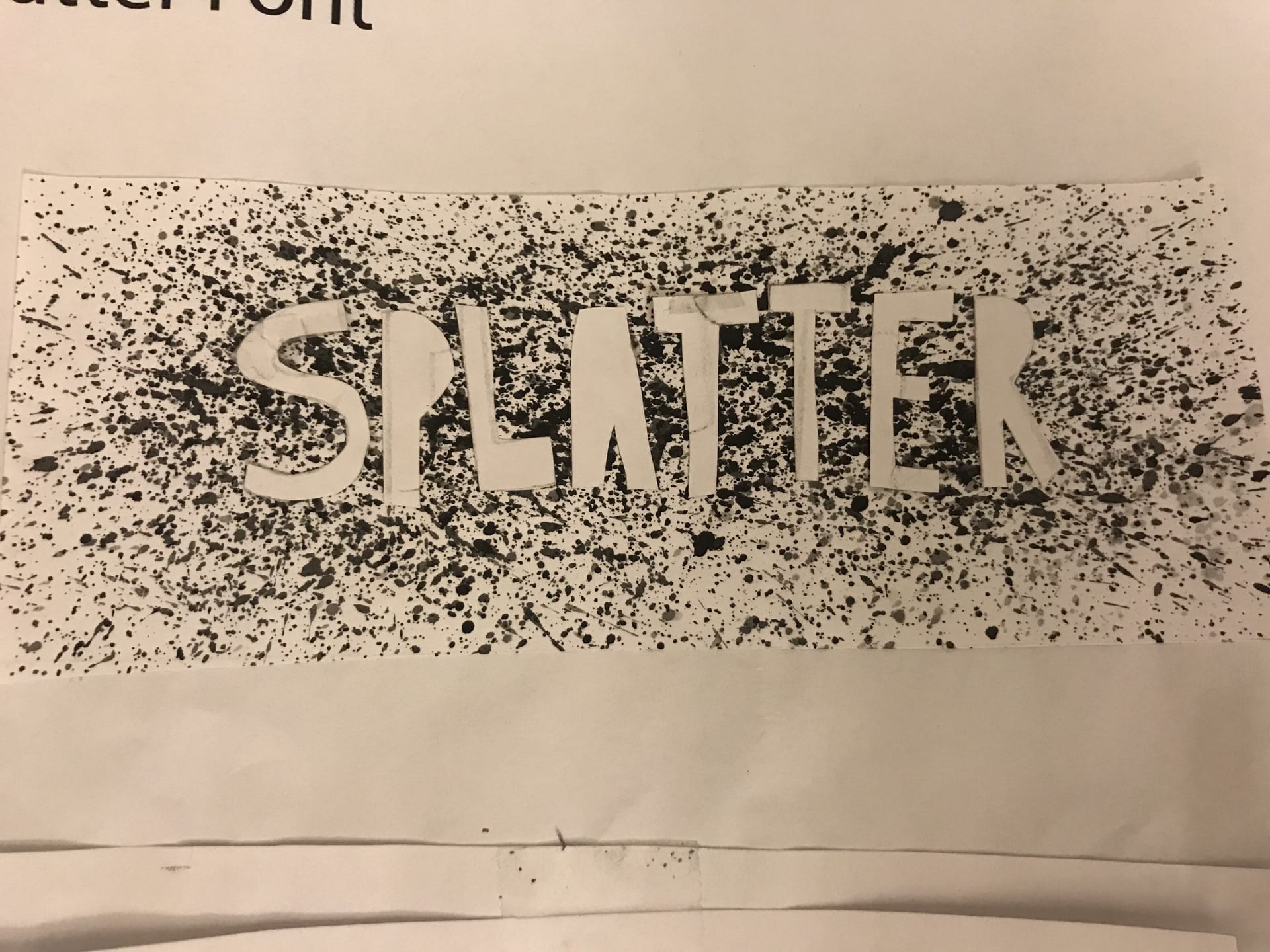
For the final concept, I thought about doing splatter because it really reminded me of the many uses of paint. First a stencil was made by cutting out the letters of the word out of paper. Then the stencil was attached on top of another piece of paper and then paint and water was used to create the splatter. This was the original font that I thought of but after creating the stencil, I realized that the cut out letters could be used too. So then I splattered another piece of paper and when it dried, I glued the letters on top. After experimenting with these techniques, the font with the cut out letters glued on top of splatter seemed to be more legible than the stencil version. In order to test out the idea more, I went on to photoshop to recreate the experiments. Using the software allowed for the splatter to be more controlled and by typing out the phrase using a distinct and bold font, it could be more easily read. In class, it was brought up that watercolor isn’t traditionally used for creating splatter paint art and instead the suggestion to create some kind of water color brushstroke background could be used instead of the splatter. Also after creating it on photoshop, both versions of the splatter font could be read so for the package, the shape is a box but each of the versions are on opposite sides of the box so when the viewer turns the box, they will see the inverse.


After presenting these 3 concepts in class, the package I will pursue will be the fabric wrapping one and as for the font, it will be a combination of the brush font and a variation of the splatter idea.