For this assignment, we were tasked to create 3 color concepts for our packaging. Because my object that is being packaged is a watercolor set, I wanted to incorporate the colors of the paint and the different painting techniques that are used with watercolor. The packaging will be either a fabric like piece of paper or piece of fabric that will tie around the watercolor set.
For the first concept, pink, orange, and yellow tones were used with a paintbrush tool on Photoshop to create a water color like pattern. The the phrase “Create Art Wherever You Go” was added on top with white ink. The look and colors reminds me of watercolor but because the text is white, it is a little difficult to read.
The second concept is similar to the first one but slightly different. Instead of warmer tones, this idea uses the cooler colors of blue and purple and instead of using the brush tool, the colors were added first and then the smudge tool was used to blend the colors. Unlike the first concept with the colors randomly across the layout, this idea had the blues and purples forming a drink around the base. And instead of the words being white, the phrase is written in the pattern of the blue rings in the layout’s white center. If the final packaging were to be made of fabric, I think it would be interesting to see if this pattern were possible to make using a tie dye technique instead of just being painted by hand.

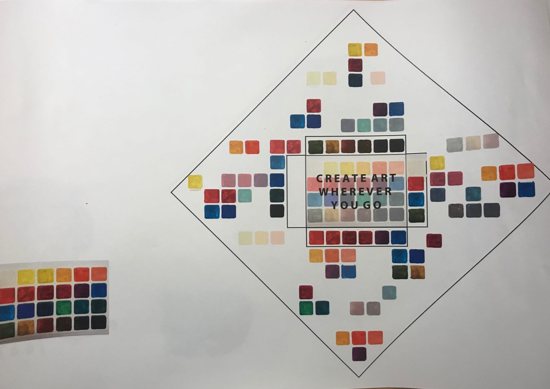
For the final concept, I wanted to play around with the colors that are in the watercolor kit itself. First the paints of the kit were used to create a color chart with all the swatches of the paints included in the kit. Then this chart was scanned in and put into photoshop where I singled out the colors of the palette and played around with a grid pattern across the layout of the packaging. The different groupings of swatches had different levels of opacity. In the center, the text is written in black with the color chart itself under it.
After presenting the ideas in class, the following suggestions were made. For the 3rd concept, instead of having all the swatches in the grid shaped as rounded squares, the swatches can be different shapes and can be played around with the grid that the swatches create. Also for the 3rd concept it is unnecessary to have the color chart under the text because it makes the text harder to read. There was also an idea to combine 2 concepts with one on the outside of the packaging and when opened, a different concept would be revealed on the inside.


