For my graphics ideas, I wanted to convey the painting aspects of my abject so I wanted to include images of things like paintbrushes and paper. I also explored the swatch idea more by adding shapes.

For my first idea, I combined two ideas from last week, one being the radiating paint gradient and the second being the swatch squares. For the outside, it would be the paint gradient and when the packaging was opened, the color swatches would be revealed on the inside. The issue with this design is that with fabric, the paint tends to seep through so if I were to do this design, the inside and outside would mix together. When this issue was brought up in class, someone suggested using two pieces of fabric instead and then tying the box inside with two layers of fabric.
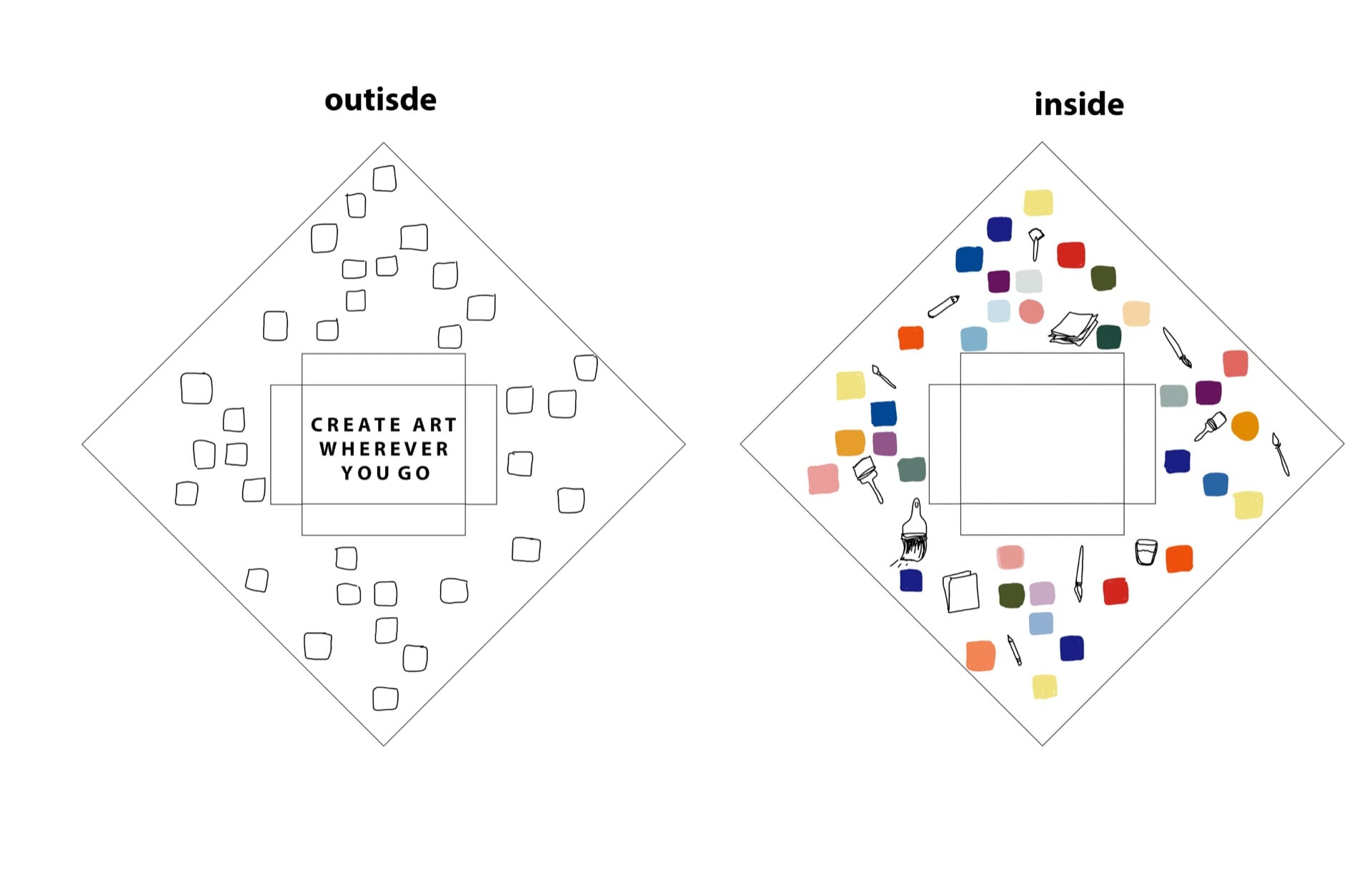
My second idea was to have empty squares on the outside and then when the package was opened, the swatches would be seen inside and along with small graphics amongst the squares. For this idea, the paint seeping through a little would be okay because little hints of color would be able to be seen from the outside of the packaging. When opened, it would reveal the colors inside. In class, it was noted that the paint idea was already present with the paint swatches so it wouldn’t be necessary to add all the little graphics of paint brushes and paper.

As for the third idea, I decided to get rid of all the paintbrush graphics on the inside and put a black frame in the center of the instead. That way, when the package was opened the watercolor kit would be sitting inside the frame and it would allude to the idea that the object will allow for you to create something for a frame. On the outside, I decided to enlarge some of the paintbrush and pencil graphics from the second idea and place them on the sides of the typography so when the packaging was tied up, the brushes would be on the sides of the object. For this idea, the class mentioned that the frame that was drawn seemed too detailed and if this idea were to be pursued, a simpler frame would work better. I personally like the intricacy of the frame I chose because it adds a lot of detail and it reminds me of the frames used in museums for famous paintings.
After discussing in class, the ideas that stood out were the first two. But instead of keeping them the way they were, the ideas were combined such that the paint gradient would go with the swatches and the second would be for the squares to go with the plain swatches. Before coming to a decision, I would need to experiment with fabrics and techniques first to see which of the ideas were more plausible. For example, I had the issue of putting the typology font with the paint gradient which would be difficult to do by hand. However, the suggestion that would be used was to include the typography on both the inside and outside.