For this week, the assignment was to use the 6 images from last week and incorporate them into 4 matchbook or matchbox designs. I made 3 books and 1 box to see what designs I could come up with. I used a lot of drawing as well as collage work and painting.
 For the first design, I went with a drawing interpretation of the images chosen from last week. As for the format, I wanted the matchbook to open sideways like an actual book rather than the traditional layout of a matchbook. Using Illustrator, and the paint brush tool, the images from the photos were recreated. For example, the table design of the wood cuts being rearranged like a puzzle was created on the front of the matchbook design. The logo that was designed was also used on the cover. The goal was to recreate the table setting on the front of the book. On the inside front page, I recreated the wall pattern with a blue background and gold dots. Then for the inside second page, I drew the dish Greek dish Kolokythakia Kai Melitzankia Tyganita, which is fried eggplant and zucchini layered on top of each other. This side is also where the matches go and they are arranged sideways like in the image. The idea was that when the matches were used, the layers of the dish would be revealed. The back of the matchbook is a drawing of the seating and ceiling with the restaurant’s information in the center.
For the second idea, it was very handmade instead of being created on photoshop or illustrator. For this concept, I decided to cut out and collage the images chosen from last week. This layout of the matchbook is created like a traditional matchbook with the front cover folding over. For the front cover, I used the images of Greece and the dish as well as the table setting. The collage was supposed to look like Greece served on a platter in a beautiful setting which is what I feel like the restaurant is trying to emanate in their atmosphere. For the inside top cover, I used the image of the pillows and ceiling and I painted gray strokes to look like the walls in the restaurant. For the other two sides, I used color palettes inspired by the decor of the restaurant. For the side where the matches go, the colors are from the seating image with the pillows. The back with the restaurant’s information uses a color palette inspired by the table setting.
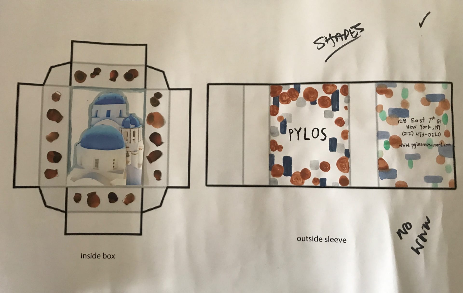
For the third design I decided to try designing a matchbook and the idea was that the outside would be a representation of the restaurant by creating a pattern and the inside are actual images that have been collaged together. The concept was that when you open the matchbox, it’s like you’re entering the restaurant where you get an actual feeling of Greece inside. For the outside, I simplified different elements of the restaurant into basic shapes ad then I painted the shaped around the border of the sides to create a space for the name and information of the restaurant to be written. For example, I drew terra cotta colored circles to represent the pots in the ceiling of the restaurant and gray squares to represent the pillows. On the back I used similar shapes and the addition of the green color and watered down the paint to create a variation of the pattern from the front. On the inside I added an image to the center of the box so that it would be visible in the middle of the box and then I cut out some of the vases from the image of the ceiling of the restaurant and glued them around the sides of the box. I realized that after creating a prototype of the matchbox, the pots are on the wrong side. I wanted the pots to be around the outside of the box but in this layout, the pots are on the inside of the box with the image of the Greek buildings. 
The last design I went back to the traditional matchbook design. The concept for this design was to create color blocked shapes and then draw the images in black over the colored shapes. For the front of the matchbook, I recreated the pots on the ceiling, the glasses, the pillows, and I used the logo design that I created last week. I also included the restaurant information on the front. On the inside of the matchbook is the outline drawings of the greek buildings that runs across the entire inside of the matchbook and blue colored rectangles of different opacity were added on top to add color to the image. On the back I drew the Greek dish with a blue rectangle on the bottom as the plate.
Out of all the designs, the two that were chosen to recreate were the last two designs of the matchbox and matchbook. For the box, the suggestion of simplifying the images on the inside of the box into simple shapes and to rearrange the the shapes of the patterns on the outside sleeve to work more harmoniously with the written information. For the book, the suggestion was made to make all the drawings have the same line weight to make the book look more cohesive. Then the address was to be moved to the back and this would allow for opportunities to add more drawings on the front cover. Then I was to check out a few artists to learn more about color blocking that could enhance my design. Out of the designs, I really like the last one because it emanates the feeling of cleanliness and sophistication that the restaurant has. I think the box also has a lot of potential as well because the colors and shapes can really work to encapsulate the feeling of the restaurant in a simplified manner. These two designs will be revised for the following week.