For my final matchbook and box, I refined the designs from last week and was able to print them out on higher quality paper to create the matchbook and box itself.
Here is the final version of the matchbox.


The first image is the front of the box featuring the name of the restaurant. The matchbox is opened by pushing the inner compartment up through the sleeve. In the middle, you can see the matchbox open revealing the matches and the design inside the box. In the third image, you can see the parts of the matchbox separated and the back of the outer sleeve is shown. This is where the restaurant’s information is written. The sticker for this matchbox is located on the side of the sleeve.
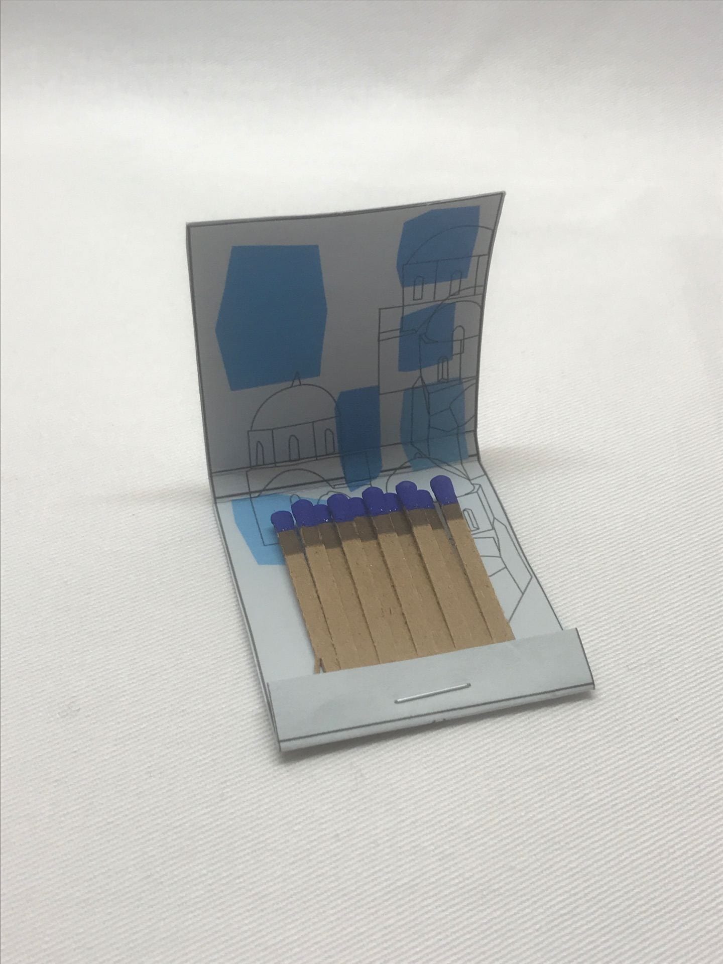
Here is the final version of the matchbook.


These images are of the front and back of the matchbook. When I was creating this final version, I noticed that the front design is covered a little at the bottom by the closing flap so in the future, this aspect of the matchbook would need more consideration. As for the back of the matchbook, I added more color to the dish and I noticed that the staple for the matches is places perfectly as it doesn’t obscure the restaurant’s information.


These are images of the matchbook opened. For the first image, you can see what’s inside with the inner design and the matches themselves. When looking for the matches, I was lucky to find ones that were blue because I think they match better with the overall color scheme of the matchbook. Also, the paper that I bought for this matchbook turned out to be a very dull shade of blue-grey which I think added to the design as well. For the second image, the inner design is clearer and as the matchbooks owner continues to use the matches, the design underneath can be revealed as well. With most people being right-handed, the matches would be removed from right to left and for the illustration, the majority of it is on the right side. This means that it’s not necessary to remove all the matches to see the full image. As for the third image, it is the matchbook’s outside. Here you can see that the striker for the book is located between the front and back sides so when someone uses it, they will strike at the top of the matchbook.
Overall, I am very satisfied with the final out come of these matchbooks and boxes. Pylos’s goal as a restaurant is to bring traditional greek food into a fine-dining modern atmosphere and I think the designs capture the feelings of sophistication and comfort of the restaurant. I am glad I was able to include elements of Greece as well in order to show people that Pylos is a greek restaurant. It was interesting trying to make designs that were more hand-done and relied on drawing and interpretation rather than using the photo images themselves. In the end, I think they turned out well and can actually be used for what they are designed for, lighting fires.
For the previous week’s progress in design, look at these posts.
Week 1 Pylos Images https://portfolio.newschool.edu/breannachin/2019/03/02/797/
Week 2 Book/Box designs https://portfolio.newschool.edu/breannachin/2019/03/08/pylos-round-1-matchbookbox-designs/
Week 3 Revisions and Mock-ups https://portfolio.newschool.edu/breannachin/2019/03/18/pylos-matchbook-and-matchbox-revisions/