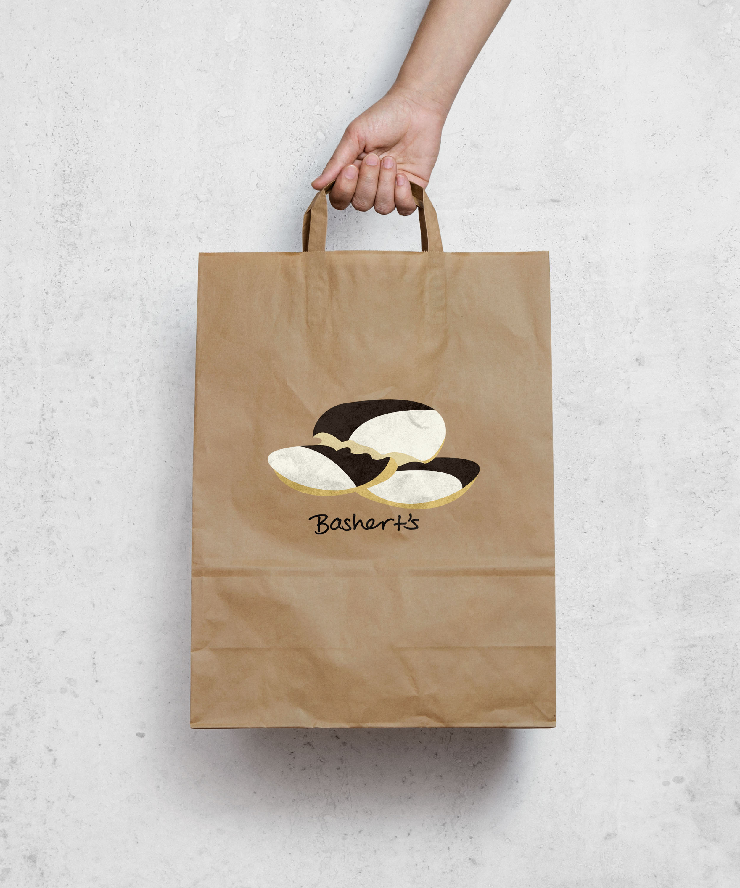
My business is a black and white cookie bakery and company. I love black and white cookies and I am hungry just thinking about it. Designing the logo and card was a fun challenge. Stacy and my classmates were extremely helpful with their tips and feedback. People looking at it said my logo made them hungry which I consider a success! It was also nice to have a general and personal guideline to have to keep it simple and clear because it was a logo. Knowing I didn’t have as much freedom to keep adding colors and lines kept me focused.
I chose the name “Bashert’s” because it means soul mates in yiddish. Stacy suggested I make a mind map for the name- writing things down I associate with my experience of eating a black and white. My main draw of association was my personal cultural jewishness, eating them as a child, my grandfather always bringing them for me, and insisting on getting them with my bagel and schmear everyday after ballet. I like the concept of soul mates because that is exactly what chocolate and vanilla is for one another. Soulmates.


