Assignment Prompt
Each day you will research and find one image, based on your evolving idea/theme. This image is analyzed
visually in detail in writing, questioning its meaning in relation to the context where it was found.
You will also create a visual response to each image in the form of drawings or photos, based on your
selected image. This response can visualize what you feel is the “cause” of the image, the consequence of
what you think might have immediately followed the image, an opposition to the image, or a conclusion.
Jan 23rd, 2018
Image

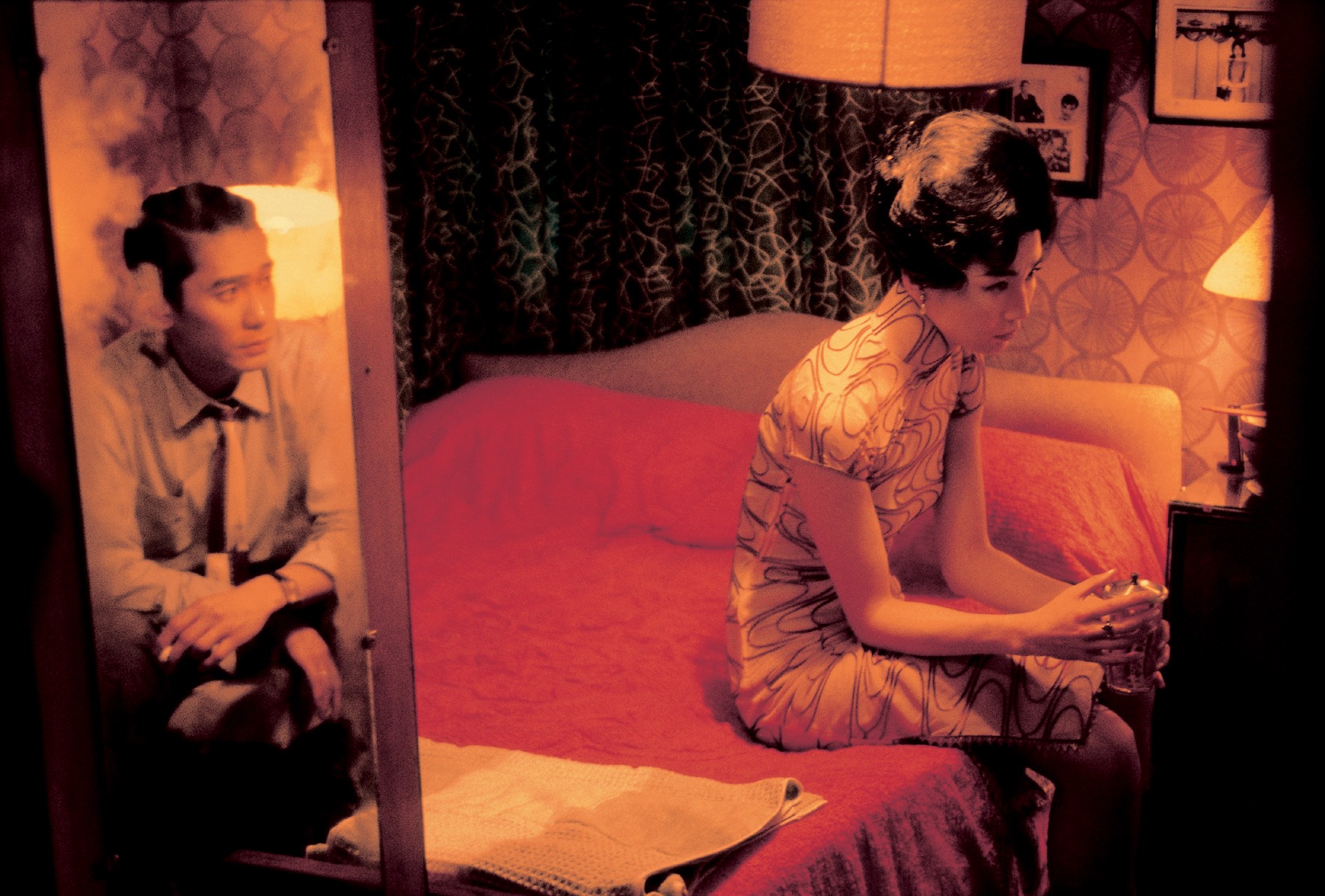
A scene from “In the Mood of Love”, directed by Wong Kar-wai
Analysis
For me, anything simulating surges and falls of my emotion are art. Color, composition, content are three things that I will notice at the first glance. Rich pink, red, black are three main colors of this image. It creates a romantic scene and implies the relationship between them is love related. And Because the colors are so intense, when I look at this, I feel like something is pulling me. And the closer you look at this scene, the more sadness you will get. And the way the director manipulates the audience’s eyes is spectacular. My eyes first stop at the man in the mirror, a decent gentleman, with a ring and a cigarette. Then, I followed his vision, I see a woman in a delicate Qipao, a traditional costume in China, mostly in Shanghai and Hong Kong, with a ring as well. And when I follow her sight, I come back to the man. It is well thought and balanced. From their facial expressions and the cigarette, Without any line, we can tell that both of them look rather worried. And if we look close enough, we see that the photos on the wall are all hers. Now, every clue the director has given us all lead to one thing, their relationship, which is also the main theme and conflict in this scene, a shady relationship.
This image is a scene from the movie “In the Mood of Love” directed by Wong Kar-wai in 2000, shot by Christopher Doyle, Kwan Pun Leung, and Mark Lee Ping-bing talks about the relationship between Mrs. Suen and Mr. Chow in 1962. The movie was created for all people who desire to have a relationship or had a relationship before. For this shot, I think it was created for those people whose related to relationship, and mostly had/have a problem with speaking up for themselves. They were painful, sad. I can see their passion, love, yearning, and contradictions in it. But they were trying to hide it. It is a typical thing in East culture, people usually have something to say, but they don’t say it. Having had this sort of experience a lot, I can deeply feel them, so can anybody who has had this kind of experience before.
Jan 24th, 2018
Image
Analysis
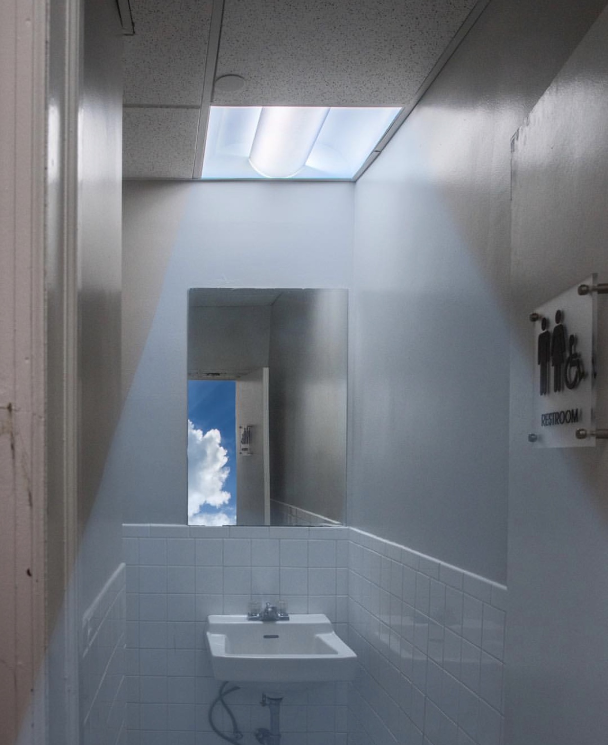
I was browsing Instagram when I saw this collage. It was made by KangHee Kim a Korean artist who is based in New York and specialized in doing collages in an unexpected way. She took out the reflection of the view outside of the bathroom and replaced it with blue sky and clouds. It is interesting to me because it shows that the power of creativity, by changing a little detail could make a huge difference among things, sometimes add stories into it. By adding the sky scene, this small place seems more intriguing to the audience, for it highlights the whole photo, and adds a certain depth to it, due to the bright hue of the sky. And when I looked at this photo, I felt curious, positive, refreshing. I love things that can pass that transmit this kind of feeling to me. Probably because I love nature, and I would always love to see modern cold cement combining with warm lively nature. It is interesting to look at an image with a mirror on it. Because, as the audience, when I am looking at the image with a mirror on it, whatever on the mirror intends to make me feel, I feel doubled, like the feeling is observed by me, but reflects by the mirror again. And the tone of the image is unified, cold blue tone without losing the highlight of it.
Jan 25th, 2018
Image
Analysis
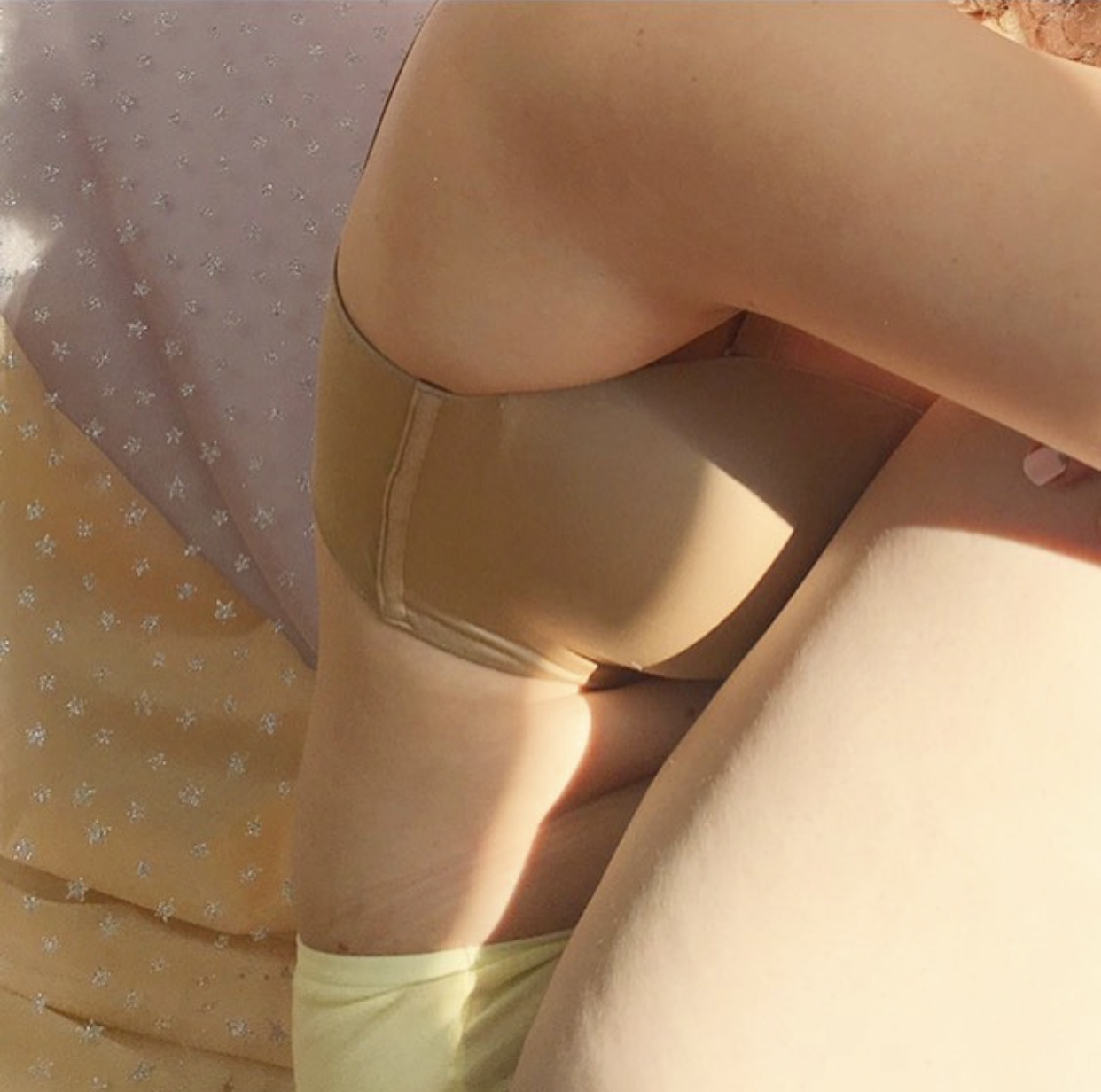
Nude Bra, yellow underwear, pale orange background, a little-faded pink on the upper corner, with gold star patterns on the transparent satin, a beam of lights, and a body without any photoshop editing, all of these things come together to drag me into the memory. Last year, in Shanghai Fashion Week Winter Fall season, there was a Russian model died because of her agency company’s inhumanity treats and overloaded work. And the news “Victoria Beckham Draws Uproar Over Superthin Model in Ad Campaign” reported from New York Times. Considering these two and other campaigns or events in the fashion industry, it does seem that we are now in a generation of being aware of self-reflection, and self-conscious. These years a lot of designers and companies have decided to use models in normal body shape to not only show respect to the customers and human rights, but also to clarify the “you have to be perfect, thin, tall, etc” false message that has been sending to the public for years and years. The beauty of this picture is not only in an aesthetic way but also in humanity way. With the cohesive color scheme and the simplicity of elements in the image, I felt refreshed when I saw this image on Petra Collins’s Instagram. I could obviously see the wrinkles on her waist. All of these create a picture that has no extra, but authenticity. I think it is for those people who value the authenticity of me would really appreciate an image like this.
Jan 26th, 2018
Image
Analysis
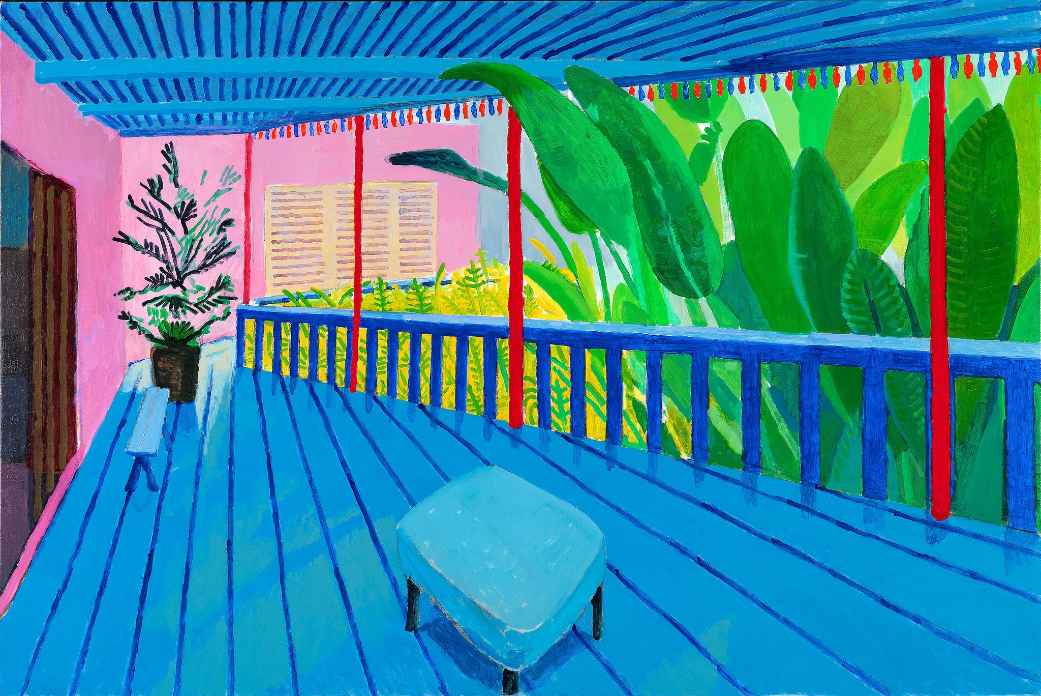
After I finished my analysis for my objects as history class in MET, I ran into David Hockey’s exhibition. The whole exhibition was literally mind-blowing. I’ve never seen someone doing such a great work. The piece above was one of my favorites. What attracted me were the fearless colors he used and the composition, the way he draws space, in other words. Triadic colors, red, yellow, and blue dominate the whole piece. He draws this in a flat way, but he is still using one point perspective, which does not reduce the depth of this space. By playing with the saturation of those three color, adding other colors like green and pink, and visible brush stroke, it looks much more vivid. When I saw the real piece, I was absorbed into the delightfulness delivered by this artwork. And because the color palette is so rich and lively, it reminded me of the days I spent in Cuba, leisure, slow paced, and delightful. I felt truly happy and full. This image/drawing is created for Hockey’s fans, color lovers, Matisse lovers, Picasso lovers, and Raoul Dufy lovers.
It is inspiring to see such great work.
Jan 27th, 2018
Image
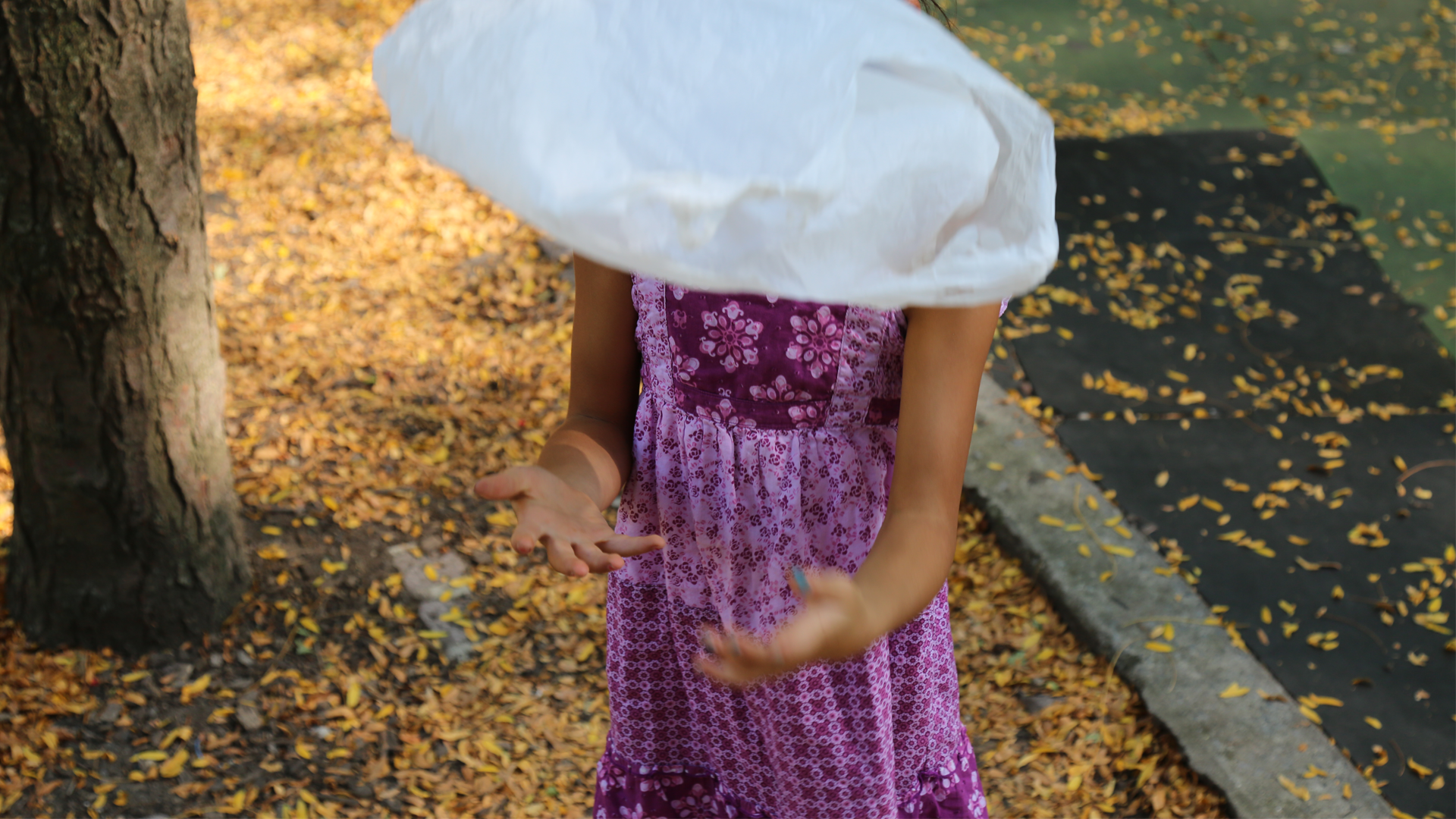
I took this pictures last semester. When I saw Kotori Kawashima’s photo above, I immediately thought of it
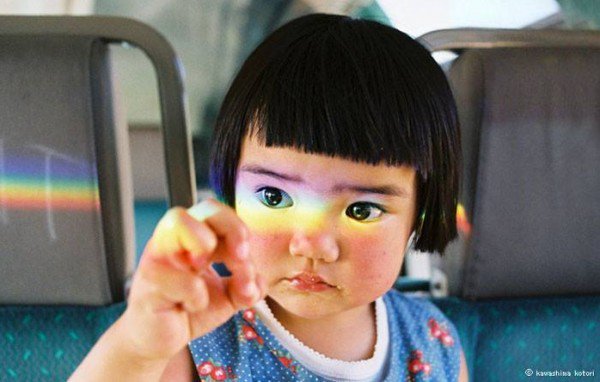
I found this image when I was doing my research on Japanese photographers. The picture above is photographed by Kawashima Kotori, 川島小鳥, a piece from the album《未来ちゃん》, which is all about his daughter’s special moments in her life. From all the adorable picture he took in that album, this one is my fav. The balance of the color and the beam of rainbow reflection catches my eyes. The girl reminds me of my childhood. She was trying to catch that stream of the rainbow. I used to do that as well, and I think “I’m gonna catch it”, “I will try”, “carefree to others opinions” moments, are the most precious. With girl’s twinkling big eyes, baby fat face and hand, her colorful clothes coordinate with the dark teal background, “Curiosity” was the first word on my mind.
It was first created for recording his little girl’s life. But later, when people started to know him. They have the same feeling as I have. This image has a power that could recall your memory, not a bad one, but the most joyous one, the one that would make you smile, by finding sparks among the ordinary stuff.
The color palette is cohesive in this picture, as the color of her top, the color in the background, and the upper part of the rainbow are in the similar hue. Meanwhile, red flowers on her top, the color of her face, and the bottom part of the rainbow echo each other at the same time. This picture wouldn’t look so balanced, or the girl wouldn’t be stand out, if the background is in a bright color, since the gray in the back formed a contrast.
Jan 28th, 2018
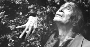
This image shows “Desire” precisely, and somehow “Relieved” as well. It tells a story about a man uses his hand to push a jumble of bushes aside, and finally gets to breathe. The elements in this photograph are rather simplified, bushes with blossoms, an old man with his head up, and his right hand. However, I figured that as long as an image with a person’s head up or showing their Adam’s apple, or hands push something, or come from a darker/messy part, it can be seen as a symbolism of desire. The reason behind it is simple by thinking about the function of them. Heads up is for breath and sees stuff we normally wouldn’t see. Hands as a tool of grabbing objects that we want, and maybe that’s way in any language in the world, we use phrases like “seize the moment”,”catch your dream”, etc. And the last but not the least, Adam’s apple swallow, as we all have desires for food, and in our life, swallowing can be considered as sexual desire. I love this image because it has all the elements of desire in it. However, it does not seem too much at all. One of the reasons behind it might be the composition of it is quite balanced, as the hand is on the left to balance out the right part, as well as enhancing it. The other reason that I can think of is that it is in monotone. I try to imagine this picture with colors, it wouldn’t be as effective as it is now, since the color of the leaves, skin, hair, and his clothes will distract the focus.
This image was shoot by Eikoh Hosoe, a Japanese photographer who is known for experimental arts and photos that he did after World War II. This image consoles those people who suffered from the war, and to express desire, obsession, etc. Most of his work is quite experimental, as the set of the photos are usually pre-designed. He also challenges the theory of photography as well. However, photography is not just about recording, but a tool of expressing, or a weapon.
Jan 29th, 2018
Image
Analysis
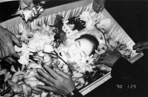
In east culture, it is not ominous to take the picture of a dead. Nobuyoshi Araki, a Japanese photographer took his wife, Yōko Araki’s picture on her funeral. I’ve been interested in death and living since 7 years old since it is such an eternal, mysterious, and a bit scary topic. I only attended two funerals. The people in the funerals have really weird emotions. As for my aunt, she can cry when she was in the mourning room, where dead lies. When she talked to my mom, it appeared her sadness was all gone. And some people tried their best to restrain their emotions. Since I was born, nobody had ever told me that what do they think of death. When comes to talk about it, people just change the subject. Death is something forbidden. Instead of avoiding death, Nobuyoshi reveals the face of death. That is beauty, and somehow a sense of desire because of the hands, flowers, and mostly, her peaceful face. at the upper right corner, it is an album book, “Sentimental Journey/Winter Journey” with all her photos taken by Araki.
Yōko’s face stands out because of all of the hands are interfacing. And as same as Hosoe did in his photo, he uses monotone to prevent distractions from bright colors.
