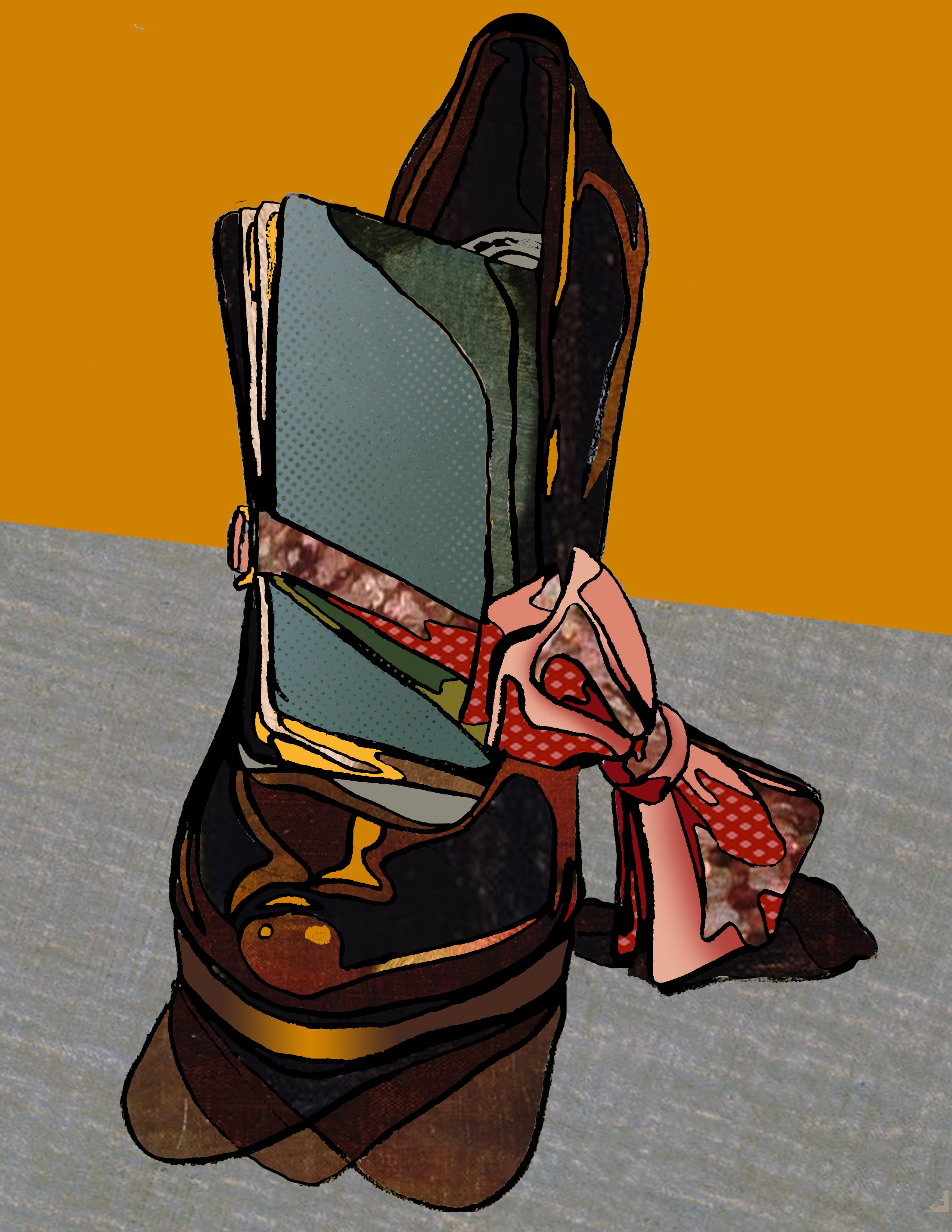
When picking and arranging objects for this project, I wanted to create a balanced composition that was also dynamic, leading viewers eyes around the peace. I tucked a passport into a black high heel, with a pink bow tie hanging around both to develop the concepts of identity and expression through the interaction of my objects. I used the principle of axis when positioning the objects to create interest with varying directions. Drawing thumbnails, I experimented with different perspectives and found I liked the more dramatic effect of an almost straight forward angle. Because the shoe was very reflective, using contour line drawing to depict so many shadows and highlights was a little challenging but later allowed me to create a detailed, 3-dimensional yet still stylized piece.
When working in photoshop I chose a painting (Still Life with Flowers and Fruit by Henri Fanton-Latour,) that had a range of bright colors so I could create graphic pieces with high contrast. For my first iteration, I transformed the different pieces of the painting as I collaged them to play with texture and scale. The colors, while not always true to actual colors of the objects, still reflected the different values I outlined. With yellow and white highlights and brown and blue shadows. However, the overall piece was still low key because i used a lot of the darker pieces of the painting where the texture was more detailed. I was able to create a high key piece for my second iteration by swatching many spots on the painting, and choosing the brightest colors. My fill in/brush piece was a lot more graphic than the others, but I was still able to maintain it’s 3-dimensionality through layering techniques to ensure shadows and highlights were apparent and not simplified by the restrictions of a 12 swatch color palette. My favorite technique was using the “Kyle’s Screentones” brush to add depth and also give my piece a comic-book look with the resulting polka dots when the brush strokes were transformed to a larger scale. My last iteration, the combination piece, I found was easiest to achieve the most realistic look. Being able to combine photoshop techniques and textures taken directly from the painting allowed me to easily define shadows and highlights and create an aesthetically appealing color story.


