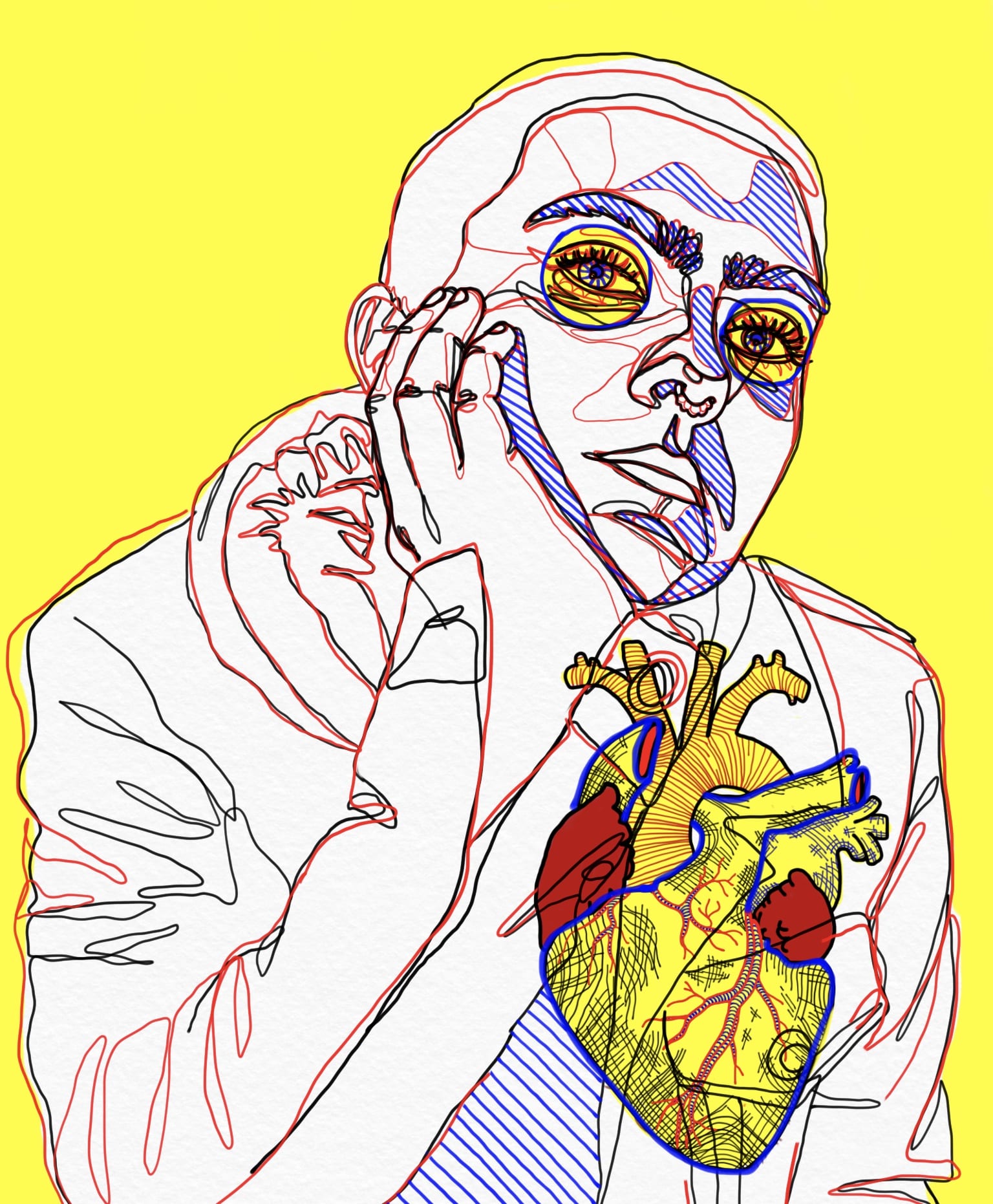
The most important thing my first semester of studio and seminar taught me, is to be intentional with the art I create. Before college, when doing art independently and even for classes, I often focused on the aesthetic and visual appeal of a piece more than the conceptual aspects of it. Because there was so much emphasis placed on ideation, research, and process this semester, I had to adjust to planning out a piece more intentionally and explaining to an audience the reasons behind my choices regarding the development and execution of an idea. The prompts, guidance, and criticism I received during the process of developing each project allowed me to more closely analyze how my work was perceived and create art with meaning. I used this idea of being intentional and emotionally involved in my art to inspire the creation of my final piece. Because this concept revolves around my personal growth as an artist, I chose to illustrate a self portrait. I wanted to draw attention to my eyes to represent the visual aspect of my work, how it is perceived by others and how I can control its appearance to an audience. I also drew in a heart to represent that I learnt the importance of making art from personal experiences and feelings in order to give it a message with conceptual substantiality.
Criticism I received was that this draft didn’t draw enough attention to the heart. The placement of colors also throws the balance of the piece off and visually falls a little flat. From this I decided to create another draft with a more detailed heart and more yellows and blues. It still felt a little flat and the blue wasn’t very apparent, so in my final I made thicker blue outlines around the eyes and heart, as well as shading in with blue lines for more depth.
I struggled developing a concept for this piece because I wasn’t sure how to visually depict the concept of being intentional. After pondering for about a week, I realized that the concept didn’t necessarily have to be 100% apparent upon first glance on my piece. By incorporating the emphasis on the heart and eyes, as well as illustrating myself with an almost determined gaze, I was able to capture the essence of what it is to act with intentions. Overall, I’m happy with the final piece, both conceptually and aesthetically. I think the color story and graphic style is true to myself, while the imagery creates a concept of growing as an artist. The layering of elements creates a sense of transparency. The concept of being transparent that ties in with the idea of being intentional in how a piece impacts an audience, and developing a concept that is clear. I wanted the piece to clearly indicate what aspects are important- my eyes, my heart, and myself. I struggled drawing the heart in cohesively because it didn’t tie into the picture of myself as easily as drawing the eyes did. I used yellow to add emphasis, and made certain layers of lineart disappear behind this yellow to bring the heart into better focus. I did still keep basic black lineart on top to show that the heart is one with me, not a separate concept on top. I had the most fun drawing the red lineart layers because they were more detailed than other line art and gave the piece more realism.


