Newspapers are a huge part of our lives whether we pay attention to them regularly or not. This project opened our eyes because we had to pay attention to the subtle details that printers and editors of newspapers display everyday for people around their neighborhood. It gives a new kind of appreciation for that hard work, and heightens our understanding on design and how it’s used in our day-to-day lives.
When creating the Jackson Journal, our group wanted to involve the culture and community feeling we had of Jackson Heights on the pages. The community is so diverse, there were many stores that we walked into where the first language people spoke to you was spanish. There aren’t many places in the city like Jackson Heights and we wanted to honour it with our newspaper. We started by creating different possible layouts, a logo, and trying to pick a font for our title. We spent a long time picking a font because we wanted to make sure it represented the melting pot community we wrote about. We then created those layouts on Indesign and with help from the class, compared them to each other. We decided to take elements from each option and mix them into one layout. We spent a very long time tweaking the design and using guides to line everything up. It was a very tiring process because you had to make everything fit perfectly and once you fixed one element there would be another issue.
Creating this newspaper showed us how strenuous the publication process is, and gave us an insight to what a job in that field might be like. We have a whole new appreciation for how difficult it is to put together a successful looking newspaper, especially if you’re putting out a new one every day.
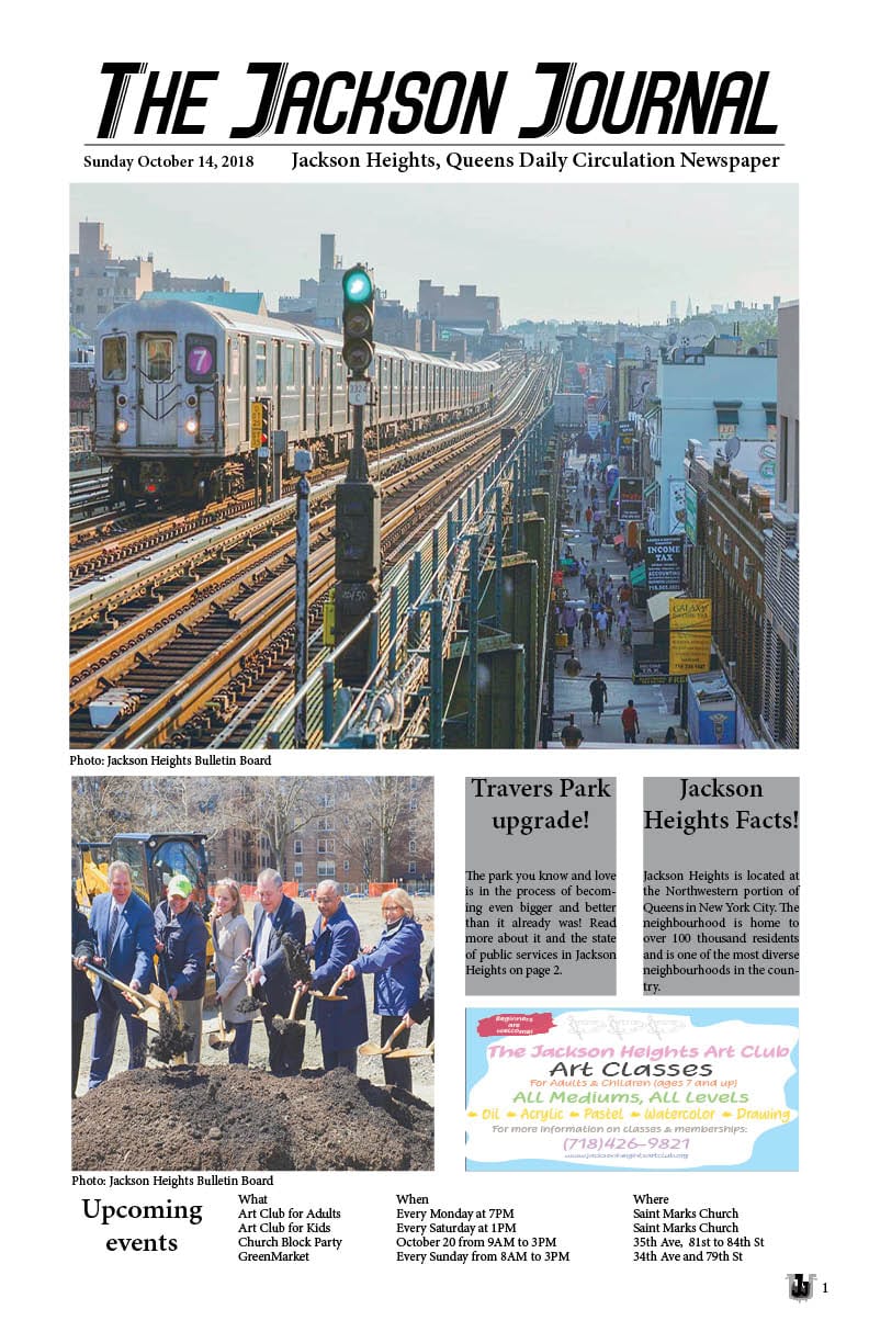
Page 1 (front cover)
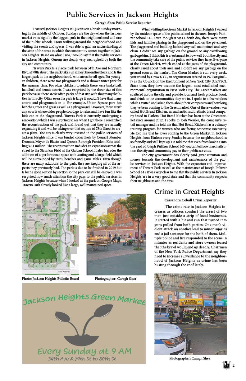
Page 2
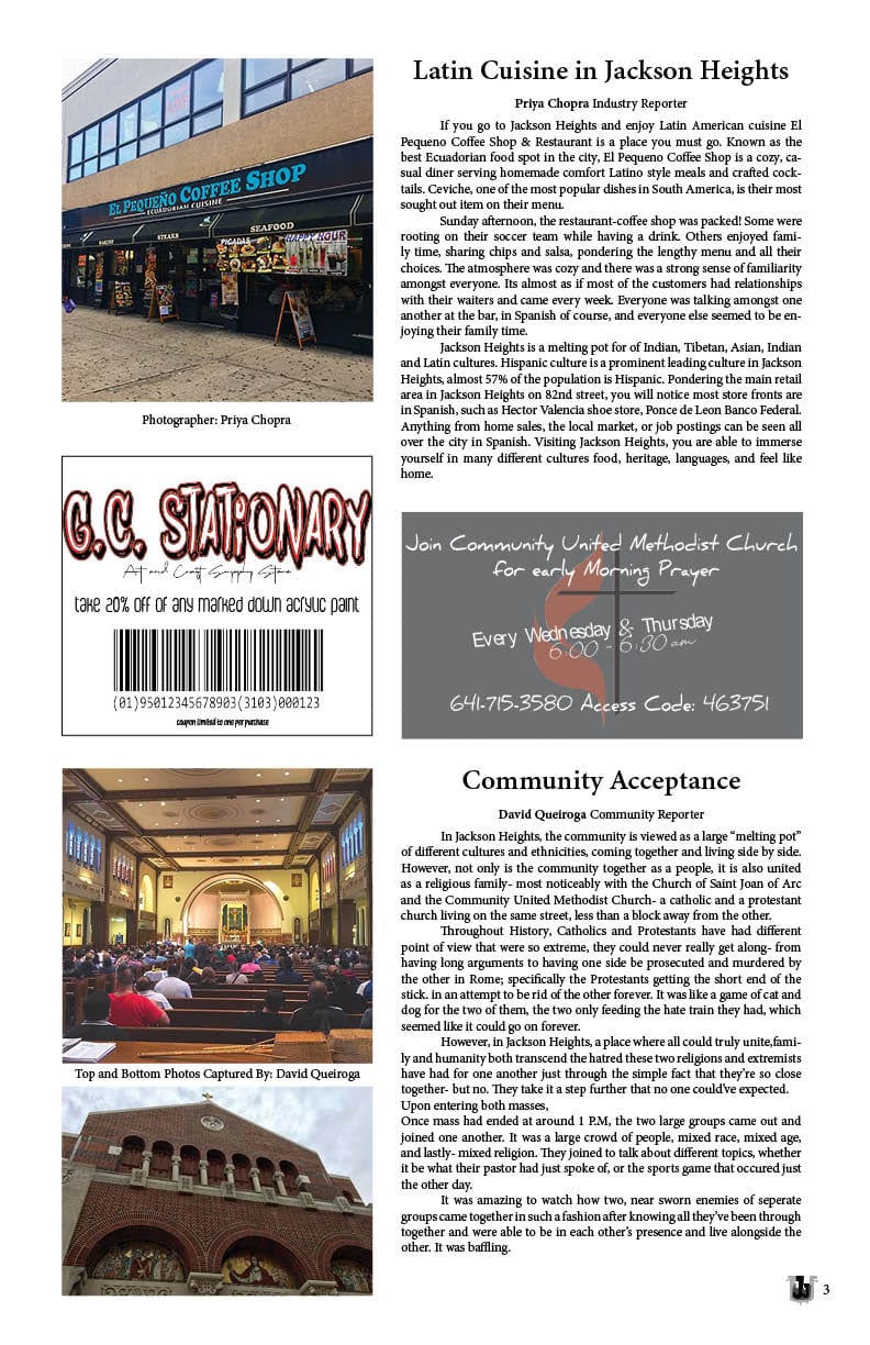
Page 3
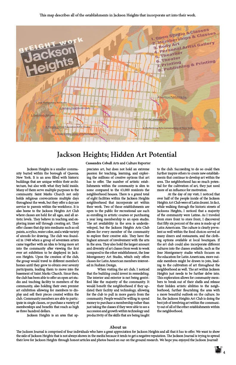
Page 4 (back cover)