
This is a photo of my planar self portrait. To create this painting, I used a photo I already had of myself and gridded it in photoshop. I then made a grid of the same proportions on my bristol paper with pencil in the center of the page. This made creating the proportions much easier because I could focus on one box at a time. I then turned it into a planar portrait with pencil which at first was very daunting. I wasn’t sure exactly how to do it but looked back at examples from class and started to get an idea. I sectioned the planes off with pencil. Then, I started creating my colours. At first I was trying to make a magenta but as hard as I tried, I couldn’t figure it out. I think it was because of the shade of red I was using. However, I was able to create these three colours which I ended up liking. I filled in the planes and tried to use different shades for the background colours to differentiate them.


Using the photo of my painting, I used the pen tool to trace each section of colour in Illustrator. I made each colour a layer and made them colours that were similar to the ones in the risograph. Then, I realized after checking the risograph file set up guide again that I forgot to leave a 0.25 inch bleed. So, I held down shift and sized down the file to fit. I also turned the layers into grey scale from their separate colours. This way they would all be the intensity that I had wanted when I printed them in their various colours. I also named each layer by its colour to make things easier.


I spent 2 hours printing because I, for the life of me could not get the orange to line up. However, I learned so much being there for that long and now I feel like I can go back and won’t need to ask for help as much. I felt like the people working there (other than Joe) weren’t very confident themselves in using the risograph so I didn’t receive much help. However, I feel like I learned much more than if they were to be able to answer every question and do things for me. For example, I kept making a master on the same colour if I changed the density of colour (to decide which I liked best) because I didn’t realize I could just press print.


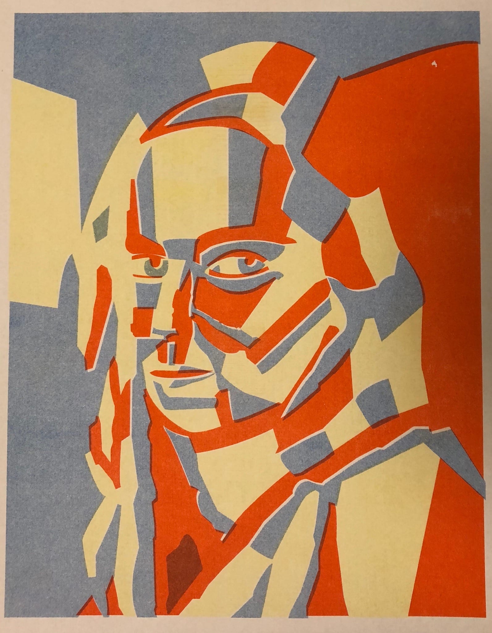
Even though the orange isn’t aligned, I think the final product looks really interesting and eye catching. I think the colours work well together since they are a triad. I think it was a good decision to choose to print only three colours because it looks like I am fading into the background which I think for a risograph print is really interesting. However, there is still a distinction because of the yellow and orange pieces of hair.

In this print I used pen to outline each section. I did this because I thought it was so interesting to see each section separately as I was printing. I wanted to highlight the fact that each colour was printed separately and that each section was it’s own shape that came together to make one face.

I used watercolour to embellish this print. I wanted to use watercolour because I love how it can be concentrated or transparent. I used the same colours as those in the print to emphasize them. I also used yellow water colour on top of the yellow section to make it more vibrant to match the orange.
I thought this was a very exciting project and I would definitely use this process again in the future. I really like painting but never think to do it and am not very confident in my drawing abilities. However, I really like how both the drawn and painted portions turned out. I really enjoyed the process of bringing analog and digital together when I traced my painting in Illustrator and I think it’s amazing that I was able to create another analog piece from it.