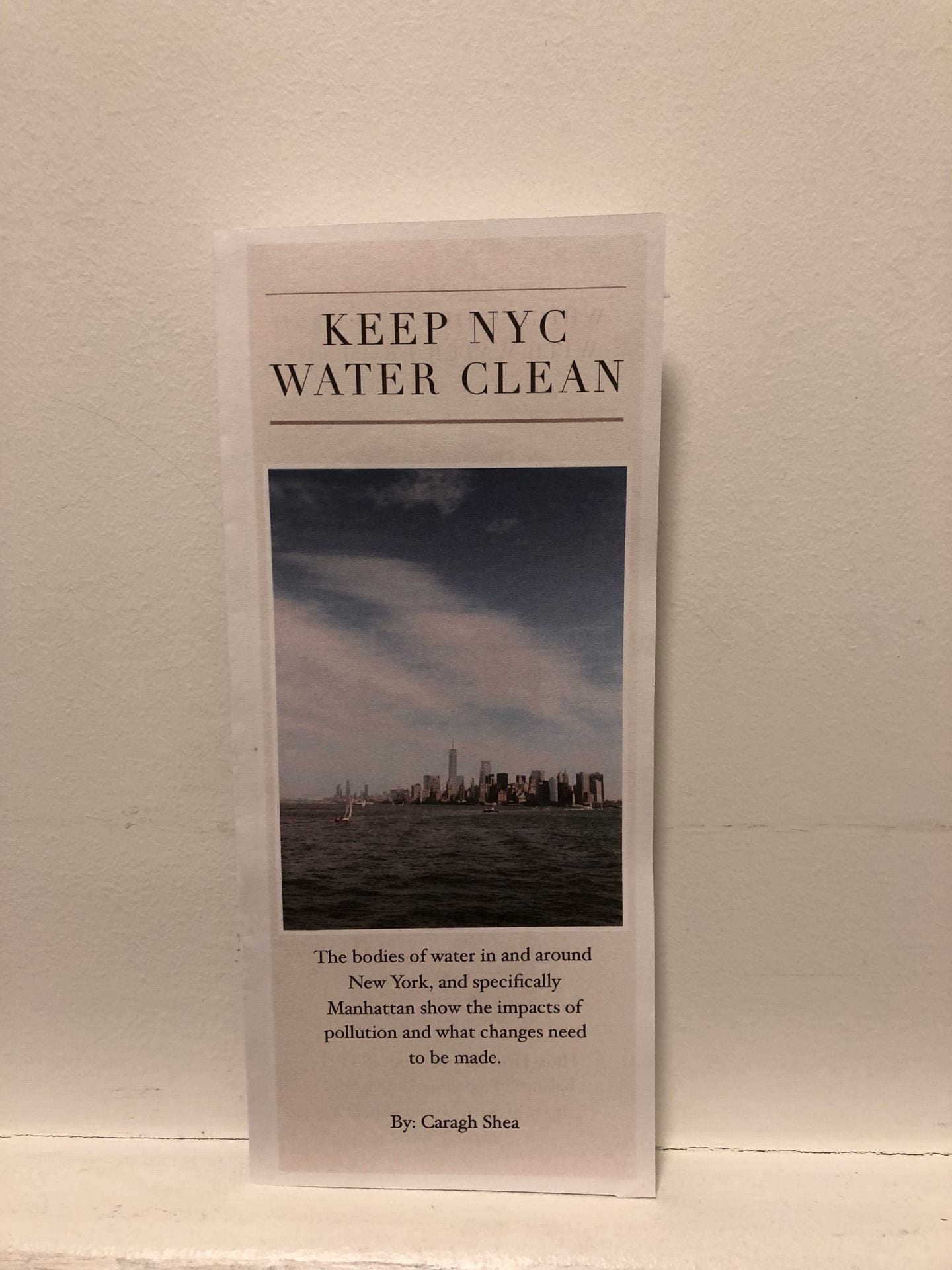
I designed an informative brochure to continue the work that the Department of Environmental Conservation has started. They are committed to keeping New York’s bodies of water as clean as possible and have a lot of information on their website about it. However, the information wasn’t visually appealing at all and there wasn’t much proof of the pollution. I wanted to use my natural dye experiment to create a visually appealing, understandable brochure that the organization could give out.
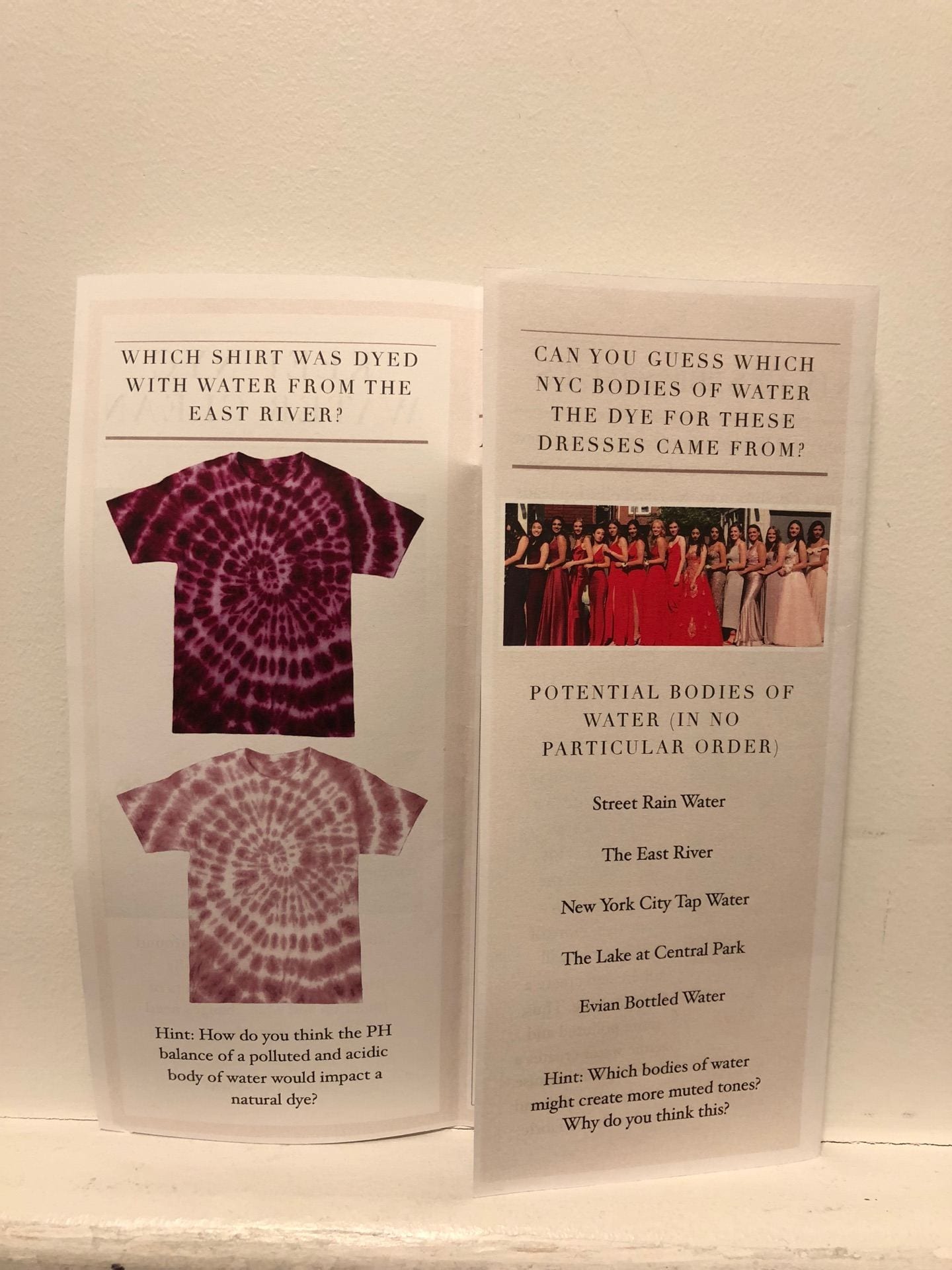
The brochure is a more accessible and visual form of information than their website. It could be given to people who are having trouble understanding the current issue with bodies of water in and around the city. The front page of the brochure says, “Keep NYC Water Clean,” with a photo of the city from the water. I took this photo on the circle line tour field trip and I think that it shows how important and large the bodies of water are. The front page also has a statement about pollution and water in Manhattan which sets the tone for the rest of the informative brochure. When you open the brochure, you see two quiz-like images with questions. I wanted to get the reader thinking right when they opened the front page and thought it would be good if these two pages connected. When you open the brochure all the way, you are able to answer those first questions based on my natural dye experiment. I showed all of the results and how they measure up on a PH scale. I wrote a short paragraph about the experiment and went into more detail about what these results mean. I made the photo of my results quite large because I think it is very important to see the difference between each sample since they showed accurate results. This page will help people understand where the more polluted bodies of water are and how they are related to bottled and tap water. Even if the people reading don’t know much about pollution in relation to bodies of water, with the PH scale you can see that the water from the East River is the most acidic. The word acid reminds me of acid rain and harmful chemicals which is why I included both acid and base. On the back page I included a statement about the Department of Environmental Conservation for New York State and their contact information. This way, after reading the information in the brochure these individuals will be more informed and can learn more on their official government website. I included the link to their page specifically about water conservation because it would be a fast way for the reader to learn more about this specific topic.
This informative brochure is meant to increase awareness about the state of pollution in the bodies of water in and around Manhattan. The Department of Environmental Conservation could give these informative brochures out as another form of education as it is more accessible and comprehensible, especially for people that want to start forming a deeper understanding.
![]()
Brochure outside.

Brochure inside.
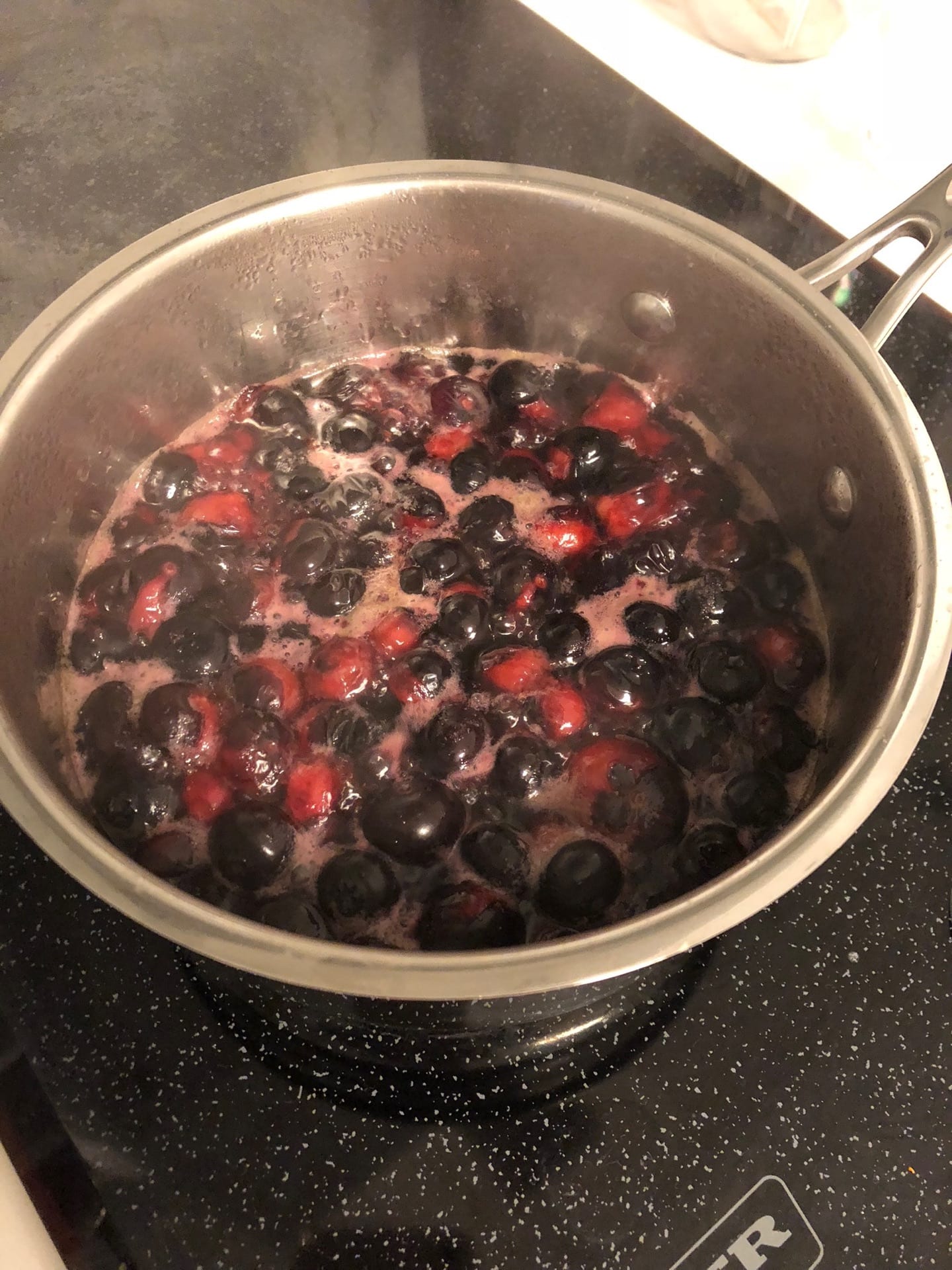
Making the dye.
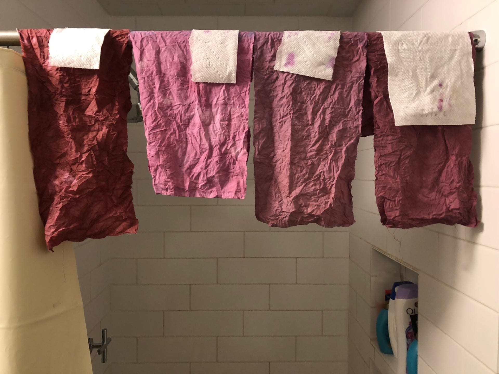
Drying the samples.

From left to right; Central Park, Evian bottled water, NYC tap water, street rain water, East River.
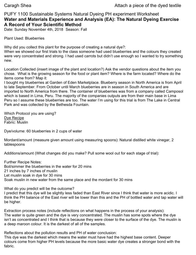
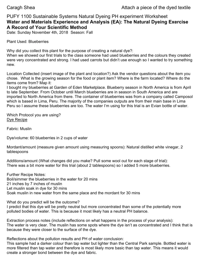
Central Park.
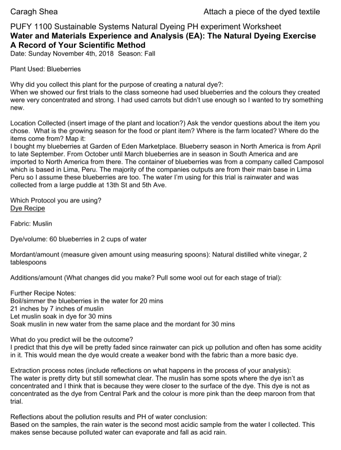
Rain water.
Bottled water.
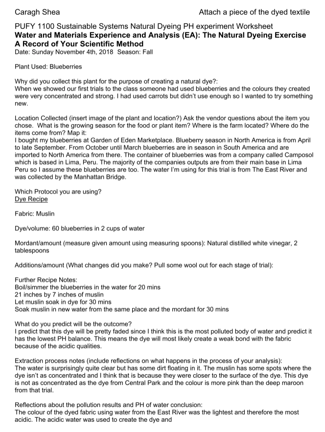
East River.
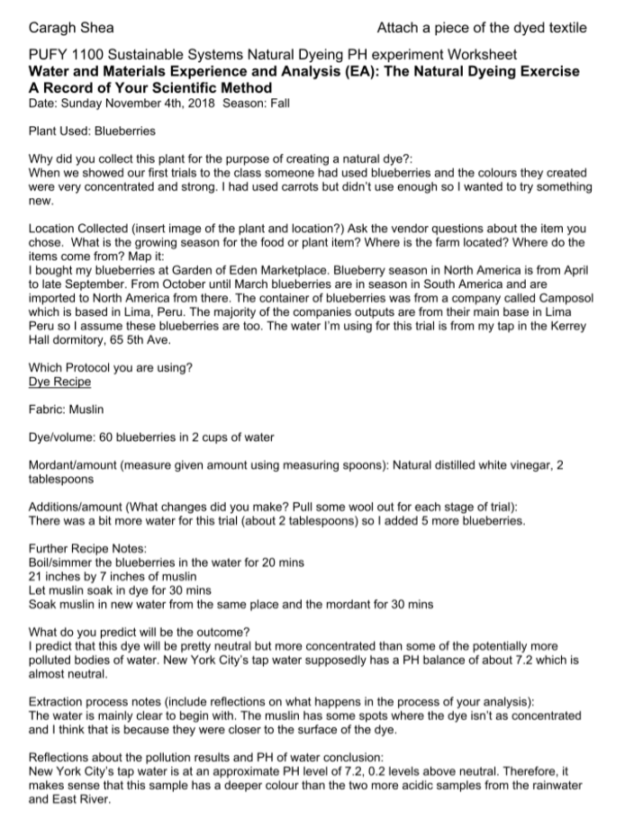
Tap water.
Front page of the folded brochure.
Inside cover of the folded brochure.

Inside of the folded brochure.

Back of the folded brochure.