I started by creating sketches and trying to explore all the possible graffiti styles I could use to illustrate my name.
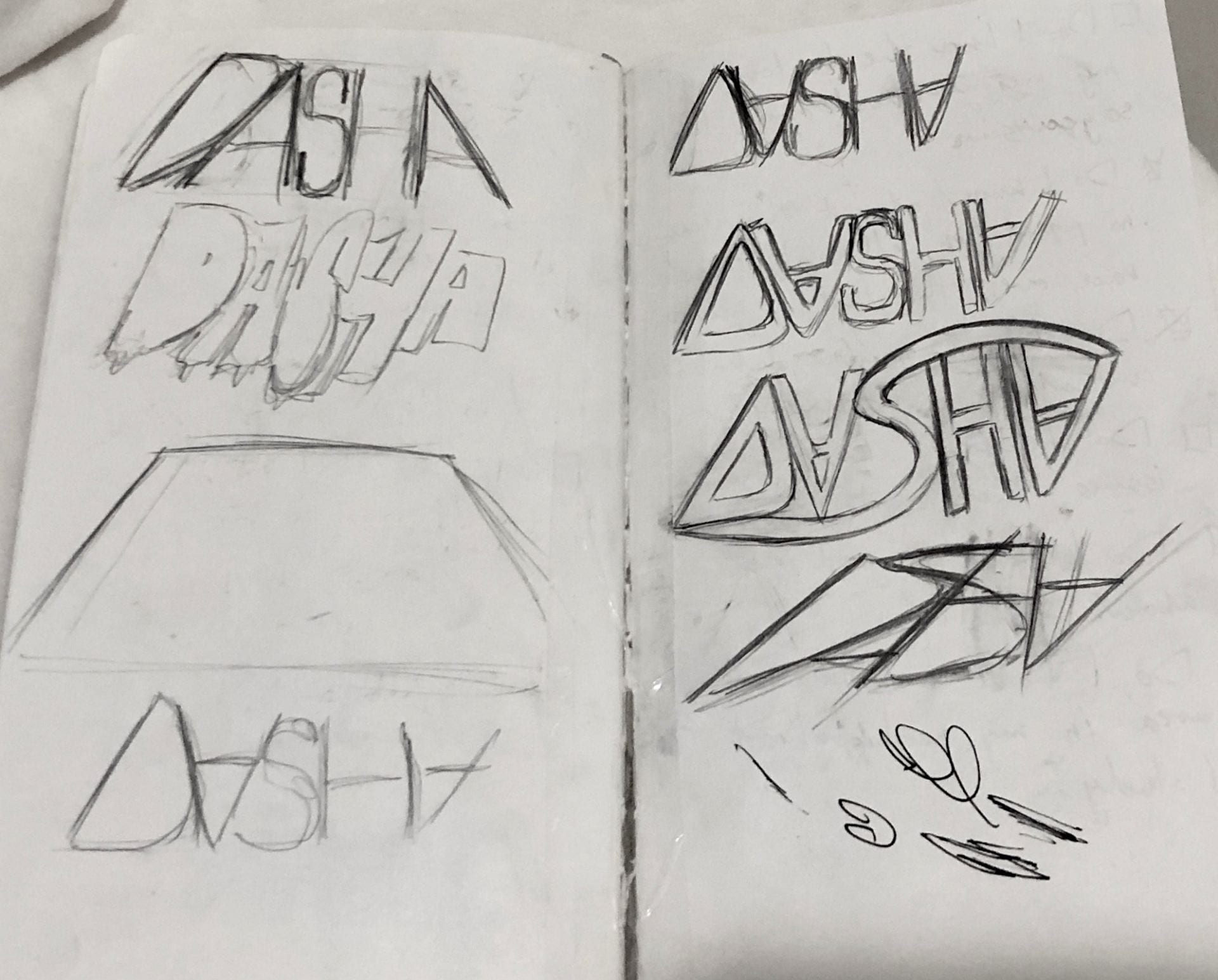
I enjoy experimenting with type and letter position, that is why I was trying to write my name in a less clear way for it to look like a cohesive piece and not particularly standing individual letters. Out of all the options I decided to pick the more sleek and minimalistic design because I felt like it represented me in a more clear way than other designs.
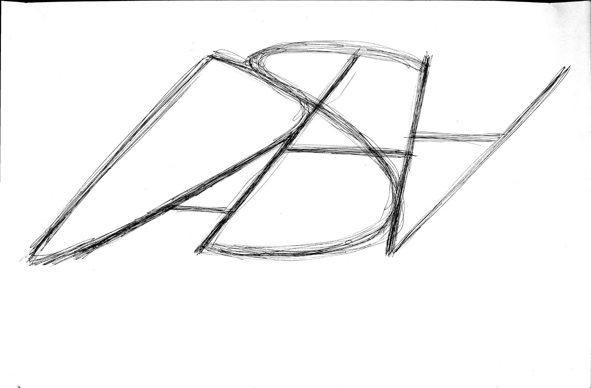
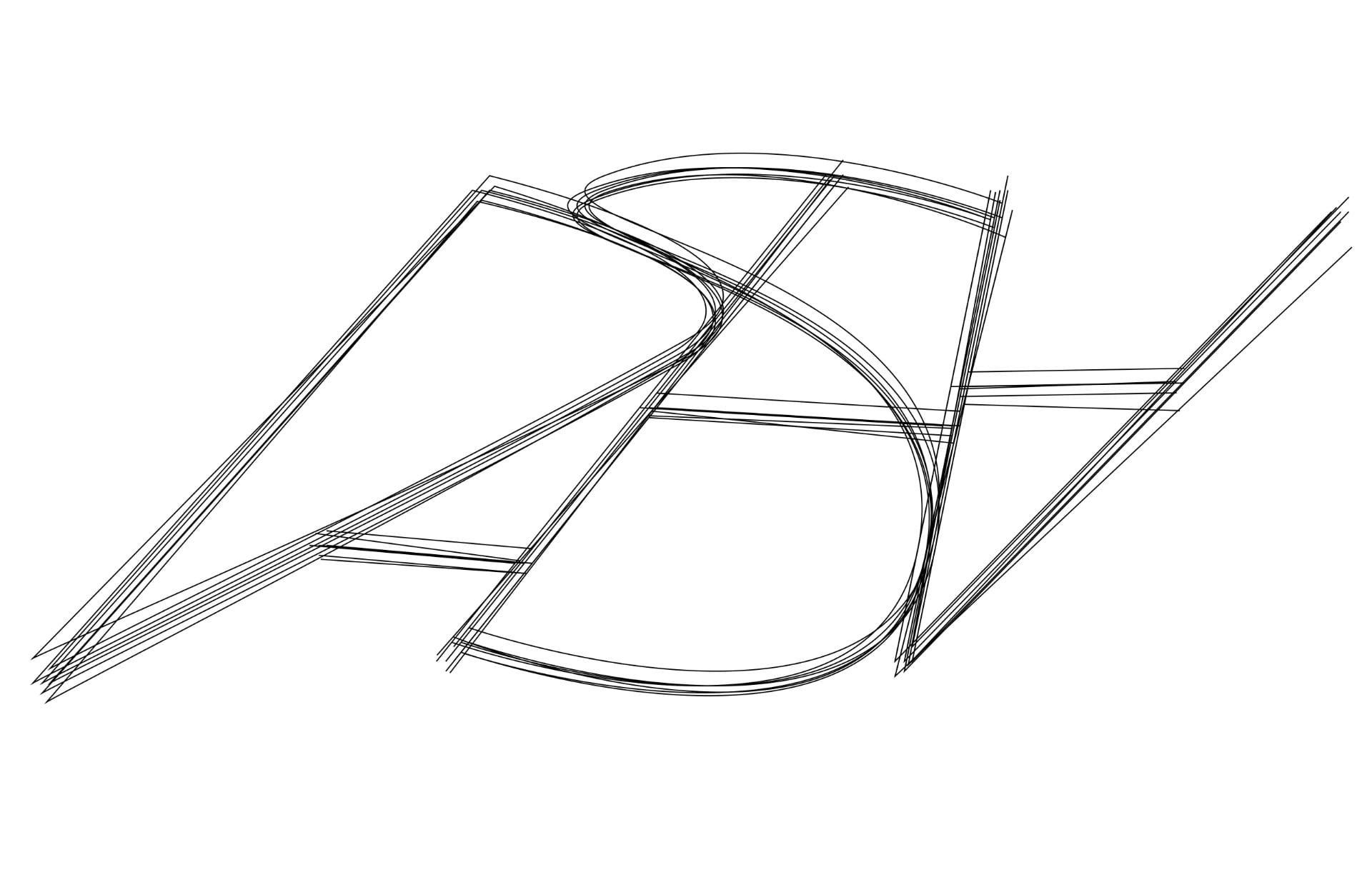
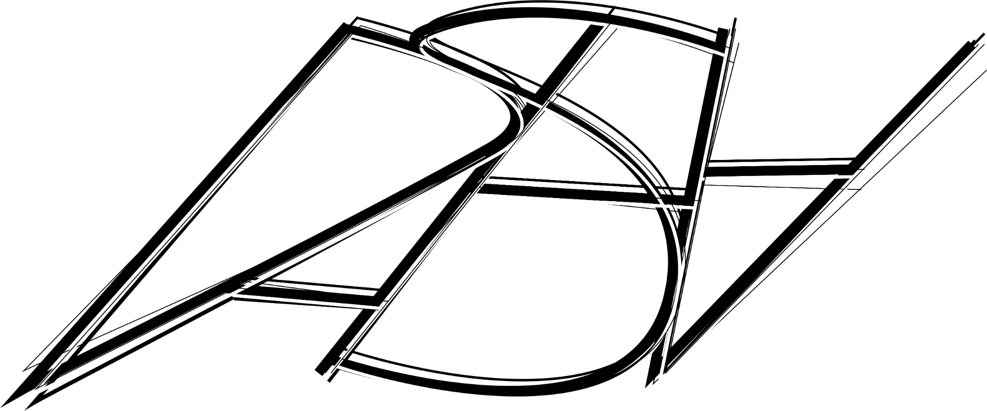
When I finalized my design, I drew it on a piece of paper which I later scanned to outline in illustrator. I started with multiple lines of the same weight which did not look very dynamic. So I decided to play with the thickness of the lines to create more exciting line variations within the piece.
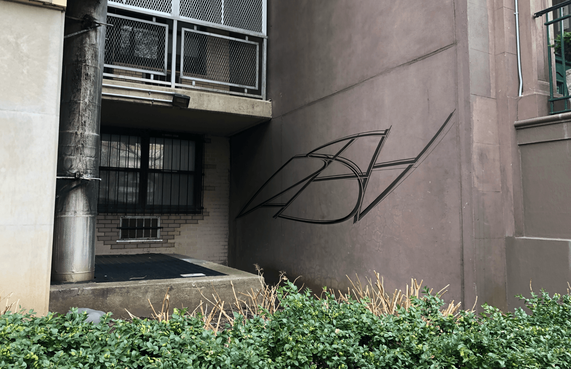
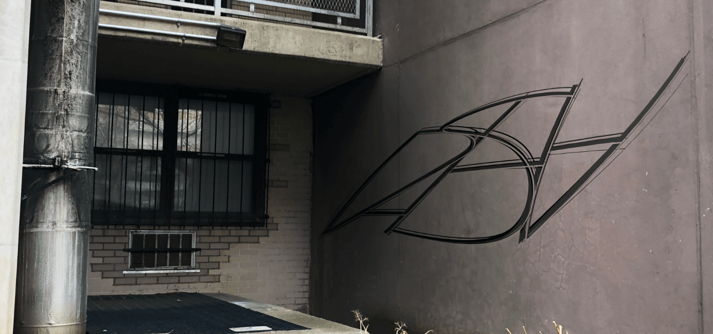
For the final version, I put the updated version of my name on the wall that is located near Stuyvesant residence. I aligned my name with the direction of the wall, made the left part of the graffiti darker and the right one lighter to make the graffiti look more realistic.