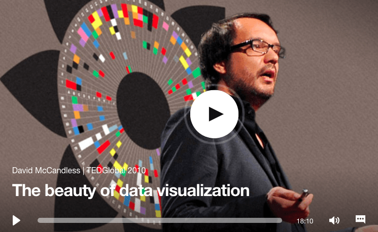
What was the purpose of watching this video?
The purpose of this video was to show the audience the beauty of data, but also to show us the potential and far reaching solutions that well-designed and compressed data visuals can provide. The examples used in the video were diverse in topic from serious issues to miscellaneous ideas which shows just how much information and types of information we can use. The effectiveness of these data visualizations is something we can incorporate into numerous fields.
What did you learn from this talk?
The aesthetics of design has always been something that intrigues me as well as the world wide application it has. Seeing the two side by side for what feels like the first time that I have been formally taught in which one was not sacrificed for the other was something enjoyable. Though I have known it can be possible to create ‘elegant solutions’ I suppose I never knew just how applicable it could really be. Though a lot of the data presented in the video was not too complex of an issue (the facebook break up correlations) the information that could be implied or gathered from this small string of statistics did go further into more complex conversations. The information wasn’t just given to the viewer, it directed the viewer like the composition of a painting. It made you feel something in the way it was presented and compared/ connected.
