PROCESS
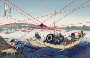
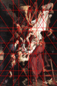
- First, I played with asymmetrical and symmetrical compositions from prints and ruben paintings: creating indirect lines along the pages
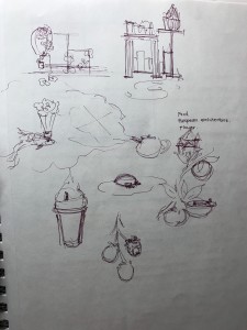
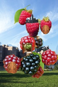
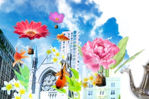
- Based on the idea of having guidelines and directions on the imagery, I experimented with different sceneries for the spatial landscape. I drew some ideas and collected images for the two I have narrowed down and pieced them together on photoshop, a collage. I wanted a happy, magical and surreal scenery, hence the berries, flowers, fish and vibrant elements.
** I didn’t like the teapot and the smoke**
** I didn’t sketch out the alterations I’ve made to the layout, but I rearranged and experimented on photoshop**
2. After finalizing on the collage I wanted to based off of, I converted it to black and white and added lines (measured, 1:3 ratio) to make grid on a letter size document.
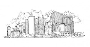
3. I then realized that the buildings were too big on the actual drawing paper so I shrunk buildings, rearranged flower balloons and fishes.
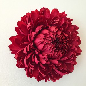
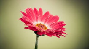
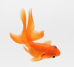
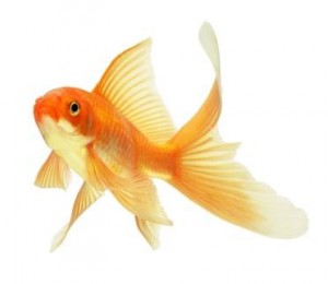
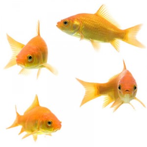
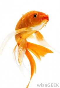
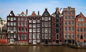
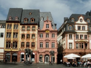
I also collected inspiration and reference photos of European buildings, flowers and goldfishes
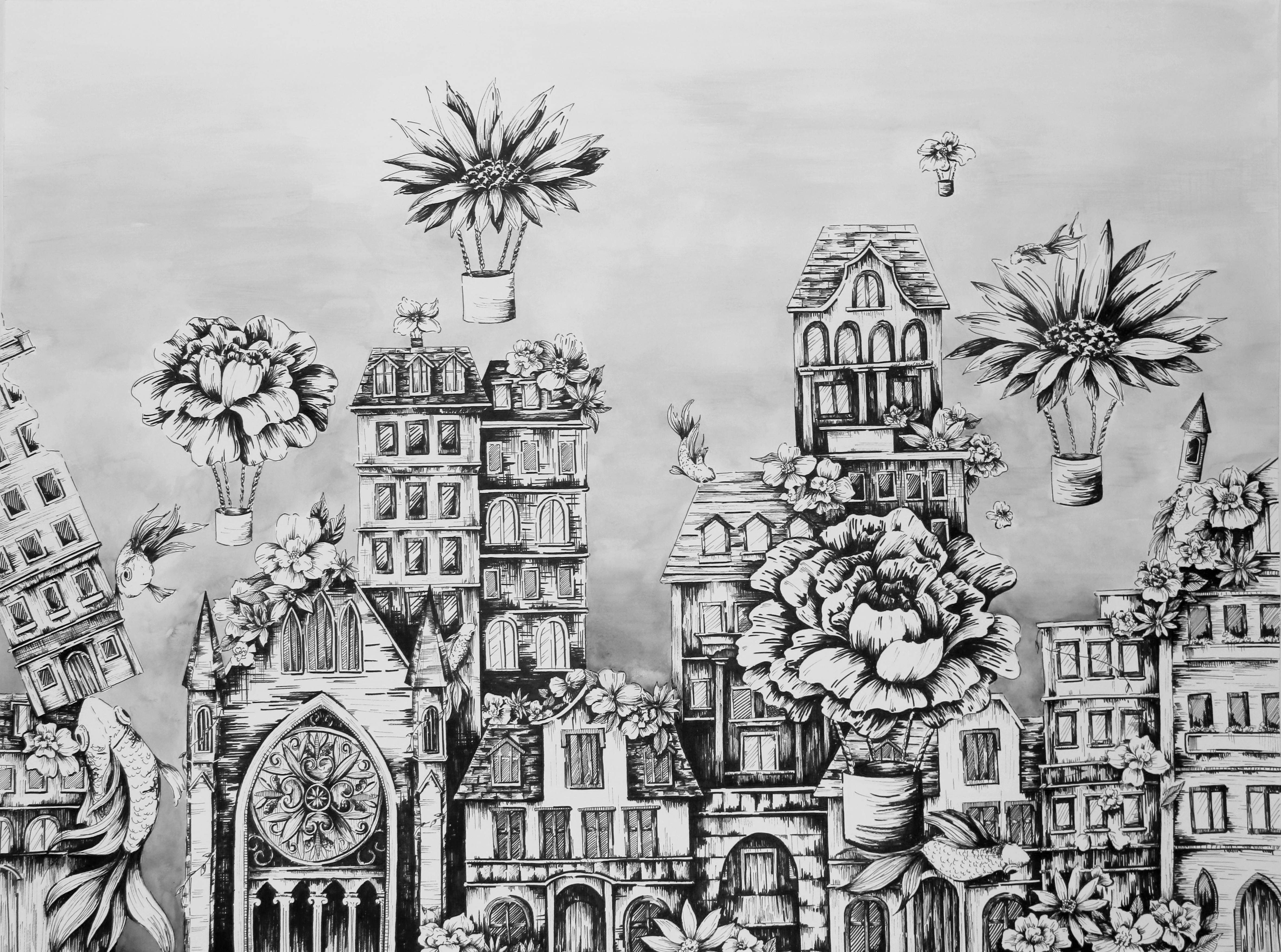
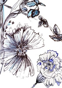
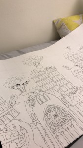
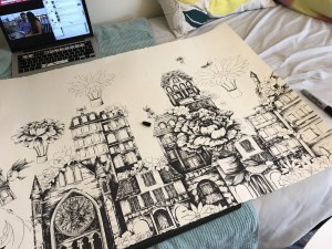
5. I began drawing with graphite, laying it out on the paper with the ratio in mind, 1 inch on the collage = 3 inches on the paper. I then inked it with sharpies, with different thickness, then made a wash with watercolor for background.
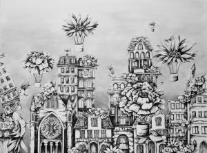
6. I added more details along the way and shaded some parts black to indicate shadows and distance between each element.
Throughout the process I had to change the size of all the elements in my collage, as I did not anticipate the actual size of it on the drawing paper. So I shrunk all of my buildings and rearranged the flower balloons. Despite the amount of time spent on this project, I was pleased with the outcome. In the beginning I was hesitant to use ink pen rather than charcoal due to time and the inability to smudge and cover a larger area. However, I was glad that I was able to make use of the different thicknesses of the markers to add details, small details that charcoal isn’t able to produce. I feel like my strength in this piece was the details I’ve put onto each element, however, the contrast wasn’t strong enough. I wanted to fill in more of the buildings but was afraid that I was overdoing it, since I wasn’t able to go back once it’s marked on the paper. I should’ve shaded the shadows darker so that there is a better sense of depth in the piece. I feel like it would’ve been more beneficial if I had cropped and placed European style buildings in my collage so that I would have a sense of what it might look like before I started drawing. Since I didn’t do that, I had to go back and forth searching up what the roof, the windows, the doors and so on should look like and drafting it out on the paper. I would also say I should’ve thought about which buildings are in the lighter range or the darker range. Last but not least I should’ve added shadows, separating the fish and the flower ballon to the buildings so that the viewer can easily distinguish which element is in front, closer to the eye.
