


First Stop: Aesop
Main Materials: Newspaper, Plywood, Textile, Coir (mat), Concrete
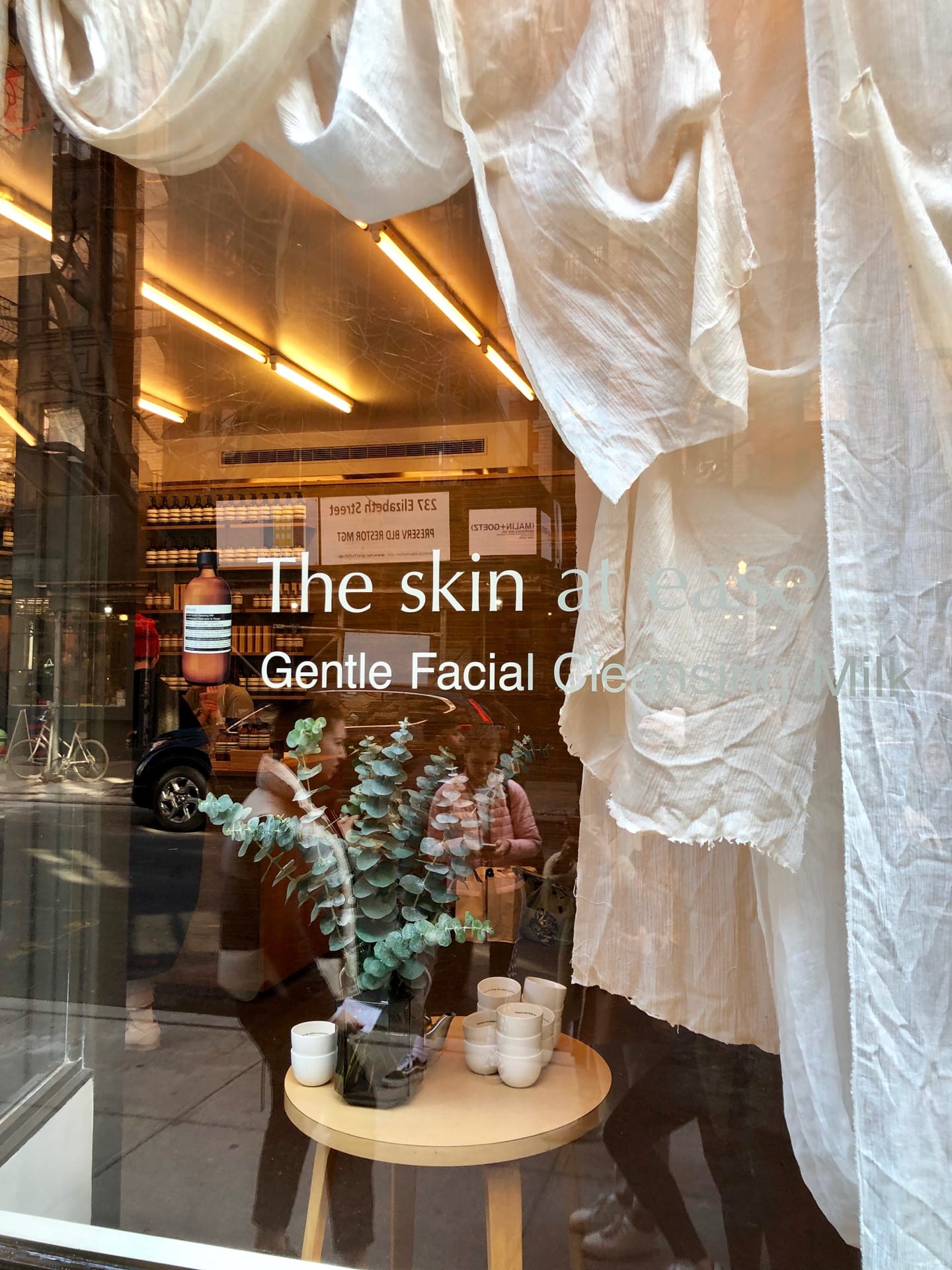
Before we entered the store, a warm, embracing feeling was already delivered through the diffused orange light through the white textile hanging at the store window. The thriving plants is telling another message about the organic and natural ingredients perhaps about the brand’s choice. As we opened the door, it was pretty interesting to see a door mat, like those you would have in your own house – I am guessing it’s a coir one – to brush off the dirt under your shoes gently. Immediately, you felt settled. Turned to the right, a small tea welcoming station was waiting for those who would need a hot tea to combat the coldness of NY wind. Obviously Aēsop is trying to create a very comforting, soothing and slow-speed environment that will help city people temporarily get out of the fast intense vibe. I was also very impressed by the wall coverings. At first I thought it was felt, until I separated two layers and found some texts written on the sheets, then I realized they were newspapers. These aged newspaper delivered a natural yellow stained tone which correspond with the overall earthy, organic theme of the store, as well as the slowing of time the brand is trying to make users sense. In addition to the visual component, the music and the scent in the air also makes you want to stay longer, which together makes a compelling environment and successful branding.
Second Stop: Claus Porto
Main Materials: Wood, Cork, Marble, Metal(Brass or aluminum finished in brass), Plywood
Claus Porto on the other hand highlights the origin and the high-end quality of its product through the interior materials. Portuguese Cork – from which Claus Porto was originated – was CNC cut three dimensionally and mounted to a plywood panel to deliver the ultimate clean and accurate structure of the tunnel. Instead of revealing the products, conceived concaveness were made to help visually organize the colorful palette used for the product packages and prevent any chaotic effect. The coarse texture of cork in contrast with the neatly arranged products, enhanced by the strong accent light, is also highlighting individual pods without creating too much information in the overall interior. In order to correspond with the cleanliness (also considering Claus Porto’s product as soup which has a function to clean), the floor is also made in white washed wood. The most impressive and probably expensive feature in the interior is the marble sink, which was also carved out from a Portuguese marble. There is this connotation of Claus Porto’s soup is paired with a luxurious, elegant lifestyle where you can also find these type of expensive marble sinks. The color of the marble, unquestionable, is also majorly white with shades of grey.
Third Stop: Feit
Main Materials: Wood (fir), Plywood, Glass, Metal (Steel)
FEIT has a recurring theme of diagonal intersection that kept showing up in its material exploration. I was immediately attracted by the infinite mirror reflection created by the two opened street views of the store front. The mirror used here enhanced the openness of the space whilst increasing – visually – the number of wood timbers in the space that almost reminds me of some tropical forest/bushes. But at the same time, the sand color of the overall interior and the cactus at the corner is giving me a vibe of Gobi desert, where complex topography is formed with very few plantations that can survived under the extreme temperature difference between day and night. The steel rod is a cold rod finished in square section, which gives it an unpolished, worn out appearance. I really like the way of how the shelves were structured, the intersecting planes correspond with the mirrors but also contrast with the orderliness of the product arrangements. However, I am not a fan of the plywood floor, which does not look clean at all, I wished it was just treated to look worn but then coated with protective finished to preserve the look instead of getting ruined like this. In addition, the light was also installed to relate to the theme of diagonals.
Fourth Stop: New Museum
Main Materials: Aluminum Mesh &. Corrugated aluminum sheets
The New Museum is an inspiring demonstration of how much you can do with just 1 material. It is also reveals to me the versatility of aluminum in fabrication. The whole building facade was constructed by aluminum mesh. Aluminum was presumably first cut in 3 sizes that differ by gauge, and then pulled by a very carefully controlled machine force to produce these openings and curvy forms. The biggest and smallest gauged aluminum mesh are used on the exterior whereas the mid gauge is employed as a book shelf material to bring the whole building into a total piece of art. Looking closely behind the mesh, another layer of corrugated aluminum was also observed, which can be interpreted as a way to add the contrast or help define the shape of the first layer of the openings, as aluminum was reflective, the corrugated aluminum would produce a even backdrop for the mesh top cover.
Fifth Stop: Architectural Museum
Main Materials: Reinforced Concrete, metal frame
The architectural museum uses material in a similar way of how we see in the University Center. Here, precast concrete are also made in panel form but much bigger, though they are expected to be reinforced with some sort of structure as well. The concrete this time was not tinted, so that the whole building would appear in a similar tone to the concrete pedestrian walkaway. In terms of fixture, the metal – steel frame adds a very brutalist feeling to the combination. The very basic material of all architectural construction, but surely stands out with its clean, “straight on your face” style in the very busy, antique soho area.
Sixth Stop: Prada
Main Materials: Corrugated plastic, Wood, Metal Mesh (aluminum)
Designed by Rem Koolhaas, Prada soho store is a space not only for retail but also exhibition and fashion show. To showcase the different models and products whilst not blocking any views and take advantage of the site condition of a double height, Koolhaas created this huge wooden slope which extended from one end of the store to the other. along the way, customers can see the newest designer products from the brand. Corrugated plastic is used in combination with aluminum framing and mesh to create some hanging shelves, which adds a retro futuristic vibe to the interior. The sense of movement proceeds even when we take a closer look at the choice of wood – Zebra wood. The wood does not have an official/biological name of Zebra but was popular referred to as Zebra wood in the industry for its contrasting strips that look like zebra skin. The more contrasting tone of this wood gives the slope a wavy illusion, and blended the stair treads, which makes it look more like a round slope. The visual trick played here is such a masterpiece.