Daniela: Through our poster, we, as a group, wanted to do more than just provide information regarding our topic. The problem we wanted to directly address and bring light to was concerning the foster care system. While on one hand we could have directly given the audience detailed and profound information on all the defects of the system, we felt as though it was more important and relevant to hook the viewer with intrigue and also guilt. Guilt because through the data shown about the percentage of students with at least a minimal amount of knowledge on the subject was so slim that it encourages and stimulates interest that will therefore lead to further involvement. This, as a result, will lead to the beginning of what is a very complex solution.
HJ: One of the challenges that we were dealing with was narrowing down to a specific problem pertaining to the foster care system, but we finally decided to focus on the awareness and involvement — the first step toward change. Pertaining to the poster, we wanted it to be simple but clear, allowing peers to easily and quickly understand the information. As a result, we decided to contain charts rather than words to show statistics. Whenever we provided words, we wrote them in white to give contrast and stand out from the yellowish-orange background. In addition, the colors of the poster were chosen for specific purposes. We chose a bright yellowish-orange to represent the positive energy of children and an intense red to elicit emotion and to alert the dangers of neglecting this problem. In addition, the vivid colors were utilized in intention to easily catch people’s attention as this poster is expected to be posted in the public where a lot of people would pass by.
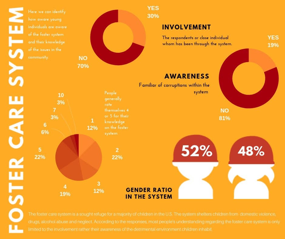
Ashanté: We conducted our research through direct and indirect sources, the survey we submitted to our peers and reliable sites for statistics and outlooks. Our surveys responses summed at least thirty responded, once they were recorded, we collected the results relevant to our approach. It was clear that involvement and awareness were prominent components that we saw needed to be implemented into our poster as the focus. We integrated the percentages of their familiarity with general issues surrounding the system and if they or any of their peers were present in the foster care system, including they rated their knowledge individually. Additionally, it entailed a visual component illustrating the number of females and males in the system.
Reflecting on our poster, we acknowledged that this institution is vastly compromised with minimal attention. It is an organization that seeks the best for the children, however, corruption is inevitable.
James: To complement our topic on the foster system, we chose to use analogous colors of red and orange and round shapes to generate a sense of harmony, but at the same time attempt to evoke a sense of alertness and danger with the color red. These design philosophies represent public’s ignorance on this topic while believing the foster care system creates only positive outcomes. We believe the visual allows us to better deliver our message and raise awareness by creating contrast between the visual and contents.