My name is Isabella Krebs. I am a BAFA student, majoring in Urban Studies and Architecture, with a minor in Anthropology. I was born in Seattle, raised in Beijing, and now am here in NYC for university.
Across the first-year classes, I saw a huge range of themes, styles, and techniques in my work. I looked at sustainability, personal stories, current situations, stylistic exploration, and more. This semester, I saw a stronger connection between my academic studies in urban studies and anthropology and my studio work. I was able to work more conceptually in modeling software and also physical modeling. I did enjoy doing some more experimental projects in Time, like Sticky and my Zine, as a way to push myself to do things that I normally wouldn’t do. I also really enjoyed working in the woodshop and laser lab to construct a prototype bench for Space and Materiality.
Highlight #1

After drawing many different sketches, this was the initial idea I decided to move forward on.

I used illustrator to design the shape I wanted and then drew each individual shape so that it could be cut out on the laser cutter.

I made a scale model out of cardboard to make sure that the proportions were correct and that I liked the shape.

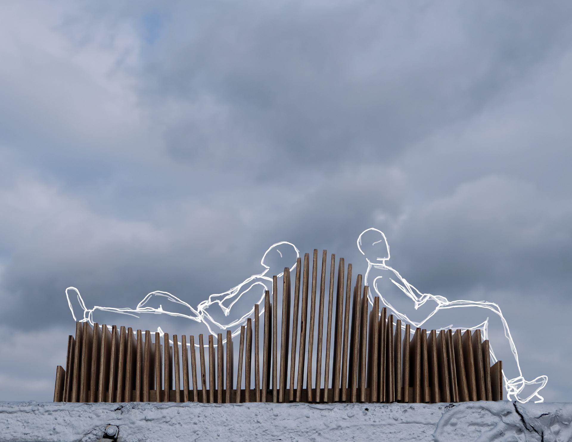
This was my final product. I learned a lot about how to use the laser lab to cut material and refine the shape and assemble the pieces in the woodshop. This project definitely tested my patience, but I thought it really took me through a complete design process. Without taking all the preparatory, planning, and testing steps, I don’t think I would have had a successful product.
Highlight #2


My inspiration for the topic was David Bowie’s iconic costuming and characters. I specifically was interested in his 1973 Aladdin Sane outfit after further research.
I thought of different data topics I could present on the infographic. Eventually, I decided on his original album sales versus his cocaine usage.


For the sketches of possible formats, I focused on one classic data presentation and two experimental ideas. I found that I really like the experimental ideas because of the illustrative component. I decided to go with the third idea because I felt the line graph fluidly combined with his costume.
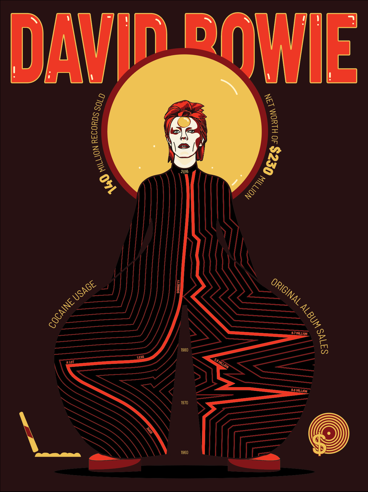
This was one of my favorite projects from first-year. I felt like it was a culmination of many different concepts we had learned in Drawing and Imaging. This was the first unit that I think I successfully applied color theory to the project. I also learned more about semiotics, Gestalt Theory, Typography, and Compositional layout. I intentionally organized the icons and the central halo-like circle in a triangular formation. I think this is an application of Gestalt Theory in my infographic. In terms of typography, I chose to use a simple font and simply change size, boldness, color, and outlining to highlight certain pieces of information. From the original sketch, I did add icons, the halo circle, a stronger title, and extended the graph to the neck to fill the space. And, I think these were successful additions and edits. It added to the meaning and clarified the information. Overall, I am very happy with how the infographic turned out.
I find myself most fascinated by the expansive yet intricate zones of convergence between theory and reality. Currently, I am involved in a project exploring the meta-city and urban form in Chiang Mai, which is a concept that has become one of my focal interests. I want to continue studying constructed environments and cities in my future studies.