World War II : from 1939 to 1945,
design that I like:
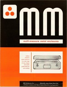
MM Multi-Measure Metal Enclosures brochure, by Ladislav Sutnar, 1944
typeface: futura “Crawfords put sparkle into your advertising” ad, by Ashley Havinden, 1948
typeface: prisma, scotch
prisma in use: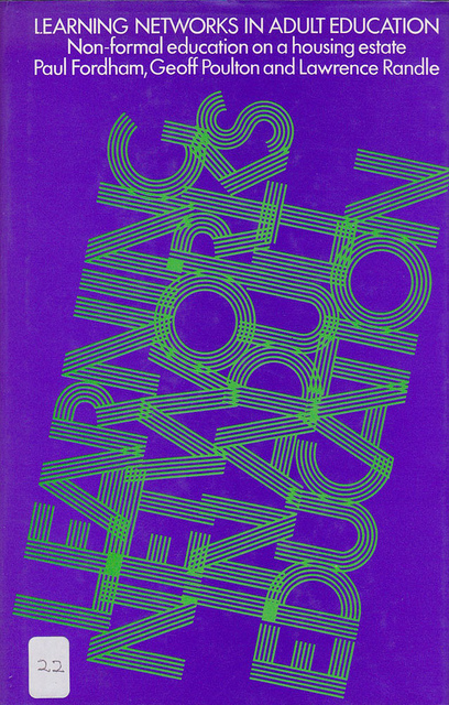
Learning Networks in Adult Education, in 1979
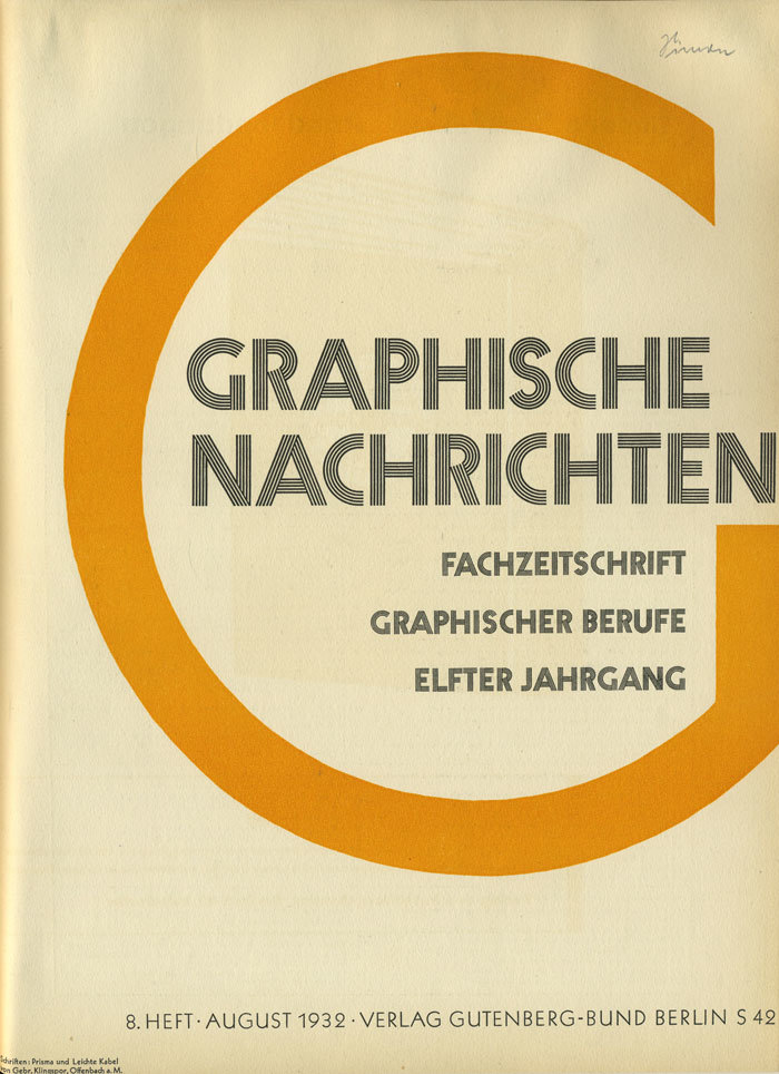
Graphische Nachrichten, Vol. 11, No. 8, Aug. 1932

A flyer that was distributed in The Netherlands during World War 2
typeface: basalt

Zuiderbad Amsterdam Swimming Certificate in 1942
typeface: gnom

Armin Hofmann, 1940
design that I don’t like:

Drink to Yesterday by Manning Coles, Bantam Books,
by Hoffman, 1947
typeface: brush script

Newell-Emmett Co., Pepsi-Cola, “Pepsi-Cola hits the spot,” c. 1940