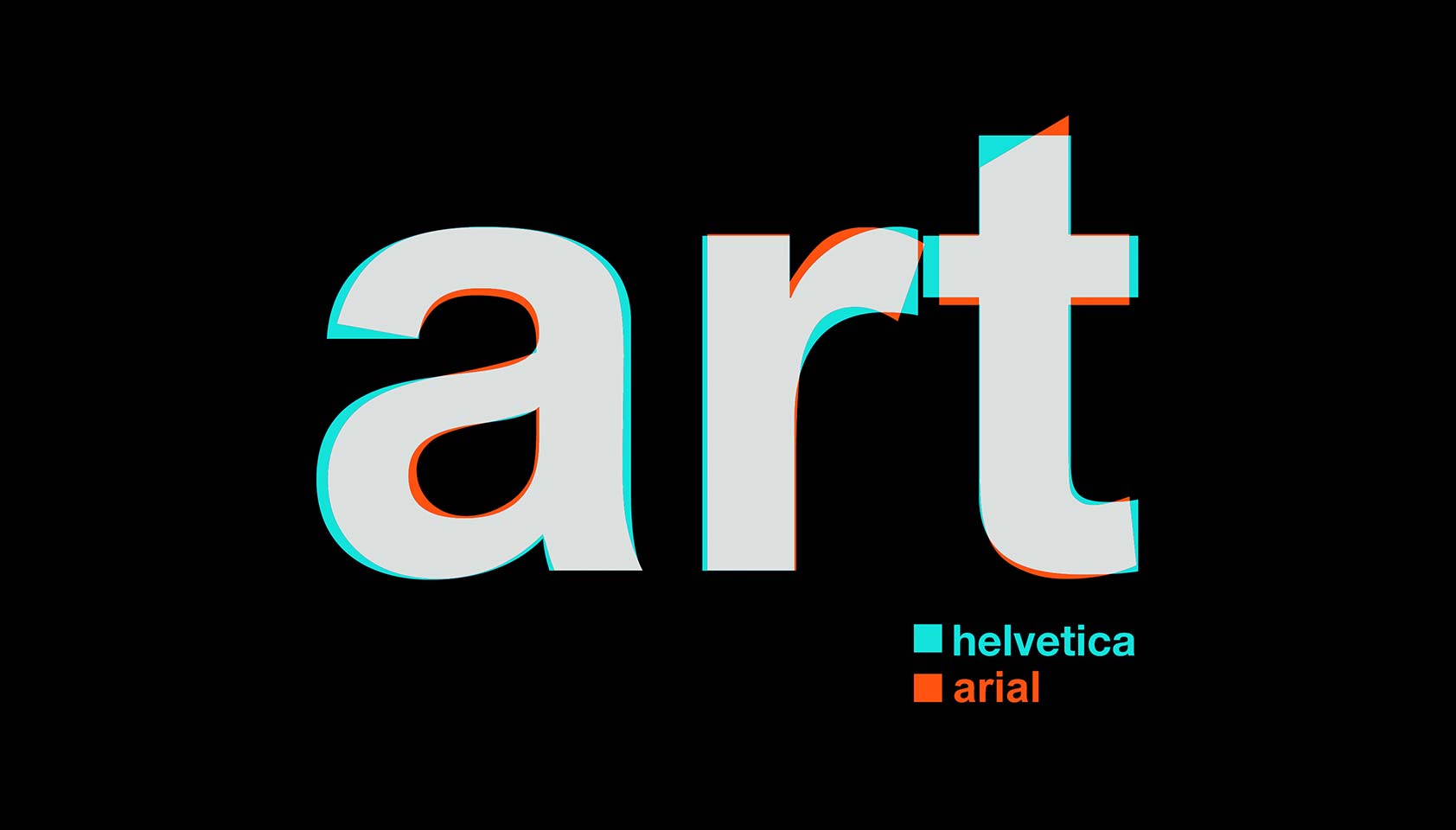
In the documentary “Helvetica”, the font Helvetica is often used for simplicity, convenience, directness depending on the context it is in. It is usually seen in instructional signs that tell the public to do/not do something, and so the font is used to display a simple yet polite message that demands to be followed. When used in stores or advertising, it is seen as something clean-cut, easily accessible to the public, and normal for everyone to have. To some designers, Helvetica has a feeling of “finality” to it, signifying that this is the point that we’ll ever reach in typefaces. When it first came out, it was exactly “what all the designers were looking for” in a font. It can also be seen as monotonous and overused, especially because each letter is designed to the look like the other, allowing no room for creativity.
It is truly a phenomenon that Helvetica is as often used as it is and that you can’t walk a single block in New York City without seeing a sign with it.