Integrative Studio 2
Patrick Martinez Show Visit
- What are the materials being used in each of the 3 bodies of work described in the galleries press release?
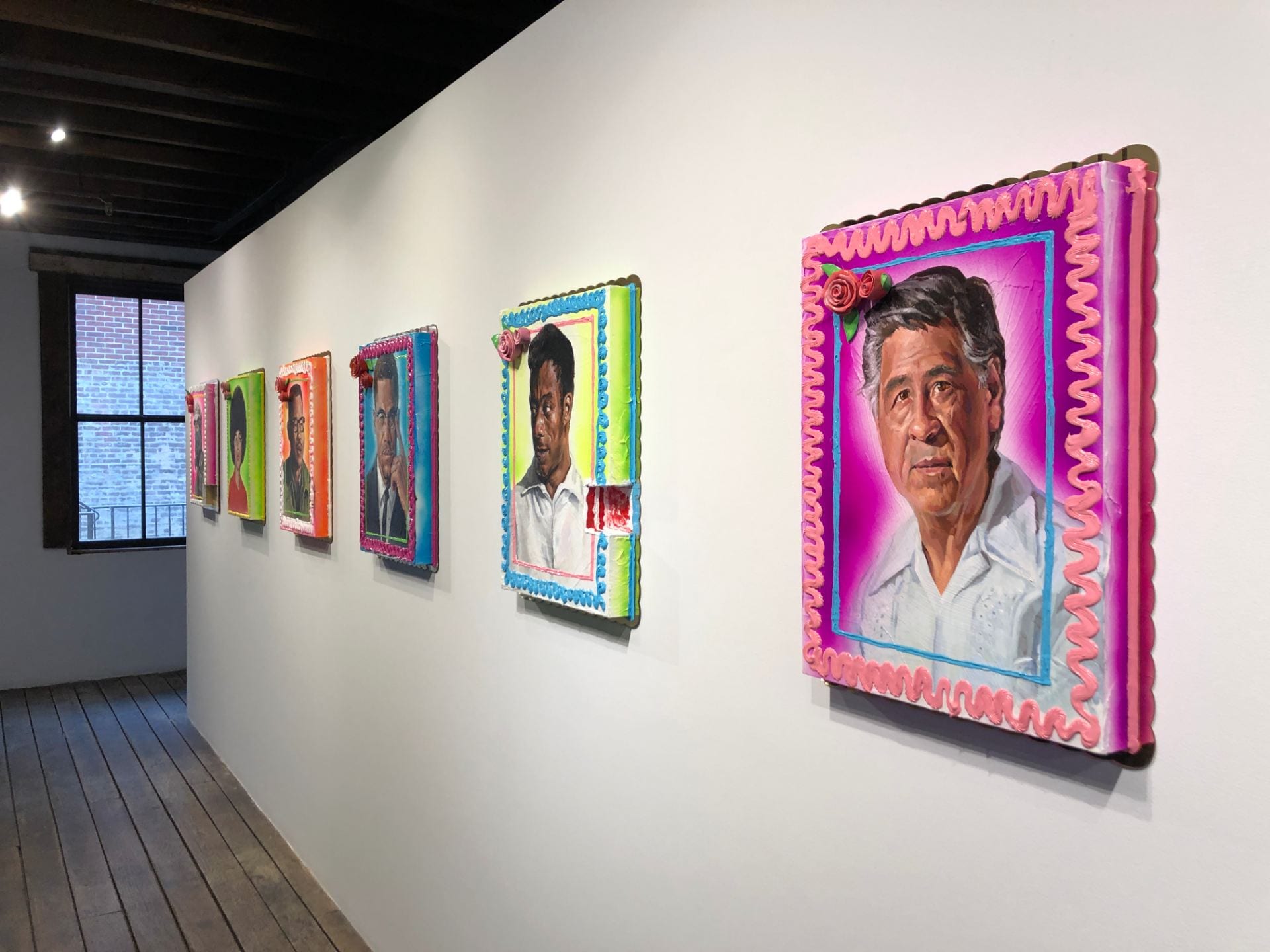
Cake paintings used acrylics and ceramic cake roses on a panel with gold mirror plex. Small cake pieces from the main cakes were displayed on a plastic plate.

Los Angeles “landscape paintings” used stucco, ceramic, acrylic paint, spray paint, and latex house paint, etc.

Neon pieces on the first floor only included neons. But, other pieces on the third floor also included stucco, ceramic tile, latex house paint, window security bars, acrylic paint, spray paint, etc.
- What do these processes and materials communicate about the work? Do they add or distract from his overall aim?


Materials listed above collaborate to represent the purpose of his work. The overall theme of the show interprets the duality of shadow and light. The way of representation, such as cake portraits and ceramic roses, simultaneously celebrates and mourns the events he portrays. Specifically, for example, cake portraits celebrate the past and current civil rights leaders who are left in the shadow in history. They not only show white historical figures, but also the faces of freedom fighters of all races. It’s interesting that he portrays shadows by lighting them.
- What are Los Angeles landscape paintings? How does he refer them on this work?


Los Angeles landscape paintings consist architectural landscape of Los Angeles that he has seen over his growth and ceramic roses that represent street memorials. The paintings themselves mourn the loss of the city.
- Compare his American flag painting to two other famous American flag artworks of your choice. Research and compare how they differ in content and interrogate the symbol in different ways.
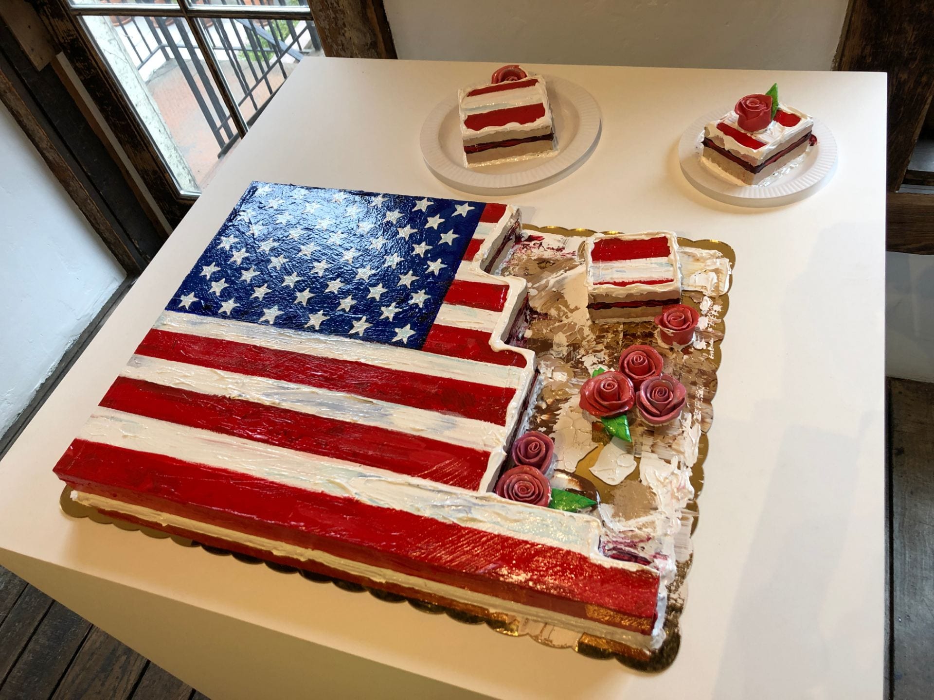

Patrick Martinez’s American flag cake titled America’s Pie is almost half cut out. Some pieces cut out were presented on the same table. This work means the transition between the two functions as both a celebratory symbol and one used in times of mourning, again which is the overall theme of his show.
Comparing his work to other famous American flag artworks is interesting. First, The Fourth of July, 1916 oil-painted by Childe Hassam was a landscape painting of Fifth Avenue, New York. The street had dozens of American flags in celebration of Independence Day. This was also known to be a gift of Richard Gilder.
The Fourth of July, 1916:

Second, White Flag painted by Jasper Johns is also fascinating. It was his second piece of flag paintings that was inspired by a dream of the U.S. flag. It was painted in a monochrome style using encaustic, oil, newsprint, and charcoal. It was a collage of three different canvases, which were finally finished with a layer of fast-setting dirty white encaustic and white oil paint. If you see it in real life at the Metropolitan Museum of Art in New York, you will notice his rapid brushstrokes and rough use of the encaustic medium.
White Flag:

There are more artworks using the American flag, but I chose these two works because they have similarity with Matinez’s flag cake, which is a celebration. Although they have different meanings of celebrations, the way of their representations are very similar.
- Do Martinez’s neon pieces do something new in art history that past neon works do not do? How do they add to this genre? Research Glen Ligon, Dan Flavin, and Paul Stephen Benjamin’s neon work for context.
Martinez’s neon works:

Glen Ligon’s neon works:


Glen Ligon’s neon works are similar to Martinez’s neon pieces in terms of using letters. However, Ligon’s works only used the black, white, and yellow tone of lights, when Martinez used various different colors. Martinez further played with the lights by turning off the light in parts of the sentences.
Dan Flavin’s neon works:


Dan Flavin’s neon works are minimalistic, colorful, and big-scale. Minimalistic designs dominate the mood of the space. Flavin and Marinez’s works have different amounts of the gleam of lights. Flavin’s works have a simple structure of straight lights that all have the broad gleam of lights. However, Marinez’s works contain sentences in different colors that only shine the letters. They don’t spread the colors of the lights to the surroundings.
Paul Stephen Benjamin’s neon works:


Paul Stephen Benjamin’s neon works have a distinct style. They only have one tone of color of the light; violet. He sometimes incorporates televisions in his work. The format, style, mood, and many others are different from Martinez’s neon works.
- What’s your favorite work in the show and why?
It’s really hard to choose only one piece from his show, but if I have to, I would pick this painting because its meaning is well-portrayed through its visuals. Also, since I personally like abstract paintings that have their own tone and mood, this painting attracted my eyes stronger. The colors and the rough texture of the surface of the painting deliver the mood and emotion of its theme. The way the landscapes are painted reminds me of street art, which is also relatable to the theme. Last but not least, ceramic roses convey the feeling of remembrance and celebration at the same time. This overall theme of duality is very interesting to interpret because people understand the work in so many different ways.
- What’s your least favorite work and why?
This is my least favorite work from the show because the way how pink neons and poster-like words go together forms some sort of cheesy mood. I think that big numbers and words are making this tacky feeling. If it only consisted of neons and tiles, it might have been very classy and chic. I think I prefer minimal and sophisticated works than complicated and too-artistic works. However, ignoring my personal taste, this work fits the theme of the show because of the materials and objects used in the work. It wouldn’t be the main piece of the show but could be a piece that supports the purpose and contents of the show. This piece definitely conveys the meaning with its own style that is truly respectful.