I’m generally one who is drawn to scientific concepts, like the child perpetually asking why, I feel that science provides the most possible satisfaction in an explanation. At The Cooper Hewitt’s current exhibit “Saturated: The Allure and Science of Color” visitors learned about the myriad scientific approaches taken towards the study of color, and the application of color in novel ways throughout history.
Below is a piece that I find inspiring, because it’s one of the first noted uses of color as an ‘infographic’ to transmit information. The below infographic documents the ratio of church accommodation to the total population over 30 years of age.
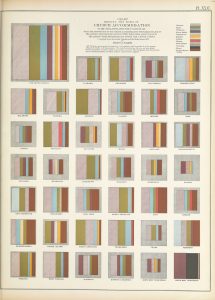
Infographic based on the results of the 1870 US census
The digital rendering makes it difficult to see, but each square represents a state in the United States. Once the key is memorized, a viewer can learn about the religious demographic of the US- and this information is transmitted visually. It speaks to the mind’s ability to digest information in different forms. This visual transmission of information lets the mind assemble a picture of the population from a statistical number. Color is a key component of this new form of information, because it signifies a difference in form. Within the colors the information of volume is also communicated. This is the merging of two pieces of information: the different religions present in each state, and the percentage of the population practicing each- represented abstractly by a square broken into lines of different colors and sizes. It becomes very easy to quickly note differences e.g. there is far more grey in one square than there is in another- where were this information written out numerically, without color, the brain would need to do more work to assemble the comparison.
On visiting the Met following this exhibit, I took notice of the other ways color transmits information. The below image is in someways quite visually similar to the former, but is not a visual representation of statistical information, and is instead the translation of a time and a mood into small blocks of color.
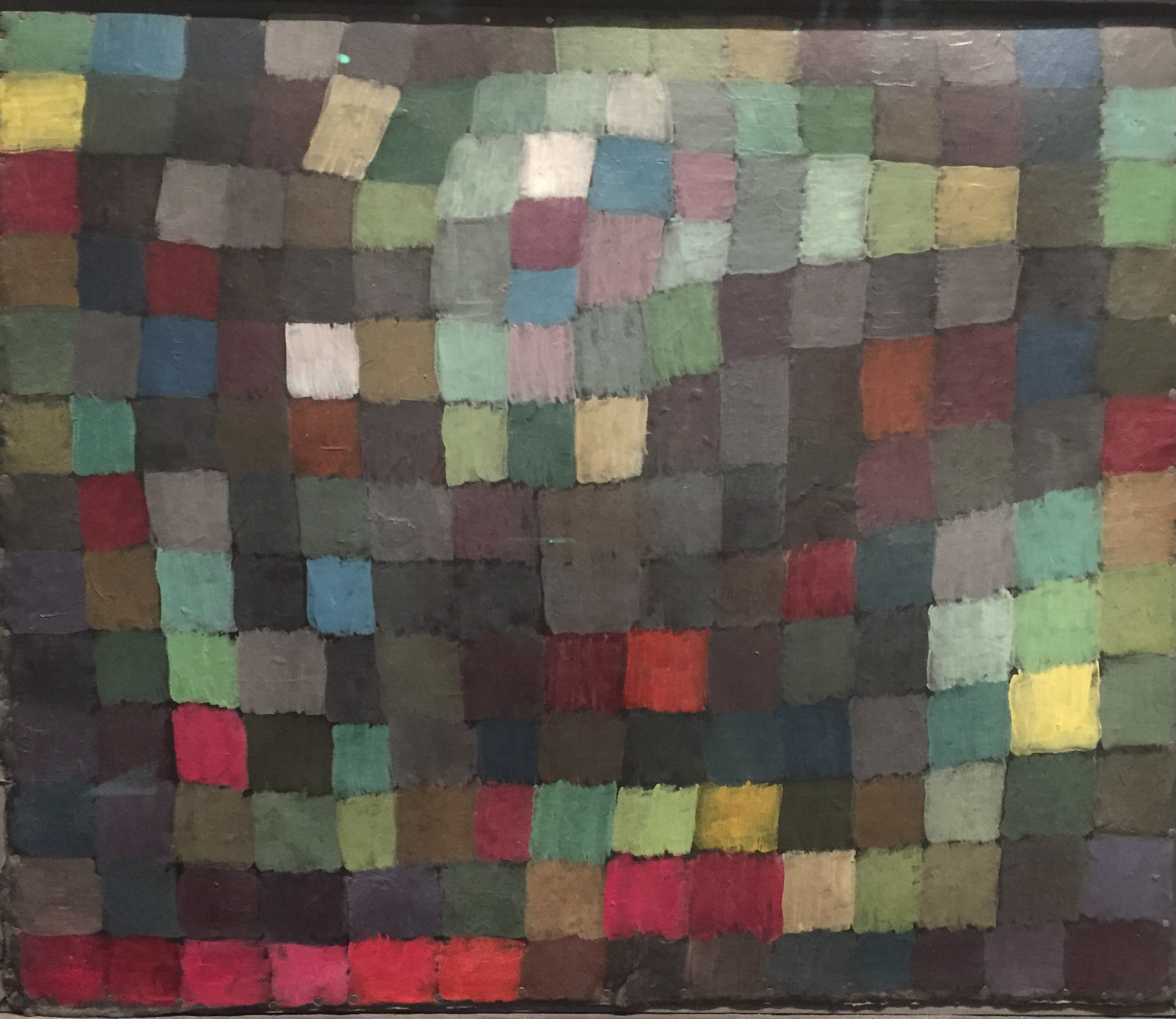
Paul Klee- May Picture, 1925 Oil on Cardboard
Without reading the title of this piece, one could try and assemble a theory for the display of color, but once the intention becomes clear through the title our mind is free to feel the emotions intended by the artist. Here he has been inspired by the month of May, the month when flowers begin to bloom, and leaves begin to gain their color and strength. I appreciate the sentiment of translating a time of year into an abstract visual, almost pixelated in nature- as if the viewer were looking back or forward at the moment from a removed distance.