The Introduction of a Concept
While exploring the Cooper Hewitt Museum, I became fascinated with the notion that in 1665 Isaac Newton named our 7 color spectrum after the 7 notes in a d Dorian Mode. After further investigation, I learned that this was an analogy he created, with no actual parallel between the frequencies of the sound waves and the lightwaves of the colors emitted from a prism.
Several centuries later, mathematician and composer Joseph Schillinger applied mathematics to human understanding of the creation of and perception of art in his essay titled “The Mathematical Basis for the Arts”. Interestingly, one of Schillinger’s students went on to teach his methods of geometrical composition in Boston, establishing the “Schillinger House” which has since become the Berklee College of Music.
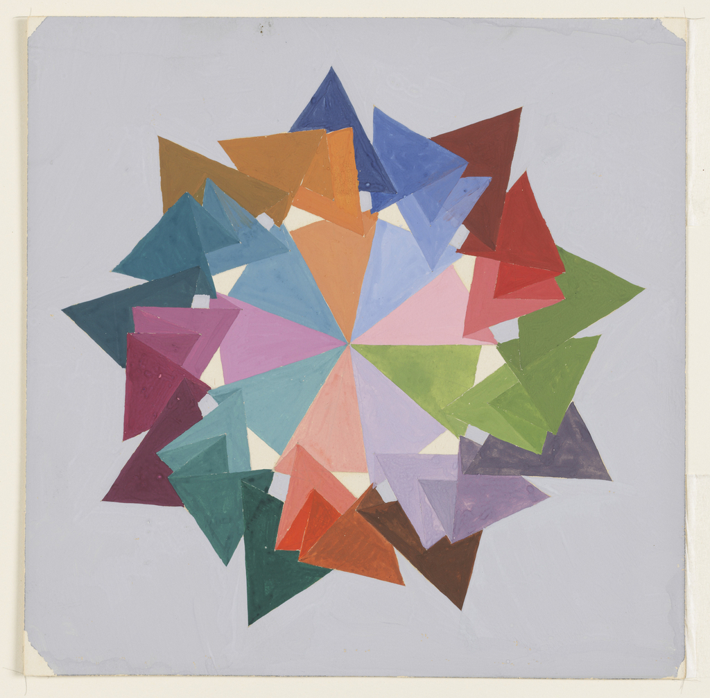
For my final project I have chosen to recreate one of Schillinger’s geometric tessellations. This work is a nonagon, a nine-sided polygon, pulled outwards into triangles in descending from dark to light as they collapse inwards. He positions complementary colors next to one another.
I’ve extracted a variety of fascinating quotes from Schillinger’s essay that I will be using to inspire my final product. Most interestingly, I am inspired by his notion that the frequencies of the lightwaves of the colors we experience have proven physiological effects.
“The psychological triad is in direct accord (and, perhaps, correspondence)
with the frequencies stimulating visual and auditory perception. The low frequency of red affects us as under stimulation; the middle frequencies of yellow, green and blue — as normal stimulation; and violet — as overstimulation. Compare these color frequencies with the sunset with its overabundance of red, the midday with a balanced spectrum and the forenoon with its ultra-violet pre-dominance.”
I’m in love with the notion that the frequencies of our natural surroundings, facilitated by the strength and intensity of the sunlight, adheres in the creation of our circadian rhythms. It’s currently the time of year synonymous with the Summer Solstice, the time when the northeast is flooded with the light of long days; early sunrise and late dusk.
One of the essential elements of music is the movement of notes through time- this movement is what Schillinger used to mathematically create geometric shapes from musical compositions. I’d like to take this concept of time, and explore the movement of color through time- within the span of a long summer day.
The Evolution of a Concept
I began my photographing journey at sunset on the westside of lower manhattan, trying to capture the golden light’s influence on color. I photographed the purples of the sky, and its descent into dark blue. The following morning I tried to capture the distinctest of morning light, to see if it would translate into colors I could capture and use to articulate the notion of time. Back on the computer the colors and textures weren’t coming together cohesively and voicing time in a visually appealing way. To really achieve the effect I was seeking to, I would have needed several days to photograph the same item repetitively at different hours. Because I wanted to create something that was, above all, visually pleasing, I decided to use Schillinger’s shape to explore the colors and textures of Summer.
“As the range of readers will probably vary as widely as the respective fields covered by this theory, the author expects a correspondingly wide range of re- actions to it. He has hopes, however, that this work will be a stimulus of high potential, which will lead the spirit of investigation into the most majestic of all playgrounds known.” Joseph Schillinger, Preface
The Creation of a Concept
The creation of a final piece involved using the clipping mask to extract the right textures. Below are a few of the pics I sampled to follow Schillinger’s original color scheme.
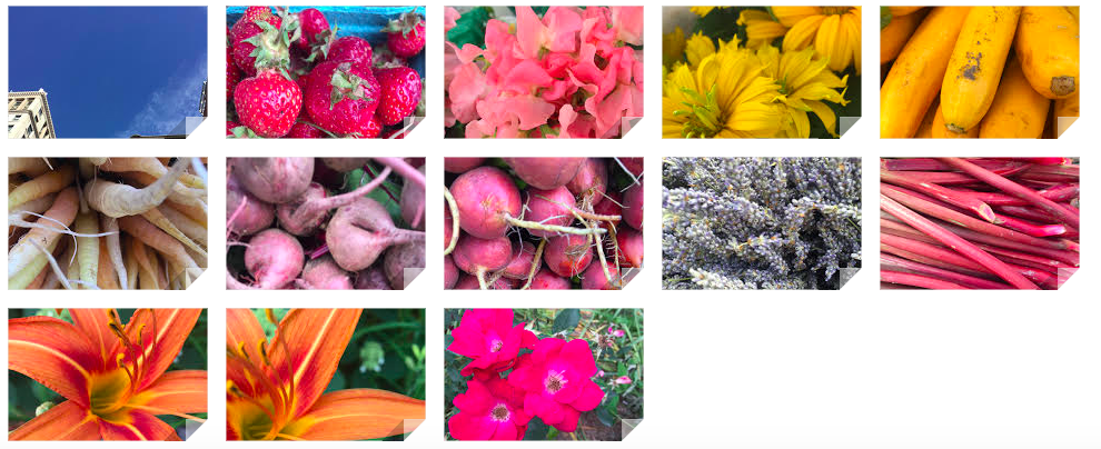
Red onions, carrots, flowers, kale, morning sky, and evening sky were all sampled to create the final geometric figure. Visually, I was pleased with the result. Conceptually, I felt a little was lacking, as I wasn’t able to tie in my original fascination, the relation of color to music. Perhaps, if I were to fill the nanogram every season with the respective seasonal colors it would deliver a more substantial analysis of color. It was, if nothing else, an intimate experience with a geometric shape that had the illusion of color created through shadows. Below I was experimenting with how the shape would converse with the viewer in a more dynamic way. I loved the idea of breaking the shape apart in an explosion, but again, this had to conceptual backing, and I felt it looked too incomplete.
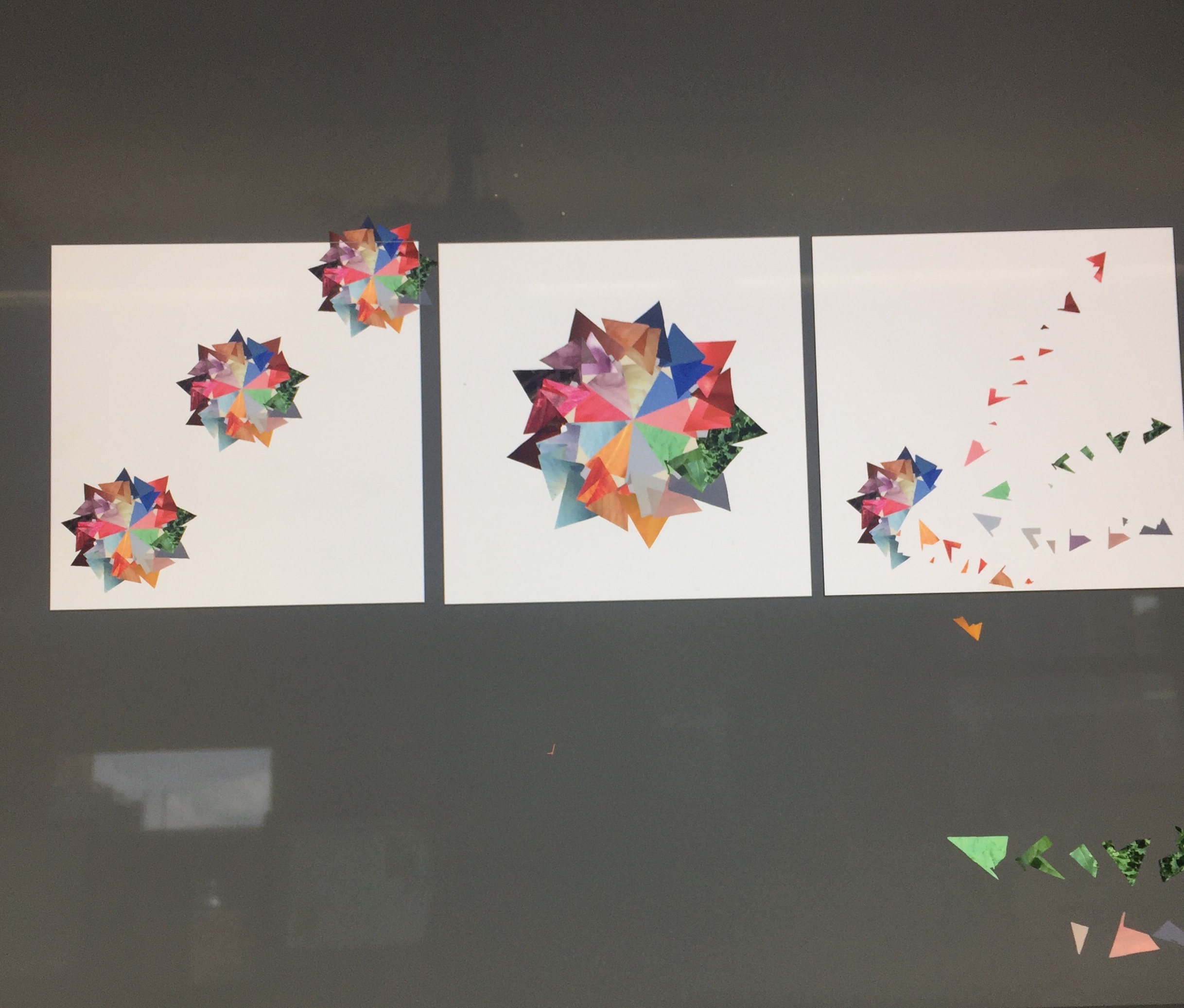
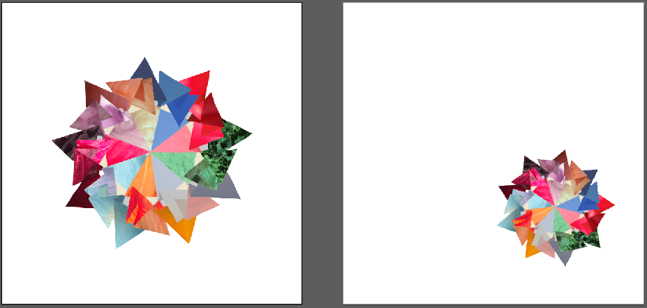
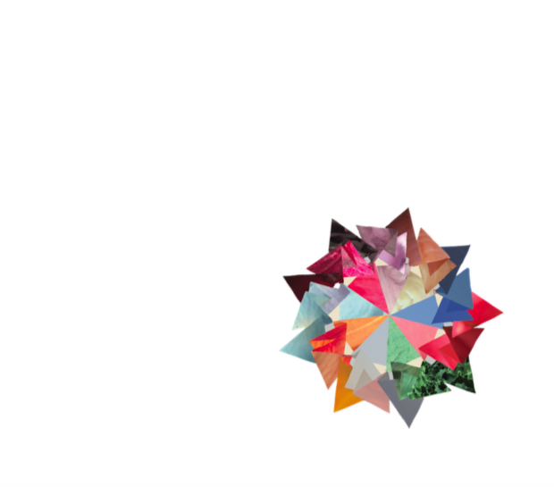
I finally settled on using the shape twice, in different sizes. Inspired by Schillinger’s analysis of what makes good art:
“Esthetic satisfaction comes mainly from the sensation of being off balance, but in an obvious relation to balance. Here a mechanical experience becomes an artistic one through the discrimination of the “artistic differential” by our senses. Then the joy of discriminating simple relations in a sensory form possessing a standard deviation is psychologically similar to solving problems or riddles. The element of the unknown stimulates curiosity, and the process of associating it with the known produces a feeling of satisfaction. Here lies the success of one work of art and the failure of another.”
To explore this concept I took a copy of the original shape, decreased its size by 40%, and placed it in the lower right side of the page. The balance comes from the obvious repetition of the shape, and the tension comes from it being pulled into the lower corner of the page- in contrast to the other adjacent page where it exists centered, in full size.