Landscape Collage with Figure

As the class stepped into the unit of perspective drawing, we started out by making collages that gave the illusion of depth.

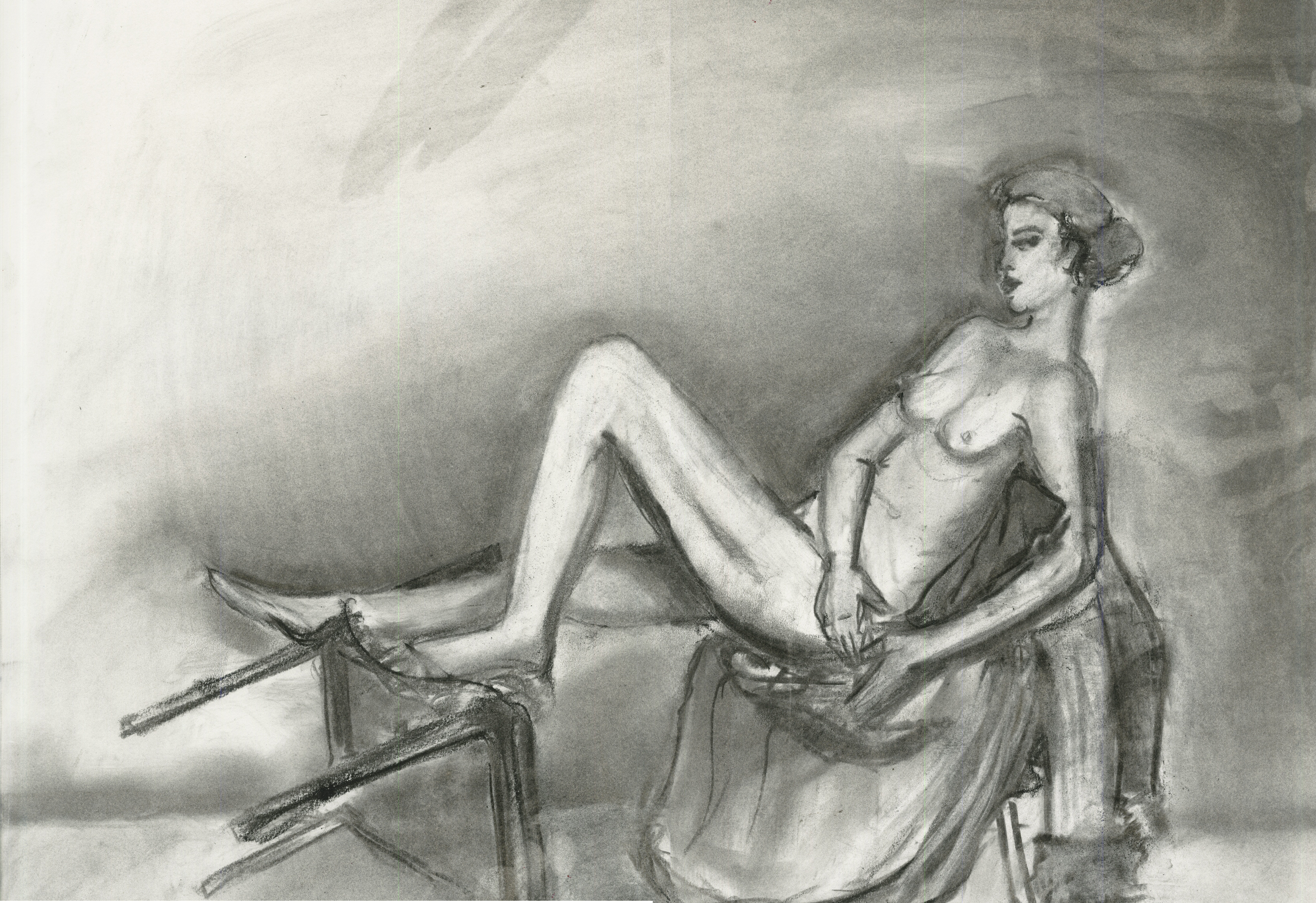
The first step was to make tonal drawings of a model using “boxy,” “mapping,” and “naturalistic” techniques. This step was important in getting students familiar with shading and how contrast of light should be treated in a drawing. For instance, the lighter side of a subject should be accompanied by a darker background, whereas the darker side could havea lighter background. These are some examples of my tonal drawings:


We were then asked to choose one or more of our figure drawings to include in a landscape collage. We worked with various materials like decorative paper, textures, and mark-making to create a collage that conveyed a sense of 3-dimensional depth. Since this project was basically a study of how we see space, I literally thought of space and decided to base my collage on that idea. I wanted to create a sense of infinite space by repeating the same image of the large figure at bottom in smaller figures above, and using different decorative papers and prints to make the moon and planets. I reduced the size of the upper figures and planets and placed them in an S-shape to evoke a sense of depth.


White and Ambiguous Figures

This project consisted of a multistep process that integrated physical and digital work. The object was to make two compositions, one with a white figure on a black background and one with an ambiguous figure/ground relationship. Both compositions were to use the same negative shapes from a montage combining drawings of stools and a nude model.

The first step in the process was to draw the model and the stools. By doing so, the students strengthened how well they translated what they saw onto paper. We used a helpful method to scale the various components of what we were looking at by using a pencil to compare the sizes of various parts. Also, it helped to first draw a mini version of the objects before beginning the actual drawing. Afterwards, we scanned the drawings and edited them in Photoshop to clean them up and make the negative spaces white. Below is the edited image of the stools… unfortunately there is no image of the figure alone but you can view it in the composition of the stools and the figure in the next step.

Next was to combine the edited images of the stools and figure into an Illustrator file in an interesting way that would create at least 15 decent-sized shapes out of the negative space. We “carved” out the negative spaces using the pen tool and added a white fill to them. Here I’m showing the negative shapes with a colored fill to make them more visible.

The final step was to create two 10 x 10-inch art boards in Illustrator with black backgrounds. Once that was done, it was time to start laying out the white shapes from the stool and figure composition to create new compositions. The two images had to use the same shapes, at the same size, with minimal overlapping. It took a lot of experimenting to make both images properly fit within the frame size and be appealing with such restrictions. However, doing so improved our skills in working with restrictions, which are often faced in real-world situations. Below are the final figures (left is the “white figure” and the right is the “ambiguous composition”).

.